Code
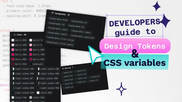
The developer’s guide to design tokens and CSS variables
Design tokens are a platform-agnostic representation of your design decisions, while CSS variables provide a way to implement these decisions in the browser.

Code
Design tokens are a platform-agnostic representation of your design decisions, while CSS variables provide a way to implement these decisions in the browser.
Penpot
One of the hardest challenges in building a design tool like Penpot is rendering performance. As designs grow in complexity, ensuring smooth performance becomes increasingly difficult.
Code
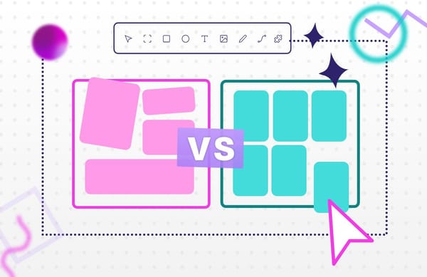
Understanding what is Grid vs. Flexbox and how to use them can help you build cleaner layouts, write less code, and avoid frustrating design issues down the line.
Code
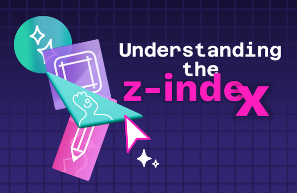
What's z-index? Learn how to manipulate the z-index, why it matters, and how Penpot makes it easier to manage stacking without touching a line of CSS.
Code
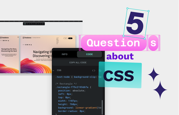
Having a basic knowledge of CSS can really benefit your skills in web and UI design. Let’s start with these answers for the top CSS questions asked by beginners today.
Design
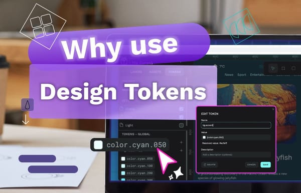
From reducing human error to creating more harmony between teams, let’s explore the benefits of design tokens and why you might want to consider using them in your next project.
Code
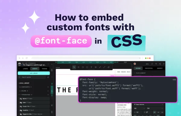
Learn how to use @font-face to embed custom fonts in your website. Includes practical examples, performance tips, browser compatibility, and common mistakes to avoid.
Code
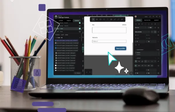
In this guide, we’ll walk through creating a token system that works intuitively for both designers and developers.
Code
What are the benefits of common CSS frameworks? We give you some reasons why you might want to consider designing in pure CSS.
Code
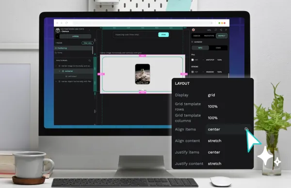
Creating a great design with CSS comes with a learning curve. However, a lot of what you’ll make focuses on knowing two design areas: positioning and fonts.
Code
While learning CSS takes time, understanding how it works should be easy. In this guide, we’ll explain the basics of CSS to help you start your journey.
Code
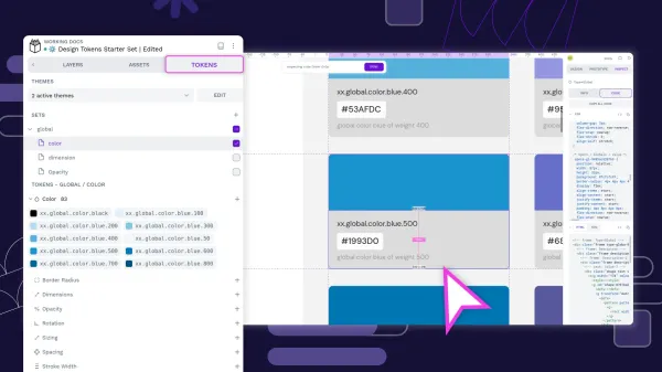
Design tokens create a single source of truth for design decisions, making your design system more maintainable, scalable, and consistent.