Penpot deep dive: Color tokens vs asset colors
Color design tokens and asset colors are both ways you can store colors in Penpot for reuse. There are some key differences that might affect which you choose to use in your project.


Color design tokens and asset colors are both ways you can store colors in Penpot for reuse. Once you’ve created a token or an asset color, you can edit its color and your changes will update across your design.
Both color tokens and asset colors are fundamentally a color value with a name. You can organise both tokens and assets in multiple ways and share them with your team, but there are some key differences that might affect which you choose to use in your project.
In this tutorial, I’ll do a deep dive on the differences between color tokens and asset colors, as well as exploring how to use both if you are new to Penpot.
Key differences between color tokens and asset colors
For a quick reference, check out this table I made comparing some key features of design tokens and asset colors:
| Feature | Asset colors | Color tokens |
|---|---|---|
| Save color with name | Yes | Yes |
| Shown in Inspect panel | Yes | Yes |
| Shown in Design panel | Yes | Yes |
| Organize in groups | Yes | Yes |
| Sync via libraries | Yes | No |
| Apply from palette | Yes | No |
| Apply from color picker | Yes | No |
| JSON Import/Export | No | Yes |
| References/aliases | No | Yes |
| Selectively turn on/off with themes | No | Yes |
It can take a while to swap all your objects between using color tokens and color assets, so try to pick the most suitable option first. There are some shortcuts you can take to change your color assets into color tokens. I would recommend choosing either asset colors or design token colors, as mixing the two approaches could create confusion for yourself or your team.
Why save colors?
A consistent visual language is key to creating a high quality user experience. When working with color, you can achieve this by reusing the same colors, or shades of color, throughout your design. Naming these colors with a descriptive name can help you remember the intention behind using that color. Meaningful names can also help when working in a team; your team can understand which color they should use for each purpose, and develop a shared language to help them have more productive discussions around design.
How many colors you choose to save, and how you name and organize them, is entirely up to you. There’s a lot of good advice out there about naming colors as part of a greater design system. But usually it boils down to what is most suitable for your project and easiest for your team to remember and use.
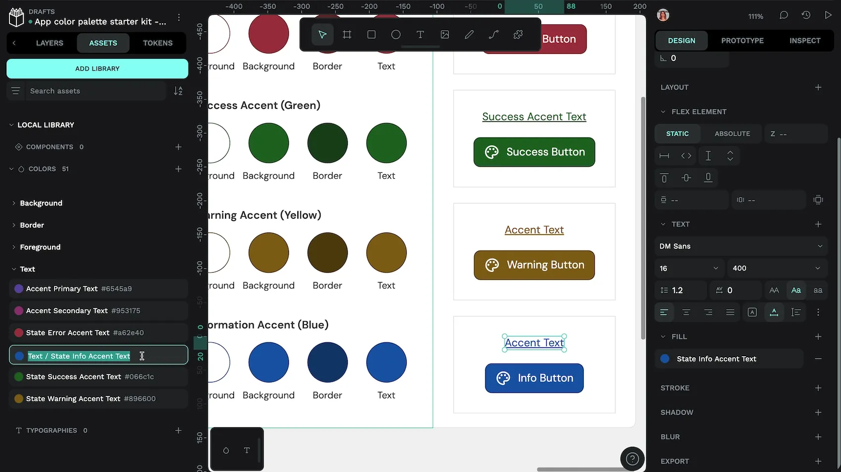
Asset colors
Asset colors are Penpot’s original way to save colors in your files and share them through libraries. Once you have created your asset colors, you can publish your file as a library alongside any components and typography assets. Your library can then be connected to any other file in your Penpot team.

Using asset colors
Your asset colors are stored under the Assets tab in Penpot’s left panel. Assets can be organized in groups and subgroups.
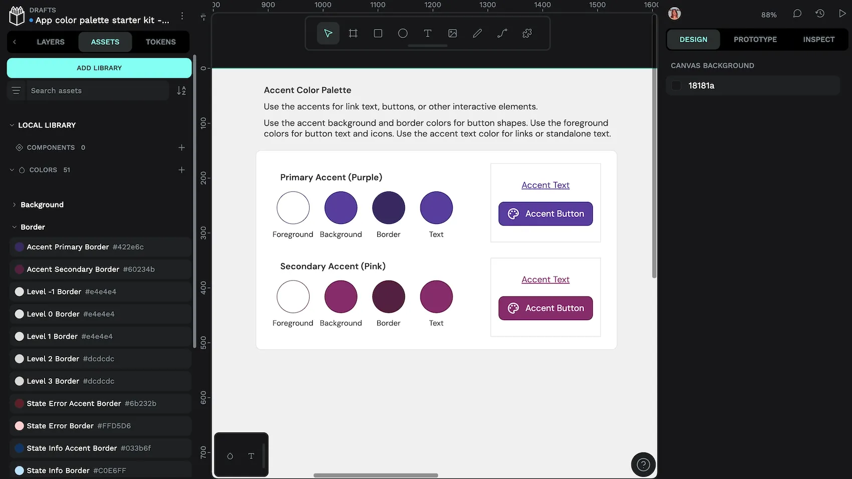
You can find any asset colors from the current file in the Local Library section. You can also connect any library file from your Penpot team to show that file’s colors in its own section under the Assets tab.
To apply asset colors to an object on the canvas:
- Select your object from the canvas or the layers list.
- Open the Assets tab.
- Click the color to apply it as the object’s fill color. Hold down the alt key and click the color to apply it as the object’s stroke color.
You can also apply asset colors from the color palette at the bottom of Penpot’s workspace. Choose your desired palette from the drop-down menu in the panel—you can choose from your current file library, any connected library, or just the recent colors used in the file.
There’s a third method for applying asset colors to your objects! From the color picker, you can choose your desired palette from the drop-down menu in the picker. Hovering over each swatch shows its name and value in a tooltip.
You can tell that an asset color is applied to the currently selected object from the design panel—instead of a square swatch with a hex color name, you’ll see a circular swatch with the color name.

If you no longer want the color to be applied to your object, you can either change the color or use the detach icon to break that object’s connection with the asset color.
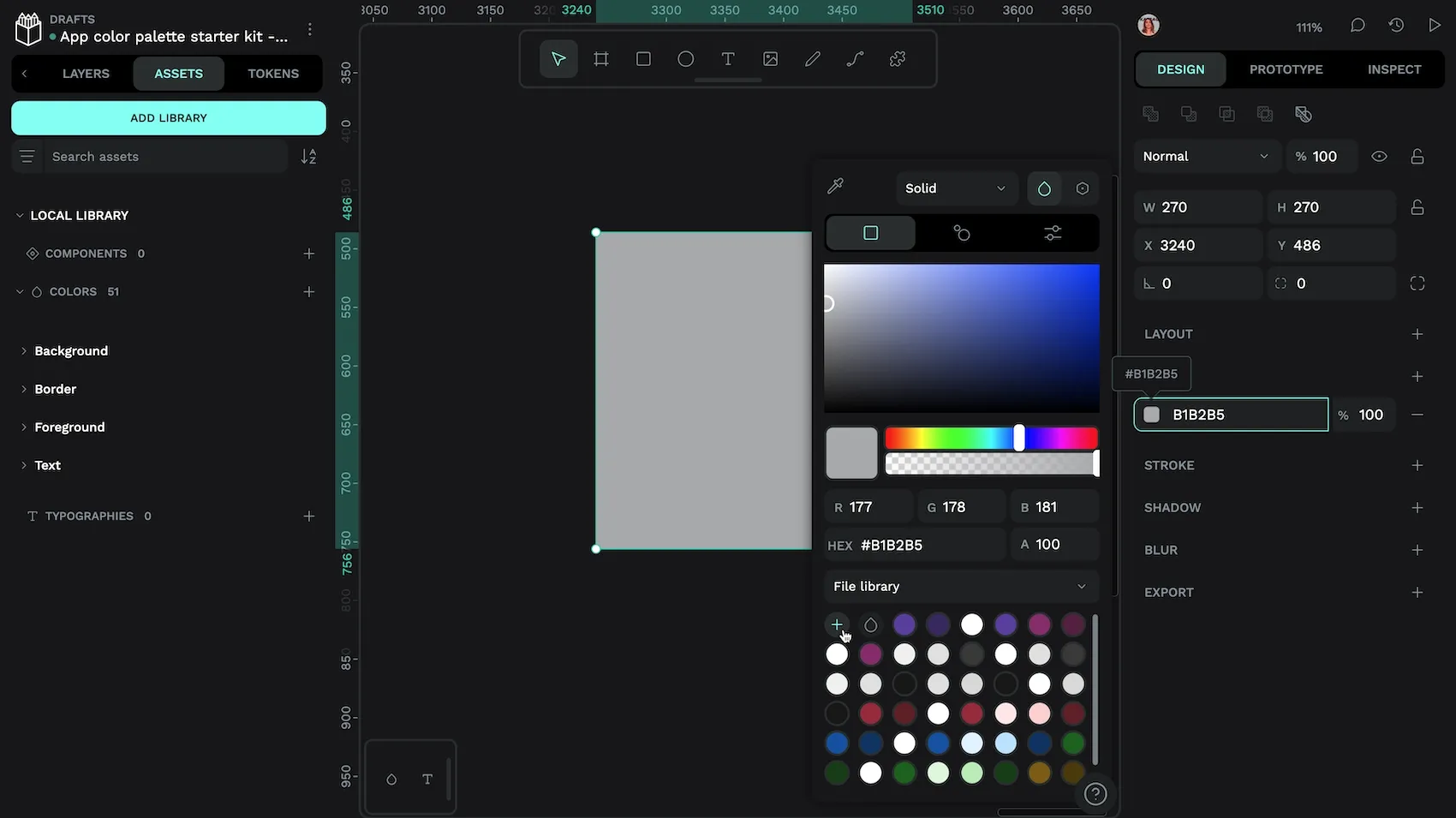
Creating color assets
There are two ways to create asset colors. The first is from the assets panel:
- Use the plus button icon alongside the colors section to open the new asset color picker.
- Choose the color you want to use for your new asset.
- Use the button at the bottom of the color picker to Save color style.
- Your asset color will be created in the colors section of the assets. By default, the name of the asset color will be its hex value. You can replace the text with a more descriptive name after saving your color style. Or you can right-click the color and choose rename at any time later on.
You can right-click any asset color to organise the color into a group. Or you can use slashes in the color name to specify its group structure.
The second way to create asset colors is from the color picker. This is the easiest way to create new asset colors if you already have objects using the colors you want to save.
- Select your object from the canvas or the layers list.
- Open the color picker by clicking the fill or stroke color swatch.
- Ensure the file library collection is selected from the drop-down menu.
- Use the plus button underneath the drop down menu to create an asset color from the currently selected color.
- Your asset color will be created in the colors section of the assets.
Editing color assets
You can change the color of a color asset at any time by right-clicking the asset and choosing edit from the menu. Changing the value of a color asset will update the color of every object using that color asset.
Try out asset colors
It can take some time to create your own asset colors, but you can get started quickly with my Color palette starter kit. It’s a Penpot template for an app color palette which uses asset colors.
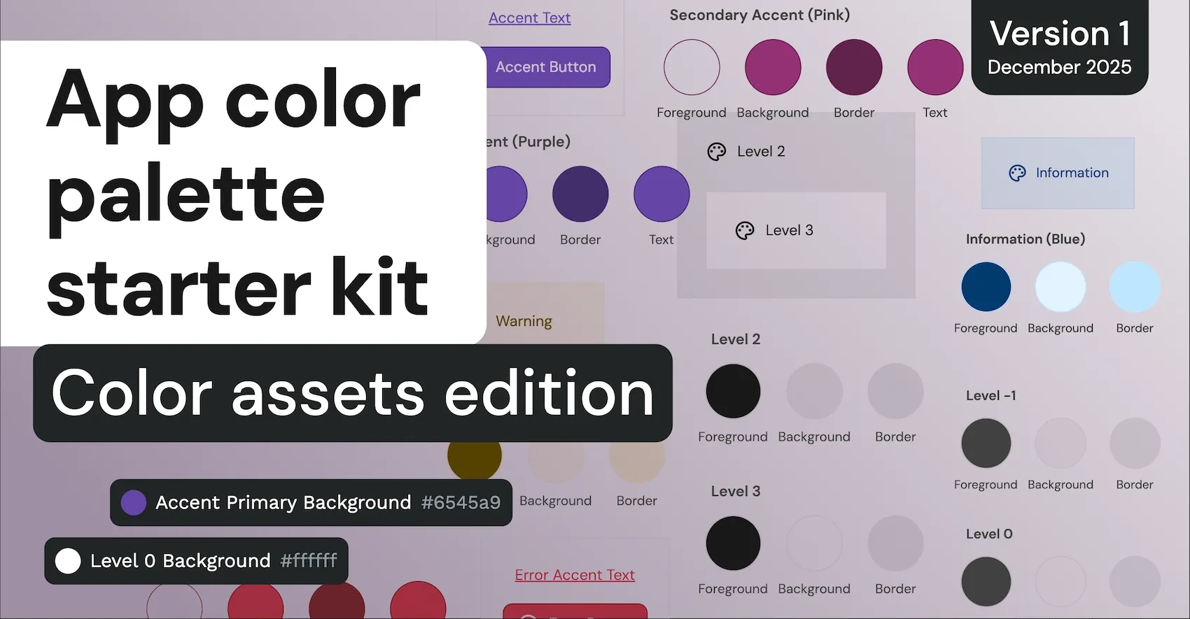
Download the App color palette starter kit - Color assets edition.
You can import the template and explore the demos in the file. Or publish the file as a library, connect it to other files and use the asset colors from the library.
Color design tokens
Design tokens are a platform agnostic standard for saving and sharing design values across design and development teams.
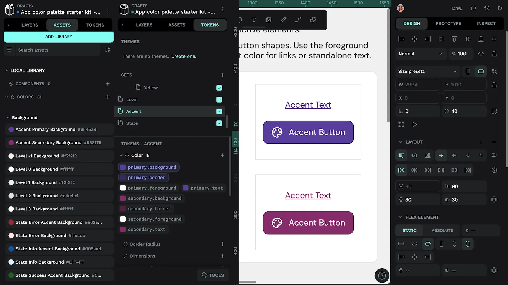
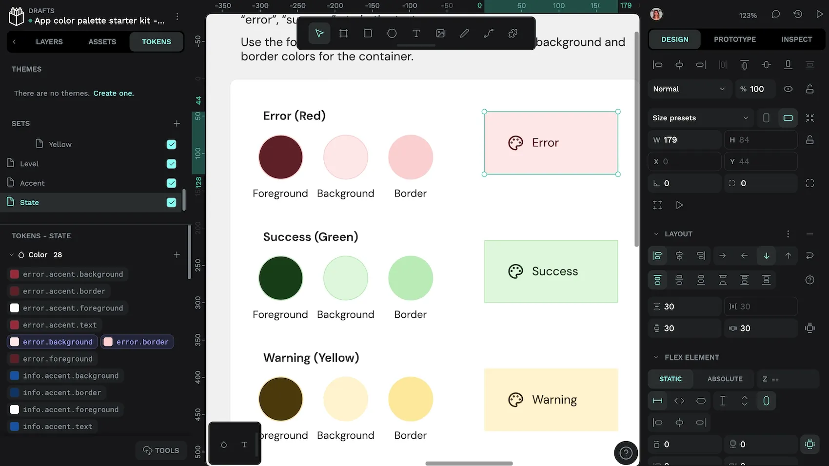
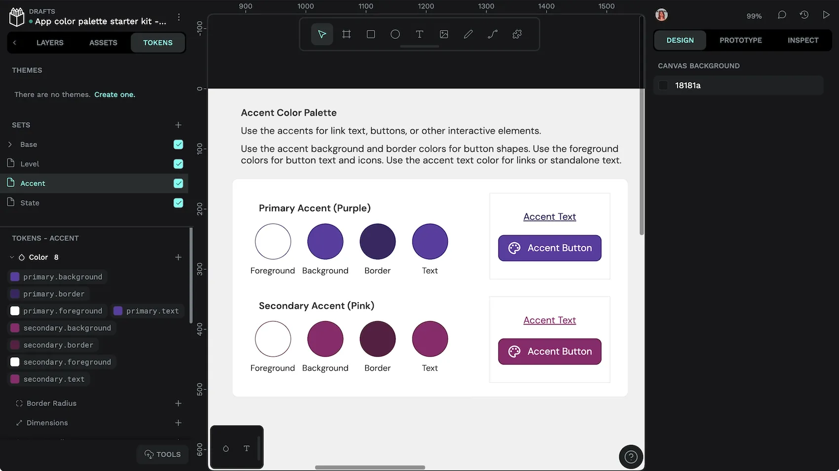
Using color tokens
Your design tokens are stored under the Tokens tab in Penpot’s left panel. Tokens can be organized in sets and subsets. Sets can be enabled and disabled from the tokens panel or through design token themes.
You can find the color tokens from the current set in the colors section. You can also import existing design tokens in the standard JSON format from the bottom of the tokens panel.
To apply a color token to an object on the canvas:
- Select your object from the canvas or the layers list.
- Open the tokens tab.
- Right-click your chosen token’s name to open the token menu.
- Select the fill and/or stroke to apply that token to your object’s fill and/or stroke.
Hovering over each token shows its resolved value in a tooltip.
You can tell that a color token is applied to the currently selected object from the design panel—instead of a square swatch with a hex color name, you’ll see a rounded rectangle swatch with the design token name.

success.accent tokens are applied to the success button.If you no longer want the design token to be applied to your object, you can either change the color or use the detach icon to break that object’s connection with the design token.
Creating color tokens
You can create color tokens from the tokens tab in the left panel:
- Use the plus icon button alongside the color token type to create a new color token.
- Enter the name of your color token. Names may only contain letters and digits separated by the
.character. - Enter the value of your color token or click the swatch to open a color picker from which to choose your color.
- Use the Save button to save your token.
Color tokens can also reference other color tokens using the color name inside curly brackets. This is useful if you want to have multiple tokens with different names use the same value. For example, you always want your icon color to match its corresponding text color, your icon color might use {text.default} as its value. If you change the value of the referenced token, it will also update the token using that reference.
Editing color tokens
You can change the color of a color token at any time by right-clicking the token and choosing Edit token from the menu. Changing the value of a color token will update the color of every object using that token.
Try out color tokens
If you want to get started quickly with color tokens, try my Color palette starter kit. It’s the same Penpot template as for the asset colors, but utilizing design tokens.
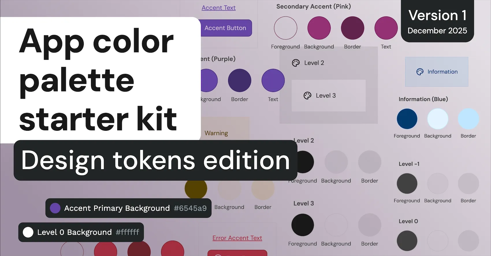
Download the App color palette starter kit - Design tokens edition.
You can import the template, explore the demos in the files, or export the tokens to import and use in another file.
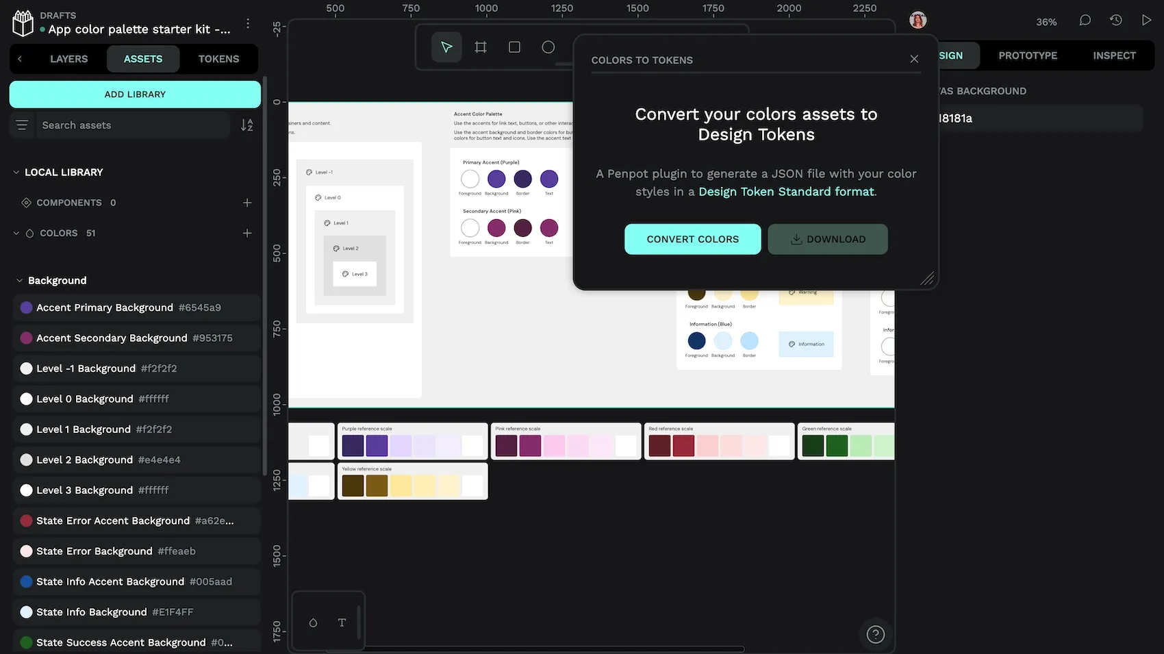
How to convert color assets to color tokens
- Install the Color styles to JSON file plugin.
- Use the plugin to convert your color styles to a JSON file (this will download the file to your computer.)
- Import the JSON file from the Tokens panel.
- Color assets groups will be converted into sets.
- Sets will be disabled by default.
- Spaces in token names will be converted to dots.
- Capitalization of token names will stay the same.
- Enable each set.
- Re-apply tokens to objects.
If you’re a developer and you want to make any changes to the sets, names, or capitalization, you might find it quicker to use a code/text editor to edit the JSON file before importing it.
Reapplying asset or token styles to objects
We’ve previously explored how you can tell that an asset color or color token is applied to an object from the design panel. We can use this feature to our advantage when reapplying assets or tokens to our object, as when you select a board containing many objects, its colors are displayed in the Selected Colors section of the design panel.
Reviewing the selected colors gives us a quick way to identify and select objects, then change their fill and stroke colors:
- Select a board.
- In the Selected Colors section, identify an asset color or color token you want to replace.
- Use the arrow icon button alongside the color name to select all objects using that color.
- Apply the new asset colors or color tokens to the selected objects’ fill and/or stroke.
Be sure you’re applying the fill or stroke correctly (not accidentally applying stroke color to the fill or the fill color to the stroke.)
Going through this process can be a good opportunity to review that you’re using color consistently, and that every object is using a color asset or color token. Full “coverage,” where every fill or stroke is using an asset color or design token ensures better maintainability, scalability, and a smoother path to development.
Kicking off your design system by saving colors
Whether you decide to use asset colors or design tokens, saving colors is a great way to kick off your design system. When it comes to choosing the best option for you and your team, it’s best to consider your project’s current setup. Are your developers already working with design tokens? Then it makes sense to use design tokens. Are you already utilizing Penpot’s typographies assets? Then you can keep your asset colors and typographies in one library.
If you are starting a brand new project with Penpot, I would try design tokens. Tokens use a platform-agnostic standard format, which means they integrate well with platforms outside of Penpot. And we all know, anything that speeds up the design and development process is usually appreciated by the rest of the team.
Related blogs
If you want to learn more about libraries, design systems, and design tokens, we have plenty more articles to get you started:
 Laura Kalbag
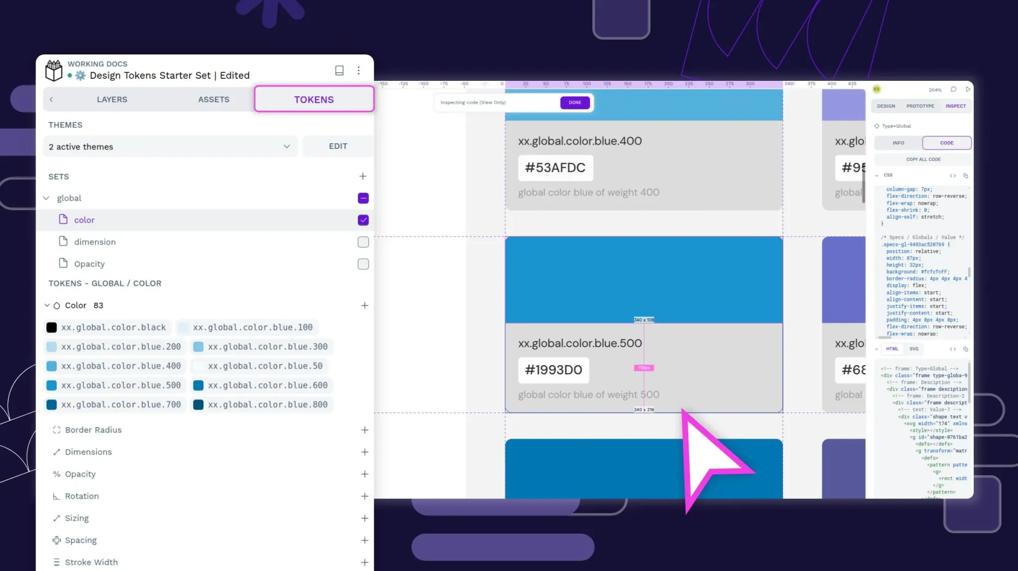
 Laura Kalbag
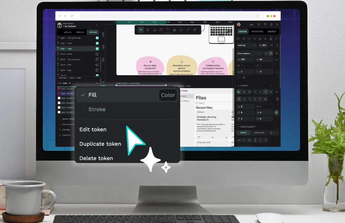
 Laura Kalbag
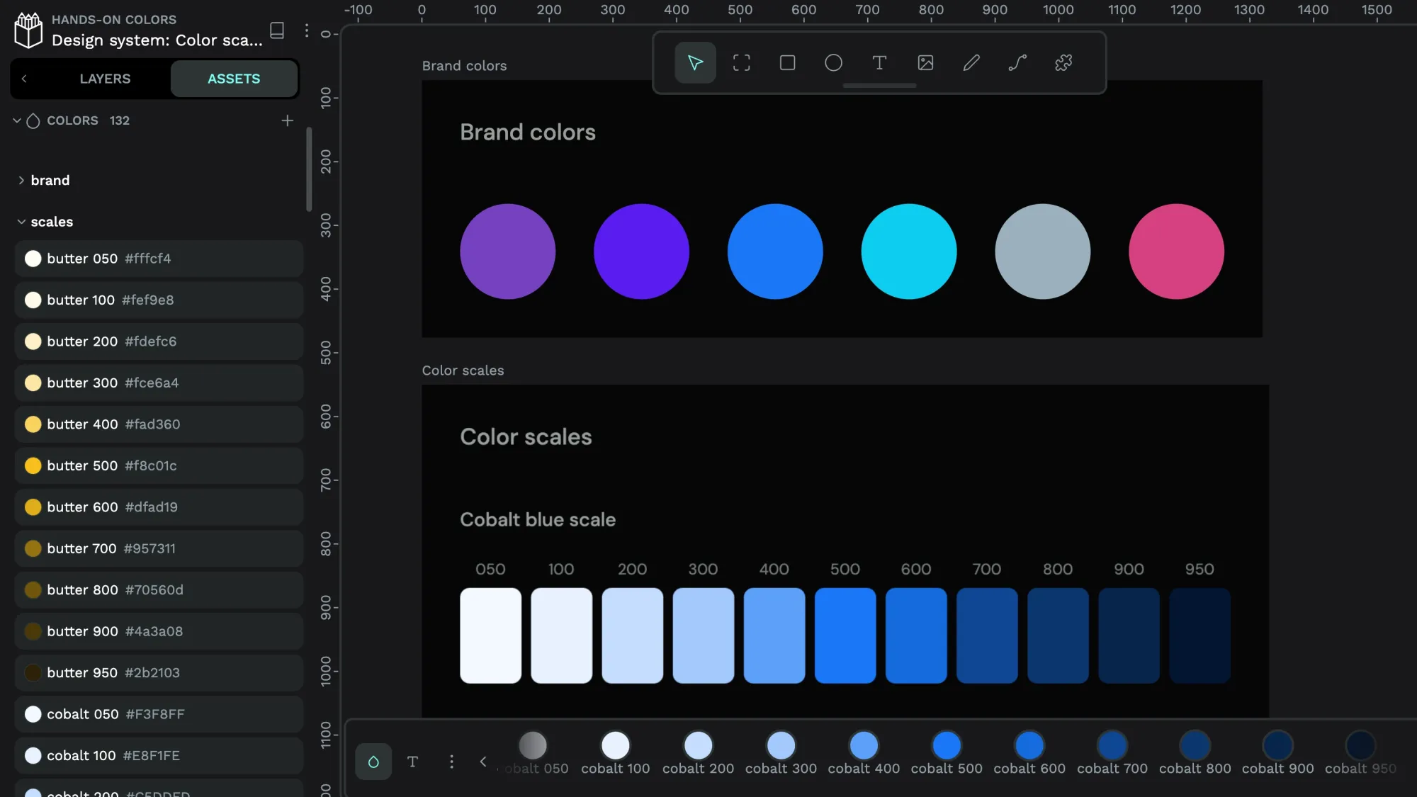
 Laura Kalbag


