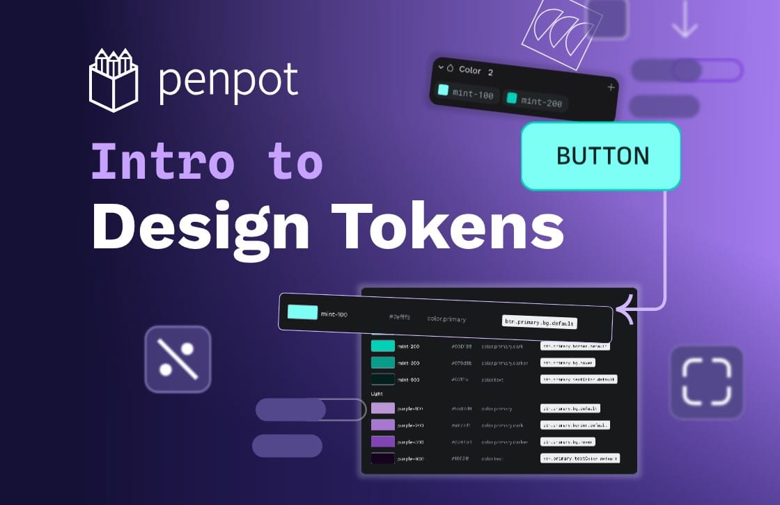
Intro to Design Tokens
Design tokens are tiny reusable building blocks. You can use them to keep colors, spacing and other styles consistent across your design, and combine them to create design systems.

Have you heard of design tokens but you’re not sure what they are or why you’d use them? You’re in the right place. Let me introduce you to these tiny reusable building blocks that can help you design faster, and even get you started with a design system.
If you’re looking for a tutorial specific to Penpot, you might want to read Design Tokens for Penpot. If you’re a developer, you might prefer What are design tokens? A complete guide.
What is a design token?
You might already be using something like design tokens in your designs. Do you pick from the recent colors in your design tool to keep the use of color consistent across your work? Do you choose to use consistent multiples of 4, 5, or 6 pixels across your mockups so all the objects align?
Maybe you’re saving these values in some kind of library so you can more easily reuse them across your project. This is one of the core features of design tokens. You can save values for colors, spacing, stroke thickness, and many other token types for easy reuse across your design.
One of the aspects that makes design tokens unique is that each token has its own name. You can name your tokens whatever you want, as long as their names are unique so you don’t confuse them.
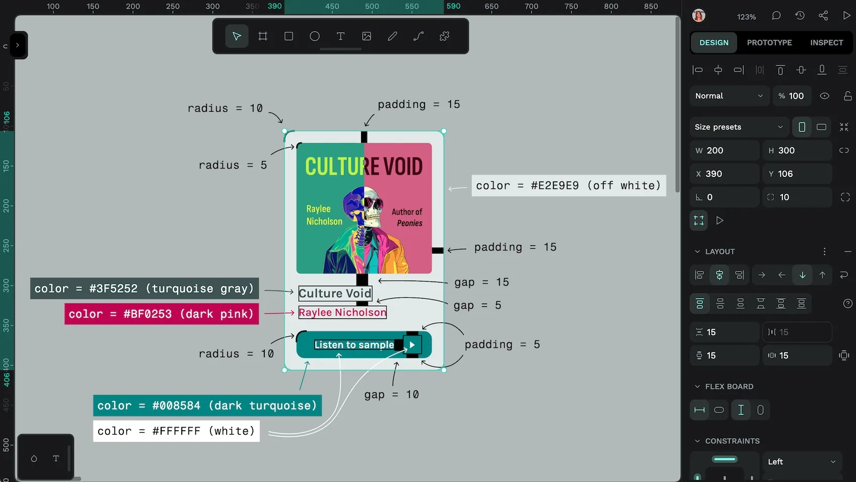
You can be really simple with your tokens; you might have tokens called white and black for the hex color codes #FFFFFF and #000000, or warning for a red color and success for a green color.
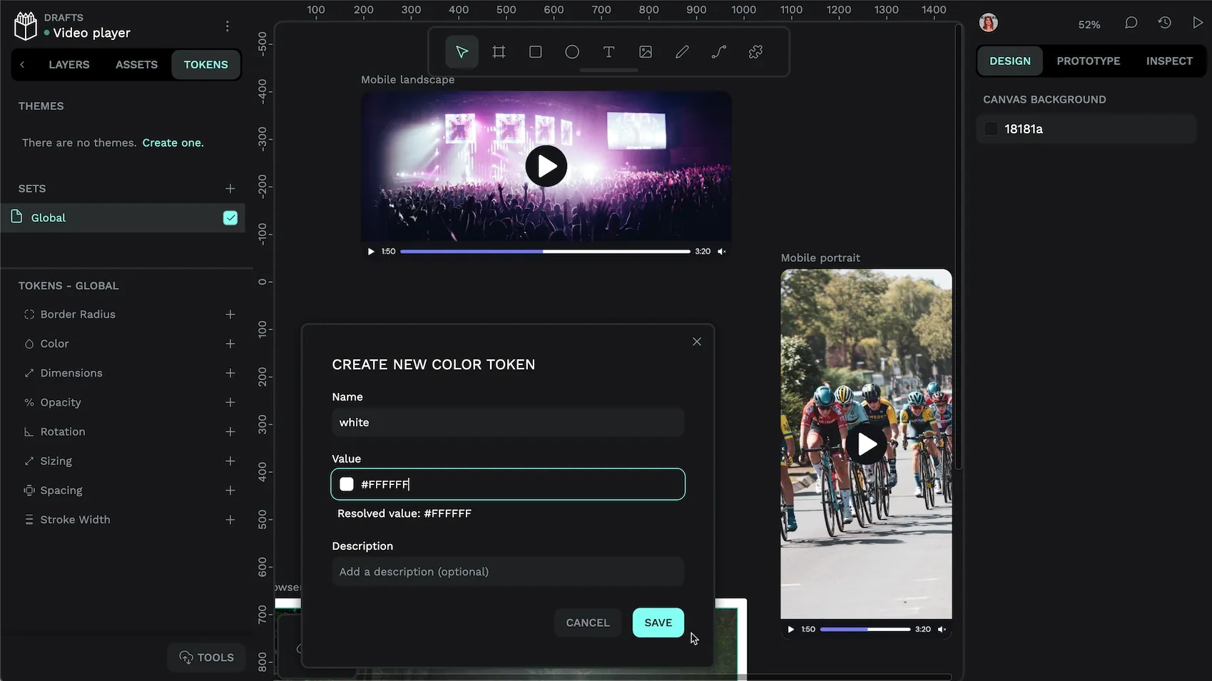
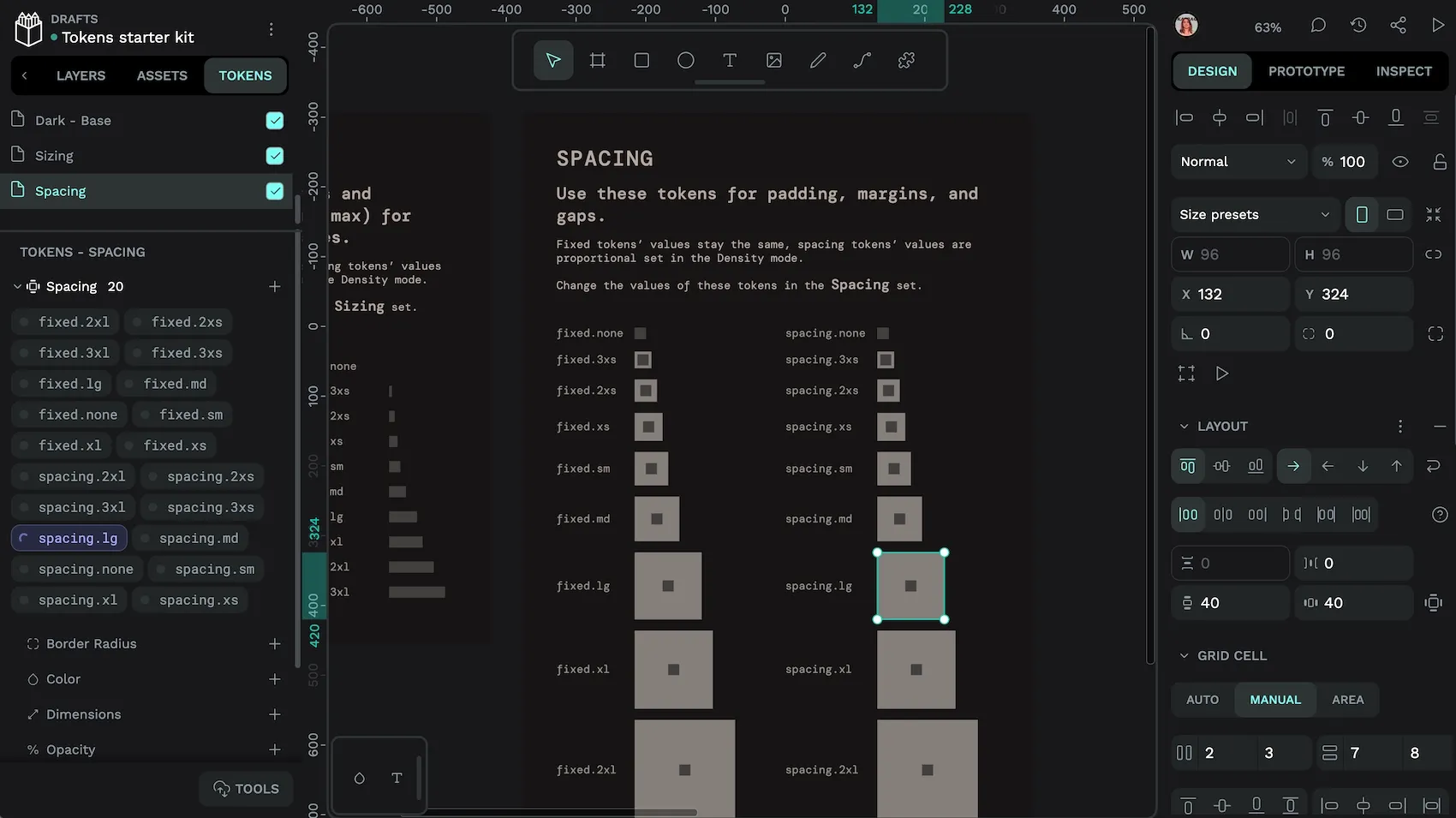
White is the token name. #FFFFFF is the token value. Every design token is made up of a name and a value.Often, a design token is part of a collection of related tokens. For example, you might want to have tokens for different sizes of spacing you use in your layouts, like spacing.small is 5 pixels, spacing.medium is 10 pixels and spacing.large is 20 pixels.
. dots in design token names later.Design token values can also include references to other tokens, as well as calculations. Read more about how you can use these design tokens power features in Penpot.
Where can I use design tokens?
Once you have created a design token in whatever tool you’re using, (of course, I’d recommend Penpot!) you can apply those tokens to your project. Consistency is a best practice in design because it aids usability, as well as suiting organizational goals for brand alignment. For example, when you line up the content in a layout consistently, it’s easier for a user to scan. When you use the same colors for warnings and confirmations of success, most users’ eyes are drawn to that area and they quickly understand the meaning.

Using the same token across many locations in your design is also beneficial when you can change the token’s value to update all those locations at once. Have you changed your mind about what your text color should be? Just edit the value of the token you’ve applied to all your text. Does your layout feel a bit cramped? Edit the value of the tokens applied to your whitespace.
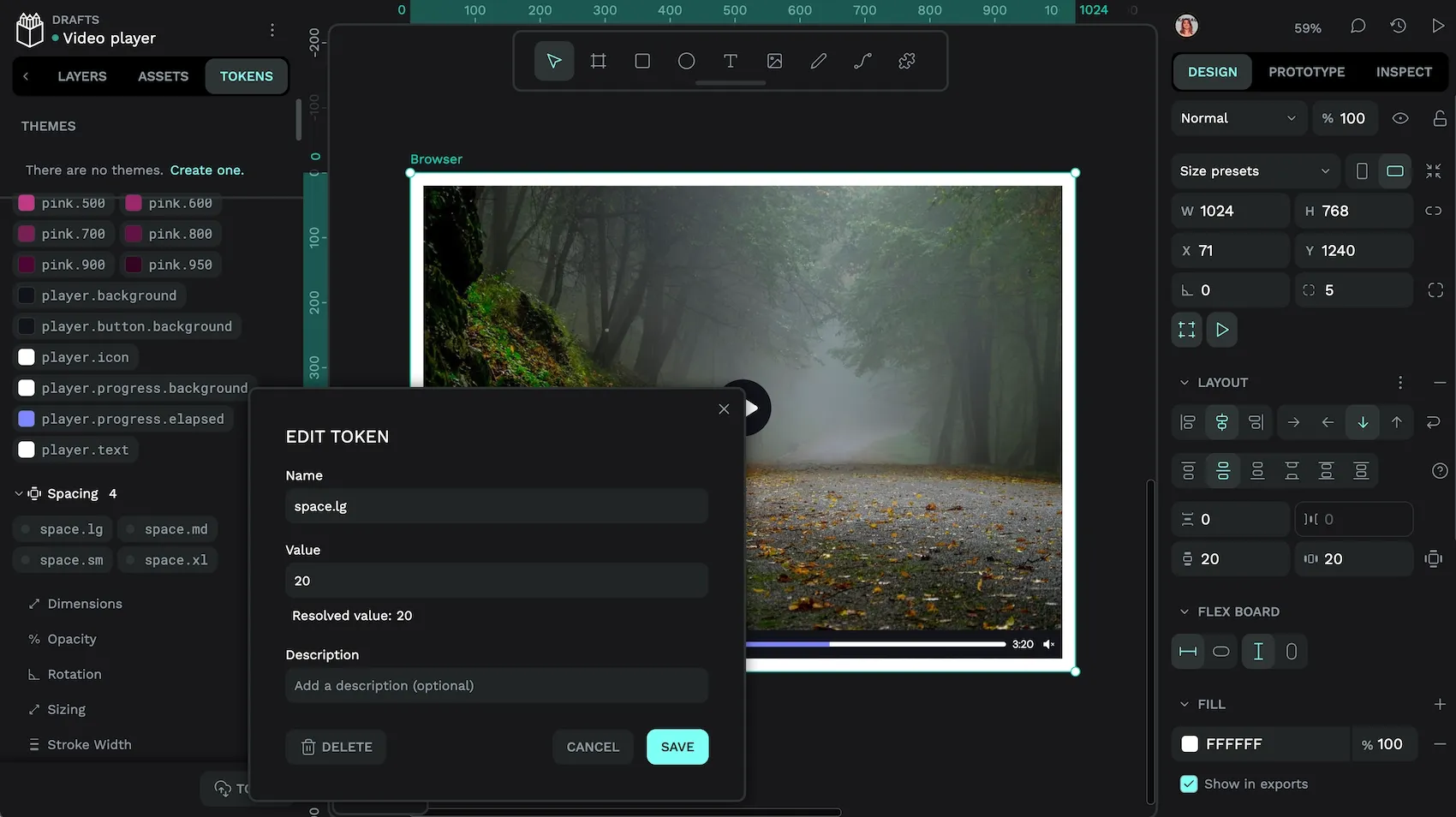
Changing the accent.background token changes the color of the progress bar across the designs.
Design tokens make collaboration easier
There are many ways design tokens make it easier to collaborate with the rest of your team:
- Built-in documentation: your token names are a way to document your design decisions. You can also add descriptions to each design token that can be used to annotate your tokens and shared with developers.
- Standardisation: the other aspect that makes design tokens unique is that they’re created to be a universal standard. That means that many tools already support design tokens, making them cross-compatible and simple to import/export across different platforms. Which brings me to…
- Developers love design tokens: the format of design tokens has been built with both design and development in mind. Design tokens translate directly to development frameworks, and feature the uniformity and easy updatability that make developers’ work easier.
And what if you’re a team of one? Well, design tokens make it easier to collaborate with your future self. Better design documentation makes it easier to remember exactly what opacity you chose to use for overlays backgrounds, as well as helping you quickly change the accent color because that shade of green isn’t as cool this summer.
Using design tokens in your design process
It’s up to you and your team when you choose to create design tokens in your design process.
It might make sense to add a token when you make that design decision. For example, when you’ve checked that your text color is sufficient contrast against your background color, you’ll want to save both of those colors as tokens for later. Or perhaps you want to start creating a mockup first, and then look at where patterns and a visual language is emerging in your design. Then you can create tokens with a greater overall design system in mind.

When you work in a team, it’s vital that you agree on your design tokens. Not just which values should be codified as tokens, but also how you group and name your tokens. That’s why naming design tokens is both important and sometimes difficult!
Naming design tokens
Naming is often the hardest task and every team does design token names differently. The names you choose depend on the size of your project, your team, and if you’re using a design system. If you’re anything like me, you often scrap your initial names when you come up with way better, more appropriate names later.
When choosing your design token names, it’s key to consider how your tokens collection might grow. Naming a token red isn’t going to help you when you want to use multiple shades of red in your design further down the line. “T-shirt” sizes like small, medium and large are popular in names as they’re easy to visualise, but what happens when you want a size that’s between small and medium?
There are some best practices in naming design tokens emerging, and I also have some advice specific to Penpot.
Dots/periods in design token names
Dots are how you create hierarchy in your design tokens. Each dot is used as a separator between levels in your hierarchy. For example, the token named player.text describes the color of the text in the player. You might also have a token called player.icon that describes the color of the icons that appear in the player. There might be another token called player.button.background that describes the color of a button that doesn’t appear in the body content of a design but does appear in the player component.

The key to success in naming your tokens hierarchy is a system that easily allows you to add more tokens without having to change your hierarchy!
In Penpot, you can also group and separate your design tokens in sets of design tokens that can also be combined to create themes and modes.
Foundational/base/global token names
One of the most common kinds of design tokens are foundational tokens, also called base tokens, or global tokens as they are used across the whole of your system, often referenced by other design tokens. These tend to represent a series of values like lightness shades in a color palette, or steps in dimensional scales.
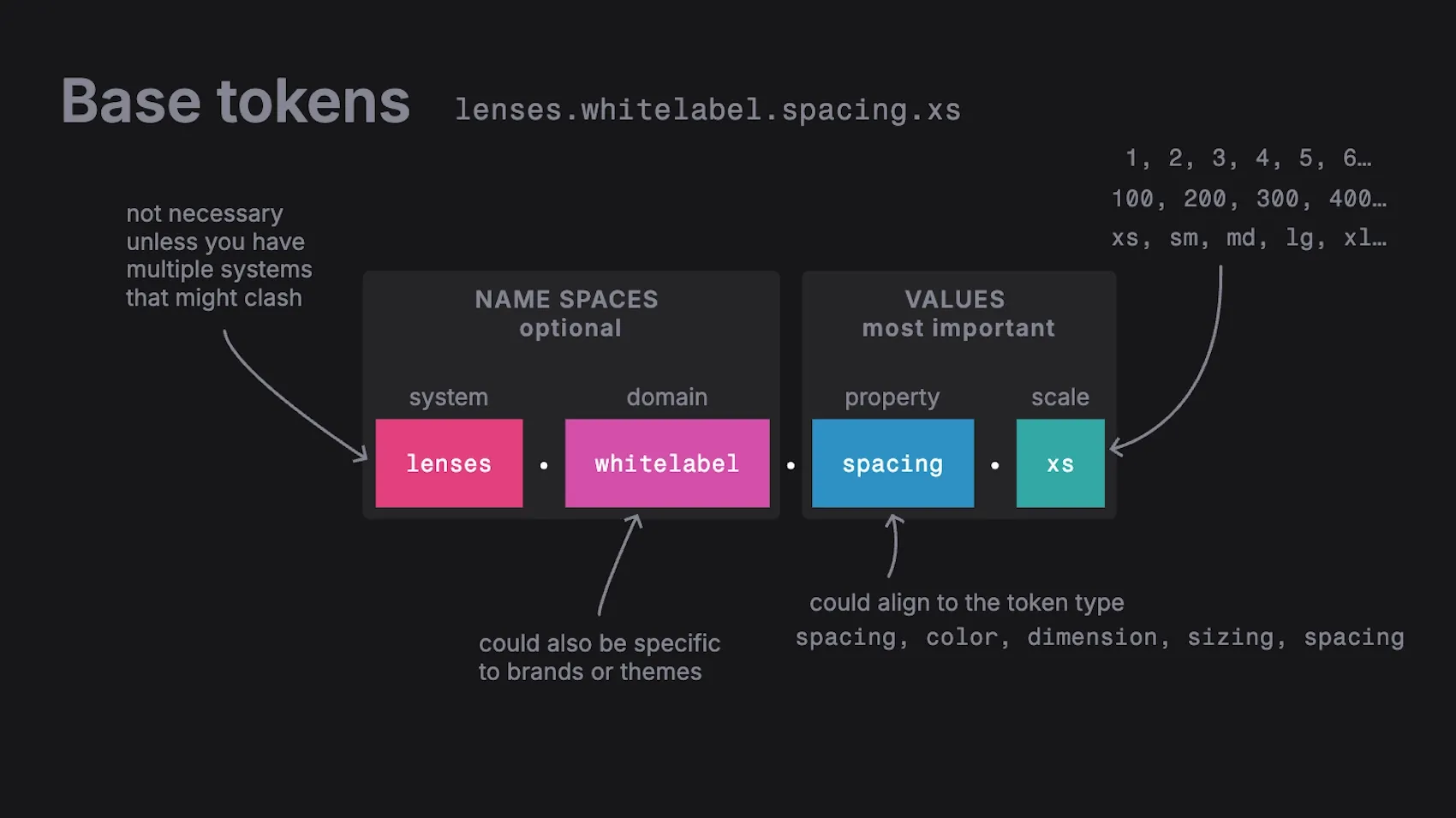
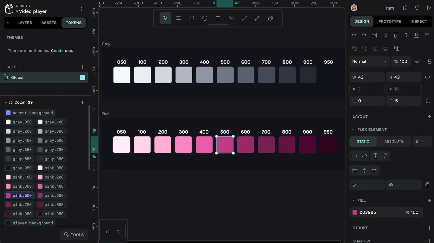
Color palette design tokens are frequently named for intervals of 50 to 950, where 0 is white, and 1000 is black. For example:
gray.50gray.100gray.200gray.300gray.400gray.500-
gray.600 gray.700gray.800gray.900gray.950
The gray.50 and gray.950 values are half-intervals, as projects frequently require multiple shades of near-white or near-black.
There are a much greater variety of naming styles for dimensional scales.
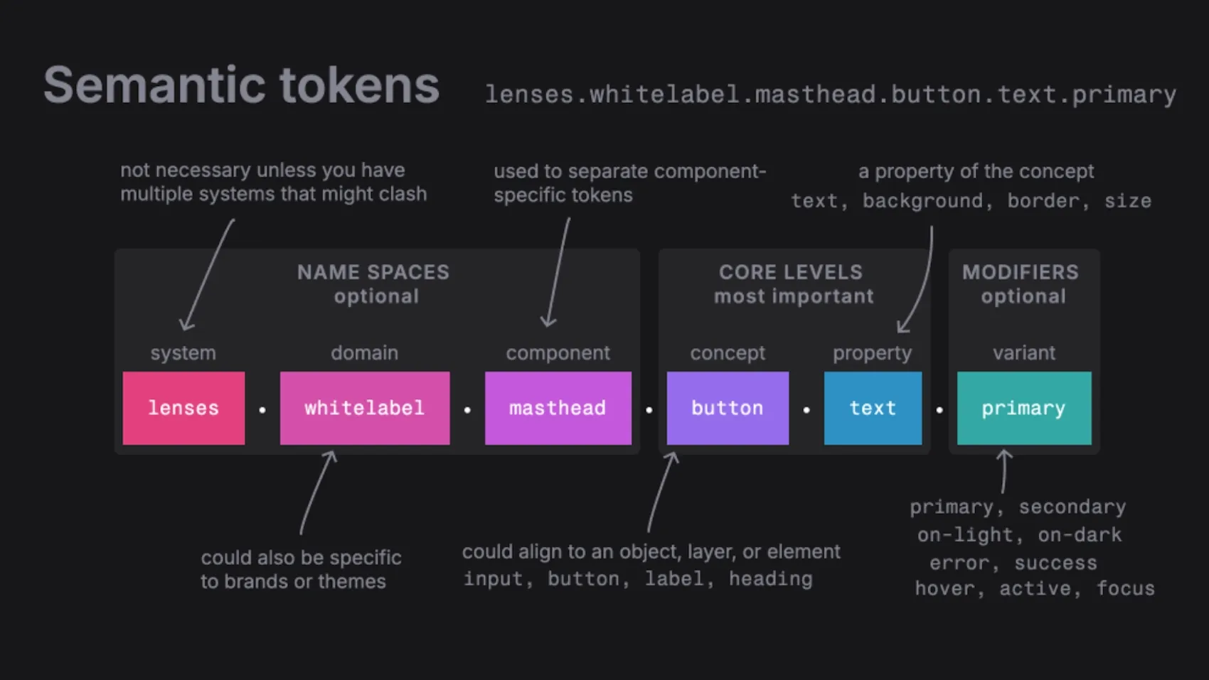
Semantic and component token names
Semantic tokens are named in a meaningful way that helps the team understand where values should be used, like primary.button.background. In semantic tokens, the token name serves as basic documentation.
Component tokens are a subset of semantic tokens used for a specific token, like navigation.primary.button.background. The component name usually comes before the other token attributes in the hierarchy. In this example, the token starts with navigation as it’s describing the primary.button.background when used in the navigation component.
Design tokens are the future
Design tokens are useful for both simple and complex projects. The time it takes to set tokens up, and give them good names, will be paid back in the benefits you get from more maintainable and well-documented projects. With design tokens, you’ll find it faster to make changes, easier to collaborate during the design process, and smooth out the path to development.
While the concept of design tokens has been around for a while, their use has only recently started becoming best practice. In fact, Penpot is the first platform to natively integrate design tokens, making design tokens more accessible to both designers and developers. Your whole team will thank you!
You can get started with design tokens with a free Penpot account.
Related Blogs
We have even more posts about design tokens and design systems. Here’s a few examples of handy articles to help you get the most out of Penpot.
 Laura Kalbag
 Laura Kalbag
 Laura Kalbag