How to use CSS and media query breakpoints to create responsive layouts
Responsive layouts “respond” to the size and resolution of the device they are presented on, and underpinning these layouts are CSS media query breakpoints.

You’ve crafted a beautifully designed website. Pixel-perfect. It looks unbelievable on your 3840 x 2160, 4K UHD Retina display.
Then, you open up the site on your phone. The logo is enormous, the text overlaps, and elements are spilling off the screen. This is the fun of developing and designing sites and products in the modern world. You are no longer just designing for a desktop — you’ve got to think about how it will look on a desktop, laptop, tablet, and phone. Everybody has slightly different devices, and it has to look great on every single one.
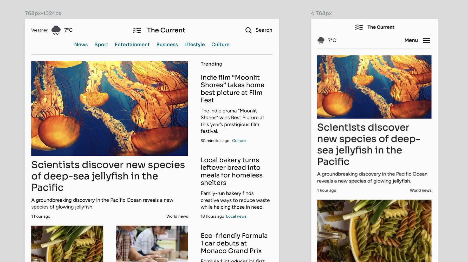
This is the job of responsive layouts. Responsive layouts “respond” to the size and resolution of the device they are presented on, and underpinning these layouts are CSS media query breakpoints. In this guide, we’ll go through these, explain why they are so critical in modern design, and discuss how you can use them in your CSS.
What are CSS breakpoints and media queries?
CSS breakpoints are specific pixel widths where layouts adapt to different screen sizes. Let's say you have a blog layout with a sidebar that works perfectly on desktop. When the screen gets too narrow, that sidebar must move below the main content. The pixel width where this change happens is your breakpoint.
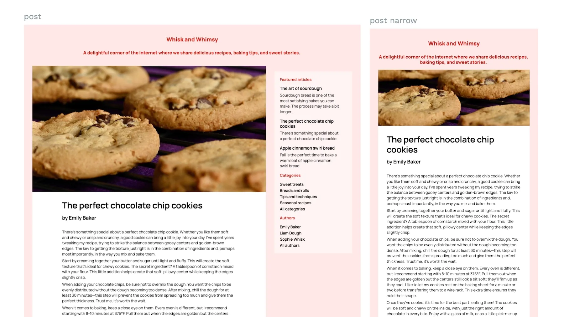
Media queries let you define these breakpoints in CSS. They act as containers for CSS rules that only apply to specific screen sizes. Here's what they look like:
@media (max-width: 768px) {
    /* CSS rules that apply when screen width is 768px or less */
    .sidebar {
        width: 100%;
        float: none;
    }
}
So, the CSS breakpoint here is 768 pixels, while the media query is the entire @media rule that checks if the screen width is 768 pixels or less and applies specific styles when that condition is met.
Why are breakpoints necessary for responsive design?
You should immediately be able to see why you need breakpoints. But let’s walk through a simple example to show their importance in CSS design. You have that blog layout. You design it on a large desktop, with the cards for each post in the center, a menu sidebar on the left, and a sidebar for featured articles, categories, and authors on the right.
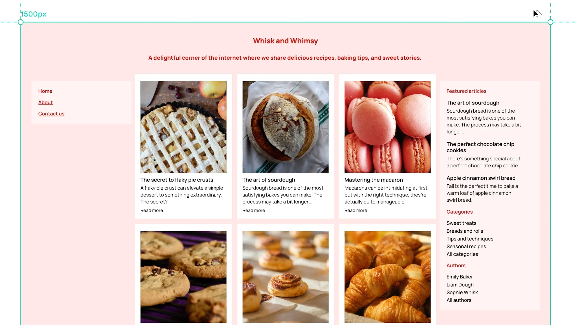
What happens to your design as you go down to smaller screens? At 1024px (typical laptop screen), those sidebars start feeling cramped. The text gets squeezed, making it harder to read. By 768px (tablet), it's completely unusable — three columns fighting for limited space.
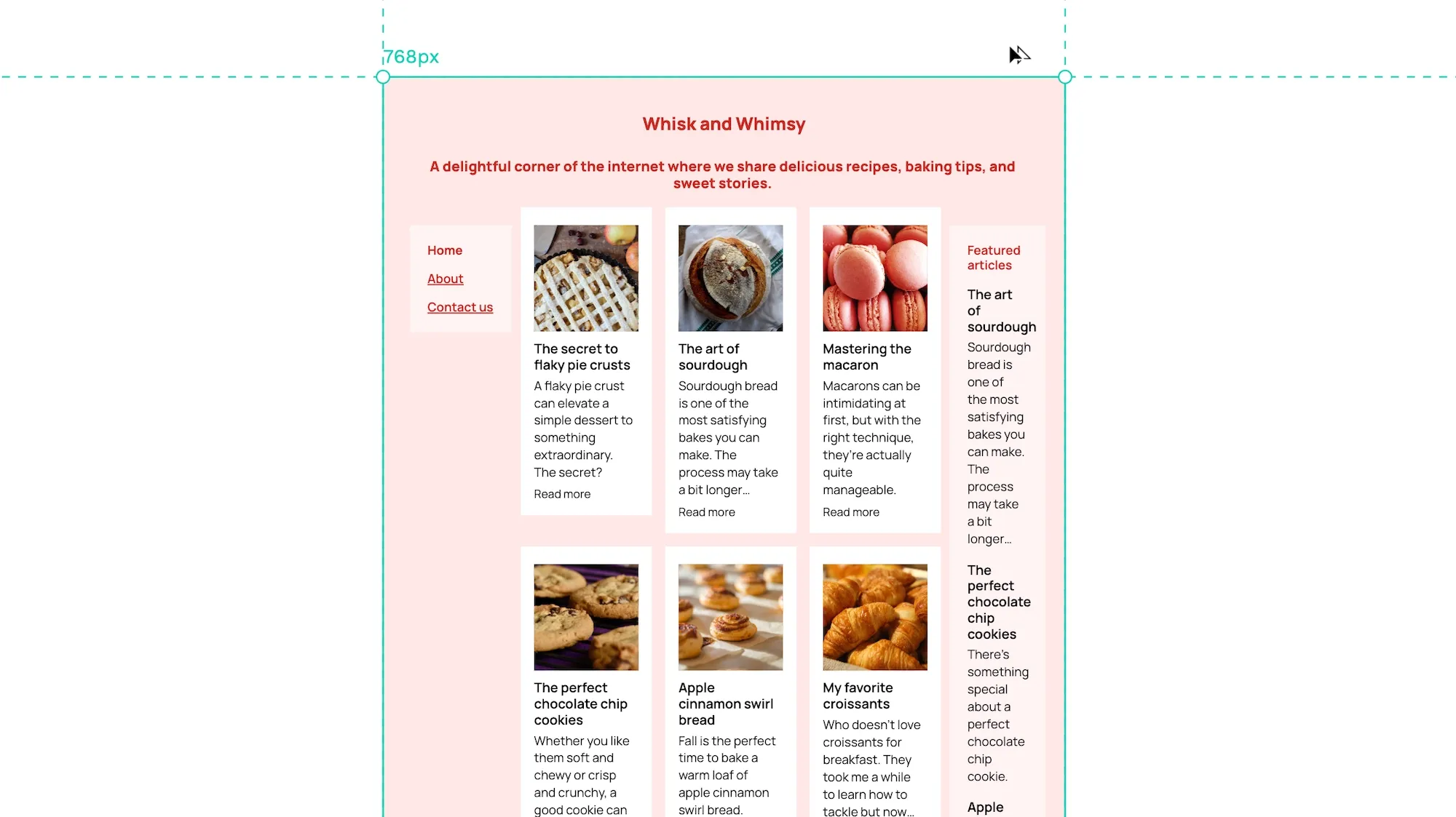
Without breakpoints, your layout would continue forcing these three columns into increasingly narrow spaces. The text would become illegible, images would overflow, and the user experience would suffer.
Breakpoints allow your layout to intelligently adapt to available space rather than breaking. At each breakpoint, the design reorganizes itself:
- Desktop (>1024px): Full three-column layout
- Laptop (768px-1024px): Slightly narrower sidebars
- Tablet and below (<768px): Single column, with sidebars stacked below
Breakpoints help responsive designs give a better experience to the end user. They ensure content remains readable and accessible regardless of device size. When users switch from their laptop to their phone, they don't want to pinch and zoom just to read an article or navigate your site. They expect the content to automatically adjust to their screen.
This adaptation isn't just about convenience — it's about maintaining the core purpose of your content. A three-column layout works on desktop because users have enough screen space to scan between columns while maintaining context. That same layout would force users to scroll horizontally or strain to read tiny text on mobile. By stacking the content into a single column on mobile, users can simply scroll vertically through the content naturally.
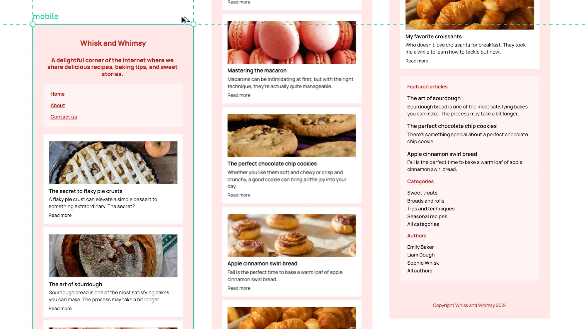
The benefits extend beyond basic readability:
- Improved navigation. Users can easily find and click links when navigation menus adapt from horizontal desktop layouts to mobile-friendly hamburger menus. Touch targets become appropriately sized for finger taps rather than mouse clicks.
- Better content hierarchy. As screen space becomes limited, breakpoints help prioritize content. The most important information moves to the top, while secondary content (like sidebars) moves lower on the page or behind toggles.
- Faster load times. Breakpoints can serve different image sizes based on screen width, ensuring mobile users don't waste bandwidth downloading desktop-sized images they'll never see at full resolution.
- Increased engagement. Users spend more time on your site when content is easy to read and navigate. They're more likely to read complete articles, click through to related content, and return in the future.
- Accessibility. Properly implemented breakpoints help maintain accessibility standards across devices. Text remains at readable sizes, contrast ratios stay consistent, and interactive elements remain easy to target.
How do we implement these breakpoints effectively?
Understanding the basics of CSS media queries
We showed a small example of a media query above, but let’s break it down further to provide an intuitive understanding of how they work.
Syntax of media queries
A media query consists of several parts:
- The
@mediarule that starts the query - One or more media features in parentheses
- The CSS rules to apply when conditions are met
Here’s an example showing all the components:
@media (max-width: 768px) and (orientation: portrait) {
    .navigation {
        position: fixed;
        bottom: 30px;
        width: 100%;
        height: 60px;
        background: #087B90;
        box-shadow: 0 2px 10px rgba(0, 0, 0, 0.3);
    }
}
Let's break down what's happening here:
@mediastarts our media querymax-width: 768pxtargets tablet-sized screens and smallerorientation: portraitensures the device is in portrait mode- The CSS inside creates a fixed mobile navigation bar at the bottom of the screen
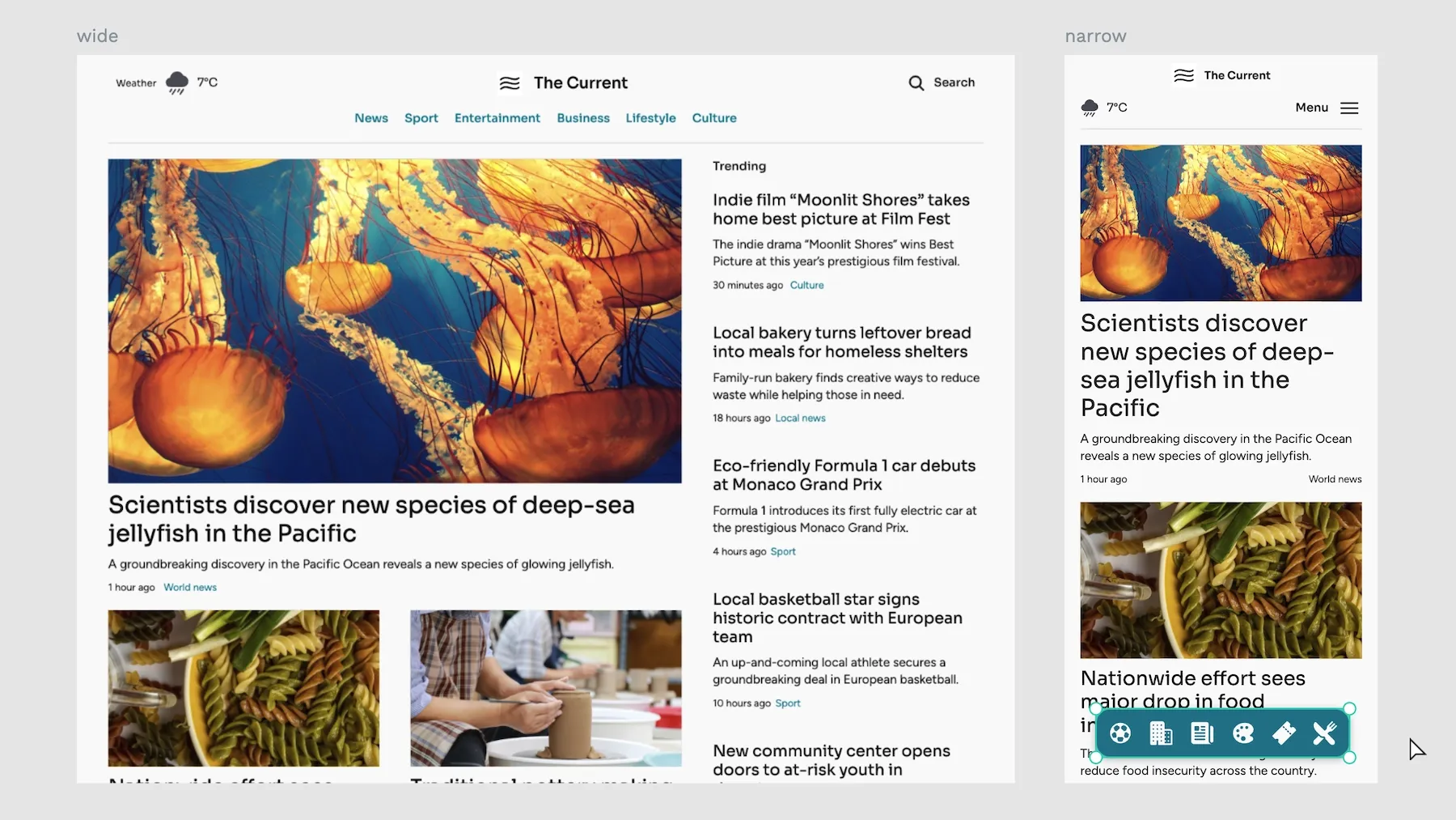
This is a typical pattern in modern web apps — on desktop, the navigation might be a horizontal bar at the top, but on mobile devices in portrait mode, it becomes a fixed bar at the bottom for easier thumb access. The media query helps create this context-aware behavior that improves usability on smaller touch devices.
Common media query features
What CSS patterns and features are you likely to see in media queries?
First, width and height changes. These control layouts are based on viewport dimensions and are the foundation of responsive design:
/* Exact width/height - matches specific dimensions exactly */
@media (width: 768px) { }
@media (height: 1024px) { }

/* Minimum width/height - styles apply at and above these dimensions */
@media (min-width: 768px) { }
@media (min-height: 1024px) { }

/* Maximum width/height - styles apply at and below these dimensions */
@media (max-width: 768px) { }
@media (max-height: 1024px) { }
Second, device orientation. These queries detect whether the device is in portrait (taller than wide) or landscape (wider than tall) mode:
/* Portrait mode - height greater than or equal to width */
@media (orientation: portrait) { }

/* Landscape mode - width greater than height */
@media (orientation: landscape) { }
Third, display quality features. These target different screen resolutions and color capabilities:
/* Target high-DPI displays like Retina - useful for serving sharper images */
@media (min-resolution: 192dpi) { }
@media (min-resolution: 2dppx) { }

/* Check color capabilities - helpful for adjusting design based on display quality */
@media (color) { }
@media (min-color: 8) { }
Fourth, interaction media features. These detect how users interact with your site:
/* Device hover capabilities - helps distinguish between touch and mouse devices */
@media (hover: hover) { }  /* Mouse/trackpad */
@media (hover: none) { }   /* Touch devices */

/* Pointer precision - determines the accuracy of the pointing device */
@media (pointer: fine) { }    /* Mouse/trackpad */
@media (pointer: coarse) { }  /* Touch */
@media (pointer: none) { }    /* No pointing device */
Media queries become more powerful when combined. You can use logical operators to create complex conditions:
/* AND operator - both conditions must be true */
@media (min-width: 768px) and (orientation: landscape) { }

/* OR operator - either condition can be true */
@media (max-width: 768px), (orientation: portrait) { }

/* NOT operator - negates a media query */
@media not screen and (color) { }
You can also create sophisticated targeting patterns:
/* Target tablets specifically by excluding both mobile and desktop */
@media (min-width: 768px) and (max-width: 1024px) { }

/* Target high-DPI mobile devices */
@media (max-width: 480px) and (min-resolution: 2dppx) { }

/* Complex interaction patterns */
@media (hover: none) and (pointer: coarse) and (max-width: 768px) {
    /* Touch-specific mobile styles */
}
As you can see, there are a lot of options. So, how do you decide which breakpoints, queries, and features best suit your application?
How to choose effective breakpoints
If you are an excellent designer, you might look at these options and intuitively understand how they should work together to create an ideal design across different devices. For the rest of us, some frameworks for choosing good queries and breakpoints are needed.
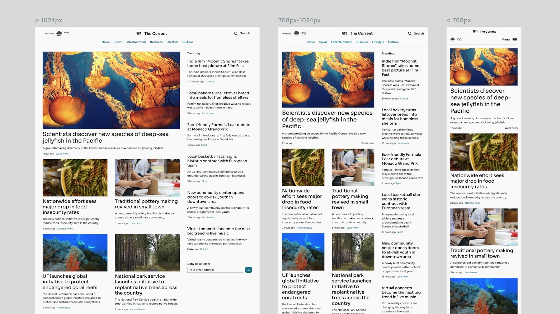
Here are three options for choosing effective design breakpoints.
Device-agnostic approach
Rather than targeting specific devices, let your content determine your breakpoints. Watch your design as you resize the browser window — when the layout starts to break or look awkward, that's your breakpoint. This approach future-proofs your design and ensures it works across all devices, not just popular ones.
Testing the card layout shows where the lines of text become too wide to easily read.
Key principles:
- Start with your core content (usually text)
- Resize until readability suffers or layouts break
- Record these widths as your breakpoints
- Consider line length (45-75 characters is ideal)
- Check spacing and hierarchy at each width
- Verify interactive elements remain usable
For example, a text-heavy blog might need breakpoints at 600px when line length becomes too long and 400px when side margins need adjusting for readability.
Common breakpoint ranges
While the device-agnostic approach is ideal, these standard ranges work well as starting points:
| Device | Size | Typography | Column layout | Minimal padding | Other |
|---|---|---|---|---|---|
| Small mobile | 320px - 480px | 14px-16px base | Single | 16px-24px | Touch target minimums: 44px × 44px |
| Large mobile | 481px - 767px | 15px-17px base | Single | 24px-32px | Can support more complex navigation |
| Tablet | 768px - 1024px | 16px-18px base | Double | 32px-48px | Hover states where supported |
| Desktop | 1025px - 1200px | 16px-20px base | Multi | Maximum content width | Rich hover interactions |
| Large desktop | 1201px and up | 18px-22px base | Optimized for widescreen | Consider max-width containers | Enhanced visual hierarchy |
Testing and adjusting breakpoints
No theoretical approach beats real-world testing. Here's a systematic process for testing your CSS responsiveness:
- Start with common breakpoints. Begin with the standard ranges above, then create basic layouts for each and implement core functionality.
- Test on actual devices. Use real phones, tablets, and laptops; don't rely solely on dev tools. Test on different mobile operating systems and check different browsers.
- Check both orientations. Test portrait and landscape modes and always verify that navigation remains accessible. Check that any fixed elements don't obscure content and ensure touch targets remain accessible.
- Test with variable content. Try different content lengths and test with minimum/maximum text. Verify image-heavy pages and check different language lengths.
- Verify interactive elements. Test all hover states, check touch target sizes, verify form interactions, and test keyboard navigation.
- Pay attention to performance. Check load times at each breakpoint. Verify image loading strategies and test animation performance. Monitor resource usage, such as memory and bandwidth.
Then, adjust your responsive strategy based on the findings. Document any needed adjustments and update breakpoints as required. You should also consider edge cases and plan for content growth.
Implementing CSS breakpoints in your stylesheets
Let's explore implementation approaches using a real-world example: a news website with a featured article section, trending stories sidebar, and newsletter signup.
Mobile-first vs. desktop-first approaches
These two methodologies determine how you structure your CSS and which breakpoints you use. The critical difference is in the default styles and how we override them.
Mobile-first starts with styles for the smallest screens and progressively enhances the design as screen real estate increases. This approach tends to result in leaner CSS because mobile designs are typically more straightforward. It also aligns well with how people use the web today — mobile traffic often exceeds desktop traffic.
Desktop-first does the opposite — it starts with a full-featured desktop experience and scales down for smaller screens. This approach can be helpful when your primary users are on desktop or when you're retrofitting responsiveness into an existing desktop site.
Let's look at both approaches with the same component. Here is the mobile-first approach:
/* Base styles - will apply to all sizes */
.featured-article {
    padding: 16px;
    margin-bottom: 24px;
}

.featured-article__image {
    width: 100%;
    height: 200px;
    object-fit: cover;
}

.featured-article__title {
    font-size: 24px;
    margin: 16px 0;
}

/* Tablet (768px and up) */
@media (min-width: 768px) {
    .featured-article {
        padding: 24px;
        display: grid;
        grid-template-columns: 1fr 1fr;
        gap: 32px;
    }

    .featured-article__image {
        height: 300px;
    }
}

/* Desktop (1024px and up) */
@media (min-width: 1024px) {
    .featured-article {
        grid-template-columns: 2fr 1fr;
        max-width: 1200px;
        margin: 0 auto;
    }

    .featured-article__image {
        height: 400px;
    }
}
This approach starts with essential styles that work on mobile devices. Note how we use minimal padding and a single-column layout by default. Every style here has to work on the smallest supported screen size. As screens get larger, we progressively add complexity:
- The base styles handle core functionality and readability
- The tablet breakpoint introduces a grid layout
- The desktop breakpoint optimizes for larger screens
Now, the desktop-first approach:
/* Base styles for desktop */
.featured-article {
    padding: 32px;
    display: grid;
    grid-template-columns: 2fr 1fr;
    gap: 32px;
    max-width: 1200px;
    margin: 0 auto;
}

.featured-article__image {
    width: 100%;
    height: 400px;
    object-fit: cover;
}

/* Tablet and smaller */
@media (max-width: 1024px) {
    .featured-article {
        grid-template-columns: 1fr 1fr;
        padding: 24px;
    }

    .featured-article__image {
        height: 300px;
    }
}

/* Mobile */
@media (max-width: 767px) {
    .featured-article {
        display: block;
        padding: 16px;
    }

    .featured-article__image {
        height: 200px;
    }
}
Here, we start with the most complex version of our design. The base styles assume a large screen with ample space. As screens get smaller, we progressively simplify the layout:
- Base styles implement the full desktop experience
- Tablet styles reduce complexity and spacing
- Mobile styles remove the grid entirely
Writing media queries in CSS
There are several patterns for organizing media queries in your stylesheets. Each has its benefits and trade-offs:
- Grouped by breakpoint. This approach keeps all styles for each screen size together. It's intuitive for visualizing how your site looks at each breakpoint, but it spreads related component styles across your stylesheet:
/* Mobile styles */
.featured-article { }
.trending-sidebar { }
.newsletter-signup { }

/* Tablet styles */
@media (min-width: 768px) {
    .featured-article { }
    .trending-sidebar { }
    .newsletter-signup { }
}

/* Desktop styles */
@media (min-width: 1024px) {
    .featured-article { }
    .trending-sidebar { }
    .newsletter-signup { }
}- Component-specific (recommended). This pattern keeps all styles for each component together, regardless of breakpoint. It's better for maintenance because all related styles stay together, and it works better with component-based frameworks:
/* Featured Article component */
.featured-article { }
@media (min-width: 768px) {
    .featured-article { }
}
@media (min-width: 1024px) {
    .featured-article { }
}
/* Trending Sidebar component */
.trending-sidebar { }
@media (min-width: 768px) {
    .trending-sidebar { }
}
@media (min-width: 1024px) {
    .trending-sidebar { }
}- Using CSS custom properties. This modern approach uses CSS variables to handle responsive values. It's powerful for maintaining consistent spacing and sizing across breakpoints:
:root {
    --spacing-base: 16px;
    --article-columns: 1;
}

@media (min-width: 768px) {
    :root {
        --spacing-base: 24px;
        --article-columns: 2;
    }
}

.featured-article {
    padding: var(--spacing-base);
    display: grid;
    grid-template-columns: repeat(var(--article-columns), 1fr);
}
Each method emphasizes different aspects of maintenance and organization. Component-specific queries are generally recommended because they:
- Keep related code together
- Make components more portable
- Improve code maintainability
- Make it easier to find and update styles
- Support component-based development
- Reduce the chance of unintended style conflicts
Best practices for using CSS breakpoints
While accessing media queries is powerful, using them effectively is essential. Let's explore critical best practices that will help you create maintainable responsive designs.
Limit the number of breakpoints
Managing multiple breakpoints can quickly become complex and unwieldy. Each breakpoint adds maintenance overhead and increases the chance of inconsistencies in your design.
Consider this example of a navigation component:
/* Too many breakpoints - hard to maintain */
.nav {
    padding: 16px;
}

@media (min-width: 375px) {
    .nav { padding: 20px; }
}

@media (min-width: 480px) {
    .nav { padding: 24px; }
}

@media (min-width: 768px) {
    .nav { padding: 28px; }
}

@media (min-width: 1024px) {
    .nav { padding: 32px; }
}


/* Better approach - strategic breakpoints */
.nav {
    padding: clamp(16px, 4vw, 32px);
}

@media (min-width: 768px) {
    .nav {
        display: flex;
        justify-content: space-between;
    }
}
The second approach is more maintainable because it:
- Uses modern CSS (clamp) to handle minor variations
- Only adds breakpoints for significant layout changes
- Reduces the number of media queries to maintain
- Makes the responsive behavior more predictable
Use relative units (em, rem) in media queries
Using relative units in media queries makes your breakpoints more adaptable to user preferences and browser settings. Here's why this matters:
This approach ensures your layouts remain proportional when users change their browser's font size or zoom level.
/* Pixel-based queries don't respect user font-size preferences */
@media (max-width: 768px) { }

/* Em-based queries adjust with browser font size */
@media (max-width: 48em) { } /* 768px ÷ 16px = 48em */

/* Real-world example */
.article-grid {
    display: grid;
    gap: 1rem;
    grid-template-columns: 1fr;
}

@media (min-width: 40em) { /* 640px */
    .article-grid {
        grid-template-columns: repeat(2, 1fr);
    }
}

@media (min-width: 64em) { /* 1024px */
   .article-grid {
        grid-template-columns: repeat(3, 1fr);
    }
}
Avoid device-specific breakpoints
Instead of targeting specific devices, create breakpoints based on your content and layout needs. Here's an example of a card component that adapts based on available space:
/* Don't do this */
/* iPhone SE */
@media (max-width: 375px) { }
/* iPad Air */
@media (max-width: 820px) { }


/* Do this instead */
.card-container {
    display: grid;
    gap: 1rem;
    grid-template-columns: repeat(auto-fit, minmax(min(100%, 300px), 1fr));
}
This content-driven approach:
- Automatically adjusts to any screen size
- Doesn't break when new devices are released
- Maintains design integrity across all viewports
- Focuses on the content's needs rather than specific devices
CSS breakpoints with modern layout techniques
Modern CSS layout systems like Flexbox and Grid often reduce the need for explicit breakpoints. However, understanding how to combine these tools with media queries creates more robust responsive designs.
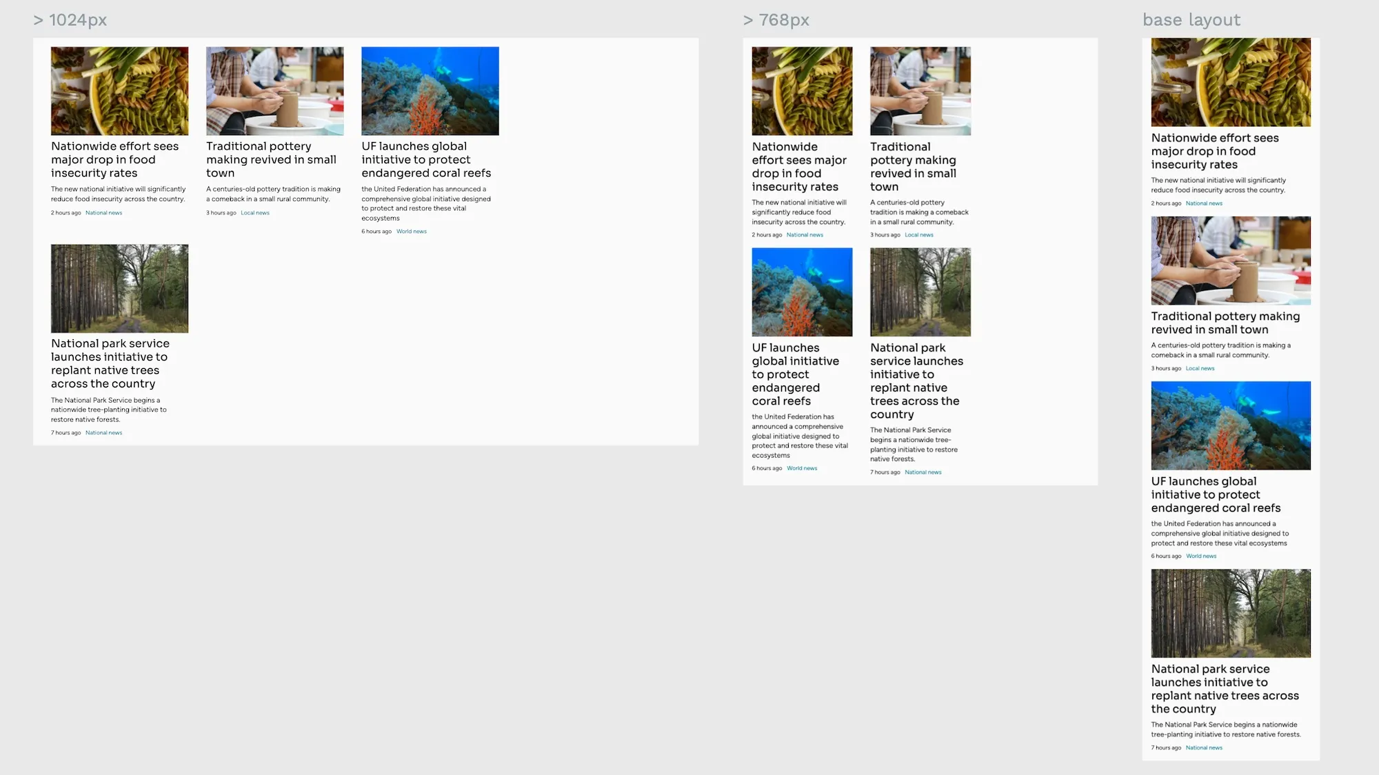
Using breakpoints with Flexbox
Flexbox provides built-in responsiveness, but breakpoints can enhance its behavior for specific layout needs. Here's how to combine them effectively:
.card-container {
    /* Base flexible layout */
    display: flex;
    flex-wrap: wrap;
    gap: clamp(1rem, 2vw, 2rem);

    /* Mobile: stack vertically */
    flex-direction: column;
}

/* Tablet and up: horizontal layout */
@media (min-width: 768px) {
    .card-container {
        flex-direction: row;
    }

    .card {
        flex: 1 1 calc(50% - 1rem);
        /* Ensures cards take up half the container minus gap */
    }
}

/* Desktop: optimize for larger screens */
@media (min-width: 1024px) {
    .card {
        flex: 1 1 calc(33.333% - 1rem);
        /* Creates a three-column layout */
    }
}
This approach has a base mobile layout using column direction and responsive card sizing using calc() and flex-basis. We also set up strategic breakpoints for significant layout changes and maintained spacing consistency with clamp().
Combining Grid layout and breakpoints
CSS Grid provides powerful built-in responsive features, but breakpoints can enhance grid layouts for specific design needs:
.article-layout {
    display: grid;
    gap: clamp(1rem, 3vw, 2rem);

    /* Base mobile grid */
    grid-template-areas:
        "header"
        "main"
        "sidebar"
        "footer";
}

/* Tablet layout */
@media (min-width: 768px) {
    .article-layout {
        grid-template-columns: 2fr 1fr;
        grid-template-areas:
            "header  header"
            "main    sidebar"
            "footer  footer";
    }
}

/* Desktop enhancement */
@media (min-width: 1200px) {
    .article-layout {
        grid-template-columns: 1fr minmax(auto, 800px) 300px 1fr;
        grid-template-areas:
            ". header  header  ."
            ". main    sidebar ."
            ". footer  footer  .";
    }
}
This implementation shows a mobile-first, single-column layout with responsive content areas using grid-template-areas. There is a maximum content width control on larger screens and, again, maintained spacing using clamp().
When to use breakpoints vs. CSS Grid/Flexbox features
Modern layout features often reduce the need for breakpoints, but each tool has its place:
/* Let Grid handle the responsive behavior */
.auto-grid {
    display: grid;
    gap: 1rem;
    grid-template-columns: repeat(
        auto-fit,
        minmax(min(100%, 300px), 1fr)
    );
}

/* Use breakpoints for specific layout requirements */
.featured-content {
    display: grid;
    gap: 1rem;

    /* Base mobile layout */
    grid-template-columns: 1fr;
}

@media (min-width: 768px) {
    .featured-content {
        grid-template-columns: repeat(2, 1fr);
        /* Specific two-column layout needed */
    }

    .featured-content > :first-child {
        grid-column: 1 / -1;
        /* Feature item spans full width */
    }
}
Use Grid/Flexbox features when:
- You need automatic, fluid layouts
- Content quantity is variable
- Equal distribution of space is desired
- Simple responsive behavior is sufficient
Add breakpoints when:
- Specific layouts are required at certain sizes
- Content hierarchy needs to change
- Complex component arrangements are needed
- Design requirements can't be met with auto-flowing layouts
Learn more about responsive design with Penpot
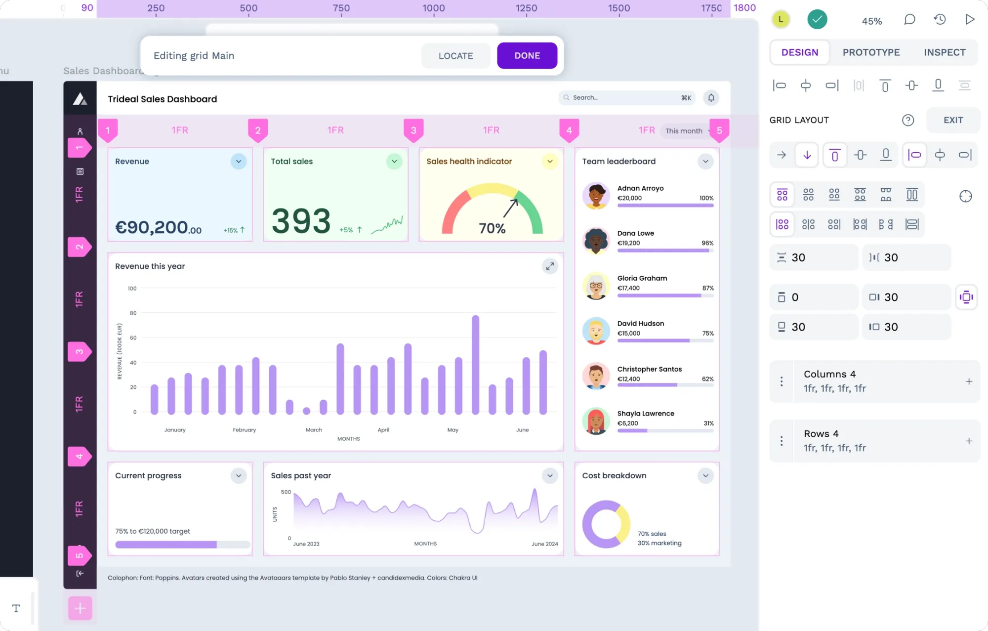
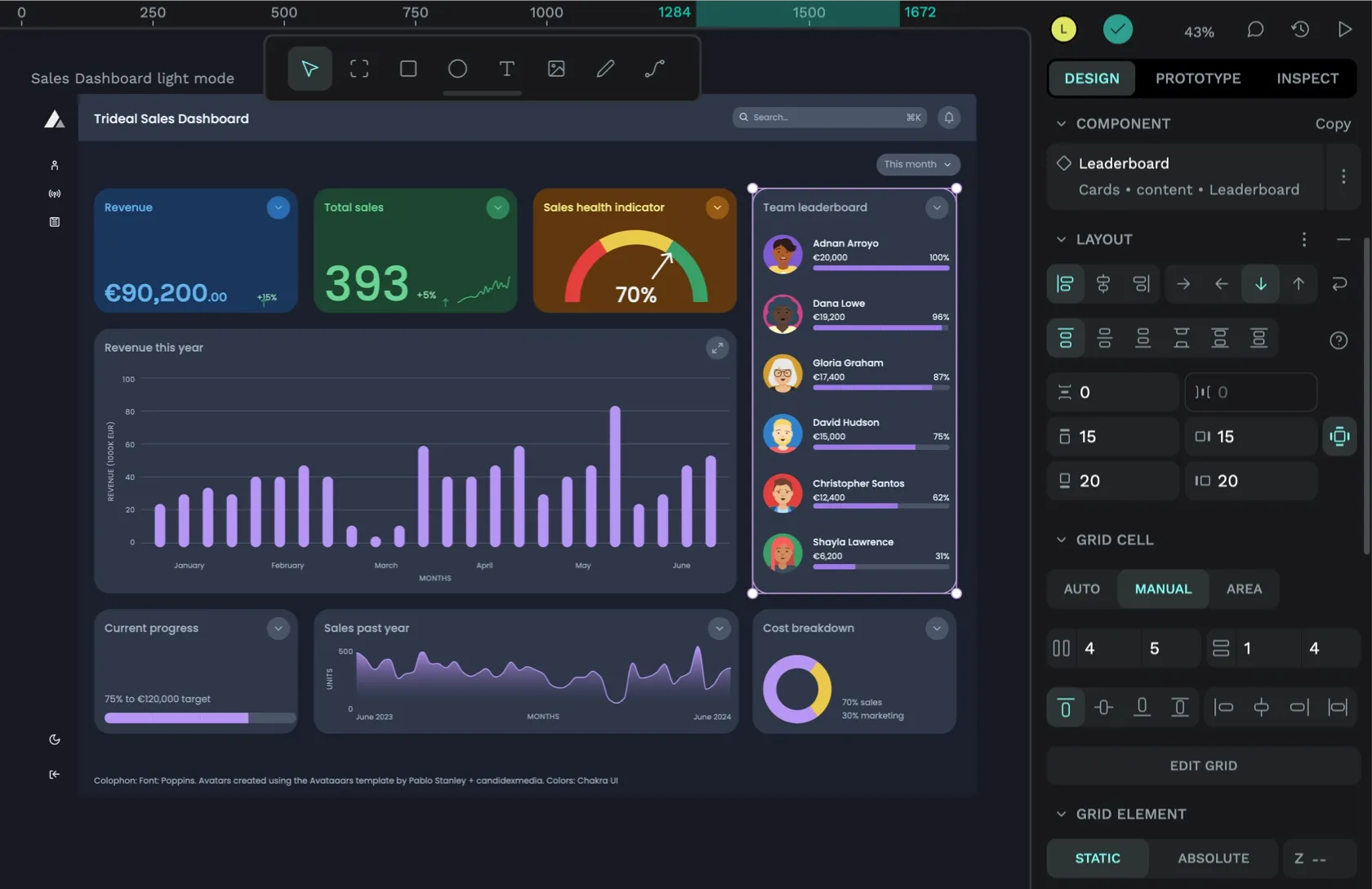
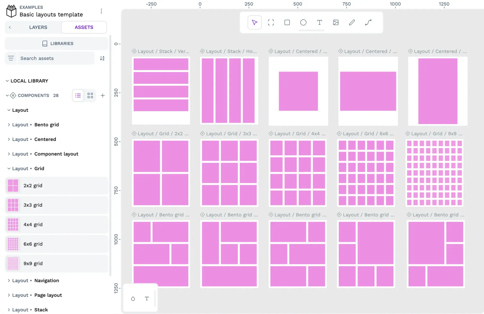
Understanding CSS breakpoints and media queries is essential for creating responsive websites, but modern tools make this process more intuitive and efficient. Penpot, an open-source design platform, offers a particularly innovative approach by directly incorporating CSS Flex and Grid layouts into the design workflow.
Check out my live demo of CSS Flex and Grid layouts in Penpot.
Penpot's approach is powerful because it bridges the gap between design and development. Instead of creating multiple static layouts for different breakpoints, designers can use the same flexible layout tools developers use in CSS. This means:
- No more designing separate versions for every screen size
- Direct translation of designs to CSS without interpretation
- Built-in support for responsive components and design systems
- Ability to create truly flexible layouts without coding knowledge
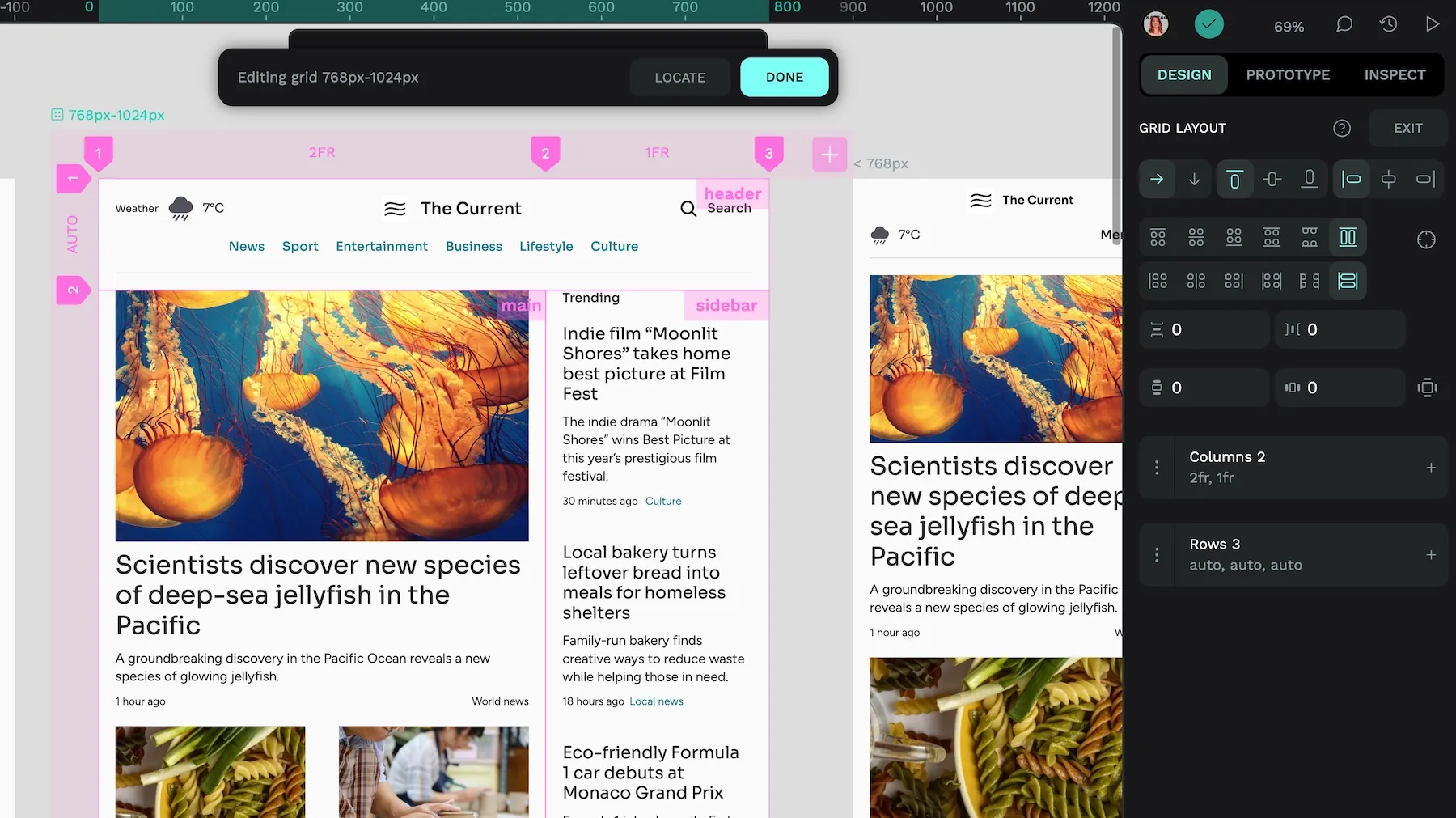
While understanding CSS breakpoints remains valuable, tools like Penpot represent the future of responsive design — where designers and developers can work with the same underlying concepts and tools, creating more efficient workflows and more consistent results.
To learn more about creating responsive designs with Penpot's flexible layouts, check out our detailed guide to flexible layouts for responsive designs.
Related Blogs
Check out our other blogs, from informative topic guides to tutorials on how to get the most out of Penpot.
