How to create interactive image hover effects with CSS
Learn how to create effective hover effects in different ways and how they help designers provide a better user experience
Feedback is a critical component of interaction.
Think about when you press a button in real life. Not only does the physical act of the button press provide feedback of the action but even the tactile sensation of touching the button provides input — this is one of the reasons touchscreens can feel so alien without understanding where you are pressing.
It is also one of the reasons why UIs can feel stale and unresponsive. If designers offer no feedback to users about whether they are interacting with a website or product, users may feel disconnected and uncertain about whether their actions are being registered or having any effect. This can lead to frustration, repeated clicking, and, ultimately, a poor user experience that may cause users to abandon the interface altogether.
Image hover effects are an ideal way to provide this crucial visual feedback, indicating to users that elements are interactive and responding to their actions. Let’s look at how to create these hover effects in different ways and how they can help designers provide a better user experience for their users.
What are hover effects?
Hover effects are visual or behavioral changes that occur when a user's cursor moves over an interactive element. In CSS, these are primarily triggered through the:hover pseudo-class. While seemingly simple, they serve multiple crucial functions in modern web interfaces:
- Signaling interactivity: They indicate that an element is clickable or interactive
- Providing state feedback: They show the current state of user interaction
- Enhancing visual hierarchy: They help guide users through interface elements
For example, a basic hover effect might look like this:
.interactive-element {
  transition: transform 0.2s ease-out;
}

.interactive-element:hover {
  transform: scale(1.05);
}
But hover effects aren't just about simple color changes or scaling. Modern web design employs sophisticated hover interactions that can include:
- Parallax movements
- Reveal animations for additional content
- Depth changes through shadow manipulation
- Image filters and overlays
- Content transitions
One critical consideration often overlooked is that hover effects should be meaningful and purposeful. A hover effect that's too subtle might go unnoticed, while one that's too dramatic could be distracting. The key is finding the right balance for your specific use case and ensuring the effect enhances rather than hinders the user experience.
Implementing basic image hover effects in CSS
Hover effects require understanding a few different elements of CSS. These core concepts include CSS transitions, transform properties, and pseudo-classes.
Let's break these down and then implement them in our basic scaling hover effect:
- CSS transitions: Transitions make our hover effects smooth rather than jarring by defining how property changes should be animated over time. The transition property has four main components: The property to transition (or
all), the duration, the timing function, and an optional delay. - Transform properties: Transforms allow us to modify elements without disrupting the document flow. Common transforms include
scale(),translate(),rotate(), andskew(). - Pseudo-classes: The
:hoverpseudo-class triggers our effect when a cursor moves over an element.
Let's examine our above examples in detail:
.interactive-element {
  transition: transform 0.2s ease-out;
}
Here, we're saying:
- Animate any changes to the
transformproperty - Take 0.2 seconds to complete the animation
- Use an
ease-outtiming function, which means the animation starts quickly and slows down at the end
.interactive-element:hover {
  transform: scale(1.05);
}
When hovered:
- Scale the element to 105% of its original size
- The transition property we set earlier ensures this happens smoothly
Let's see this in action:
The images in the gallery use the transform and scale as above.
That might seem like a lot of code for such a small effect, but most of this is just setting up the general CSS to show an image. The hover is just from these two elements:
/* Basic hover effect */
.interactive-element {
  width: 100%;
  height: 100%;
  object-fit: cover;
  transition: transform 0.2s ease-out;
  /* Ensure smooth transitions for all properties */
  will-change: transform;
}

.interactive-element:hover {
  transform: scale(1.05);
}
Here, we are establishing critical components of our hover effect. First, the base state. We set the image to fill its container with width: 100% and height: 100%, then use object-fit: cover to ensure the image scales appropriately without distortion. Then, we define the transition behavior with our transition: transform 0.2s ease-out.
(We’ve added a “helper” here to optimize performance by using the will-change: transform to hint to the browser that this element will animate.)
Then, we set up the hover state. This applies a straightforward scale transform that enlarges the element to 105% of its original size, which works with the transition property to ensure this happens smoothly over 0.2 seconds.
This creates a subtle but effective hover interaction that gives users immediate feedback when interacting with the image. The effect is particularly smooth because we're only animating one property (transform) optimized for performance.
Building out advanced image hover effects in CSS
The nice thing about hover effects is they aren’t too hard to master. Here are just a few ways you can use a few transitions, transforms, and the :hover pseudo-class to get pretty advanced with image hover effects.
Zoom effect
A smooth scaling animation that enlarges the image when hovered. This creates a sense of focus and draws attention to the important details within the image. Perfect for product images in e-commerce or portfolio pieces where you want to emphasize visual information.
/* Zoom Effect */
.zoom-effect img {
  transition: transform 0.3s ease-out;
}

.zoom-effect:hover img {
  transform: scale(1.2);
}
This effect uses a CSS transform scale property with a smooth transition, increasing the image size by 20% on hover while maintaining its aspect ratio and center point.
Hover over the images to increase the image size by 20%.
Grayscale to color
Transitions an image from grayscale to full color on hover. This creates a dramatic reveal that draws attention to the image's vibrancy. Excellent for portfolio websites or image galleries where you want to create visual interest and encourage interaction.
/* Grayscale to Color Effect */
.grayscale-effect img {
  filter: grayscale(100%);
  transition: filter 0.3s ease-out;
}

.grayscale-effect:hover img {
  filter: grayscale(0%);
}
This applies a grayscale filter initially and transitions it to 0% on hover, creating a smooth animation between monochrome and full-color states using CSS filter properties.
Hover over the images to go from grayscale to color.
Blur effect
Applies a Gaussian blur to the image when hovered. This effect can create a sense of depth or draw attention to overlaid content. Helpful in indicating non-active states or focusing on overlaid text or buttons.
/* Blur Effect */
.blur-effect img {
  transition: filter 0.3s ease-out;
}

.blur-effect:hover img {
  filter: blur(5px);
}
Using CSS filter property with blur(), this CSS smoothly transitions from sharp to a 5-pixel Gaussian blur on hover, with the transition property ensuring smooth animation.
Hover to blur the images.
Slide-in caption
Reveals a text caption by sliding it up from the bottom of the image. This provides additional context while maintaining a clean initial presentation. Perfect for image galleries or portfolio items where you want to give more information without cluttering the initial view.
/* Slide-in Caption Effect */
.caption-effect {
  position: relative;
}

.caption-effect .caption {
  position: absolute;
  bottom: 0;
  left: 0;
  right: 0;
  background: rgba(0,0,0,0.7);
  color: white;
  padding: 20px;
  transform: translateY(100%);
  transition: transform 0.3s ease-out;
}

.caption-effect:hover .caption {
  transform: translateY(0);
}
This creates an absolutely positioned caption initially hidden below the image using translateY(100%). On hover, it transitions to translateY(0), sliding the caption into view with a semi-transparent background. The relative positioning of the parent ensures proper containment of the absolute caption.
Hover over the image to reveal the caption.
Reveal effect
Animates a colored overlay across the image using scaleX transform. This creates a sweeping reveal effect that can add dynamic energy to the interaction. Great for interactive galleries or highlighting clickable images in a modern interface.
/* Reveal Effect */
.reveal-effect::before {
  content: '';
  position: absolute;
  top: 0;
  left: 0;
  right: 0;
  bottom: 0;
  background: rgba(0,123,255,0.3);
  transform: scaleX(0);
  transform-origin: left;
  transition: transform 0.3s ease-out;
}

.reveal-effect:hover::before {
  transform: scaleX(1);
}
This CSS utilizes another pseudo-element (::before) that acts as an overlay, initially scaled to 0 width using scaleX(0). On hover, it animates to full width (scaleX(1)), creating a sweeping effect from left to right due to the transform-origin property being set to left.
Hover over the image to reveal the color overlay.
3D flip effect
Creates a 3D rotation effect that flips the image on hover. This adds depth and creates an engaging interaction that can reveal content on the back. Ideal for card interfaces or anywhere you want to create a strong sense of physicality in the interface.
/* 3D Flip Effect */
.flip-effect {
  perspective: 1000px;
}

.flip-effect img {
  transition: transform 0.6s;
  transform-style: preserve-3d;
}

.flip-effect:hover img {
  transform: rotateY(180deg);
}
This establishes a 3D space using perspective and preserve-3d properties, then applies a 180-degree rotation around the Y-axis on hover. The longer transition duration (0.6s) ensures the flip animation is smooth and visible.
Hover over the image to flip it with a 3D effect.
Tilt effect
Applies a subtle 3D rotation that creates an interactive, physical feel to the image. Excellent for adding polish to hero images or creating engaging product presentations.
/* Tilt Effect */
.tilt-effect img {
  transition: transform 0.3s ease-out;
}

.tilt-effect:hover img {
  transform: perspective(1000px) rotateX(5deg) rotateY(5deg);
}
This CSS combines perspective with rotateX and rotateY transforms to create a subtle 3D tilt, using positive angles to lift the top and right edges of the image away from the viewer.
Hover over the image to tilt it.
Glitch effect
Creates a rapid position shift animation that simulates a digital glitch. This adds a unique, technical feel to the interaction. Perfect for cyberpunk or tech-themed designs or anywhere you want to create a sense of digital disruption.
/* Glitch Effect */
.glitch-effect:hover img {
  animation: glitch 0.3s ease-out infinite;
}

@keyframes glitch {
  0% { transform: translate(2px, 2px); }
  25% { transform: translate(-2px, -2px); }
  50% { transform: translate(-2px, 2px); }
  75% { transform: translate(2px, -2px); }
  100% { transform: translate(2px, 2px); }
}
This defines a keyframe animation that rapidly moves the image in different directions using translate transforms. The animation runs continuously (infinite) while hovered, with precise keyframe positions creating a jittery, glitch-like movement pattern.
Hover over the image for the glitch effect.
Morphing effect
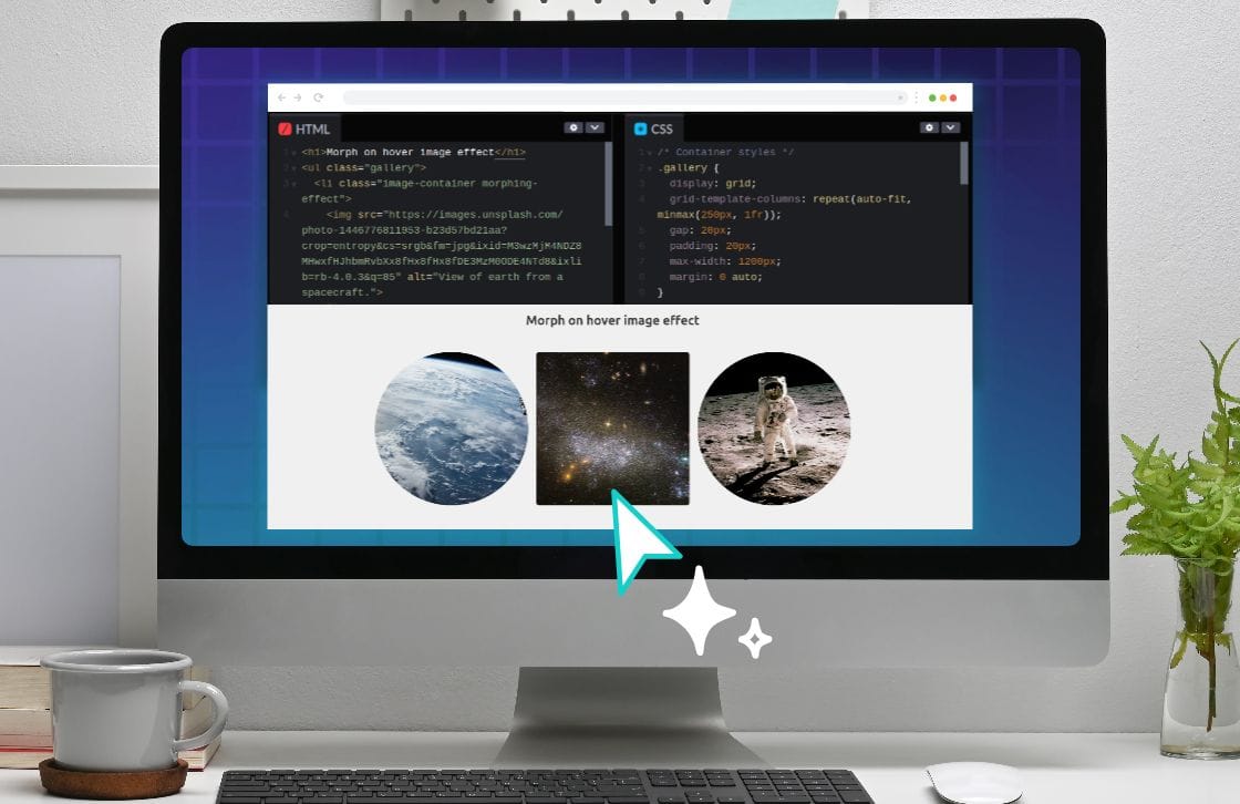
Smoothly transitions the image's clip-path to create an organic shape transformation. This creates a fluid, modern interaction. Great for creative portfolios or anywhere you want to add a touch of organic movement to your interface.
/* Morphing Effect */
.morphing-effect img {
  clip-path: circle(50% at 50% 50%);
  transition: clip-path 0.3s ease-out;
}

.morphing-effect:hover img {
  clip-path: circle(70% at 50% 50%);
}
Using clip-path with circle(), the code transitions from a circular mask at 50% size to 70% size while maintaining the center point, creating a smooth expansion animation that reveals more of the image.
Hover over the image to morph to the full image.
Design and code together on Penpot
These image hover effects are one of the areas where it is imperative that designers and developers work together. As the effects become more sophisticated, they must serve aesthetic and functional purposes while maintaining performance and accessibility standards.
Here's why this collaboration is crucial:
Performance considerations
Designers need to understand the technical implications of their hover effect choices. Some effects, like complex transforms and filters, can be CPU-intensive.
To make sure that there is always a balance between performance and user experience, developers can guide designers on:
- Which effects are most performant
- How to optimize animations for smooth transitions
- Balancing visual complexity with loading times
This way, your team can ensure that their end product both looks good and performs well, even on older devices or slower internet connections.
Accessibility impact
Hover effects are a useful tool, but they can’t be the only way you convey information about your product.
If your product is going to be accessible to all users, your design and development teams will need to work together to make sure that:
- All hover-revealed content is accessible via other means
- Effects don't interfere with screen readers
- Alternatives exist for touch-based devices
You can also disable hover effects for users who have the reduce motion setting enabled on their device using the prefers-reduced-motion media query:
@media (prefers-reduced-motion: reduce) {
/* Don't show hover effect if a user’s device settings are set to reduced motion */
  .morphing-effect:hover img {
    animation: none;
  }
}
User experience consistency
Hover effects should be part of a cohesive interaction system that works regardless of what device or system it’s being used on.
This can be accomplished by your design and development team:
- Maintain consistent timing across similar interactions.
- Use appropriate easing curves for different effect types.
- Ensure effects align with the broader design language.
- Create predictable patterns users can learn.
By working together, designers and developers can create hover effects that are both visually engaging and technically sound. Penpot is built for precisely that. Rather than creating separate workflows for designers and developers, it enables collaboration throughout your workflow.
Improve collaboration between design and development
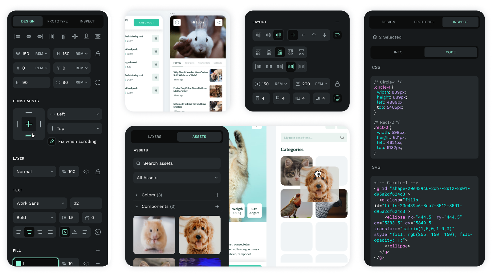
Designers work directly with web-standard properties, and designs are translated directly into production code. This means when creating designs, developers can immediately see the underlying code, with real-time code generation for all design elements and direct access to CSS properties and values.
Designers and developers can work simultaneously to refine interfaces:
- Live preview of changes for both design and code
- Immediate feedback on implementation considerations
- Shared workspace for testing and iteration
This approach eliminates the traditional handoff process, where design intentions often get lost in translation between teams. Instead, both designers and developers work with the same tools and speak the same language, resulting in more efficient implementation and better final results.
Interested in boosting designer and developer collaboration on your team? Sign up for Penpot today and see how your team can work smarter and faster today.
Related Blogs
Check out our other blogs, from informative topic guides to tutorials on how to get the most out of Penpot.
