Design Tokens with Penpot
Design tokens are the smallest repeatable elements of your design that can be reused consistently across your Penpot projects and teams.

Design tokens are a way of storing the smallest repeatable elements of your design so you can reuse them consistently across your projects and teams. You might already be familiar with the concept of storing variables in code, or with saving repeatable visual styles like Penpot’s Colors and Typographies. In Penpot, these building blocks help you create scalable, maintainable design systems.
Design tokens provide a single source of truth for your design decisions. Want to change the primary accent color of your theme for every object at once? Just edit the accent token that you’ve applied as the color for all relevant text, fill and stroke colors.
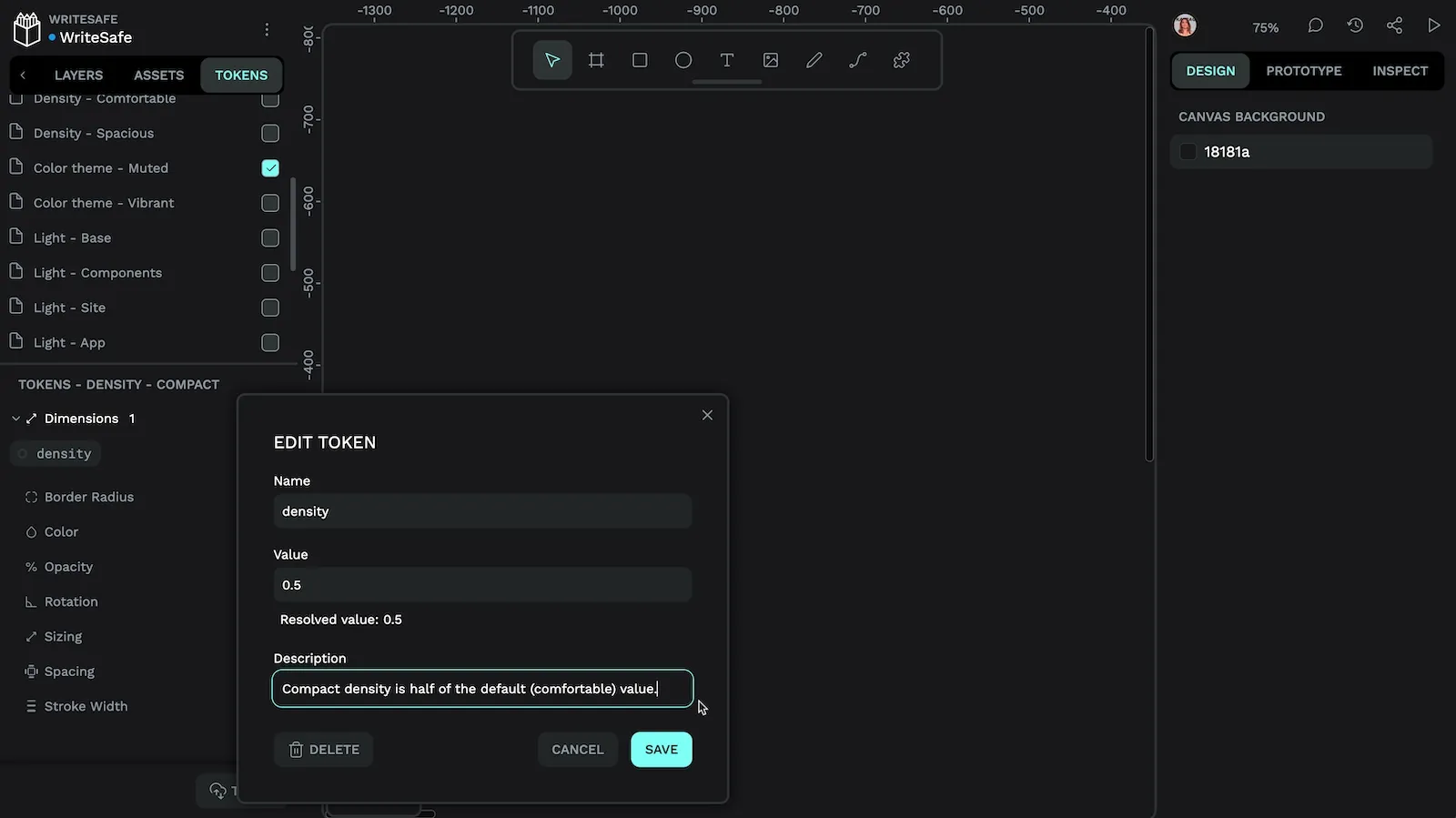
Each design token is made up of a name and a value—it’s that simple.
Penpot is the first platform to natively integrate the W3C’s draft standard for Design Tokens, in collaboration with the experts from Tokens Studio. This standardization means your tokens will be compatible with any other tool that supports design tokens.
If you’re already using Design Tokens in your development process, you can also import your existing tokens into Penpot to give your design process a head start.
Create a design token in Penpot
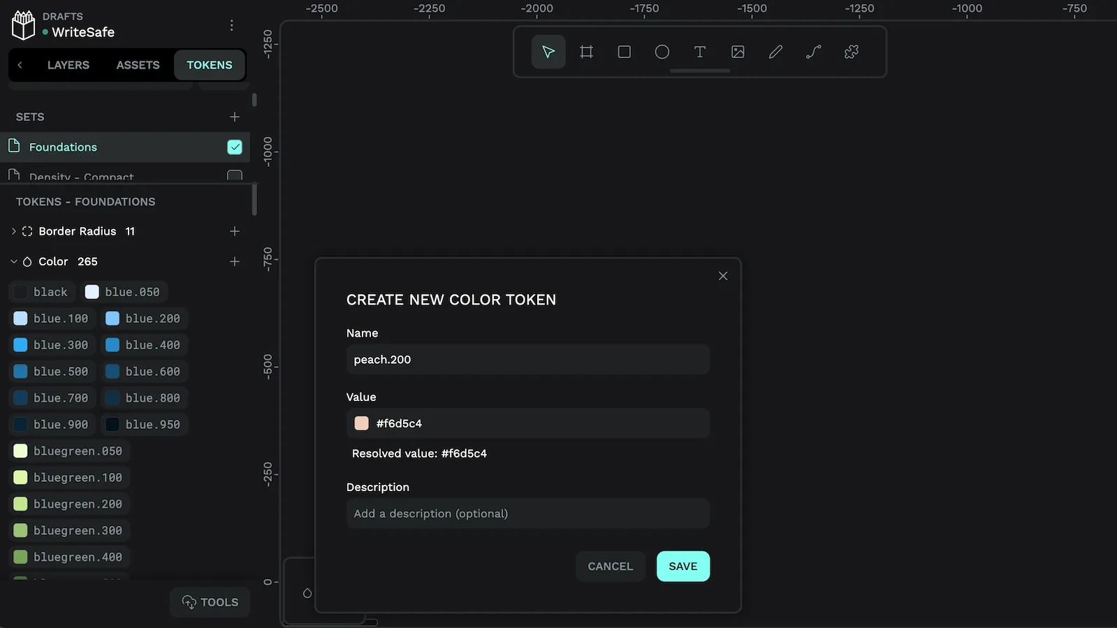
To create a Design Token in Penpot:
- Navigate to the Tokens panel on the left side of the workspace
- Choose the appropriate token type (more on types later!)
- Use the “+” add button to add a new token
- Name your token using only letters and numbers, with dots as separators (more on naming below!)
- Set the value for your token
Naming design tokens
Name your tokens in a way that’s meaningful to you and your team so you can easily find the right token to use later.
Many teams split their design tokens into:
- Foundation or base tokens that represent the shades in a color like
blue.100, or the steps in size scale, likespacing.md. - Semantic tokens that help the team understand where the values are used, like
primary.button.background. - Component tokens are semantic tokens used for a specific component, like
navigation.primary.button.background.
This approach works well with Penpot where you can create different sets to keep your foundation and semantic tokens separate.
Combining foundation, semantic and component tokens helps you create complex systems, making it easy to update hundreds of properties in seconds.
Aliases and calculations
You can use token aliases and calculations in your token values to help you create more consistent and scalable design systems. Editing one value can propagate changes across all of your designs without any other manual adjustments.
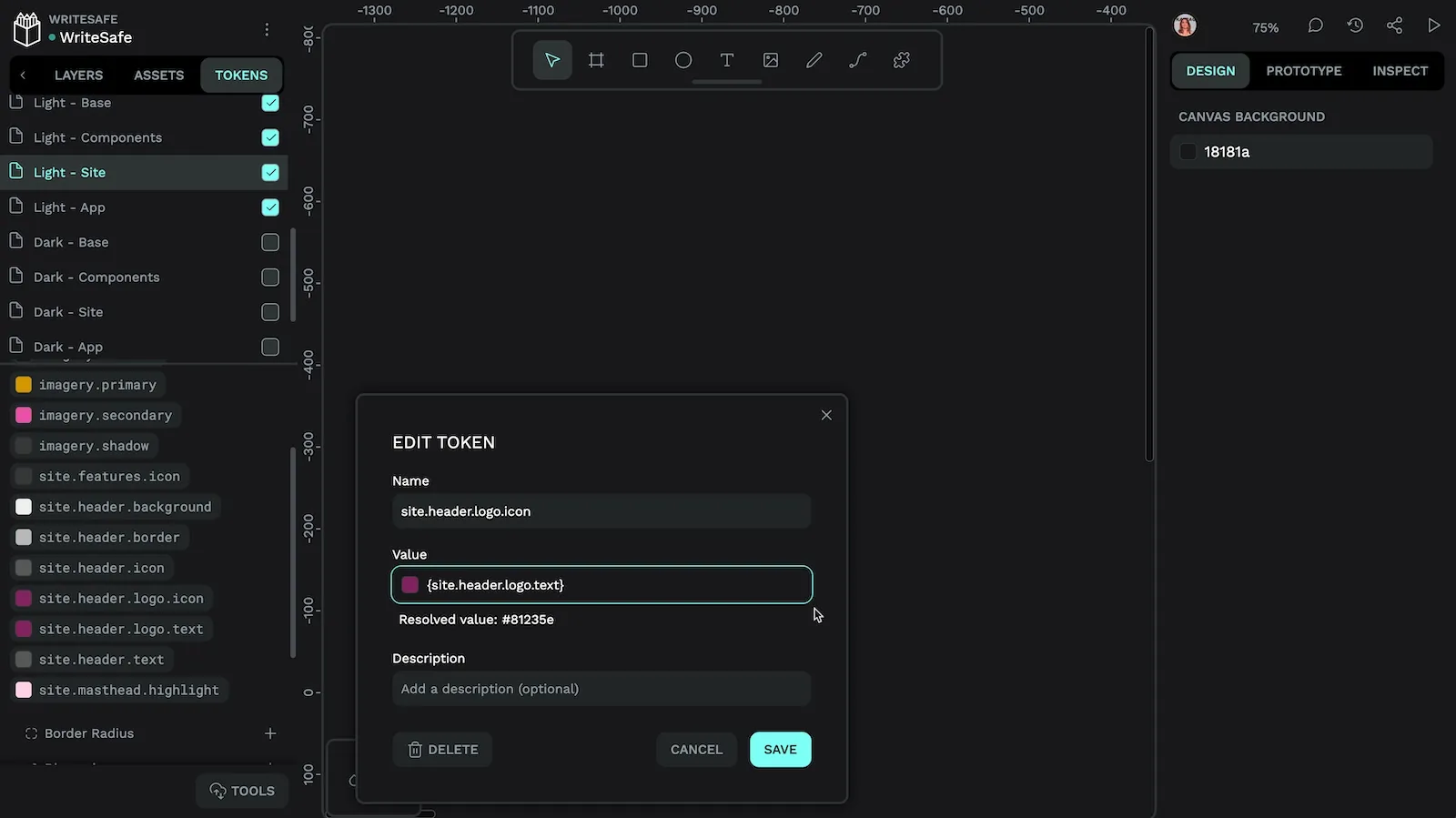
{site.header.logo.text} as the value for the site header logo icon means the icon will always match the text color.Reference another token using its token name inside { curly brackets }.
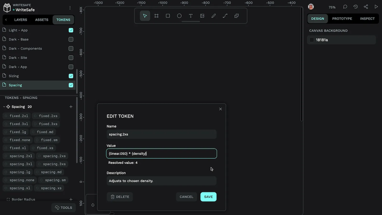
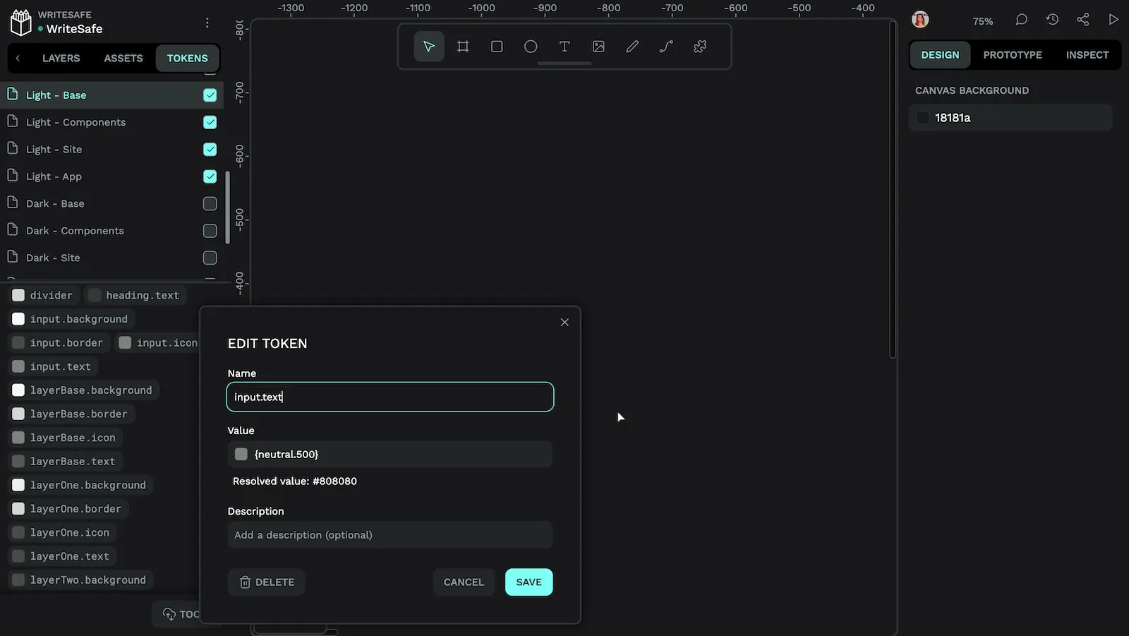
Underneath the token value, Penpot displays the resolved value, which is useful for checking the values of token aliases and calculations.
Types of design tokens
Design tokens extend beyond just colors; in Penpot you can currently use the token types of:
- Radius: used for the object’s border radius value.
- Color: used for the object’s fill or stroke value.
- Dimensions: used for the same values as radius, sizing, and spacing, as well as x and y positioning.
- Opacity: used for the object’s opacity percentage.
- Rotation: used for the object’s rotation angle.
- Sizing: used for the object’s height and width, including the maximum and minimum heights and widths.
- Spacing: used for the object’s paddings, margins, and column and row gaps.
- Stroke width: used for the object’s stroke width value.
You can read more about token types in the Penpot User Guide.
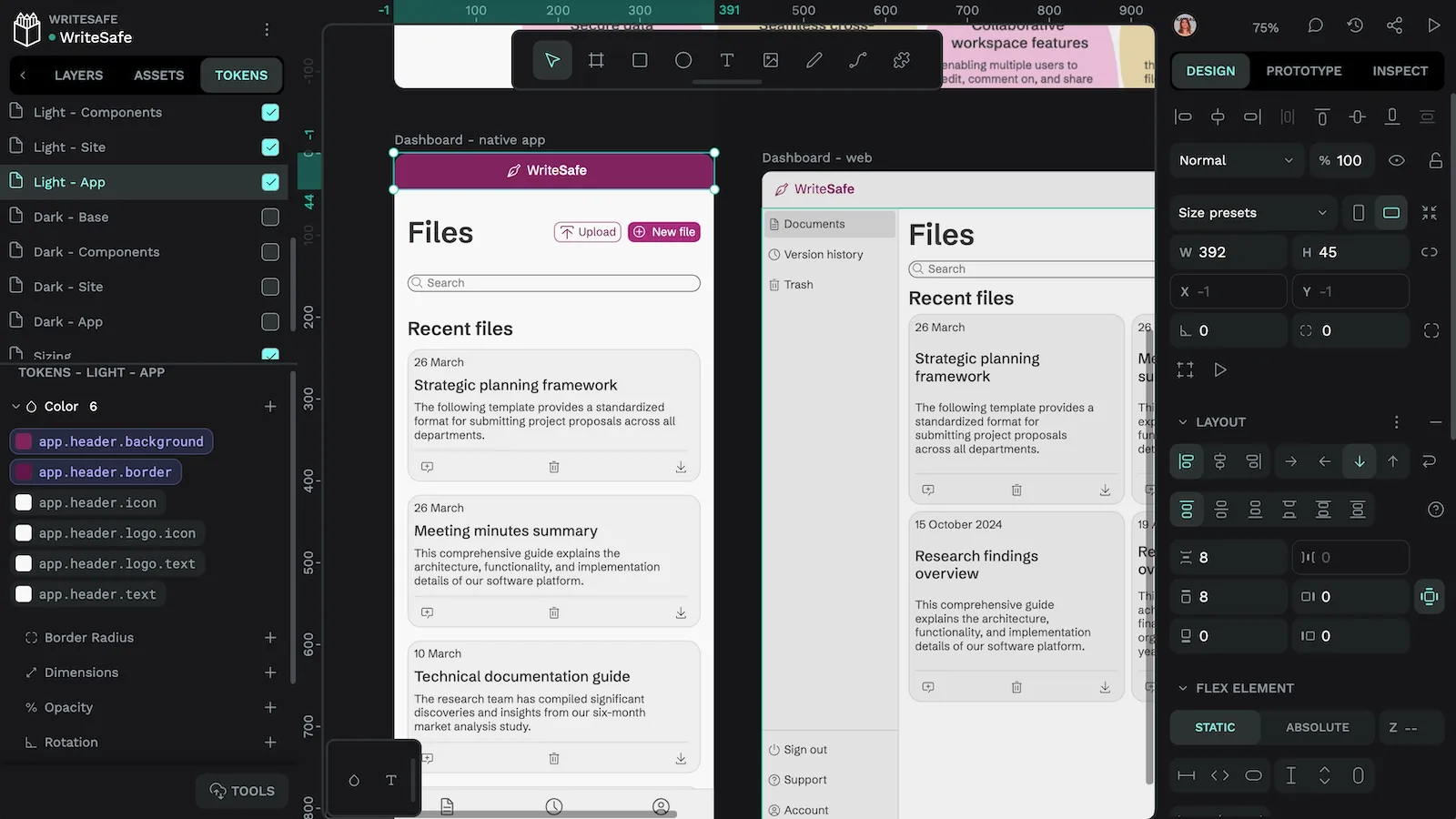
Applying design tokens
To apply a design token to an element:
- Select the layer in the Layers list or on the canvas
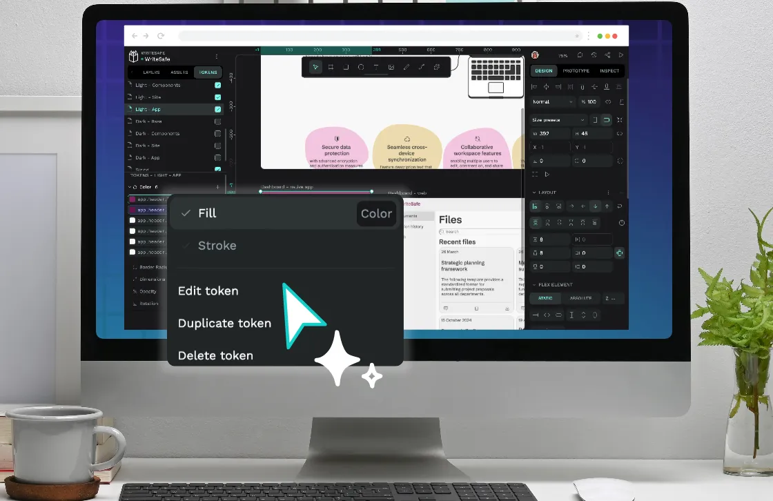
- Right-click the token you want to apply
- Choose which property the value should be applied to (fill, stroke, etc.)

You can edit your design token values at any time by right-clicking your token and selecting Edit. This will update all instances where that token is used.
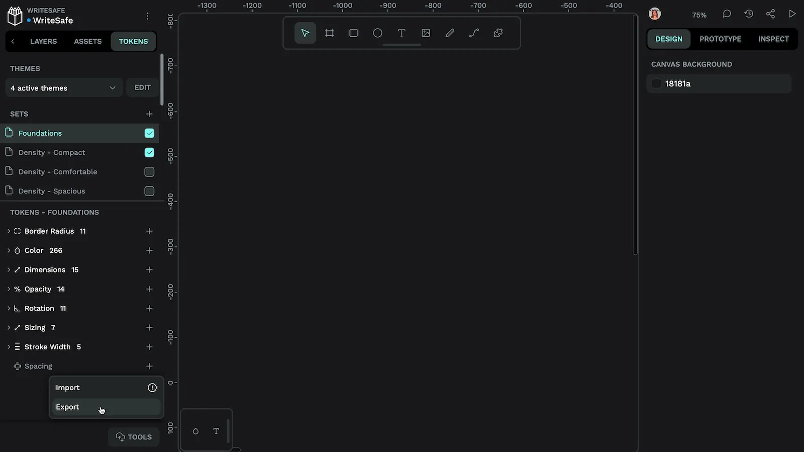
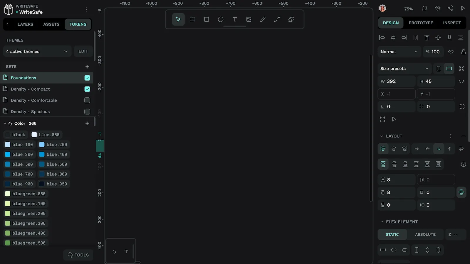
Working with design token sets
By default, your tokens will be added to a set named Global. You can create more sets to group your tokens, and enable or disable sets to create different combinations of tokens.
To create a new token set:
- Use the + button in the Sets section of the Tokens panel
- Name your set (for example, “Dark Mode”)
- Add tokens to this set
Creating and managing design tokens themes
Penpot allows you to save your combinations of token sets as themes. Each theme has a name, and you can choose which sets are enabled as part of that theme.
This can simplify the process of building complex modes and themes like light and dark modes or different brand colors, as well as designing for different states and environments without creating separate mockups for each case.
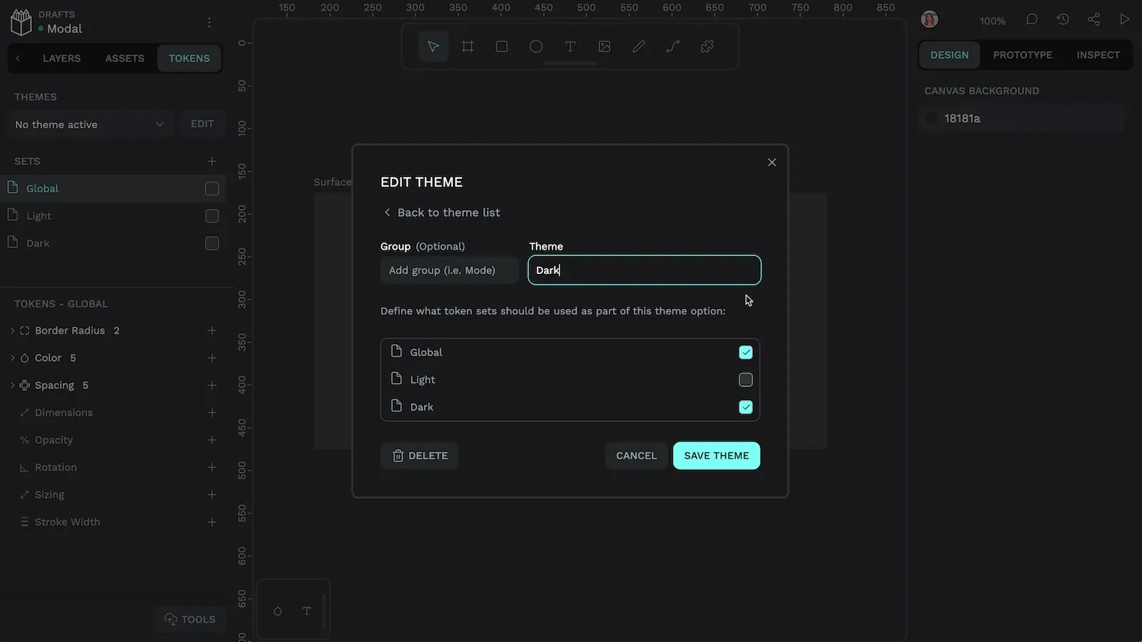
To create a theme:
- Use the + button in the Themes section
- Name your theme
- Select which token sets should be enabled in this theme
Once created, you can easily switch between active themes with the switcher at the top of the Tokens panel.
Token groups
For very complex designs, you can group themes. This makes it easier to switch between different combinations of themes.
For example, the comfortable theme might belong to the Density group, the dark theme belongs to the Color Mode group, and the Muted theme belongs to the Color Theme group. Enable these at the same time to see the comfortable, muted, and dark sets together.
The power of design tokens
Design tokens are a powerful tool that creates a shared language between designers and developers. By investing time in setting up tokens for your team, you'll quickly realize the benefits of a scalable and easily maintainable design system.
Watch this demo in action in my Intro to Design Tokens hands-on session.
Start small with a few color and spacing tokens, then gradually expand your token library as you become more comfortable with the system. You can create design tokens for free using Penpot. Your future self (and your team) will thank you for the consistency and efficiency that design tokens bring to your workflow.
Related Blogs
We have more posts about design tokens and many other design systems related topics. Here’s a few examples of helpful articles to help you get the most out of Penpot.
 Laura Kalbag
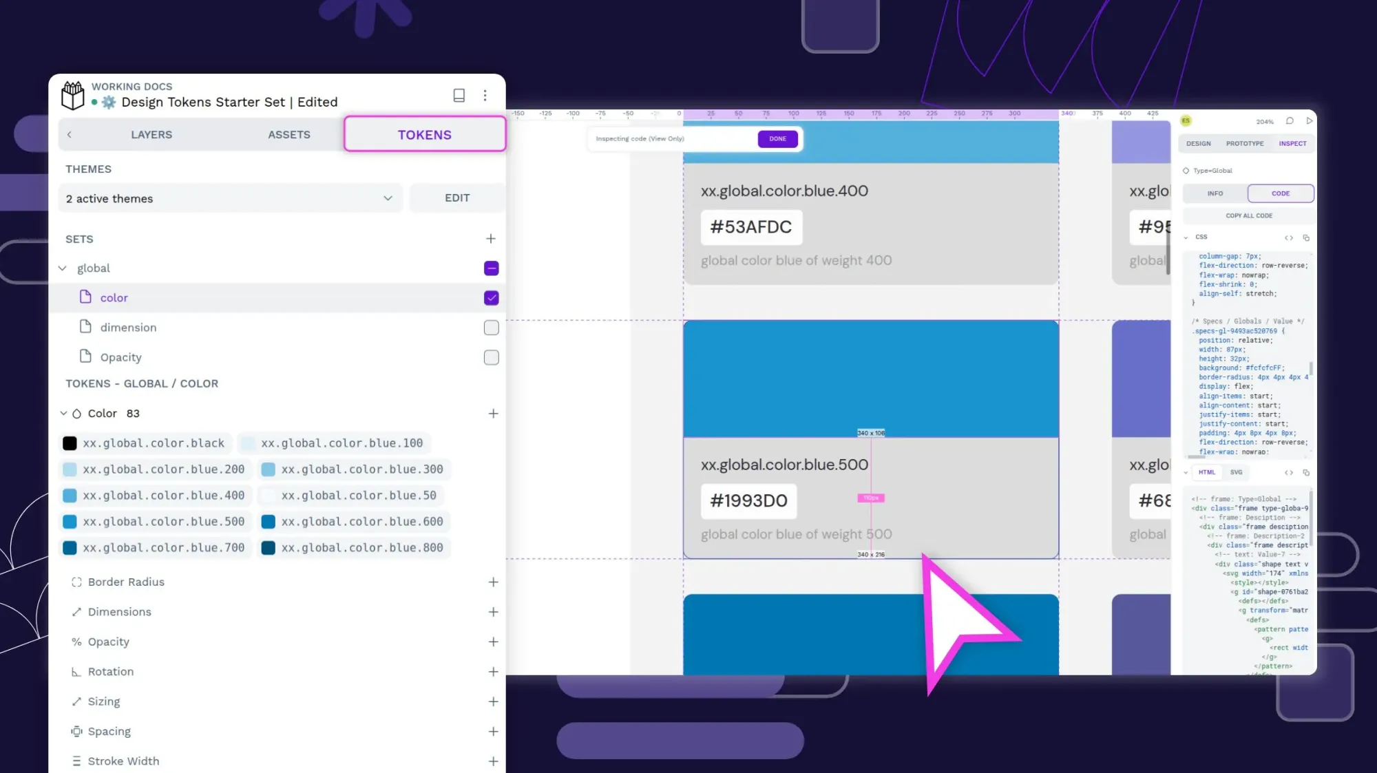 Laura Kalbag
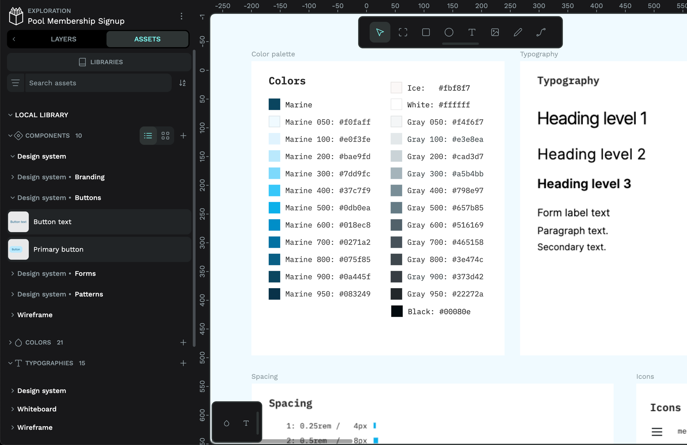 Laura Kalbag