Design systems best practices with Penpot
If you want to create a design system using Penpot, I’ve got some tips, tricks, and best practices for you.
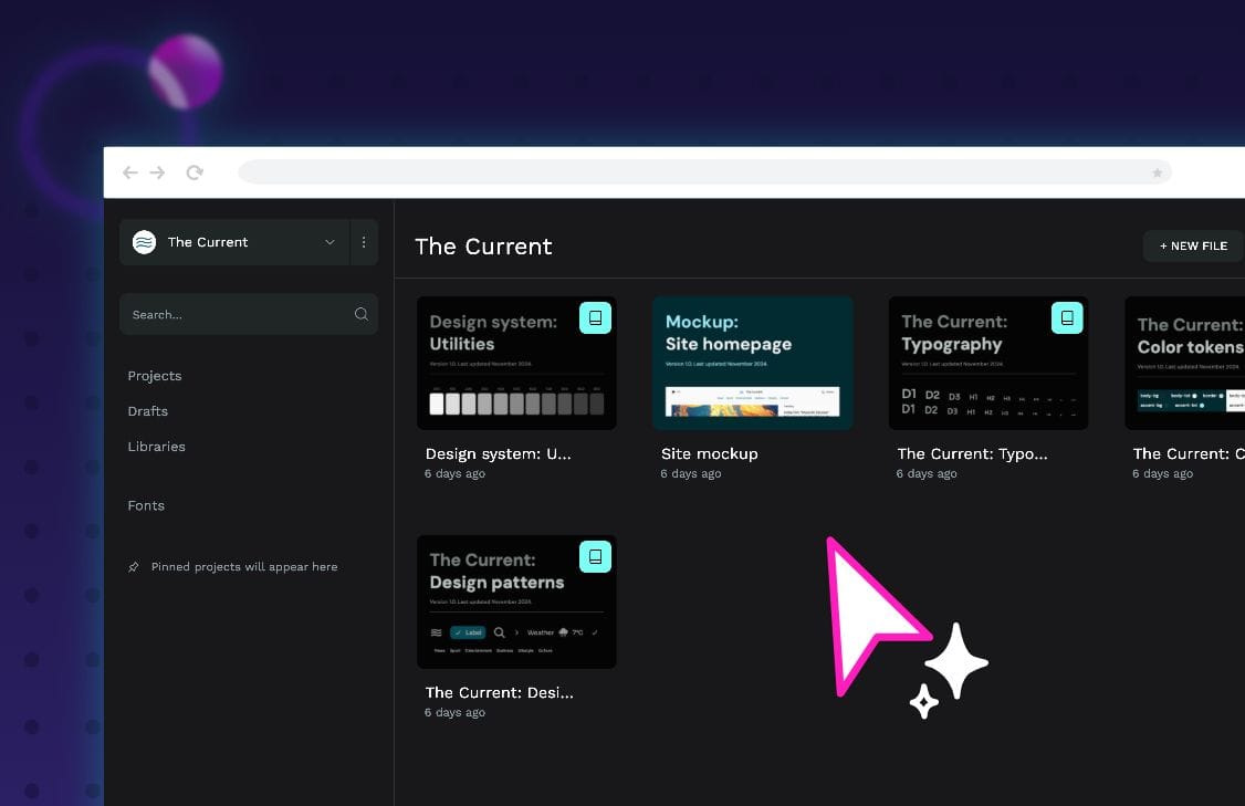
Design systems aren’t just files with collections of design patterns. They benefit from being living documents that you can develop and improve to suit your team’s needs and keep everyone in sync.
Check out our Intro to Design Systems hands-on session to see more of this example design system in action.
With Penpot, you can create a design system that works for your needs, combining:
- Colors, typographies, and components (collectively known as “assets”), which you can save to a library, name, and organize in groups and subgroups.
- Local libraries where you can store your assets in your file.
- Connected libraries where you can import and use assets from other files.
- Shared libraries where you can publish your local library to share with your team and keep your assets in sync across your projects.
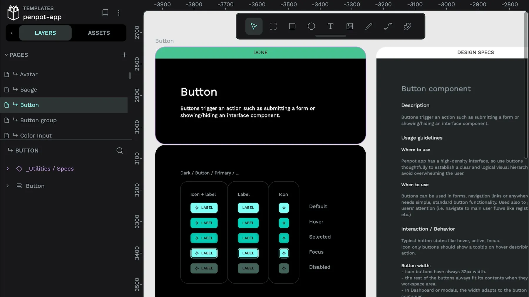
I wrote in more detail about these different Penpot features in a tutorial on Penpot for Design Systems and I recommend you jump in there if you’re just starting out with Penpot.
If you want more advice on best practices and implementing your design system in Penpot, read on!
Break your systems into interconnected libraries
You don’t always need every element of your design system for each new project. For example, you might not need to use your icon collection in your banners or tab menus in your landing page design.
Creating separate libraries for different areas of your design system has multiple benefits. Your libraries will be better organized and labeled, making it easier to find assets that your team has created.
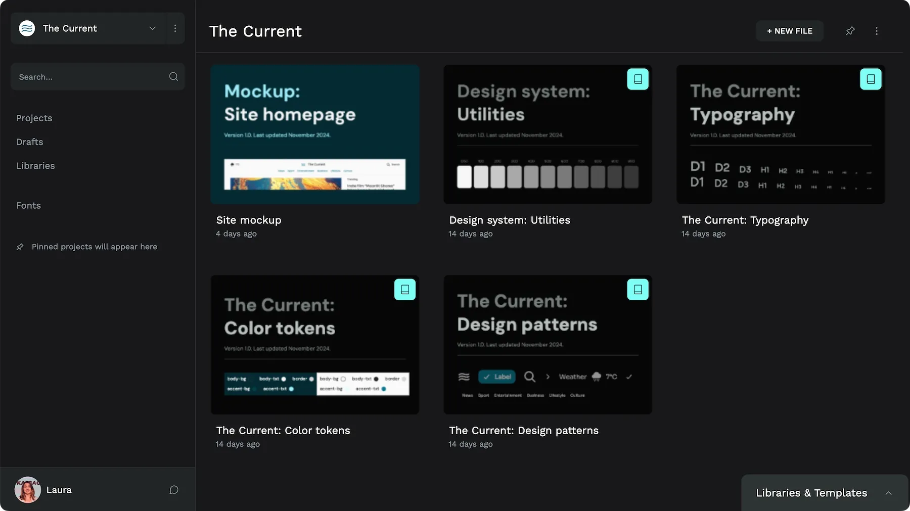
You could break down your design system into smaller libraries in many different ways. I would pick my breakdown based on my team’s requirements and what works best for our projects. For example:
- Separate brand vs. UI elements to prevent them being used in the wrong context.
- Store colors in their own library, as you’re unlikely to update this file often.
- Store your most frequently-used utilities in one library that you can connect quickly to each new project.
- When you need to document similar components together, store them together.
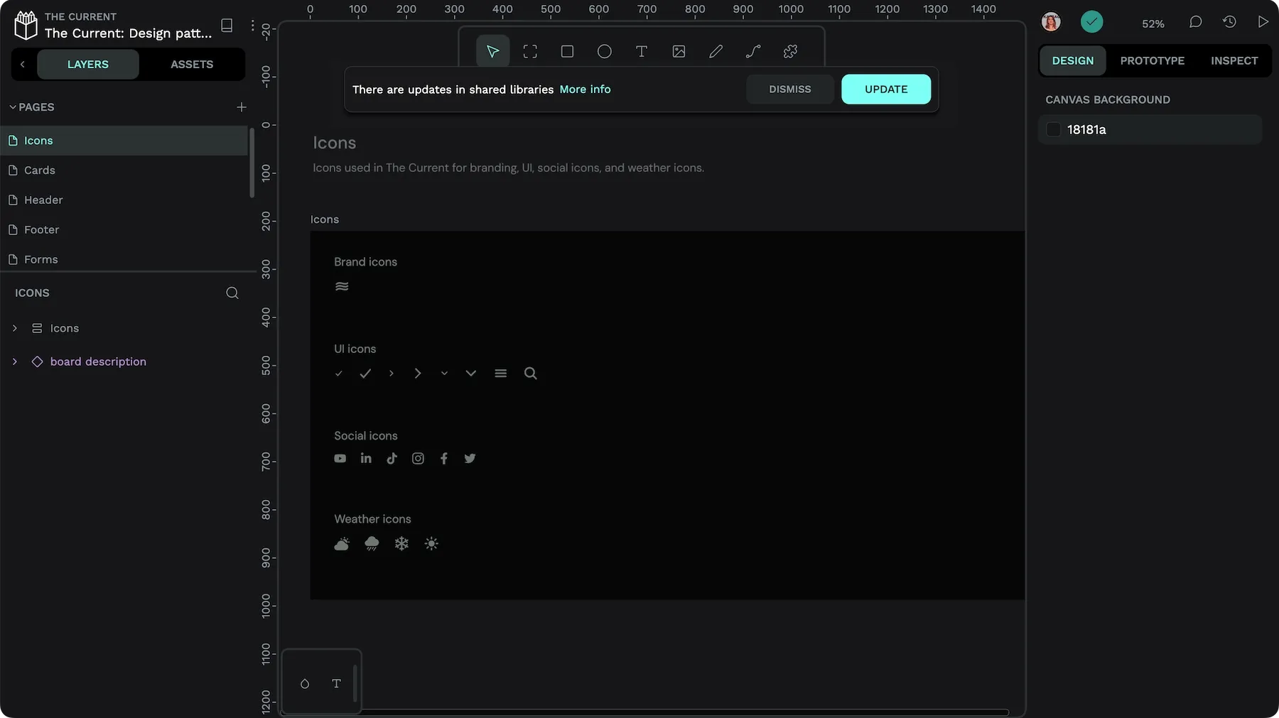
You can’t edit assets from a connected (non-local) library while using them from a different file, preventing you or your team from accidentally changing your design system while using it.
Chain your libraries together
You might want to split your design system into separate libraries depending on the type of asset, with different libraries for colors, typographies, and design pattern components.
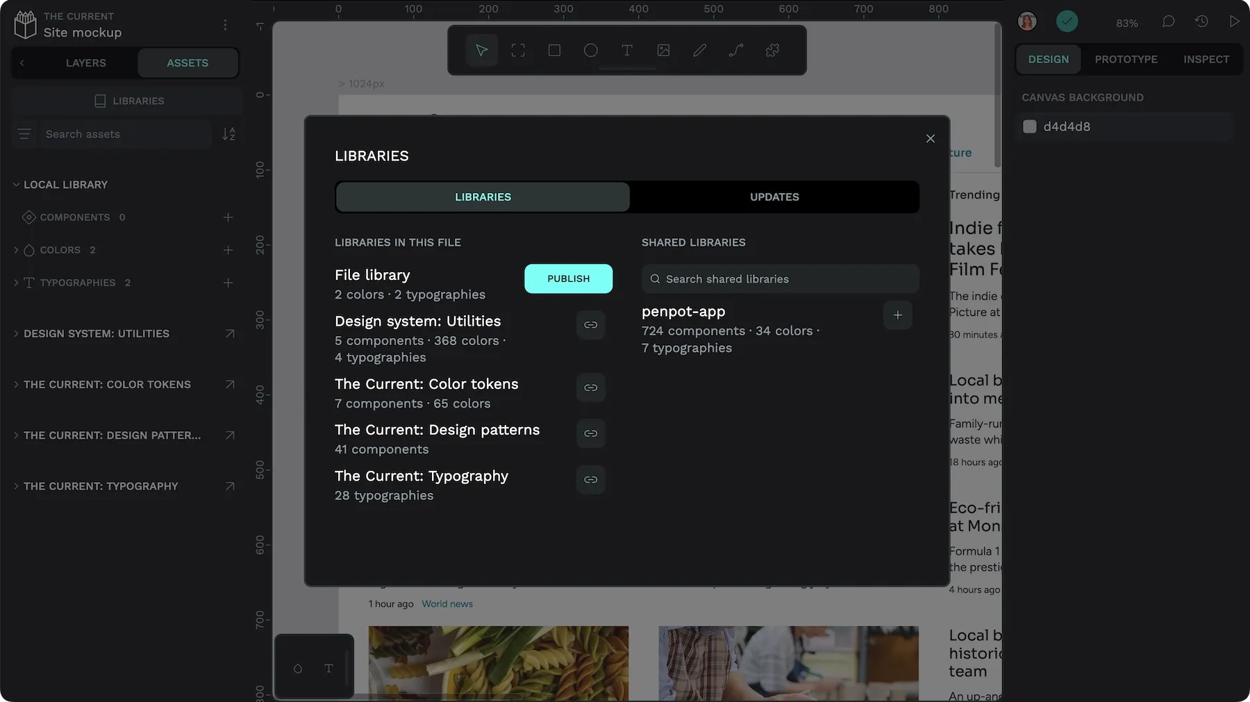
Once you’ve divided your design system into libraries, you can connect them to each other to reference the assets between each library. Perhaps your color tokens library connects your branding library, and your design pattern components connect your colors and typographies.
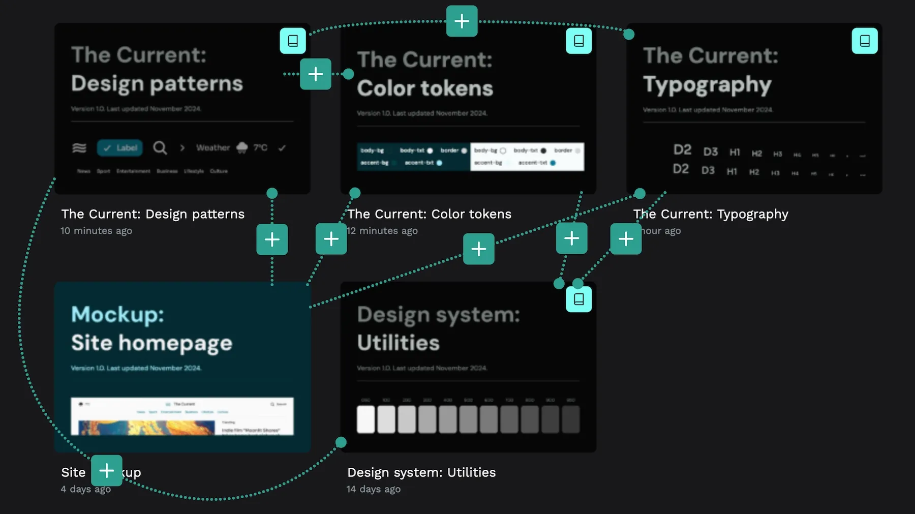
These connections will also make it easier for developers looking to create performant code without too much repetition, as they can easily see the library dependencies for each library and working file.
Design tokens
You can also use libraries to create token aliases. If you’re building a complex design system, you’re also likely to create primitive design tokens, semantic design tokens and more component-oriented design tokens. You could document your primitive tokens in one library and use the values of those tokens to define your semantic and component-oriented tokens in other libraries.
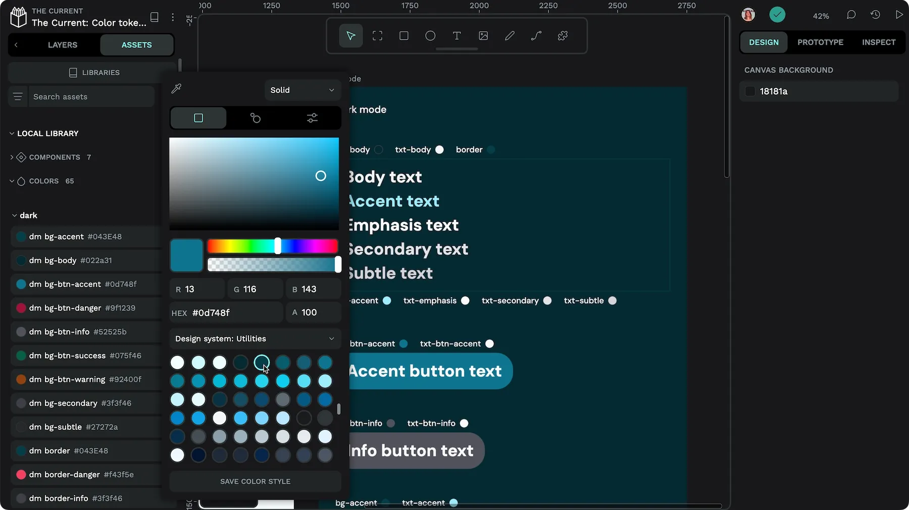
Design tokens are coming to Penpot soon. You can check out a preview in the hands-on demo I did in the Intro to Design Systems.
Document your libraries
If you want your team to use your design system, you need to make it easy to understand what elements are for and when they should be used. Documentation is what makes your design system truly useful.
Documentation on the canvas
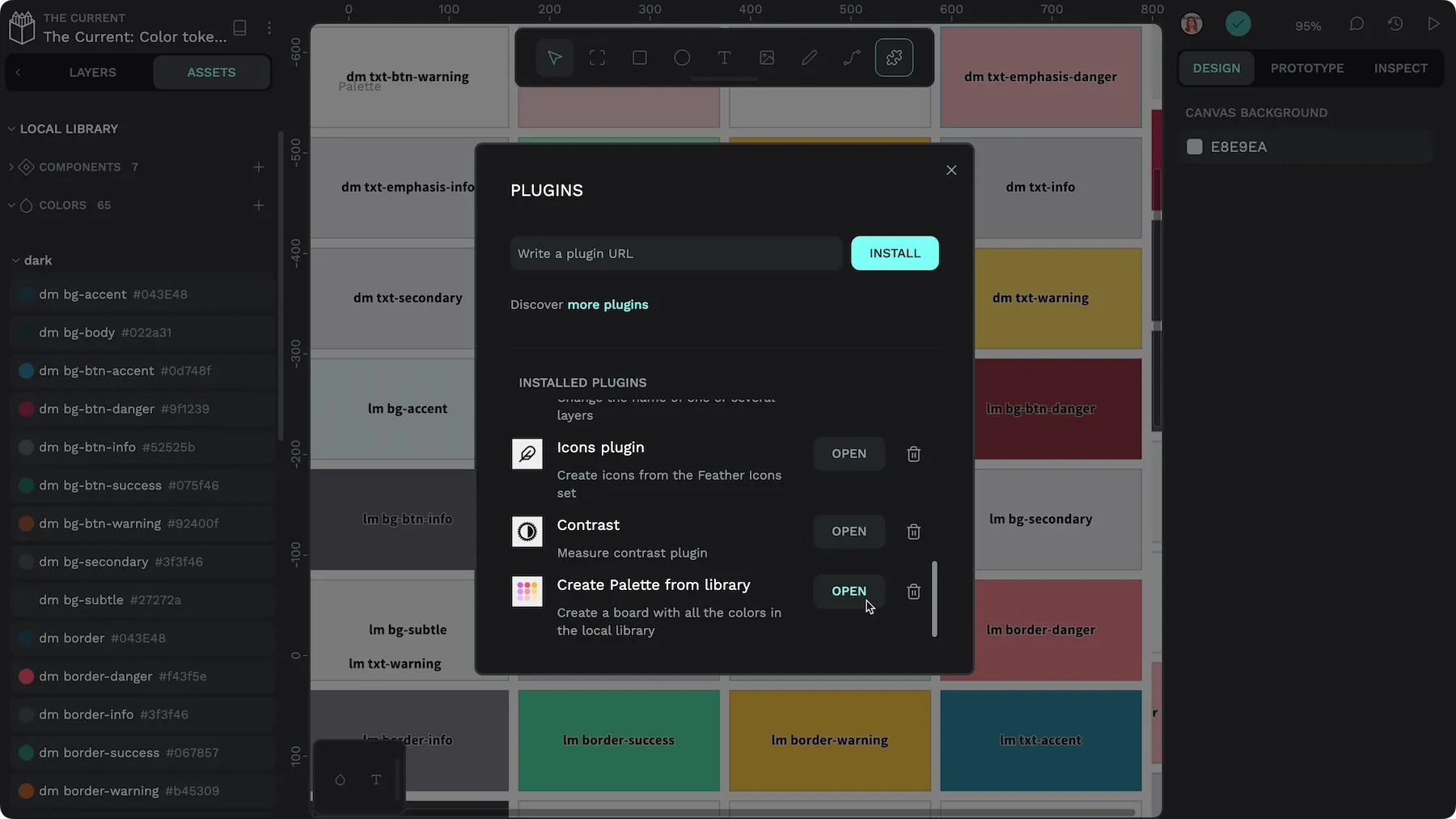
The most versatile way to document your design system is to create boards to demonstrate and document the library contents in each library file. By default, you don’t need to display color and typography assets on the canvas to include them in a library. But it can be helpful to give a nice big preview to your team and include guidelines on their use alongside.
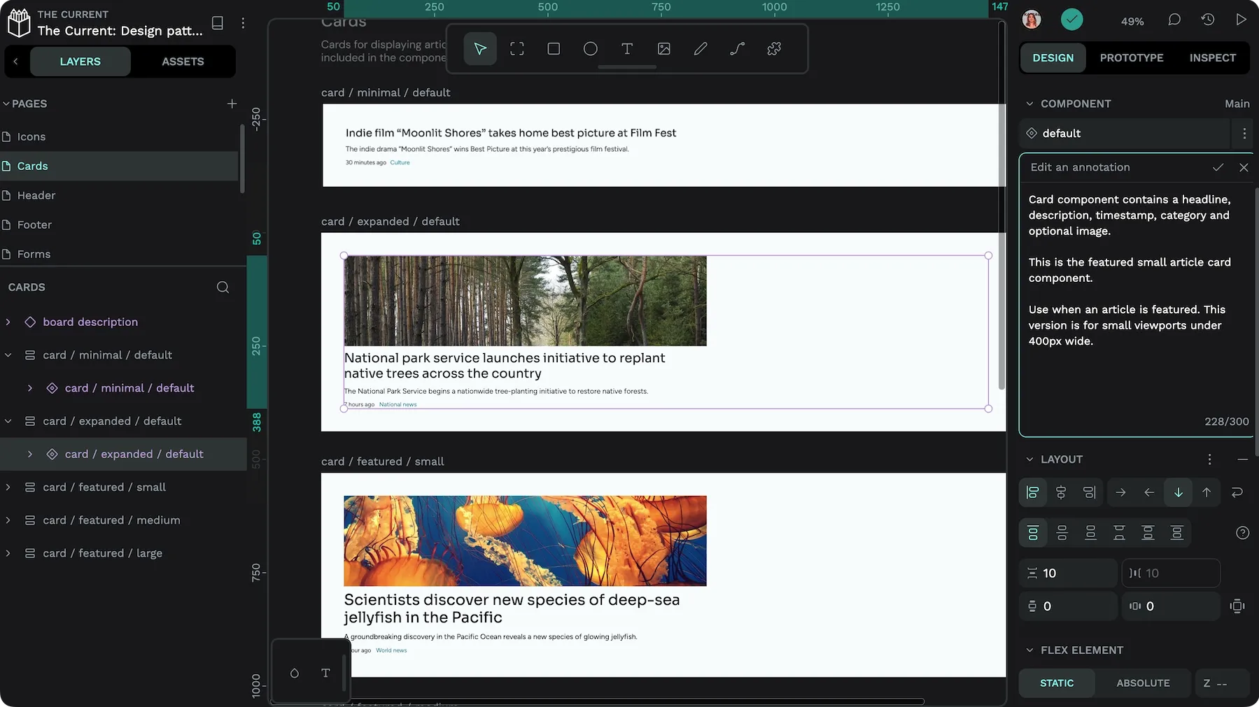
Unlike color and typography assets, you need to store your main components on the canvas to share them in a library. This is an excellent opportunity to add additional documentation alongside each component so your team understands how your team can use them best.
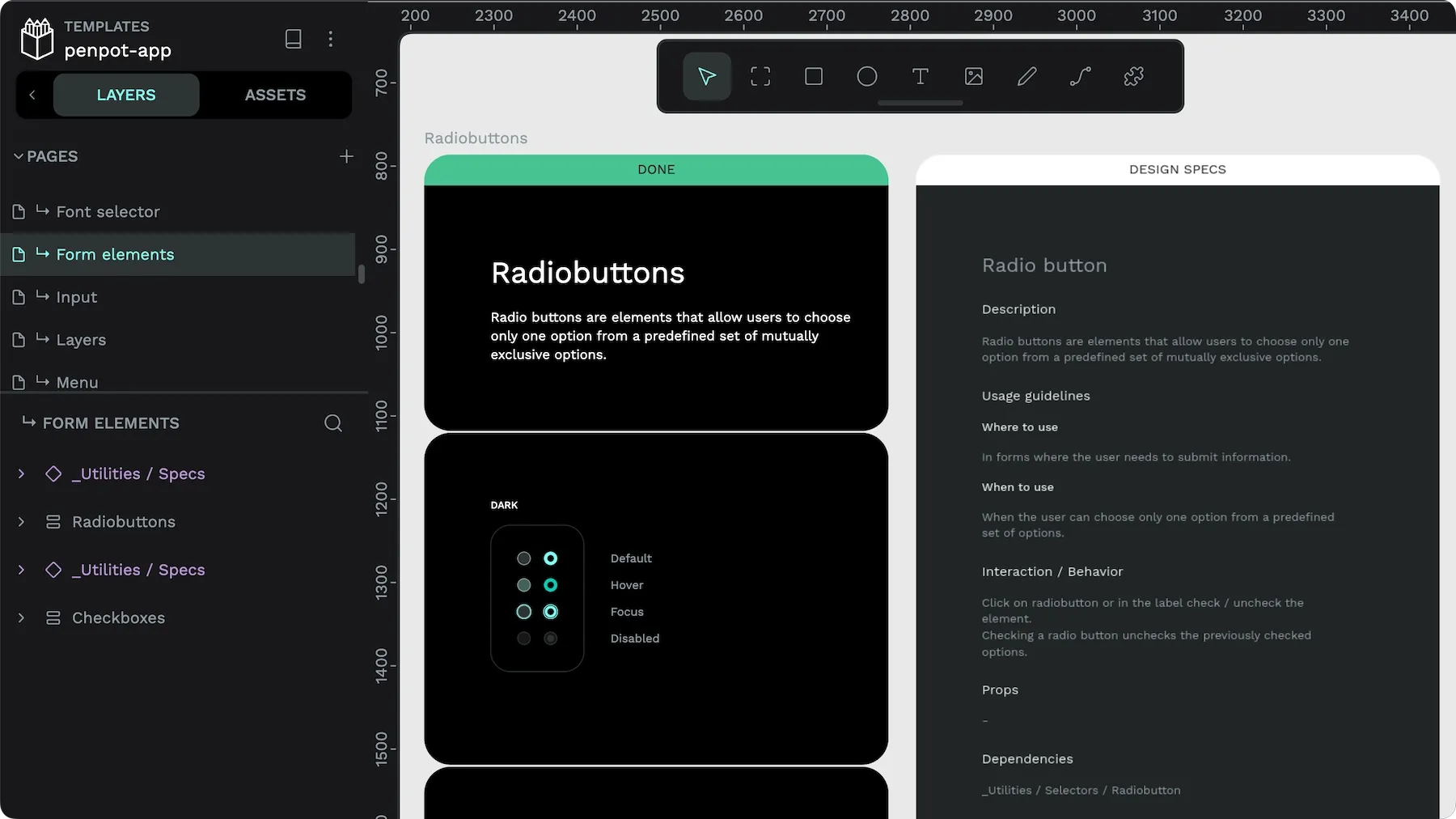
You can also annotate your components and name assets in a way that is meaningful to your team.
Add a cover thumbnail
Naming your library something meaningful and useful will help your team find it easily amongst your other files. You might want to add version numbers to your files if you want to make breaking changes that you don’t want to sync to your current working files.
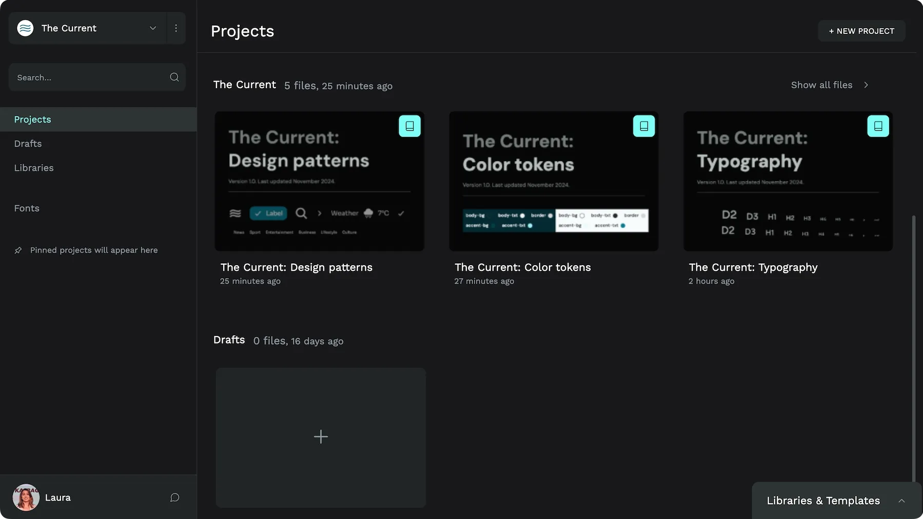
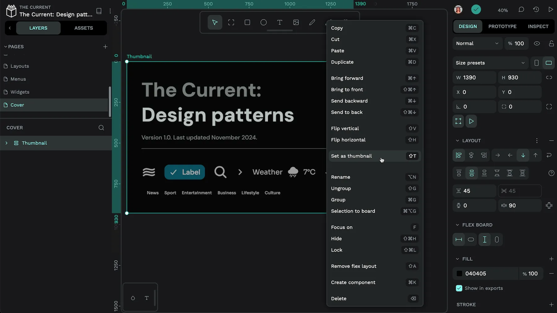
You can create the cover thumbnail as a board inside your file. A 3:2 width:height ratio works best for the board size. I tend to use a 1390 x 930 board size.
At the minimum, I’d recommend you include the following information in your cover thumbnail:
- Library name and function
- Version number
- Last updated date
Documentation is the best way to ensure everyone on the team understands how your design system works and the intended use cases for its elements, which is necessary to keep design and development in sync.
Keep in sync between design and development
You might have big design and development teams, or you might be a one-person team! Either way, it’s helpful to create your designs in a way that smoothes the path to development.
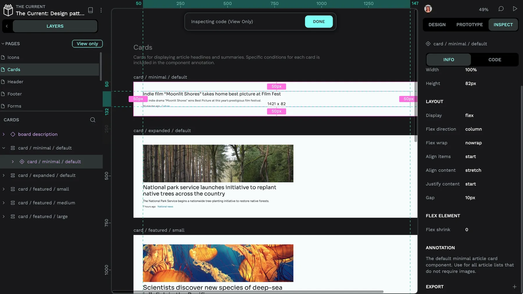
My number one tip is to use boards. Boards are containers for your designs; you can even include boards inside other boards. Boards are important for development because once you’ve created a board, you can easily inspect its CSS properties and grab its HTML and CSS code from the Inspect tab.
Naming is hard but important
Naming is key to good design communication. How you name your files, libraries, pages, layers, and each asset will help your team (and your future self!) understand your design intent.
Use meaningful and consistent names
Names are most straightforward to remember when they are meaningful, and you use them consistently.
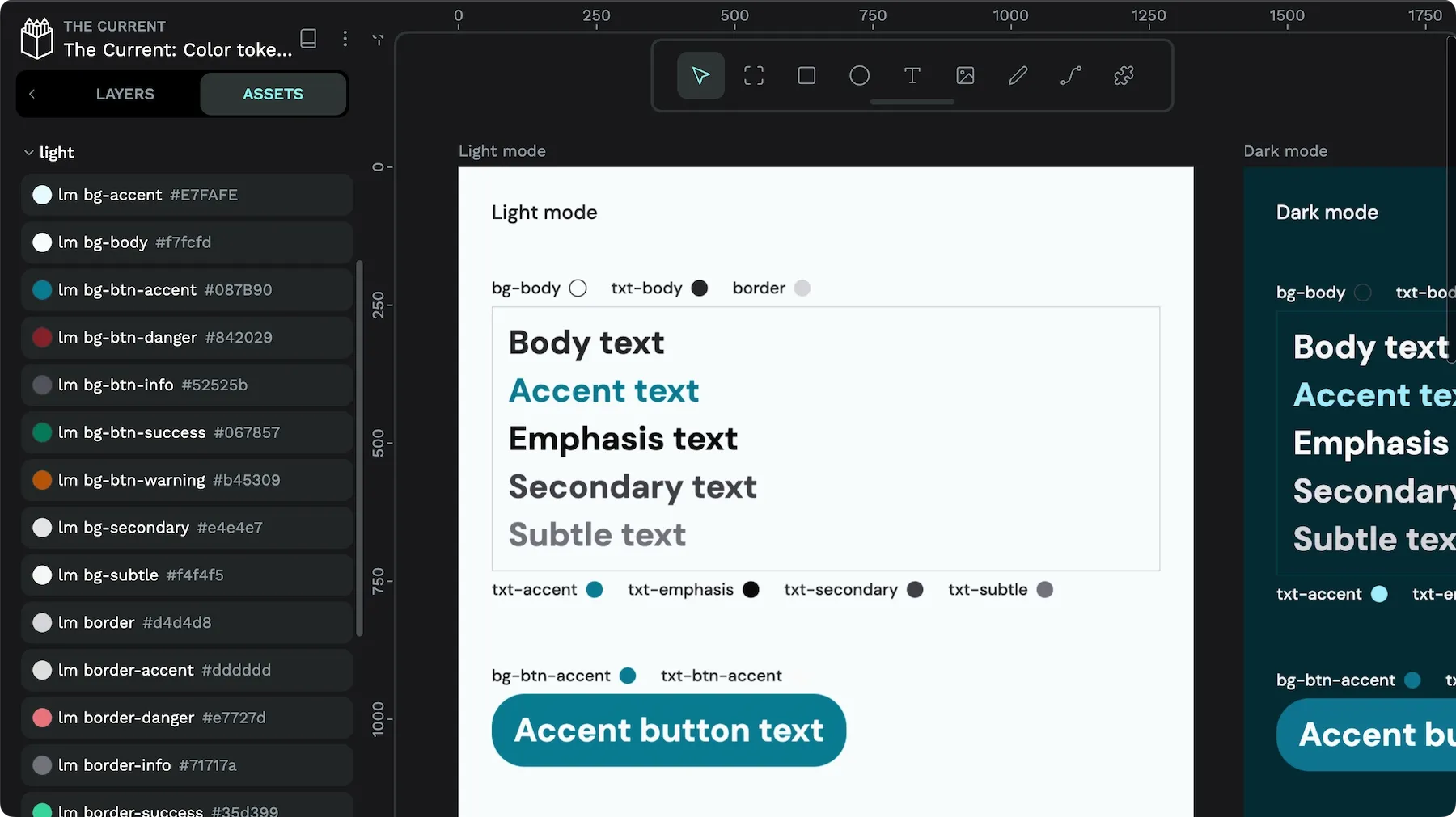
Shorthand is usually a bad idea, for example, using lft bdr instead of left border. You might save space, but you have to remember exactly how you decided to shorthand a term, and your whole team has to learn it, too. If you use full keywords, assets will also be much easier to find via search.
Grouping assets into meaningful collections is also helpful when you have a lot of assets or want to give hints on how to use them. For example, in your design system, you might want to group all your icons together, perhaps even organizing them by category or style.
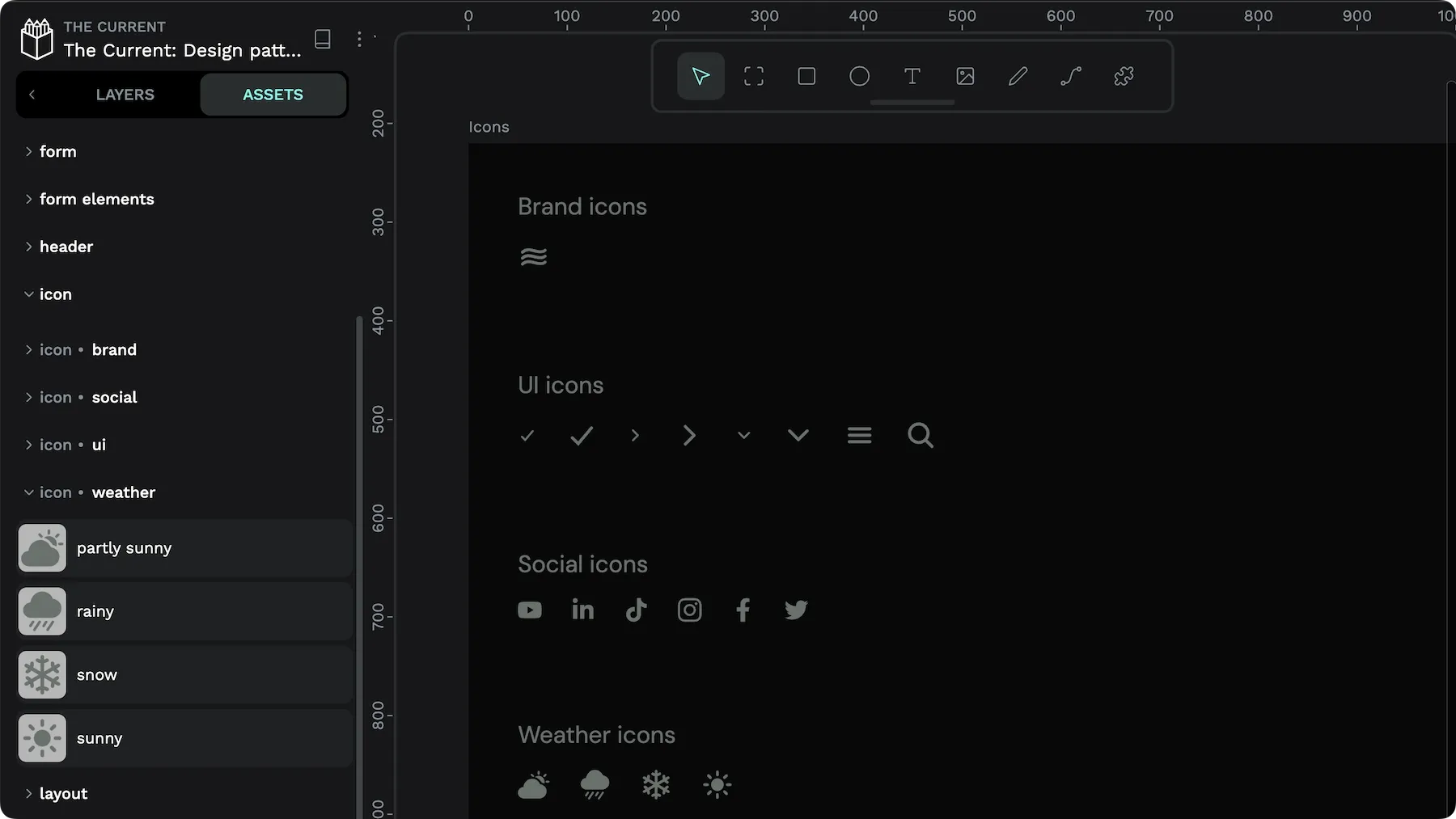
One of my favorite approaches is using asset names consistent with HTML elements and CSS variables to ease the translation between design and development.
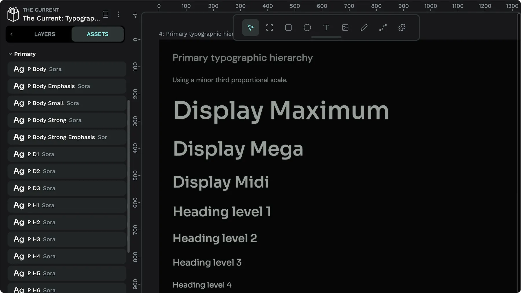
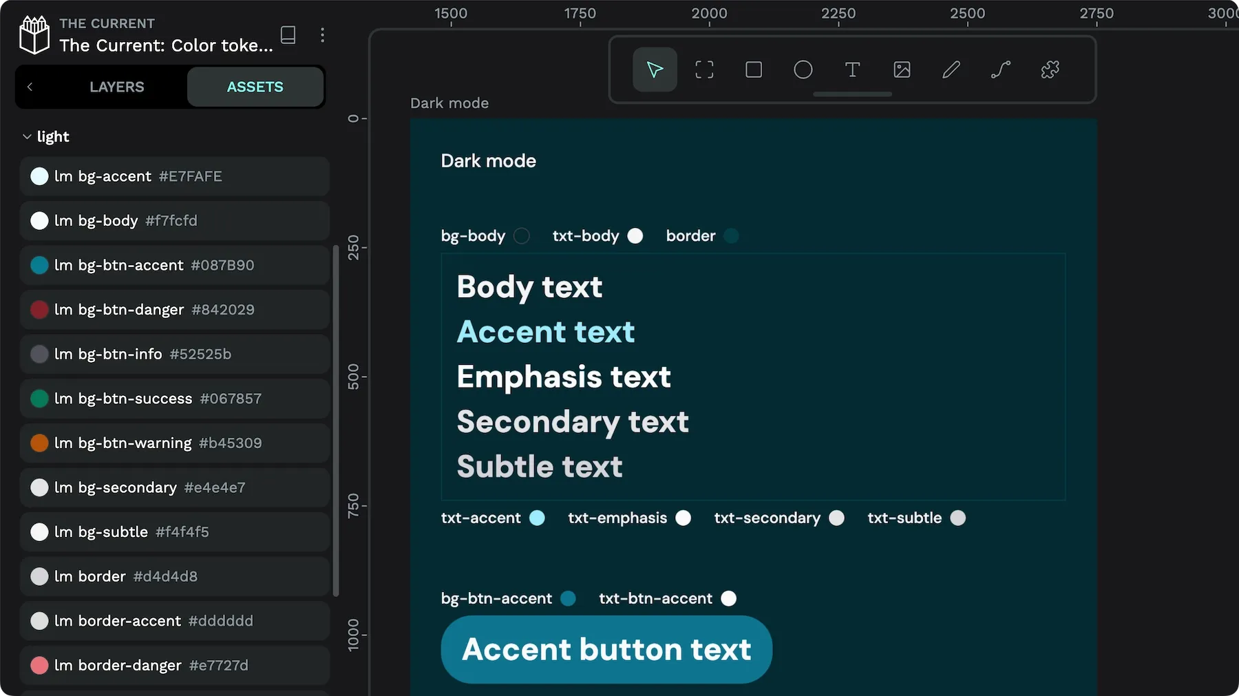
Make sure everyone on the team understands
The most crucial aspect of any naming system is that your team agrees on your system and understands how to use it. It might be helpful to write down your guidelines for naming.
Collaborate; don’t just handoff
Penpot is designed for true collaboration between design and development rather than a “chuck it over the wall” handoff approach. Penpot designs use open standards and features such as CSS Grid and CSS Flex layouts to ensure the design’s code is genuinely useful.
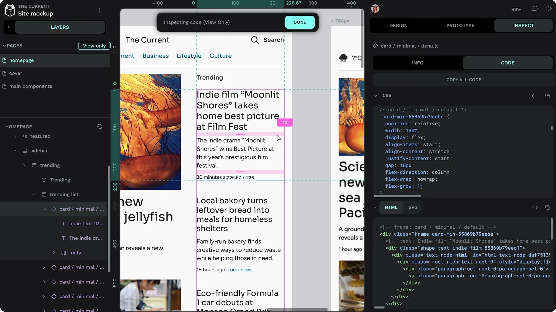
Inspect mode shows the following for the selected board or objects:
- Measurements
- Specific CSS properties
- Complete CSS styles (commented with component names and other helpful information)
- Rendered as HTML
- Rendered as SVG
You can also use other techniques to ease your design/development process. Here’s my pre-development checklist for design files:
- Use Flex and Grid for your layouts. People consume the web on many different-sized devices. Using Flex and Grid helps you make your designs responsive to the size of the device and directly translate them into CSS that developers can use.
- Annotate components. When creating a component, you can add an annotation with documentation from the Design panel. These annotations are displayed in Inspect mode.
- Create design systems using libraries. Use libraries as the source of truth for your design patterns, and then use mockup files to demonstrate implementation details and layouts. This approach mirrors best practices for UI development.
- Ensure you’re using library assets once you’ve defined them! When you’re in the design flow, objects and styles can quickly get messy. Before sharing your work, ensure you’ve documented every object is using defined assets; all color fills and strokes are using saved colors, all text has a specific typography applied, and any detached components are saved as new variations for reuse later. Using the defined assets will make the code more useful and make it easier to update your design later.
- Use consistent and meaningful names. This is so important that I’ve included it twice. Check that your asset names are consistent and that you don’t have duplicate assets with name variations.
The best design system is the one that works for you and your team
Every design system is unique. The power of a truly useful design system depends on how well it works for your team’s and projects’ unique needs. Whether you’re a massive organization with multiple projects sharing the same design system or a solo designer looking to create more consistent work, a design system will reward the effort you spend creating it.
Your design system will likely be very different from that of another team, depending on your projects and your team’s needs, and that is absolutely fine. Focus more on what works for you rather than what everybody else is doing, and you’ll be on the path to success.
With Penpot’s shared libraries, you can start your design system in no time. Sign up for a free account, invite your whole team at no extra cost, and start your design system today.

