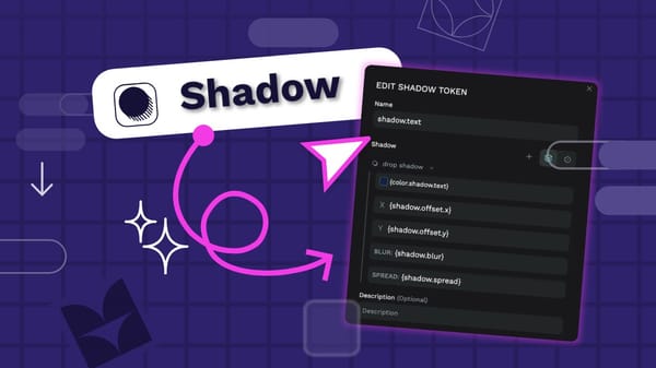
CSS Grid vs. Flexbox: Choosing the right layout for you
Understanding what is Grid vs. Flexbox and how to use them can help you build cleaner layouts, write less code, and avoid frustrating design issues down the line.

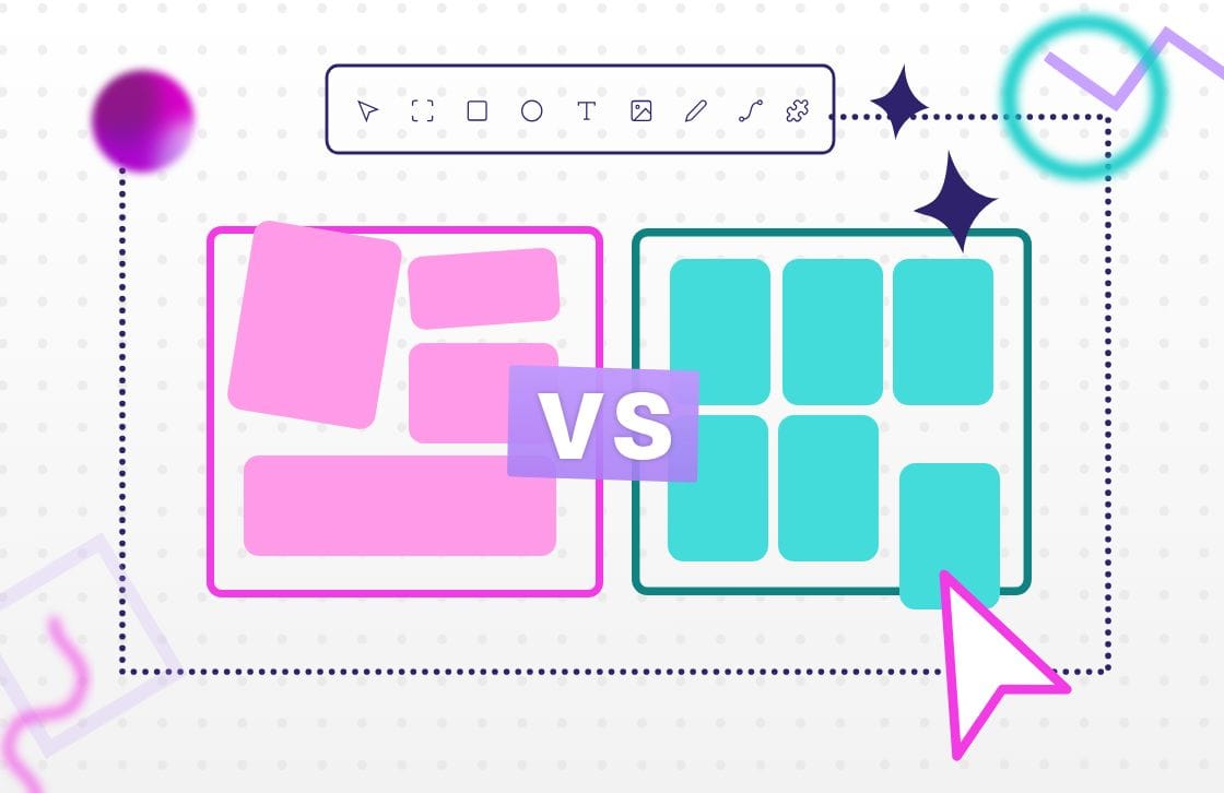
If you’ve spent any time building web pages or even just talking to developers, you’ve probably heard of Flexbox and Grid. These two layout systems are core parts of modern CSS, and they make structuring a page faster and more flexible than older techniques.
You might have already used one of them without realizing it. But understanding when to use Grid vs. Flexbox can help you build cleaner layouts, write less code, and avoid frustrating design issues down the line.
Both layout options are built into Penpot, making it easier than ever to design and implement responsive layouts visually, you don’t even need to know how to write the corresponding CSS. This guide will walk you through how Grid and Flexbox work, what each one is best at, and how to combine them to level up your design workflow.
What is CSS Grid Layout?
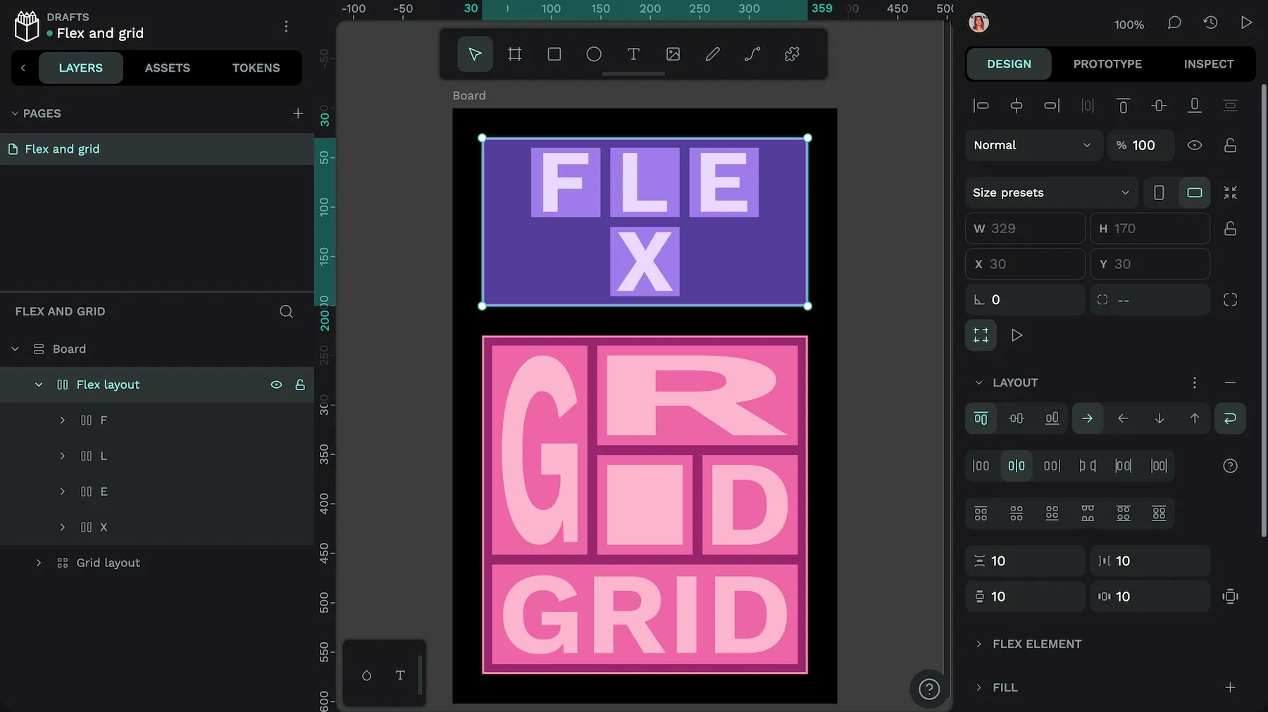
CSS Grid is a layout system that lets you place elements in rows and columns — like a spreadsheet for your webpage. Because it works in two dimensions, you can control layout both horizontally (across) and vertically (down) at the same time.
Grid is well-suited to complex layouts and can reduce the need for deeply nested wrappers by giving you explicit control over rows, columns, alignment, and placement. You define a grid on a container, then place child elements inside it using grid lines, tracks, and areas.
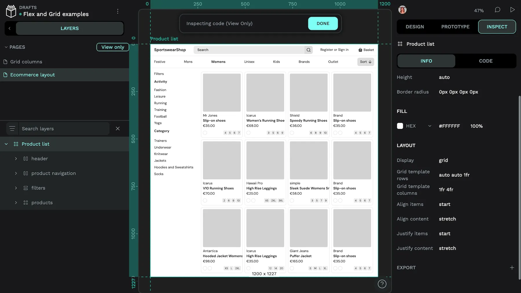
One key feature of CSS Grid is the fr unit, which divides the available free space among tracks. In simple cases, it can behave like proportional columns. For example, using 1fr for three columns, will result in three equal-width columns:
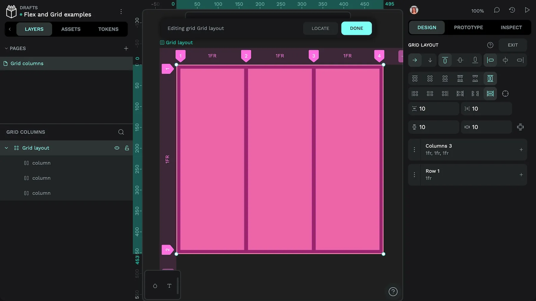
1fr wide.But once you add fixed sizes, gaps, or min/max constraints, using fr allocates free space rather than acting like percentages. In the following example, the first column is 100px wide, leaving the second and third columns with 1fr width each to divide the remaining space between them:
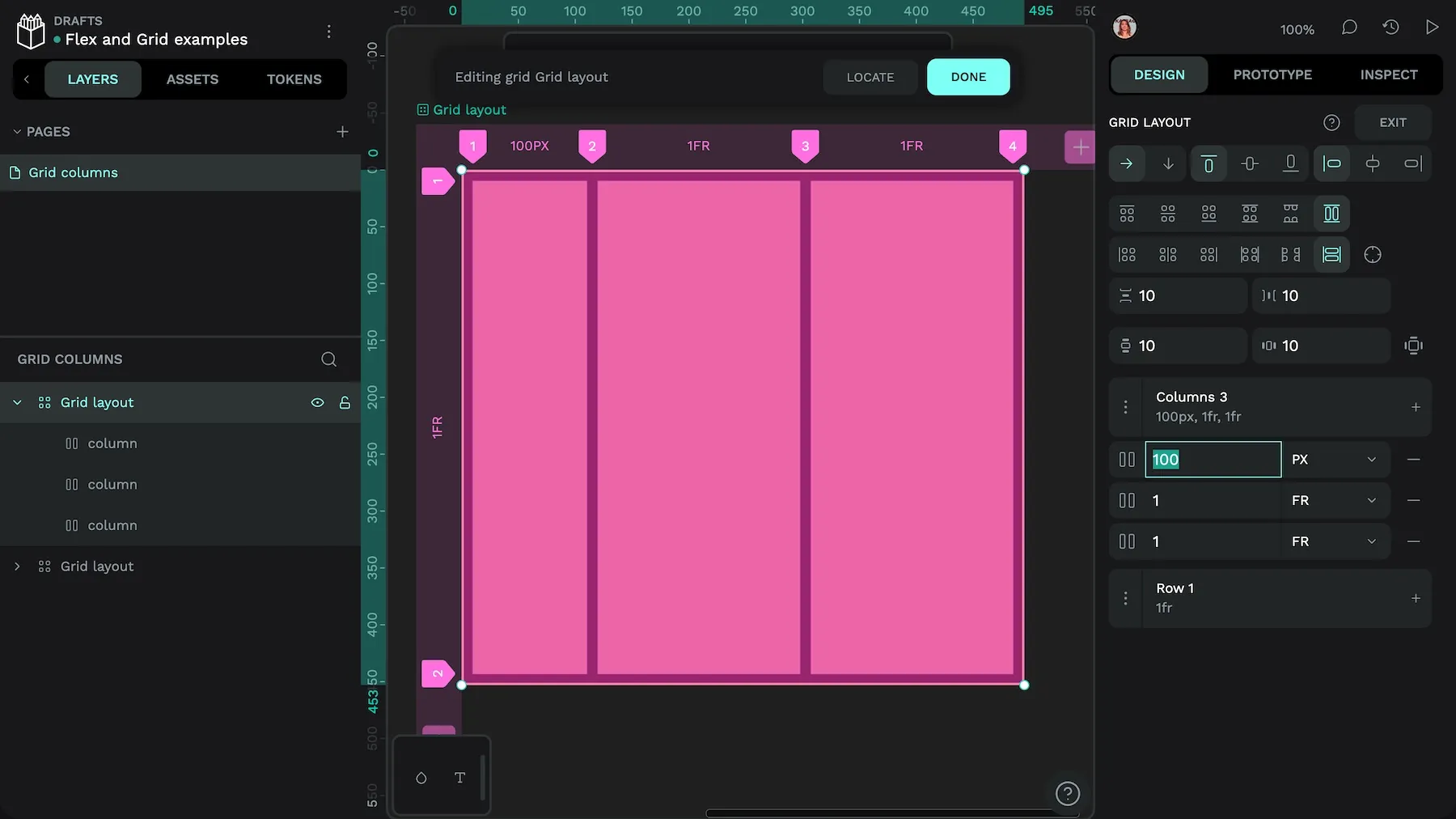
100px wide, the other columns fill the available space.For responsive patterns, pair fr with other flexible units like fit-content, minmax(...) and container queries or media queries.
What are the advantages of CSS Grid Layout?
CSS Grid gives you more control over layout than almost any other system in CSS. It’s especially helpful when your design needs to be both flexible and precise.
Here are some key benefits of using CSS Grid in your designs:
- Simpler HTML markup: You can express a lot of your page structure in CSS, often reducing the need for extra wrappers or deep nesting.
- Responsive by design choices: Use flexible track sizing (for example
repeat(auto-fit, minmax(...)),fr,%) and, where needed, container/media queries to change columns, rows, or gaps across screen sizes and build responsive designs. - Two-dimensional layout: Because Grid works on both rows and columns, it’s ideal for very structured designs like dashboards, galleries, or multi-panel interfaces.
- Named placement areas: You can assign named grid areas spanning multiple columns and rows, and place items into those specific areas.
- Automatic placement: Grid can auto-place items into the next available space, which saves you the time and effort of figuring out manual positioning.
Grid will feel familiar to designers coming from graphic design (like I did!) where layouts are often aligned to underlying grids. All of these benefits make CSS Grid a powerful layout solution that any developer should have in their toolkit.
When should you use CSS Grid Layouts?
CSS Grid is the right choice when your layout needs to work in both rows and columns at the same time. It’s especially useful for larger or more structured designs like dashboards, landing pages, portfolios, or anything requiring a multi-column layout.
Grid gives you fine-tuned control over spacing, alignment, and placement. If Flexbox feels too limiting or if you’re fighting with nested containers to get things aligned, Grid is probably the better tool.
You can also use Grid when you want to:
- Create a fully responsive layout with adjustable rows and columns
- Align items precisely within a container
- Overlap elements intentionally (for example by assigning items to the same grid area or spanning lines).
Grid and Flexbox are often combined, you can include Grid layouts inside Flexbox layouts and vice versa. For complex two-dimensional page structures, Grid is a strong starting point; for one-dimensional rows/columns, Flexbox is typically simpler.
What is Flexbox?
Flexbox (short for flexible box layout) is a one-dimensional layout system in CSS. It helps you align, space, and size elements along a single axis—either in a row or a column.
Unlike Grid, which works in two dimensions, Flexbox is all about distributing space in one direction at a time. That makes it ideal for simpler layouts or when you want elements to grow, shrink, or move around dynamically based on the available space.
You can also instruct Flexbox layouts to wrap when their elements exceed the width or height of their container, making Flexbox really useful for unpredictable content.
You can nest flex containers, align content easily, and avoid many of the layout headaches developers used to run into with floats or positioning hacks. Flexbox also allows visual reordering with the order property. But use it cautiously: assistive tech and keyboard navigation follow the DOM source order, not the visual order. Ideally, your visual order should reflect the source order so that your content makes sense and visual focus doesn’t get confusing.
What are the advantages of Flexbox?
Flexbox (often shortened to flex) is designed to simplify layout challenges, especially when you’re working with elements in a single row or column. It takes care of spacing, alignment, and sizing — without requiring you to write loads of CSS.

Here are some key benefits:
- Better alignment. It can be frustrating to get every element aligned just right. The automatic alignment and spacing features come in handy when dealing with hundreds or even thousands of elements.
- Responsiveness. When creating layouts for smartphones, tablets, desktops, and other devices, getting the sizing just right can be tricky. Flexbox adapts easily, so all users get an equally good experience.
- Cleaner code: You can often build a flexible layout with less HTML and CSS than older methods like floats or inline-block.
Overall, Flexbox is great for making layouts that “just work” across different screen sizes and content types, as long as you’re okay with a single axis layout.
When should you use Flexbox Layouts?
Flexbox works very well for one-dimensional layouts in a single row or column. For example, you could create a navigation bar or menu listing items to feature in a single container, then easily size and space them with very little work. It’s also useful for aligning elements on a single axis vertically or horizontally.
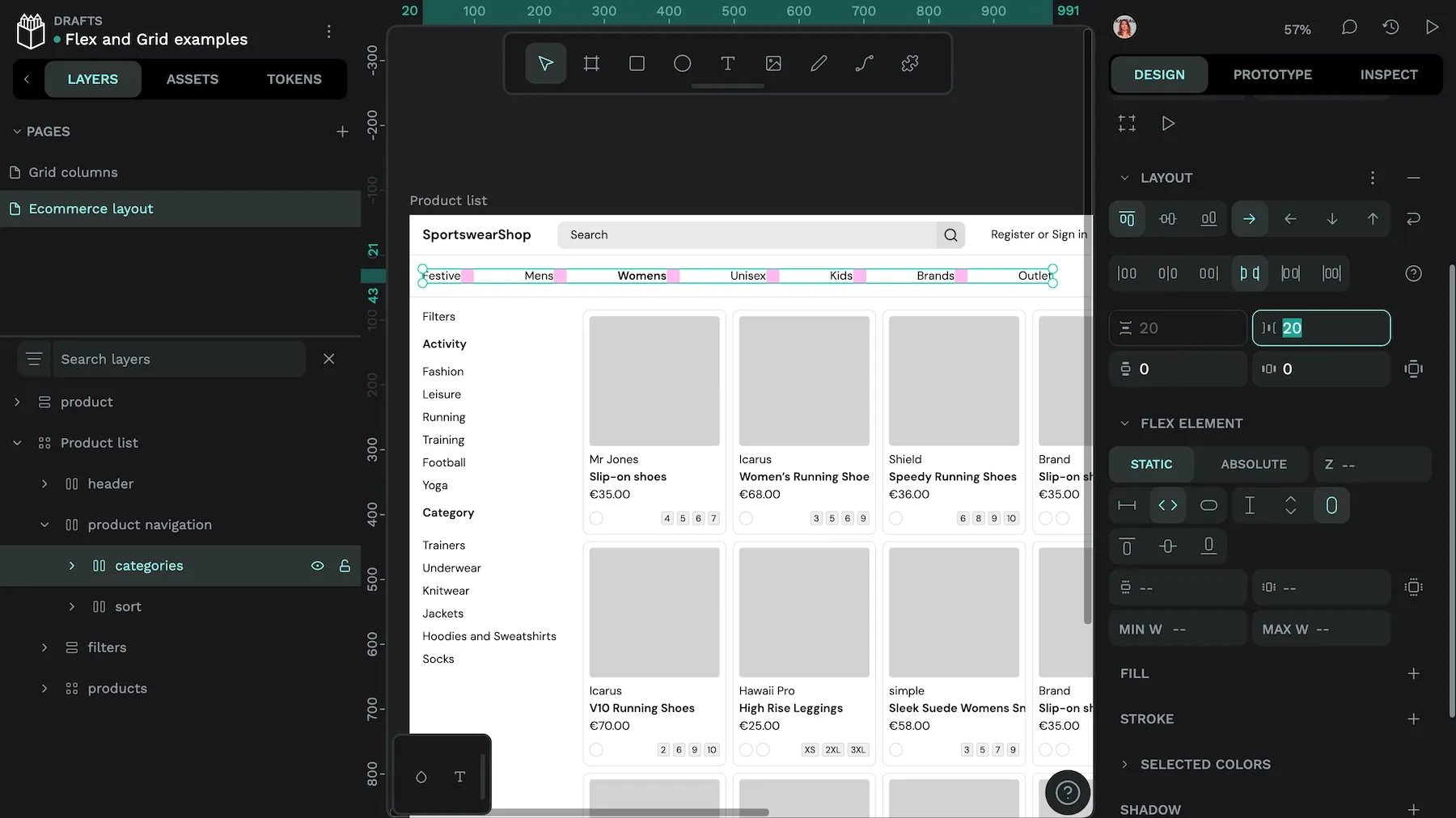
Flexbox shines when item sizes and quantities are unknown or dynamic along a single axis (row or column). It distributes free space, aligns items, and adapts as content or viewport changes, often with minimal CSS. With such a straightforward way of arranging items, Flexbox may feel easier for newer designers and developers to use right away.
Can you combine CSS Grid and Flex Layouts?
Of course! Grid and Flex Layout have unique strengths that can be used together to get you the best of both worlds.
One approach is to use CSS Grid for the larger page layout and Flexbox inside sections for alignment and distribution. Both systems support responsive design—Grid handles overall structure; Flex refines the flow of individual elements.
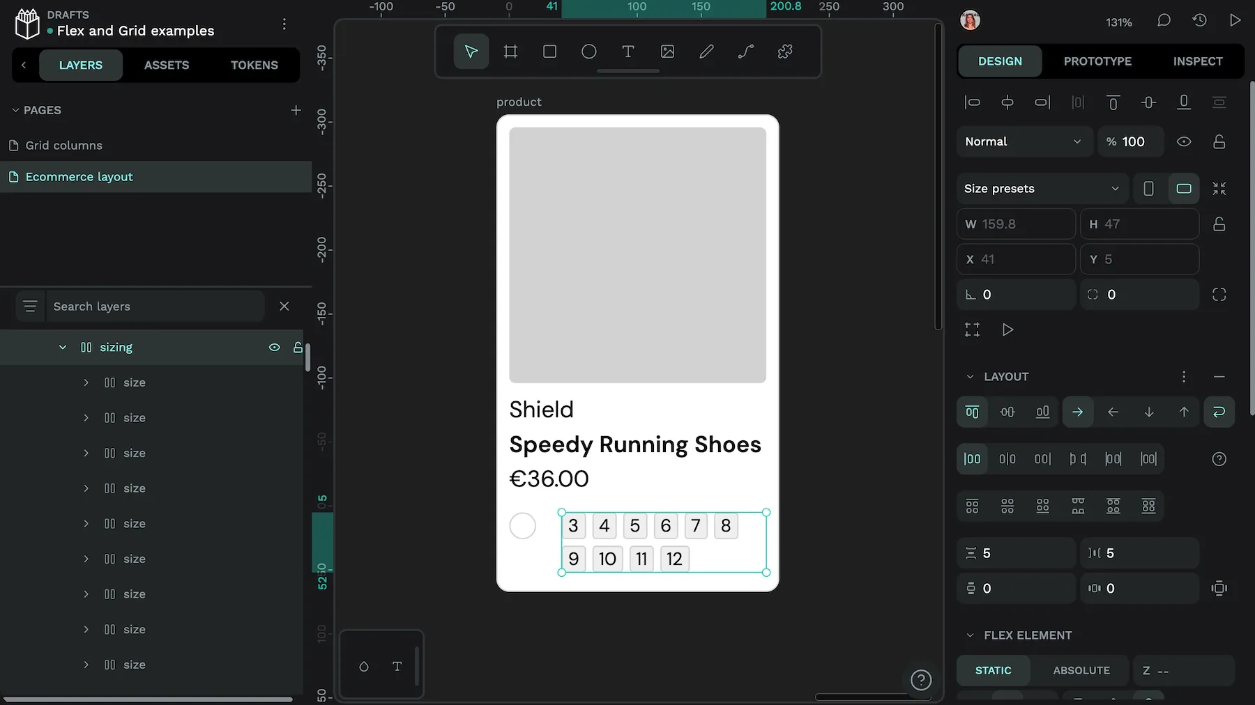
For example, imagine you’re building an e-commerce product page:
- Use Grid to lay out the entire page: a header at the top, a product image gallery on the right, and filter options on the left:
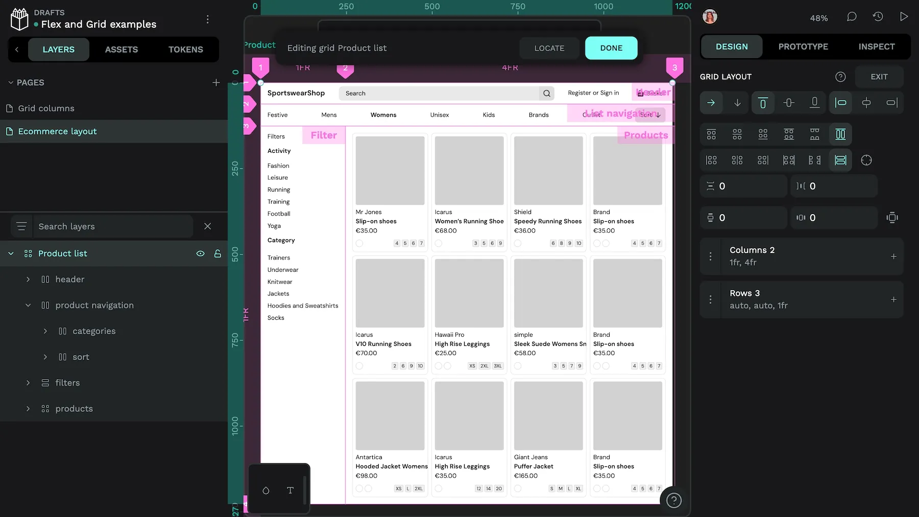
- Inside page layout, use another Grid to arrange the products into columns and rows.

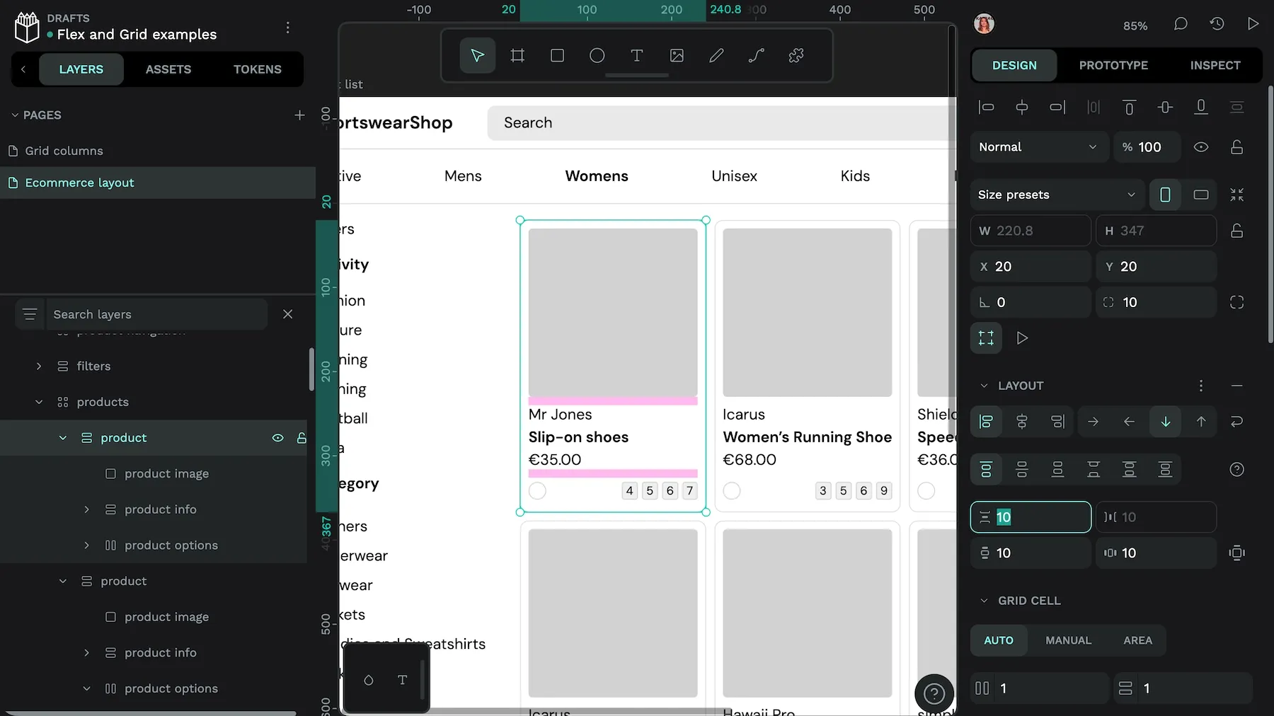
- Inside the product layout (a grid cell), use Flexbox to stack the product image, info, and options vertically.
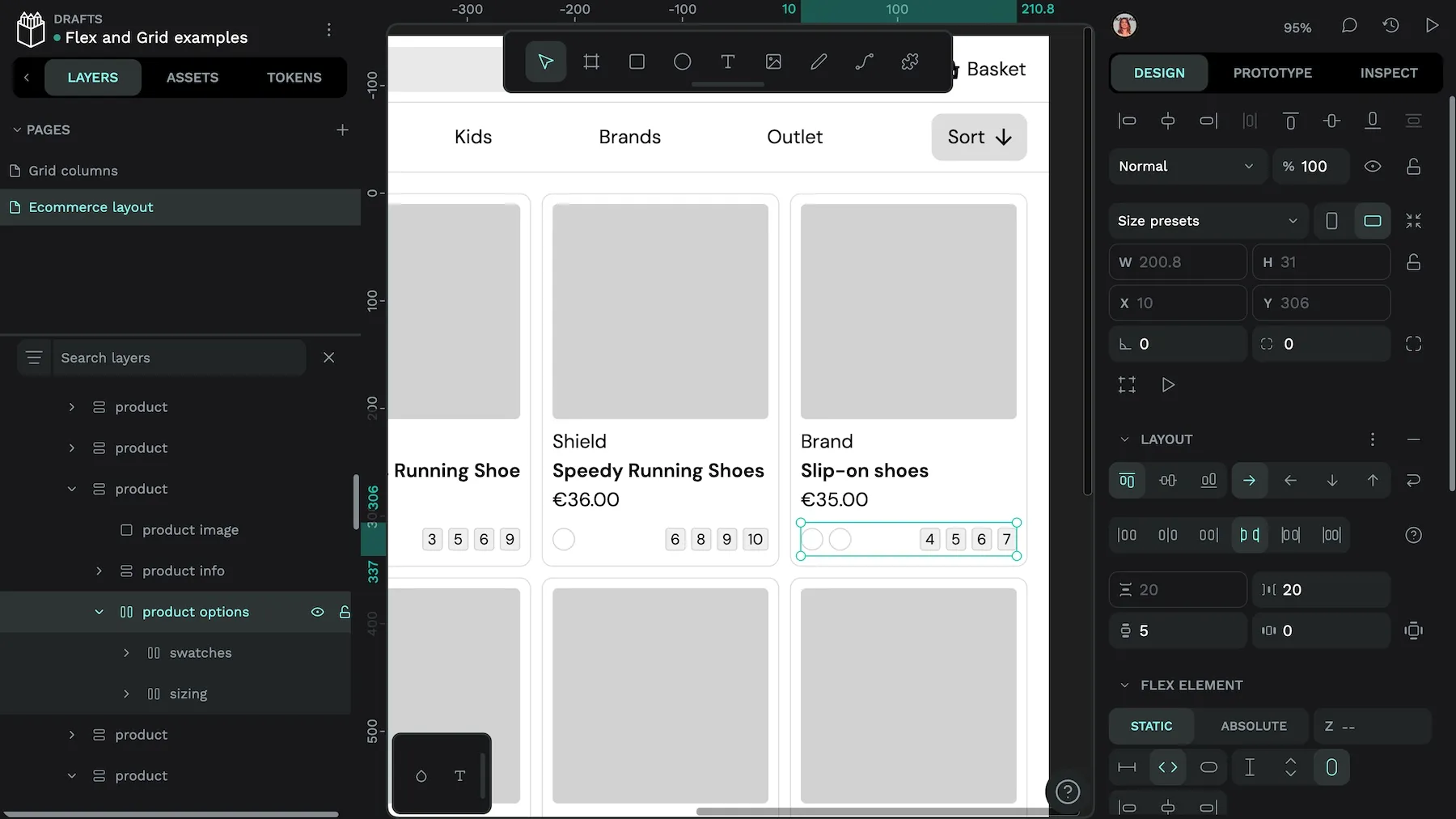
- Use another Flex container for the color and size options, placing them in a row with space between each item.
By combining both layout systems, you can keep the page structure clear and responsive while easily fine-tuning smaller layout details inside each section.
Design with CSS Grid and Flex Layouts on Penpot
Now that you know how each CSS layout strengthens your overall project design, which one will you start with? Penpot makes it incredibly easy to create with both Flexbox and CSS Grid, and the design is expressed as ready-to-use code so you can easily transition from design to development.
Sign up for your free Penpot account today and get started with some of our free templates and guides, including our Grid and Flex Playgrounds.
Related Blogs
We have more blogs about Penpot layouts and many other design and code-related topics. Here’s a few examples of layout-related articles and tutorials to help you learn more about CSS Grid and Flexbox.
 Laura Kalbag
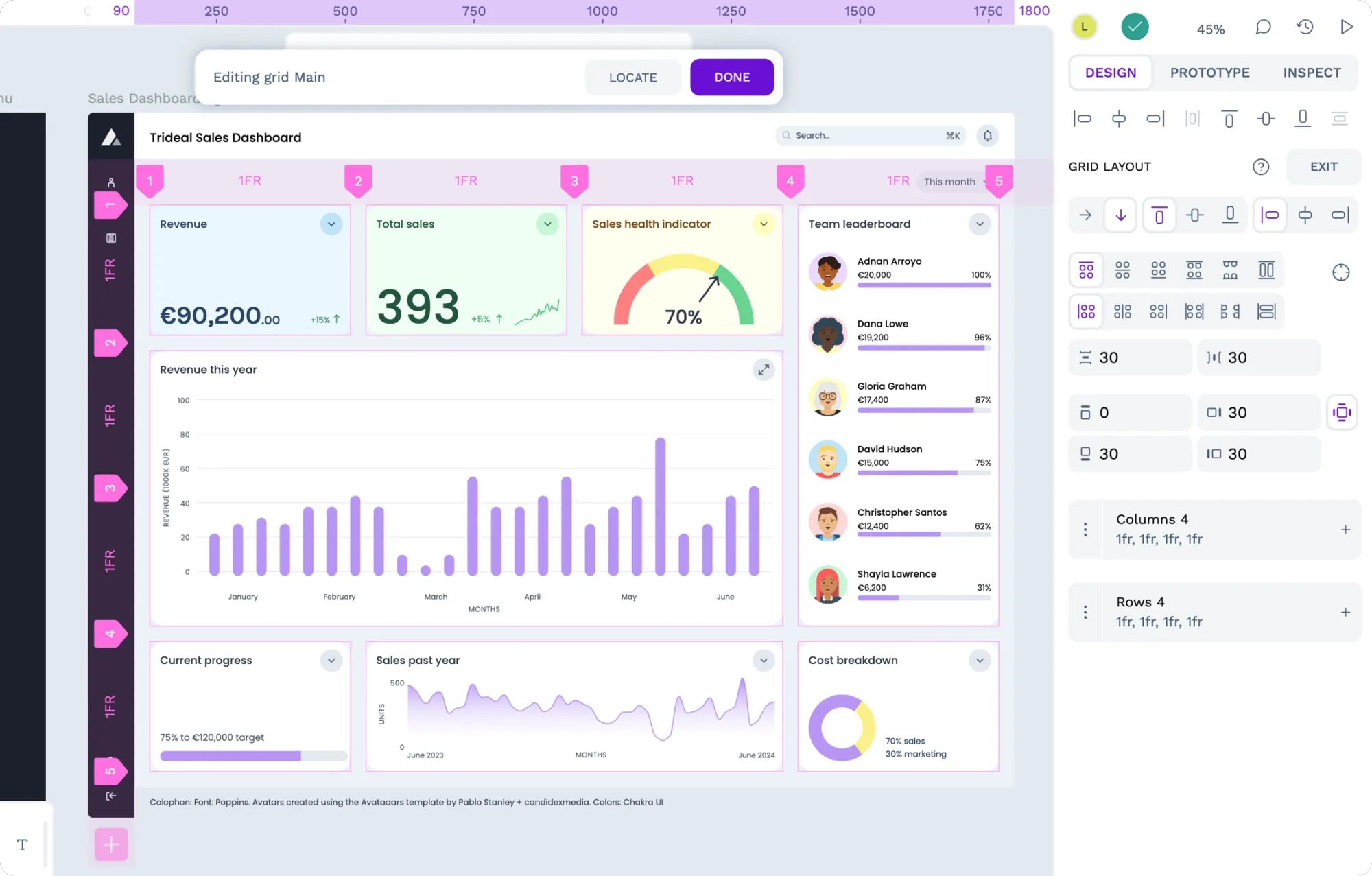
 Laura Kalbag
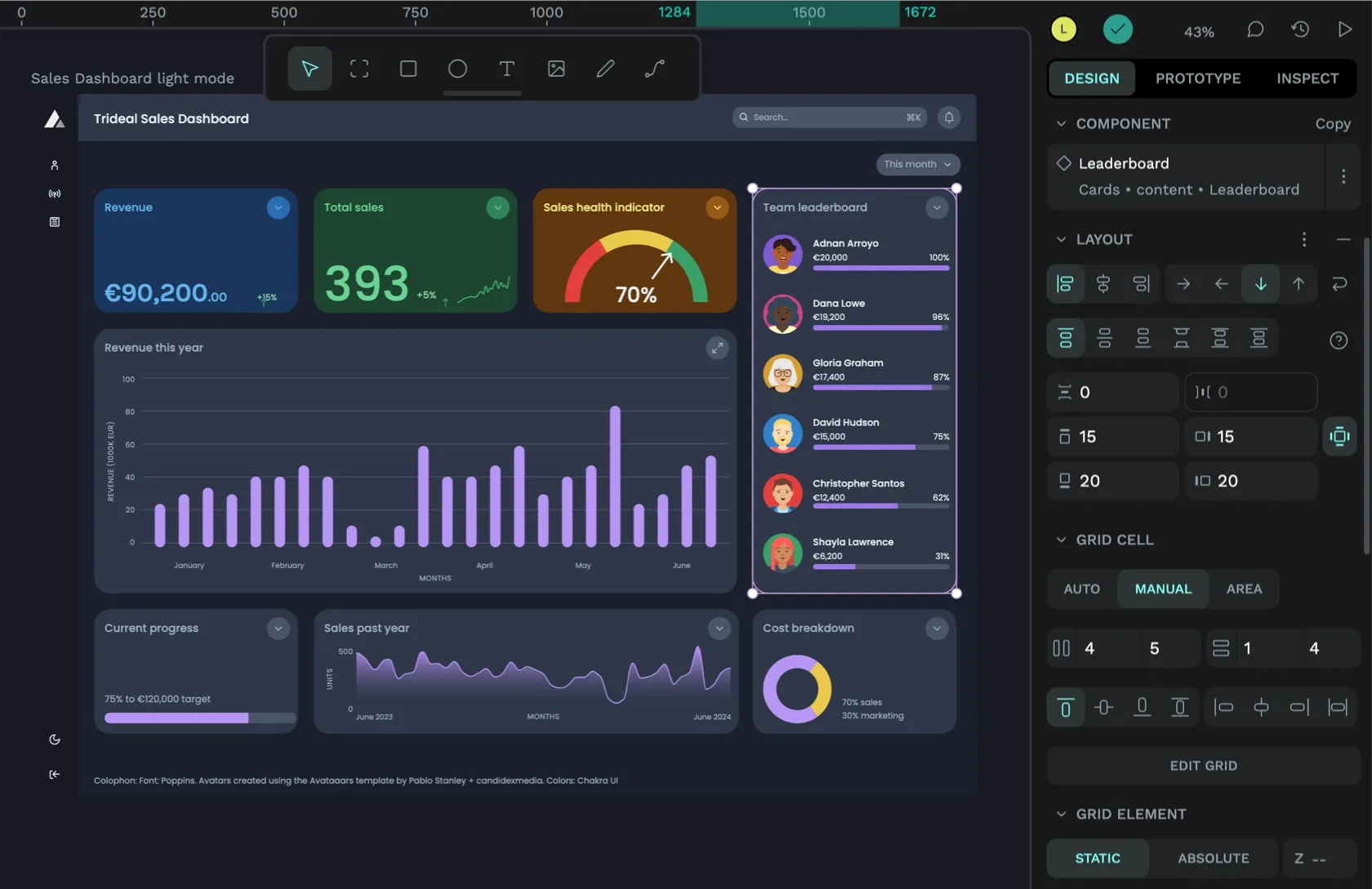
 Paula Tienza
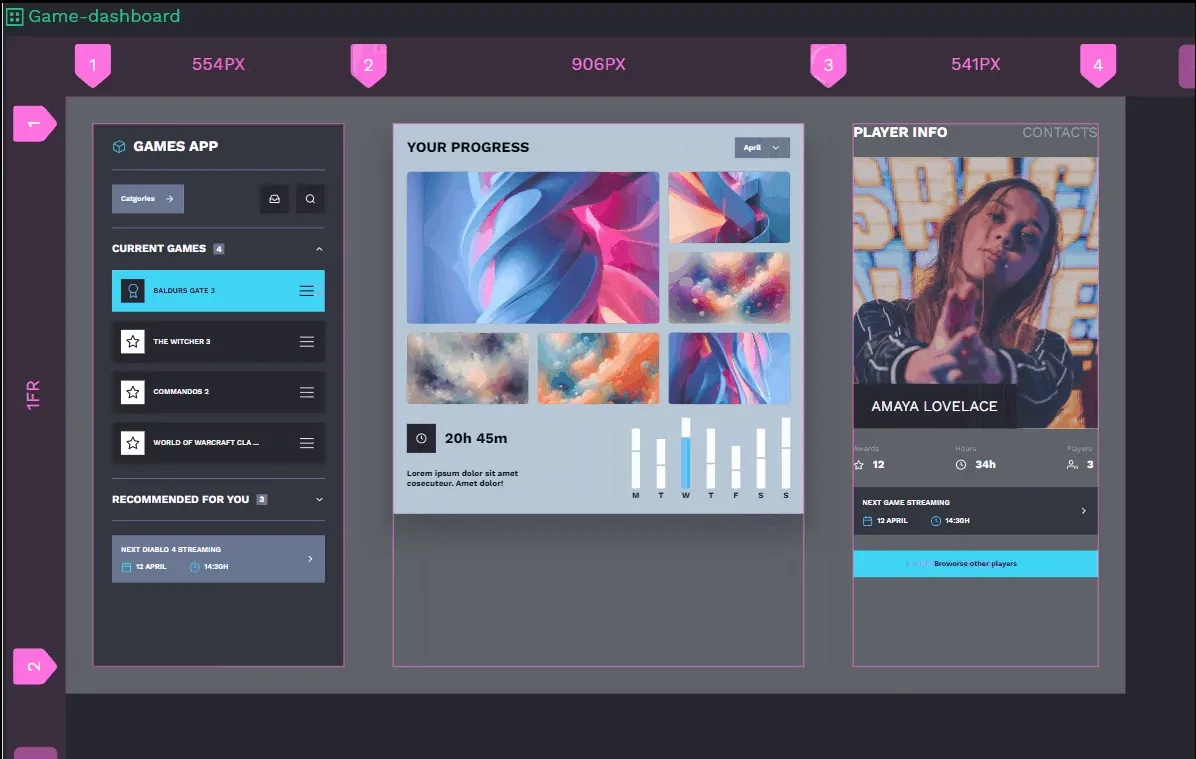
 Laura Kalbag
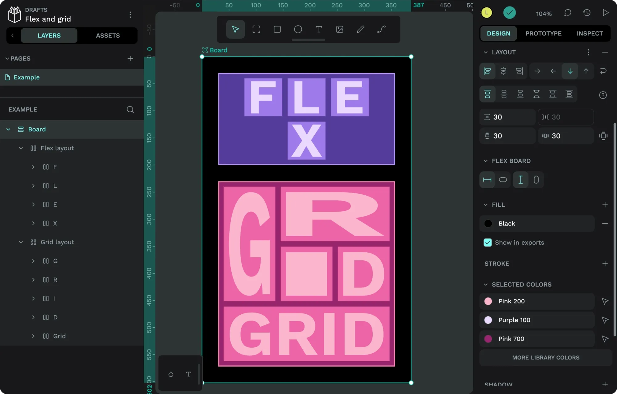
 Laura Kalbag