Creating a design system: A beginner’s guide in 7 steps
A design system guides every new project and helps designers, developers, and other teams stay unified in their workflows. Learn how to create a design system in 7 steps.


A design system is a set of rules and standardized assets formed by components for creating new designs. It guides every new project and helps designers, developers, and other teams stay unified in their workflows. The use of a componentized system eliminates the guesswork of trying untested elements and saves much back-and-forth between teams.
Design systems make it easier for companies to scale UX design and create a consistent UI for users. Each organization will have its own approach, but these general strategies for creating a design system will set you on the right path.
1. Make the rules
Design systems should be made with the end in mind. If you’re an established organization, some of this groundwork will have already been done with mission statements and other documents like this. However, your design system also exists for its own purpose, and you’ll need to determine what it hopes to achieve.
In addition to having more intangible goals, this is the phase where you’ll determine the technology for the design system, how it will be created, and who will be involved. Consider this for your master plan (the design system).
2. Create the UI inventory
Counting up all the different UI elements and assets of past projects (and accounting for new ones) is a time-consuming process. However, it’s necessary to take a complete inventory.
- Pick a tool to document your inventory: If you use a design and prototyping tool like Penpot, you can use its features to keep track of your elements.
- Go through your past projects: Take screenshots and collect design files as far back as you can. Capture fonts, colors, buttons, or any other design elements you’ll want to codify in your design system. This will likely total hundreds of elements and design choices.
- Consult with design and development teams: Not every design piece may be found in past projects. By checking with your teams, you can account for any in-progress items or items that were well-loved but not yet used. They may also know which ideation is the most recent.
- Group your elements: Categorize each item by type, including color, typography, grid, icon, and pattern. It may be helpful to reference other design systems to see how organizations most commonly break them out.
- Refine your inventory: Now it’s time to look for duplicates to remove and gaps where you can create new items.
- Collaborate: With a preliminary inventory created, you should ask for feedback from teams. Using a tool like Penpot simplifies notation and commenting, showing feedback in real time.
After the feedback phase, you can establish your inventory. Just be aware that it is a living collection and will change as your organization does.
3. Create your color palette
Design systems use a uniform collection of pre-approved colors for new elements so that there’s a consistent look and feel across all assets. To make a color palette:
- Establish brand colors: If you already have some, review them for appropriateness and refresh as needed. Include a variety of tones and hues, including neutrals and shades of black and gray. Use color scales to create slight variations of approved colors for different purposes.
- Decide on semantic colors: Semantic colors are those that infer meaning in a user interaction. For example, red can mean error when submitting a form, or green can mean success when making a purchase.
- Organize, name, and label colors: With your colors chosen and assigned a goal, you can name them in a way that makes sense for everyone. The shade color and purpose should be included in the naming convention so that similar colors aren’t confused.
- Test your colors: By creating prototypes and displaying them on different screens and with different settings, you can see if they work in real-life use cases. Then, adjust as needed.
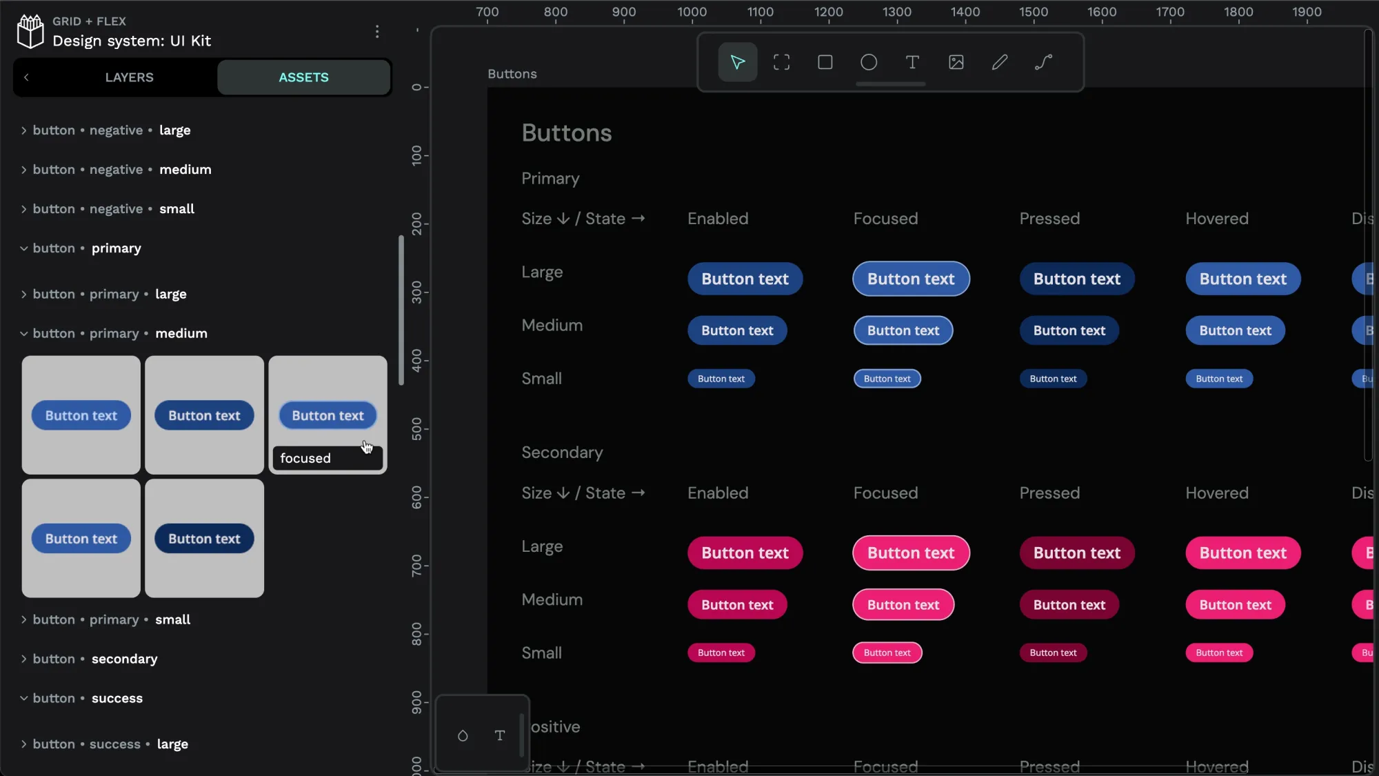
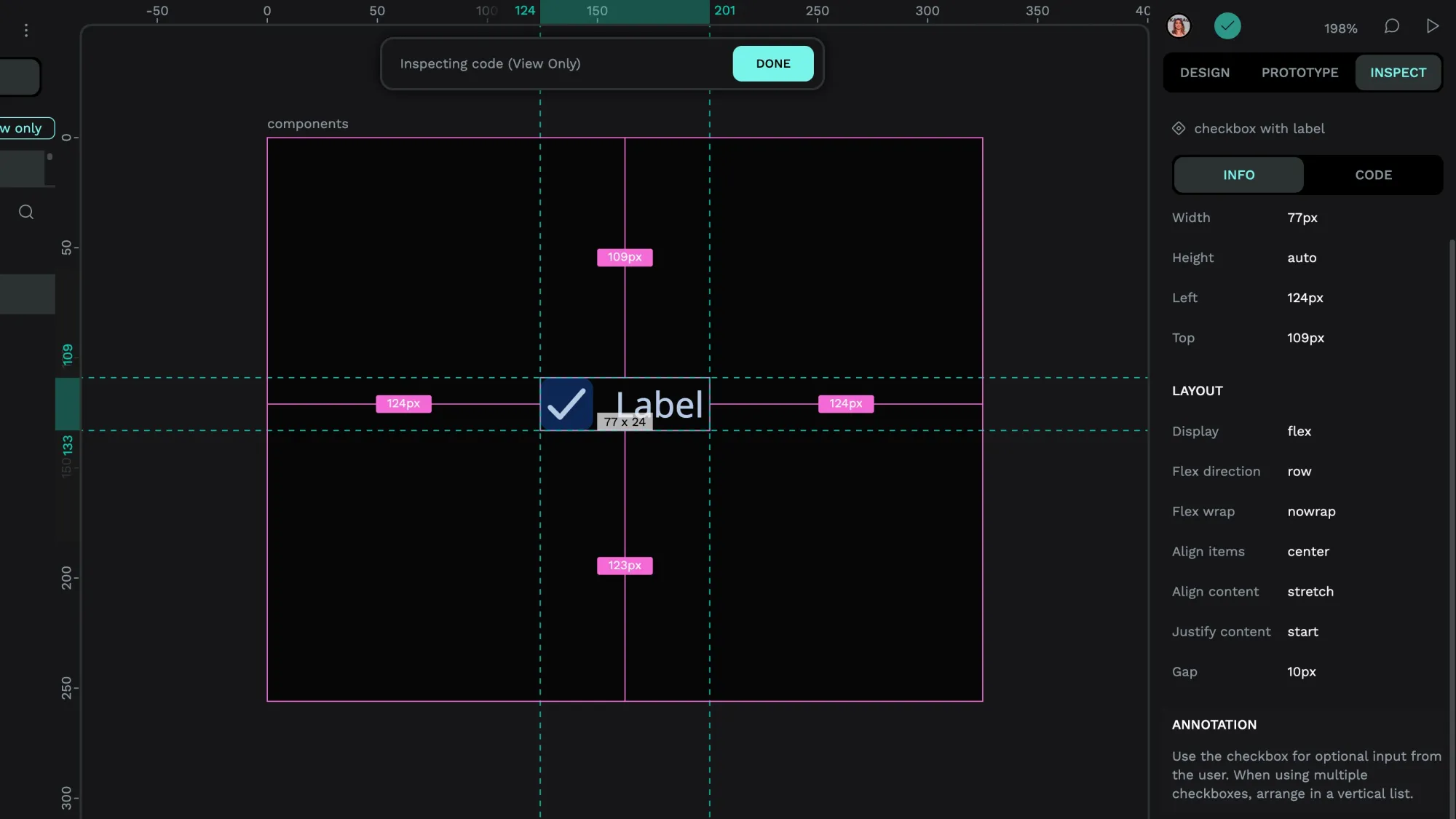
Updating a component in Penpot
4. Build the typography
Fonts, typesets, and other written language elements make up the typography of a website or app. It’s incredibly important to create a consistent experience for customers and to help users identify your brand projects at a glance. Creating the typography includes:
- Picking your fonts: Consider your brand identity and values, as well as accessibility to all users. If you will be using another company’s fonts, be sure you have permission to use or modify them.
- Sizing appropriately: In addition to the fonts, design how big or small to make them for each use case. Additional considerations include the weights and styles, such as italics and bold, to be sure they will work in your applications.
- Setting your standards: Design systems work because they create rules on how font typesets will be used. Make defaults for headers, links, buttons, and menus so that designers and developers know how and when to use them.
- Testing and refining: Just like with colors, typography elements should be tried out in a variety of environments to be sure they render clear, crisp, and to your standards.
5. Select your icons
Your iconography is not only a functional tool to help users of any language or background get around your site, but it also creates an incredible branding opportunity. Logos, in particular, are an example of iconography that works to build your reputation. Assemble your icon library in much the same way as your typography, choosing icons that communicate messages easily and at a glance.
Icons can be created in multiple sizes and colors to fit multiple uses. For example, the Home page icon on an app may be smaller or more simplified than one on a desktop site. They should closely resemble each other in design, however, so that users have familiarity when interacting across devices.
Icons can be easily added to your design system through an app like Penpot, which makes it easy to store and share icons for use in future wireframes and prototypes. There’s a wide variety of icon templates in Penpot for you to experiment with.
6. Configure other components
What will you do with white space? How far apart should your containers be? These are additional design and development decisions that can be made and added to the design system as they are figured out.
Penpot currently supports Flex Layout and Grid Layout, so as you decide on spacing, for example, you can add it to your asset library directly. This makes it easy for the next person to space out items by default and maintain your standards for quality and detail with every web project you build.
7. Solicit thoughtful feedback
While you don’t want to slow down design system creation with too many opinions, you can benefit from getting guidance from the very people who will put the system to work. Designers and developers have a lot to say about how a design system will affect their processes and can have good input on the things to create right away (and those that can be tabled for later.)

With a tool like Penpot, getting this feedback doesn't have to be a chore, and it's more streamlined than endless back-and-forth emails or Slack threads. Users can add comments right inside the icon library, for example, giving ideas for making elements better or sharing details about which icon version is the best.
The useful revision history also shows what’s been added or changed since the last iteration, so if you change your mind, it’s easy to go back a step or two. Working across time zones isn’t an issue either; Penpot offers real-time collaboration with the ability to tag others in questions to respond to later.
Final thoughts on creating a design system
Design systems can include many more components than what was listed here. Some companies also create accessibility guides, pattern libraries, and content guides and add them to their design systems for all team members to access and use. Which ones you end up creating depends on your overall design and development mission.
When first creating your design system, start small and begin with just one piece at a time. You may decide to start with the library that's almost complete or that you'll put into use right away, such as the icon library or color palette. The order may not be as important as your thoroughness and commitment to keeping your design system updated.
As your organization adds new collections and revises each element, you’ll update it in the design system along with any documentation on how to use it.
To get started on your company’s first design system, sign up for Penpot and check out the walk through of our design system features. In this guide, you’ll learn all about how Penpot can help you easily create your next design system with our new set of advanced components.
With these features — the soon-to-launch design token system in collaboration with Tokens Studio as well as the upcoming variations— your design system will continue to evolve and improve.
Related Blogs
Check out our other blogs, from informative topic guides to tutorials on how to get the most out of Penpot.
 Laura Kalbag
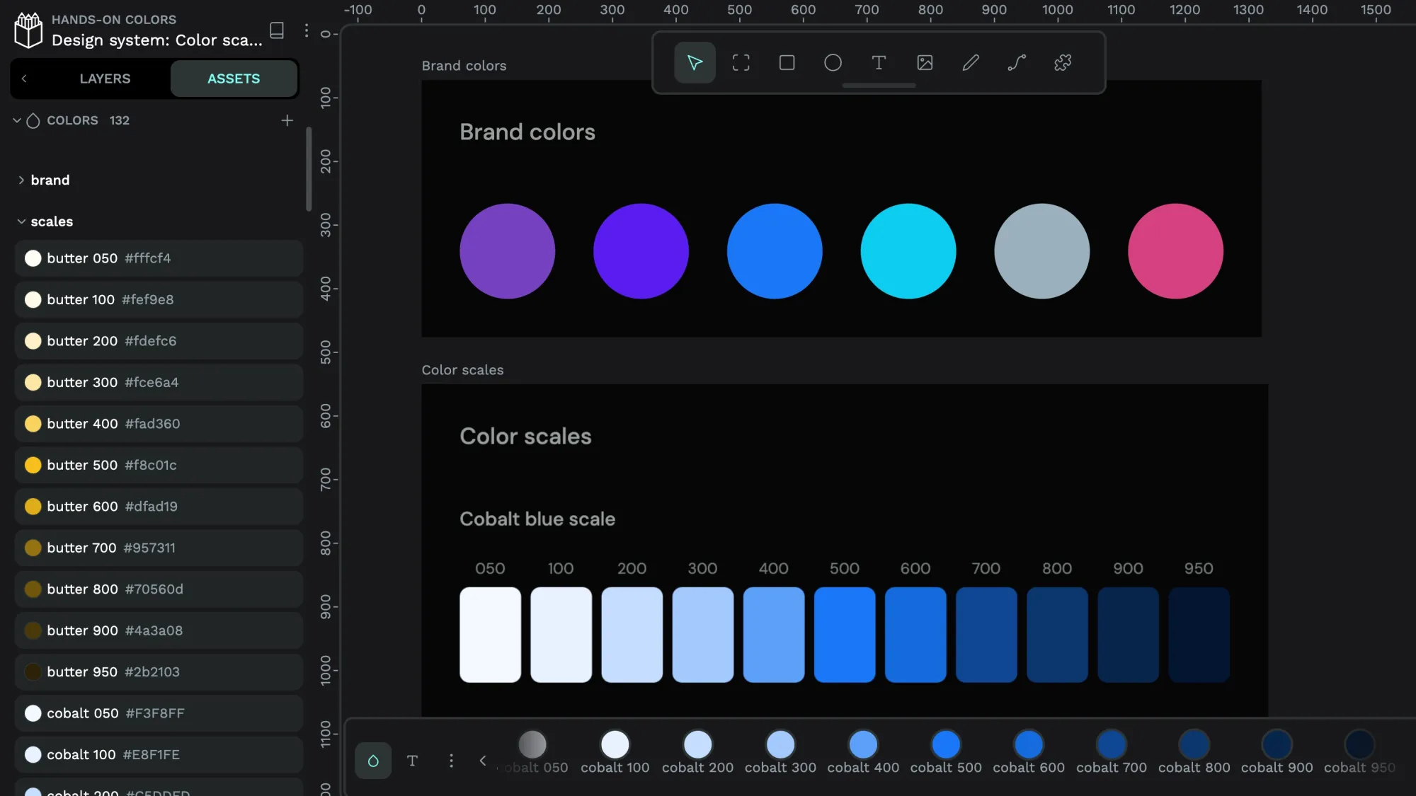 Paula Tienza
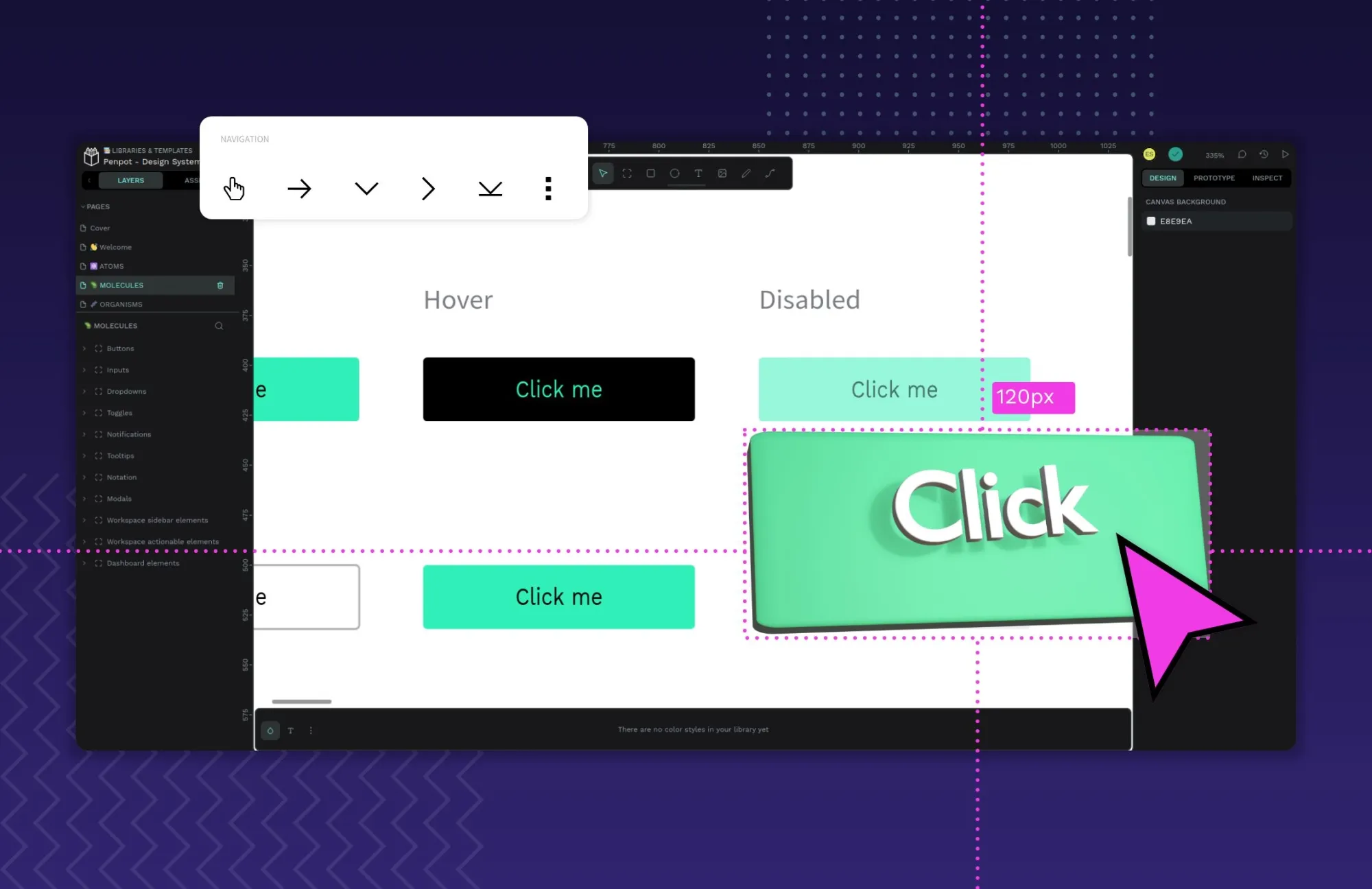 Paula Tienza
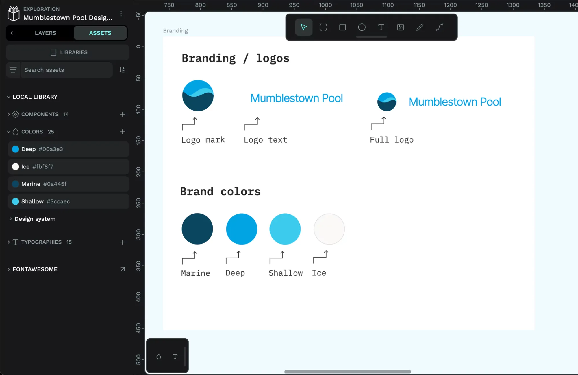 Paula Tienza