Accessible Design Checklist
Improve your design’s accessibility with this quick reference checklist and Penpot plugin.

Accessible design is when you make your design usable for disabled people. Factoring in a range of hearing, movement, sight, and cognitive abilities makes your product a better experience for everybody while preventing the exclusion of disabled people who would otherwise not be able to use it.
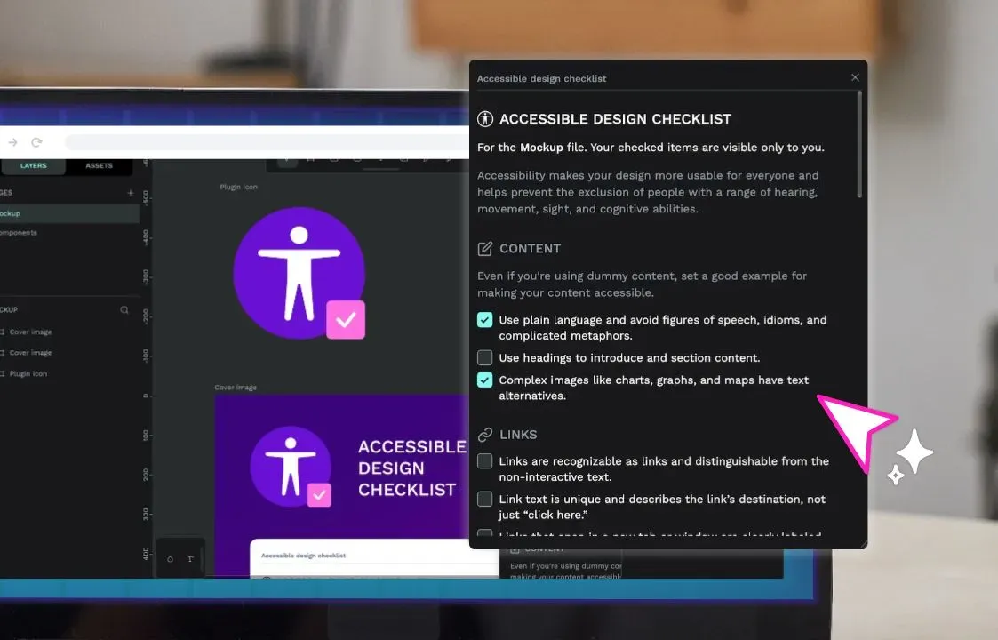
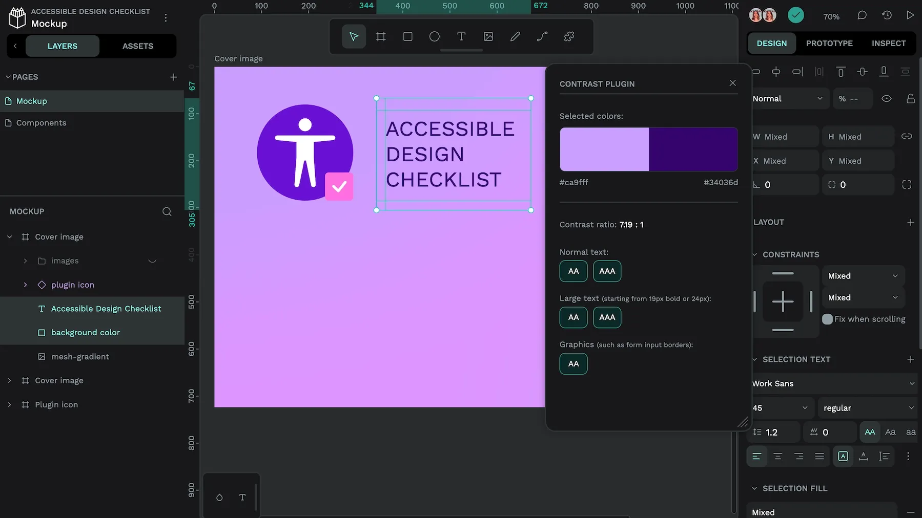
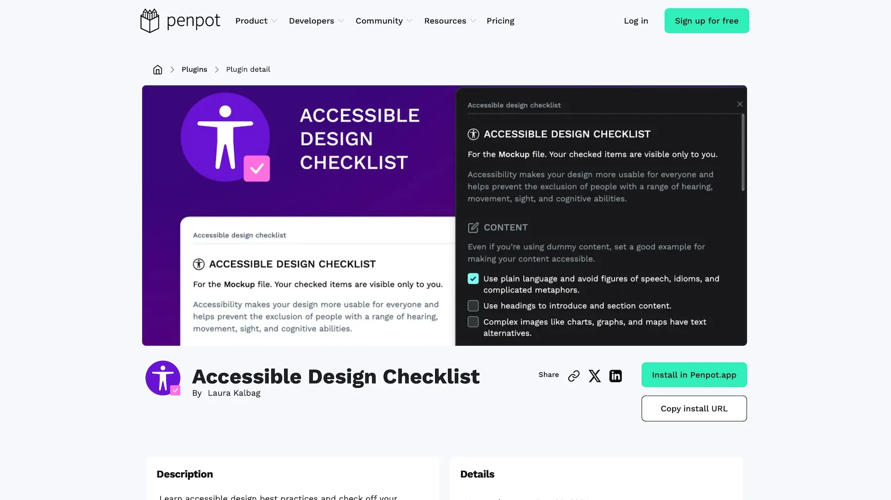
At the end of 2024, I created an Accessible Design Checklist plugin for Penpot. I wanted to make it easier to review my work for accessibility and check off items I had already considered in my design.
I was inspired by the How to meet WCAG (Web Content Accessibility Guidelines) Quick Reference. Many countries use WCAG as a baseline for their laws and regulations around digital accessibility, so it is a valuable reference. The Quick Reference is a straightforward list that explains how to meet each of the requirements of the Web Content Accessibility Guidelines.
I was also inspired by the simplicity and structure of other accessibility checklists, including the A11y Project’s accessibility checklist and Geri Reid’s WCAG accessibility checklist for designers.
The upsides and downsides of checklists
Checklists can’t address every need or accommodation specific to your product, you can easily miss an issue unique to your product. However, checklists can help you avoid some of the most obvious issues and learn more about accessible design.
This checklist covers design issues. Check out the WCAG Overview for the full WCAG requirements.
Let’s jump into the checklist. You can check off the items, but please remember that your progress won’t be saved if you refresh or leave the page!
Accessible content
Often, designers write content and microcopy as part of their designs. We create placeholder content while we await the final copy. Even if you’re using dummy content, you can set a good example for making content accessible.
Link design
Links are one of the web’s most essential features, yet we often design them to blend in with surrounding text rather than make them stand out and easily find.

Layout design
Accessible layout design involves creating predictable and recognizable designs so people can access any page on any device and have (as close as we can get to) the same experience.
Navigation design
Like layout design, navigation is most useful when users can quickly find what they need.
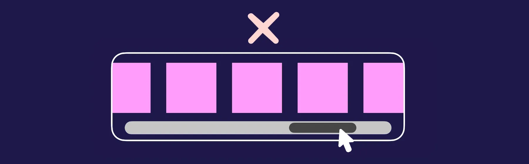
Accessible color
For people who are color-blind, blind, or have difficulties with sight, it can be difficult or impossible to understand the meaning of information when it’s communicated only through color.

Accessible color contrast
Adequate contrast between the foreground text (or object) color and the background color ensures that it is readable or distinguishable.
Accessible typography
There’s a lot to accessible typography, and it’s hard to apply strict guidelines. Firstly, it depends on the readability of your chosen font and ensuring the text is large enough for most people to read without needing to zoom in. There are no specific guidelines around text sizes, as different fonts render the same font sizes at different pixel sizes. 16px is usually a good size for body text; anything below 14px can be tricky for most people to read.
Accessible images
The best way to make images more accessible is to ensure you’ve provided text alternatives for people who can’t see or understand the image. You don’t need to do this for solely decorative images, but make sure you include alternative text for any images that are part of or support the content.

Interaction design
Interaction design is how our design works for users. How do they know what they can interact with? Is it easy to interact with the elements? How do they know what they’re supposed to do? Accessible interaction design prevents barriers for people using our interfaces.

Form design
From sign-up and login forms to apps that take, forms are the primary way users interact with our designs. Many app interfaces are just fancy forms. Accessible form design requires taking care to ensure users understand how to use form inputs and are able to use the inputs regardless of whether they’re using a mouse, keyboard, touch interface, voice control, or another form of assistive technology.

There is no such thing as 100% accessible. Accessibility that accommodates every individual person’s needs is very difficult and impossible to test. But with some thoughtful design decisions, we can make a huge difference to many people.
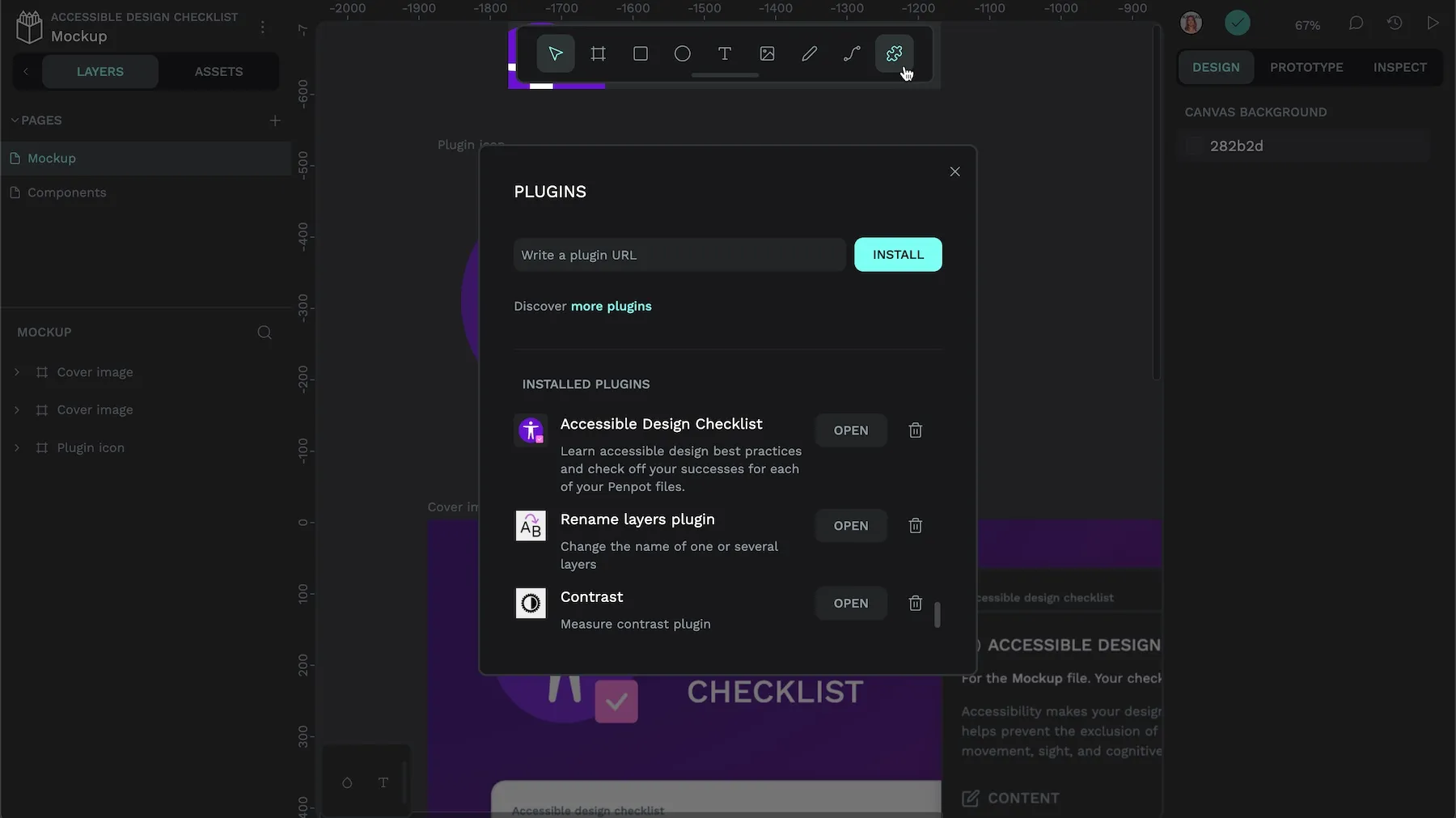
Download the Accessible Design Checklist plugin for Penpot
In the Penpot Hub, you can also find many more plugins, libraries and templates to enhance your Penpot experience.
Are you interested in developing your own checklist plugin? You can check out my open source code repository. You can also find documentation about creating plugins on the Penpot Help guide.