8 ways to use intuitive navigation to improve your website's UX
Discover 8 practical ways to design intuitive navigation that guides users effortlessly through your website or app. From clear labels to responsive layouts, these best practices will help you create smoother, more engaging user experiences — and avoid the pitfalls of confusing design.

What does it mean for something to be "intuitive?" The Interaction Design Foundation defines it as a design trait in which the user can understand and use something without consciously thinking about how it's done.
Intuitive design isn't about adding any one specific feature. Instead, it’s about approaching each page and figuring out a design that anyone could pick up and use without issue. If it requires additional context, it's probably not a good example of intuitive navigation and design.
However, there are some accepted best practices designers can use to ensure a more intuitive user experience, especially when moving between different parts of an app or website. Here's what you should know about intuitive navigation and its role in an engaging and rewarding UX.
What is intuitive navigation?
Given what we know about intuitive design, we can extend the idea to navigation.
Intuitive navigation helps people find what they need without stopping to think about how to get there. It often relies on three overlapping qualities:
- Familiar conventions: Navigation that follows patterns people already recognize — like a shopping cart icon in the upper right or a hamburger menu on mobile.
- Clear discoverability: Navigation that offers helpful cues to guide users toward the right path, even if they haven’t seen the layout before.
- True intuitiveness: Navigation that feels almost effortless — it just “clicks” the moment someone uses it, because the design fits their expectations so well.
Most good navigation combines all three. Even if something isn’t instantly intuitive on first glance, conventions and discoverable cues can quickly get users up to speed.
How does intuitive navigation affect UX?
Think of all the apps you use daily, whether it's your favorite social media app or a fitness tracker. When you first downloaded the app, how did you know what to do first?
While many apps and sites offer user tutorials to improve onboarding, the better designs don't. Instead, you can dive right in thanks to clear labels, familiar patterns, and well-placed cues that guide you through the interface.
From a user perspective, intuitive, conventional, and discoverable navigation make every interaction feel easier. Focusing on these qualities also benefits the app developer or organization behind the design by:
- Increasing engagement: Users who enjoy their navigation experience may continue taking actions within the app or site — and may even purchase more!
- Reducing bounce rates: More engaged users click on additional pages within your site instead of returning to their original search and leaving your site altogether.
- Better accessibility: For those with disabilities or limitations on how they see or hear web content, intuitive navigation helps meet them where they are and minimizes the work needed to have a full site experience.
- Enhanced brand reputation: People love a well-made digital app or site, even if they don't fully understand the why behind it. This can translate into a more favorable view of your company.
8 best practices for intuitive navigation
Each of these best practices can help users perform tasks organically on a site or app. The more you implement, the better overall user experience they'll have, but even just a few can significantly impact usability.
Logical and accepted structure
The structure of your page or app should not only make sense logically, but also follow established conventions for how users expect to navigate a site, including:
- Using large or bold header fonts for headlines and important information
- Putting less urgent text in smaller fonts
- Making actionable text ("purchase" or "learn more") as clickable buttons
For example, you wouldn't want to put the main menus at the bottom of your page. People are used to looking at the top or left side of the page for these navigational menus. Placing them somewhere unexpected breaks with convention and can create unnecessary friction.
You can take some creative liberties with navigational elements like post tags, which can be at the top or bottom of each page or post. Just be sure you place them consistently across all pages so that after the first time a user sees them, they know exactly where to find them again and again.
If you’re ever not sure what exactly “accepted” or “logical” is, it’s always a good idea to see how the best in the business handle their navigation. We’ve collected this list of the best UI design examples from around the web that you can use for inspiration for your own work.
Consistency
While we're on the topic of consistency, find a layout for your site and stick to it. Committing to a design is not just about the hierarchy of elements — it also affects how users adapt to and navigate your site over time. A recent study found that significant design changes to apps force a "new adoption process and impacts the perceived ease of use."
Since familiarity and convention are key to intuitive navigation, making changes without being sure how they will benefit the user can be risky. If you make a change, make it across all pages and touchpoints. Then, give users plenty of onboarding resources and time to adjust.
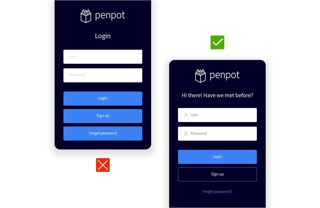
Clear labels
Labels play an important role in navigation, from the features in a drop-down menu to the links at the bottom of a page. It can be tempting to be cutesy or use novel ideas for links to the core site pages. However, users typically come to the site with conventional terms already in mind.
Instead of "Shout at Us!" for the Contact page or "What We're Up To" for the Blog, consider using the standby terms of Contact and Blog. In this case, using conventional labels makes the experience more intuitive by reducing the mental effort needed to guess what each link means.
Responsive design
A digital layout needs to work well on every modern digital device available to be truly responsive. Your app needs to function the same way, whether used on the most recent iPhone or blown up on a big-screen TV.
Browser technology helps with some of this because designing for most browsers can solve compatibility issues. However, since there are a growing number of browser solutions and versions every year, even this requires diligence.
Penpot's design tools reduce the work needed to build and test truly responsive designs. With support for almost every modern browser and screen size, you can see how the design will appear before you send it to the development team.
Visual clues
As important as text is in helping users navigate, visuals can work better for users who don't read. Icons and colors can reinforce navigation, but they should never be the sole indicator of action. Always pair icons with labels and ensure sufficient contrast and semantic alternatives for accessibility.
For instance, colors have almost universal meanings, with red and green playing essential roles in navigation. A red message may indicate something went wrong, like an order didn't process. On the other hand, green can signal success or encourage a user to continue on their navigational path.
Iconography works much the same way, with some icons being universally understood for certain uses or navigations. Consider these icons you likely see every day:
- The house icon almost always signals the home page of a site or app.
- A question mark points users to help topics, FAQs, or resource articles.
- An envelope directs users to a contact or support page
- Users can usually click the "i" icon to bring up more information in a popup or overlay
As websites become more complex, these visual clues will become even more important, and we can expect to add more icons to the "must-have" design library.
Better search
Even though Google gets all the credit, site search is still incredibly important. 78% of consumers search an e-commerce website to find what they want. People use it more often than the navigation menu!
With advances in search technology, users may not be satisfied with the same old search results. Search improvements help users navigate your site more efficiently and create trust in your recommendations. They may even help convert more sales.
Test your search frequently to see what results you get. This exercise may also surface content or menu gaps to help guide your next design iteration.
Instant feedback
Users have increasingly more tabs and apps open on their phones and desktops, making it harder to keep their attention and help them finish a task. One way to hold their attention captive is to keep them updated on processes and actions, even if it takes seconds or less.
Instant feedback elements, such as loading indicators, work well within navigational design because they discourage users from backing out, clicking away, or leaving the site altogether.
Save these elements for the most important uses, such as a cart checkout or form submission, and give users a status update when the job is completed.
Navigation validation
Design best practices can take you far, but they won’t always reflect how real users move through your site or app.
Instead, validate your design with real users. Usability testing, tree testing, and card sorting offer firsthand insight into what users expect and whether your navigation structure supports them. These tools help you move beyond assumptions and identify whether your system feels intuitive, follows recognizable conventions, or is easy to explore and discover.
This kind of testing falls under the broader umbrella of information architecture — the discipline of organizing and labeling content in ways that make it usable and findable. It ensures that your menus, categories, and overall structure don’t just look good in a wireframe, but actually work when someone tries to use them.
If you're building or revising a navigation system, incorporating these methods early can reduce guesswork, speed up iteration, and result in a structure that supports all your users.
Create intuitive navigation with Penpot
All of the elements and features described above can significantly improve user experience. Whether you sketch them out in your wireframe or add them to your digital prototype, Penpot offers room for your best navigational ideas so users don't get left behind.
Sign up for a free Penpot account in minutes and get started with your first design today!


