7 reasons Penpot is more than just a Figma alternative | Penpot
Looking for an open-source Figma alternative? Penpot offers unique features, collaboration tools, and flexibility that make it much more than just a design tool.
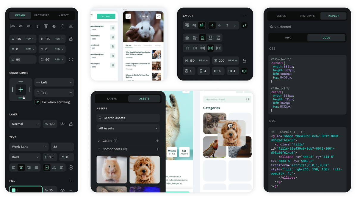
Figma is a popular option for designers and developers today, but it doesn’t meet all of their needs. So they search for new options.
For a tool to replace a legacy solution like Figma, it must be a suitable replacement and wow users with its unique features. Since it can be a lot of work to move everything from one tool to another, users seek intuitive features that “get” what it takes to bring a design project to life.
That’s why many professionals have turned to Penpot. It isn’t a simple one-and-done substitution for Figma. While it does address many of the most frustrating design issues that products like Figma may have, it also offers so much more. Here’s why you’ll want to upgrade your projects with Penpot, the open-source, collaborative solution that truly elevates how designers and developers work.

1. Cohesive design and development workflow
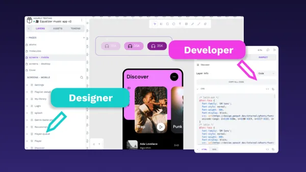
Unlike Figma, Penpot was conceived from day one to help designers and developers work hand-in-hand throughout the product creation process. The open standards enable these professionals to use the same toolchain and avoid disruptions caused by having to hand off their work.
Instead, developers can use the same design tool as the designers, reducing disconnect, confusion, and the number of steps in the overall development process.
Also Penpot’s comments and communication workflows help everyone add notes and ask for clarification no matter what time zone they work in. This is especially useful for distributed teams that need instant communication to quickly advance the progress of their projects.
2. Seamless cross-team collaboration
One of the most common issues that plague design and development teams is hand-off delays. If a piece gets delayed in one department without others knowing, the workflow is disrupted, and projects go past the launch date.
With Penpot, we’ve eliminated this problem by making it so that everyone — designers and developers — is speaking the same language. Whereas in Figma (and other similar platforms), there is a need for developers to “translate” design to code, with Penpot, everything is based on the same CSS standards.
Since there is no translation, designers and developers are free to build projects together in real time. That means more collaboration, fewer headaches, and more accurate overall results for your users.
3. Multilingual and RTL support
From the very beginning, Penpot has incorporated RTL (right-to-left) support to make the tool as inclusive as possible for as many people as possible. The tool will automatically detect and adjust for RTL languages such as Arabic and Hebrew.
Penpot’s community is also currently in the process of translating the tool into over 30 languages, including Basque, Chinese, Czech, and Dutch, in addition to the two fully supported languages of English and Spanish. This means that Penpot will only become more inclusive for multilingual teams as time goes on.
4. Self-hosting options
Penpot was designed to be used in a browser without the need to download anything or worry about software compatibility. However, if what you worry about is the security and privacy to keep your data on your own server, self host is the ideal choice.
As an agnostic platform, you can use it without pricey SaaS subscriptions or the limitations of a specific OS. It offers complete freedom to control, back up, and own the files on your device, as well as customize the program exactly how you want via the open-source code. The SaaS solution and self-hosted solution are identical and give you the same flexibility to build and control your work.
5. Customizable with an API
Penpot is proudly open-source, which means you can customize it for your needs. Have an idea on how to make it better suited for your business? Tweak it just the way you want.
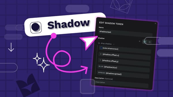
You don't have to rely on internal coding knowledge, either. APIs exist that seamlessly plug into Penpot to give you endless customization options. With the inclusion of an API, it’s now easier to plug and play with your vision of Penpot. With the 1.19 release, users can access tokens and an API for complete flexibility of continuous development.
With so many options for self-hosting, hacking, and innovating, it’s possible to get the exact workflow you want with Penpot’s totally free software. That’s the beauty of Open Source, and you only have to look at what those in the Penpot community are doing to see what’s possible.
6. Flex Layout
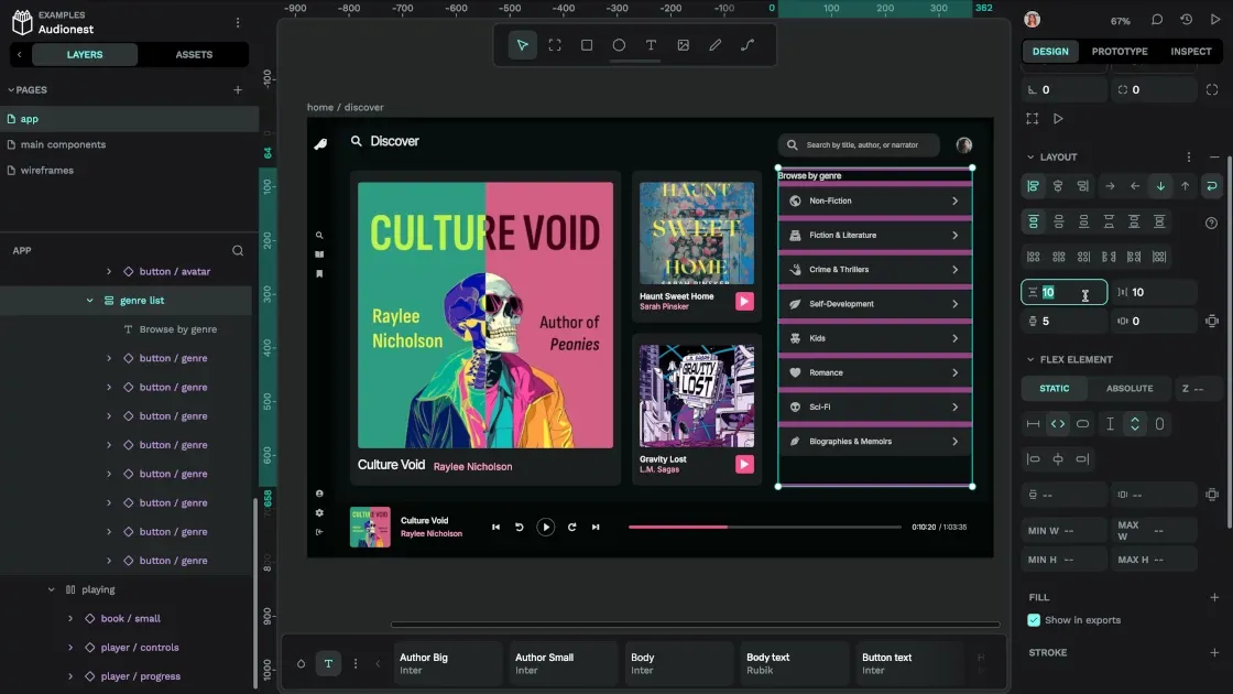
The Penpot app's simple interface makes it easy for anyone to get started, even those with no code experience. Some of the unique features of Penpot come inside the Flex Layout, which gives you more space and freedom to put your best ideas into digital form. Top perks include:
- Absolute position that lets you put an element exactly where you want it, even if there isn’t enough room to do so in the space you’ve chosen. Get rid of elements from the Flex Layout flow with this handy feature.
- Smart spacing for the intuitive realization of padding, margins, and the spaces between objects. Use drag motions to resize things to the size Penpot predicts will work the best in your composition. Without having to space things manually, you'll save time and have things lined up perfectly.
- With wrapping for dynamic layouts, you can adapt to different screen sizes and even device orientations. Get the right dynamic design for a tablet on its side and then see how it compares to a mobile device or desktop browser. With this feature, you can automatically see if items need to wrap to new lines or if they go outside the borders. There are no surprises when it comes time to test your design for various devices and technologies.
- Z-index management helps you know what elements should be on top in an overlapping design while keeping the order intact. Powered by CSS standards, it saves so much time and helps you think through designs without disruption.
7. CSS Grid Layout
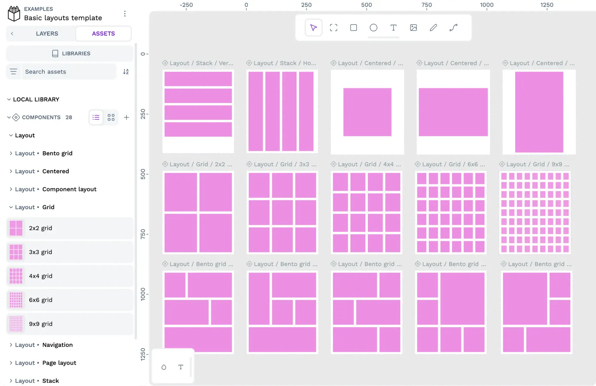
The CSS Grid Layout offers a convenient way to visualize how your design would appear within grids in CSS. This developer-friendly benefit looks like a grid within Flex Layout and helps support detailed designs with stunning precision and a consistent look across your project components.
As another example of how design and development can meld into one amazing collaborative effort, Grid Layout enables a higher level of detail at earlier stages in the creation process.
Penpot and Figma: Different but not equal
Penpot empowers developers just as well as it does designers, so you don’t have to bounce between tools. Not only does Penpot use the same language and interface from stage to stage, but it also gives every stakeholder a way to peek inside the inner workings of each design, offer recommendations, and lend their best skills to the project. It blurs the lines between design and development while maintaining the high standards and specialized functions needed by each team.
Above all, Penpot is free and open-source. You won’t have to pay a dime to use it, and it’s accessible enough for anyone to get their first project started quickly.
With no budgetary constraints and a community of highly supportive fans to inspire you, it’s not surprising that Penpot is seen as not merely a substitution for other tools; it’s truly a shift to a new way of working.
Convinced? Ready to make the switch from Figma – find out how with our blog post on how to make the switch from Figma to Penpot.

Whether you have design or developer experience (or none at all), getting started with Penpot requires a quick login and an open browser window. Try it and see why it’s the replacement for forward-thinking creatives.
Related Blogs
Click here to read one of our related blogs
