5 social media design tricks and why they work

Proven design concepts can help your brand message stand out in an accessible way to more people in more places.
This is especially true on social media, where you have just seconds to capture the attention of people scrolling past your post. Are you making graphics for a LinkedIn post or crafting the perfect Instagram Story? Taking the time to implement proper UX principles can be just what you need to break through the noise.
Use these design hacks to educate your followers on what you have to offer.
1. Master size, shape, and color scheme
Before you start experimenting with trending hashtags or the latest TikTok challenge, get the basics down first.
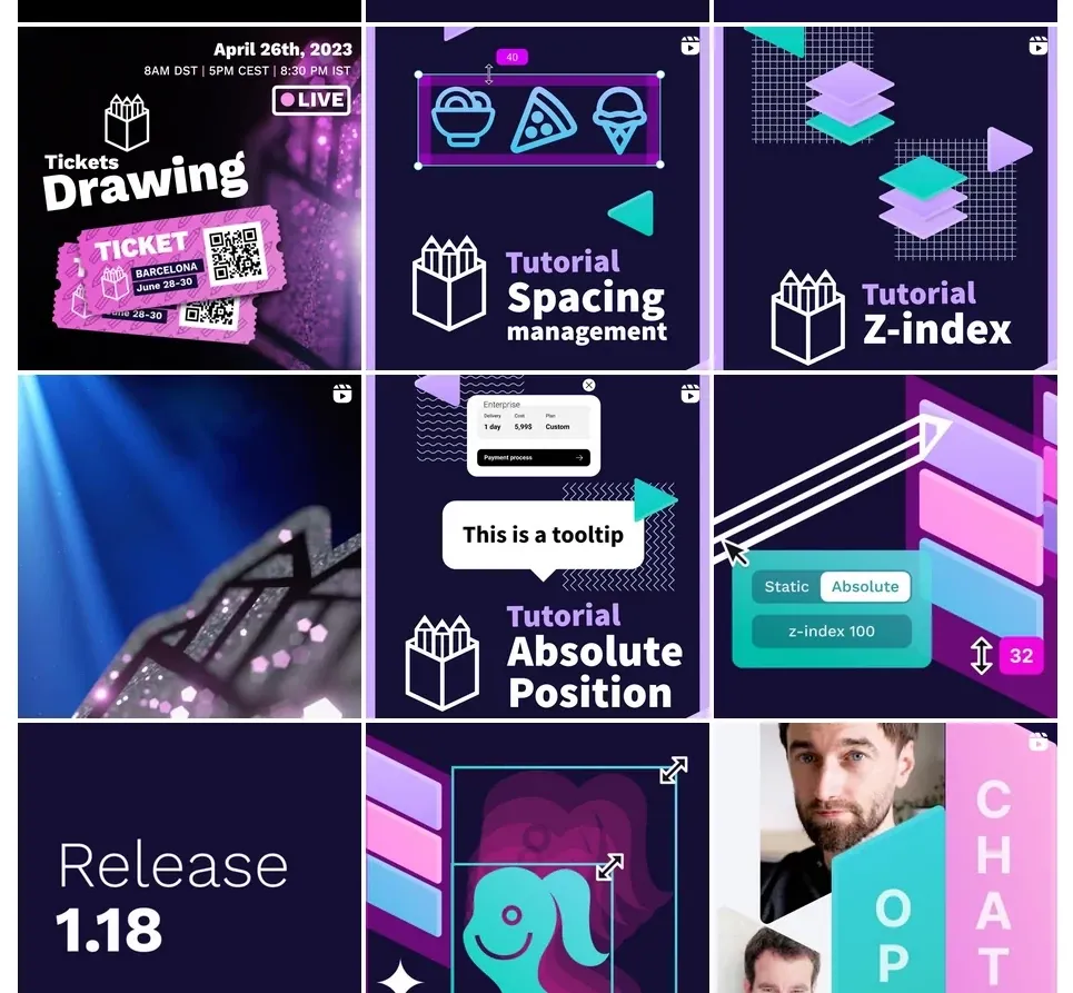
Size and shape: Each social media platform has its own size guidelines, and these do change often. Instagram 1, Facebook, TikTok, X (Twitter), and LinkedIn 1 all share their rules for making sure a post can be viewed in its entirety.
If you ignore the size parameters, your visuals can become blurry or even get cut off so that followers only see part of your message. Design each original visual asset so that it matches the size rather than trying to stretch or manipulate it after the fact; skewing photos, for example, can cause pixelation and poor display quality.
Color: Before you commit to a color palette based on your brand kit alone, consider the colors used on each social media platform.
Will your visuals stand out? Clash? Disappear into the background? While color palettes change, finding a scheme that catches the eye in each feed can be a powerful tool for capturing a user’s limited attention.
Pro tip: Test your color scheme in both the standard view and “dark mode” offered on mobile devices and desktop browsers. You may find a color palette that stands out on both and still holds true to your brand aesthetic.
2. Optimize visual hierarchy
When elements are organized in a way that prioritizes information, a visual hierarchy is followed. This includes color, size, contrast, and placement to help the viewer know what to look at first and which part of the design is most important. Eye-movement patterns, normally from top to bottom, are considered in the visual hierarchy.
There may be a different hierarchy between social channels. What do you want a user to see first on Twitter versus an Instagram Reel? How you answer may determine what you prioritize in the design and where it’s placed in relation to other elements.
By paying close attention to visual hierarchy, you accomplish two things: you make it easier for viewers to get the right information at a glance, and you encourage engagement in a very competitive landscape.
Pro tip: Start by creating the most important element first, then build around it to ensure you focus on the correct things. This element is typically the CTA but may also be the special ingredient in a sandwich, the subject of a recent article, or the main idea of a longer announcement.
3. Practice minimalism
On social media, less is more. Consider leaving out any text or design element that doesn’t directly add to the conversation. Because there is limited space for both visuals and text, you’ll need to work extra hard to get your point across.
Focus on just one CTA or ask for each message so users don’t experience decision fatigue. Ask yourself, "What do I want them to do or know after seeing this?” If your design goes beyond what’s needed for that to happen, remove the extras.
Another bonus to the minimalist approach is that it works on screens of all sizes. While a busy and detailed graphic may work on a 17" laptop screen, it may be difficult to make out on a small Android mobile device. A less busy design ensures no one is left out.
Pro tip: Minimalism doesn’t always equal “white space.” In fact, some social channels have so much white space that it could drown your use of blank areas. Feel free to include bold colors and contrast; just don’t clutter up your creations.
4. Make it interactive
Social media shouldn’t be used as a megaphone as much as a sounding board for your audience. Give them ample opportunity to share their opinions and ideas in your posts by incorporating them into the design. For the best effect, alternate posts that require interaction with those that don’t, so users have a chance to get excited by more interactive posts.
Consider including a way for users to influence brand decisions with their engagement, whether it’s for future social media posts or something as important as a product design choice. When fans and followers know their interaction counts, they will be less likely to skip over your content. They don’t want to experience FOMO (fear of missing out). Something like the next topping for a future burger or a name for a video game character are two examples of how social media posts can garner engagement for future brand decisions.
Pro tip: To be most effective, keep the interaction simple. A click or swipe should be all that’s needed for fans to share their thoughts. Choose a “yes” or “no” poll design instead of offering multiple-choice answers.
5. Be consistent
The number of times you post (and when you post) should be steady from day to day, but this isn’t the only way to offer consistency. Your brand’s color and design choices should also be consistent. Followers should be able to take any of your updates and know they’re yours, even without seeing who posted them.
Colors, logos, and conversational tone are things you have likely included in your brand kit. If not, now is the time to build assets specifically for each social channel. Using a design template can help you keep a consistent feel across your posts. It allows anyone from your marketing and design team to contribute without having to train them extensively or recreate new assets each time.
Pro tip: Consistent design elements build trust and help followers know what to expect from you. If you do have to change your color scheme, font, or other recognizable element, call it out and let users know you’re making the change. Then, they know to look for your updated posts.
Social media: An essential part of brand messaging
UX design is such an important part of business today, but social media design can be overlooked or even considered an afterthought. While it’s tempting to leave your posts to someone without design experience, they should at least have access to your brand kit and some templates that follow your mission for what you want to get across.
One other idea is to do all of your social media designs in batches. For example, Monday is when you create all of your tweets, and Tuesday is the day you create LinkedIn posts. More labor-intensive designs, like those that include video or interactive elements, may be best handled by the same person so they get a feel for what works best on each platform.
Remember, too, that social media is constantly evolving. How people use it today may not look anything like how they use it tomorrow.
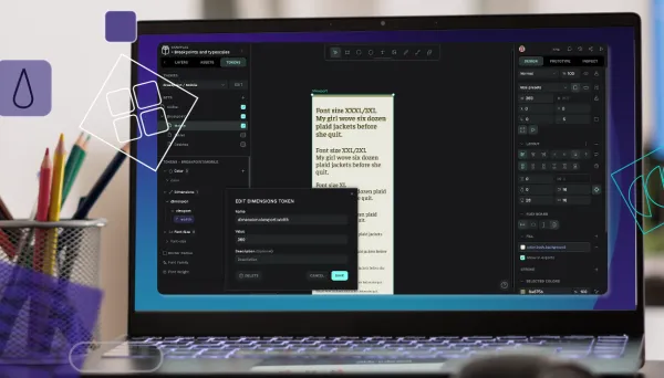
That’s why one of the best ways to improve your social media design skills is to experiment and practice constantly. If you haven’t already, try using Penpot’s design features 1 for your next social media experiments, and you’ll see how easy it is to create a wide variety of media assets, from postable memes to anything else you want to try to create.
Related Blogs
Click below to read one of our related blogs.
 Carolina Alves Portugal
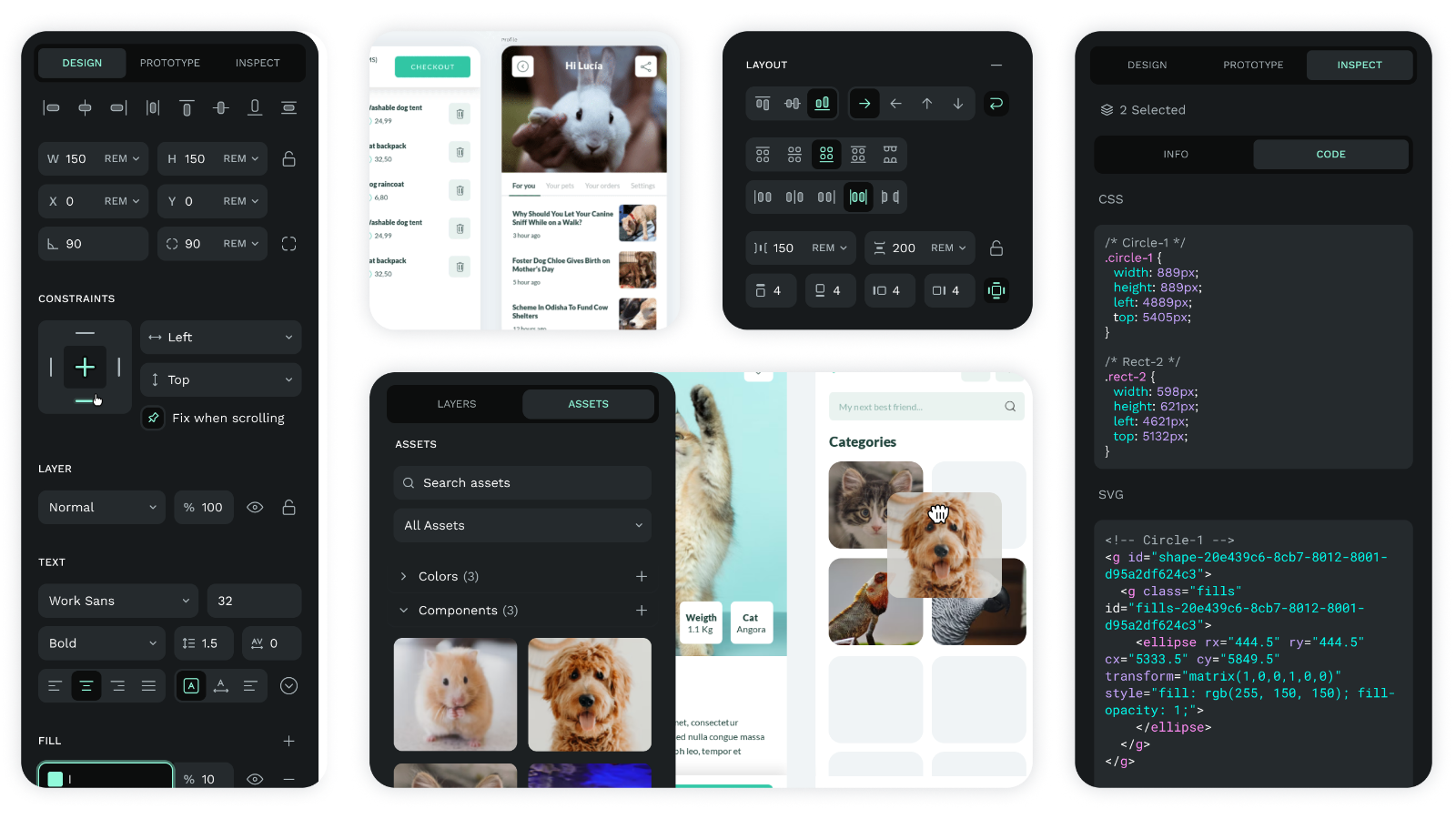 Laura Kalbag
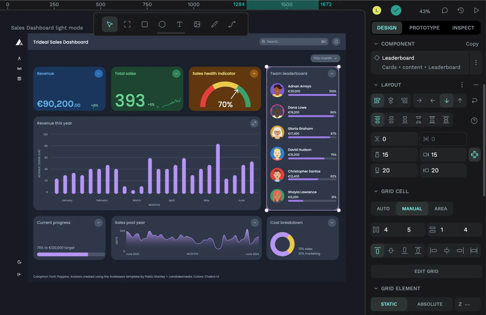 Paula Tienza
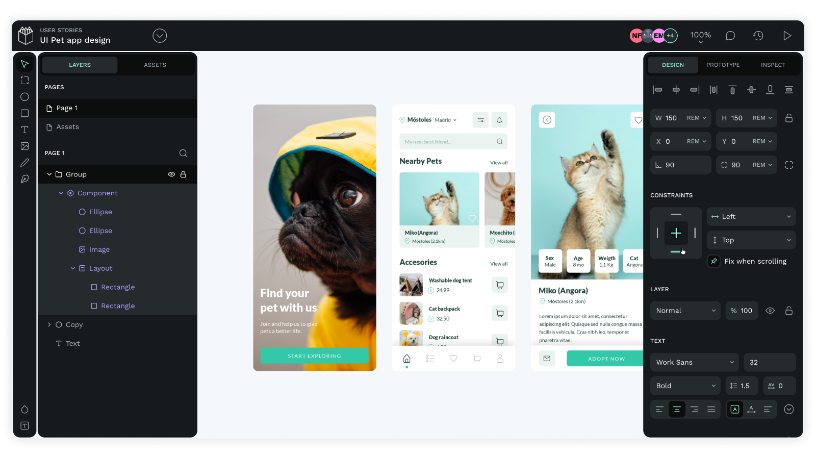 Laura Kalbag


