The 5 best CSS frameworks (and why you should maybe go without)
What are the benefits of common CSS frameworks? We give you some reasons why you might want to consider designing in pure CSS.

Knowing CSS is a superpower. It allows you to manipulate elements exactly how you want to create perfectly-aligned layouts and responsive designs that benefit and delight users.
However, it also takes time and effort to acquire the high level of CSS ability required for great design, and sometimes you need to move quickly. You need to meet deadlines, prototype new ideas, or maintain consistency across large teams and projects. You don’t want to worry about z-index and flex.
CSS frameworks are ideal for this. They provide battle-tested components and utilities that allow designers to focus on solving design challenges rather than reinventing common patterns.
Here, we’ll introduce you to five common CSS frameworks that millions of developers and designers use. We also highlight some reasons why, though these frameworks are powerful, you might want to consider designing in pure CSS.
First, though, let’s answer the obvious question.
What is a CSS framework?
A CSS framework is a structured way to apply CSS through systematic patterns rather than writing every style from scratch.
Let’s take this example. We design a button in CSS with size, color, font, shadow, and corner radius:
button {
  color: #fff;
  background-color: #0d6efd;
  border: none;
  border-radius: 0.25rem;
  font-family: system-ui, sans-serif;
  font-size: 1rem;
  font-weight: 400;
  line-height: 1.5;
  padding: 0.375rem 0.75rem;
  text-align: center;
  transition: color .15s ease-in-out, background-color .15s ease-in-out, border-color .15s ease-in-out, box-shadow .15s ease-in-out;
  vertical-align: middle;
}

button:hover {
  background-color: #0b5ed7;
}
This works great, but if you’re building an entire site this way, you’d need to write custom CSS for every component: navigation bars, cards, forms, modals, dropdowns, and more. Each component needs its own styles, hover states, animations, and responsive behavior. You’d also need to handle browser inconsistencies, accessibility concerns, and edge cases.
But these are all solved problems, so it makes sense to use the solutions. CSS frameworks tackle this complexity by providing systematic approaches. Bootstrap, for example, would let you create that same button with a single class:
<button class="btn btn-primary">My button</button>This makes it much easier for developers and designers to iterate quickly and get to a shippable product.
The core benefits of a CSS framework are:
- Rapid development and prototyping: CSS frameworks dramatically reduce development time by providing pre-built components and utilities. Instead of writing custom CSS for every element, developers can quickly implement common patterns and focus on unique design challenges.
- Cross-browser compatibility and consistency: Framework maintainers have already handled browser quirks, vendor prefixes, and edge cases. This ensures your components work reliably across different browsers and devices, saving countless hours of testing and debugging.
- Maintainable and scalable code structure: Frameworks enforce consistent naming conventions and code organization, making it easier for teams to collaborate, onboard new developers, and maintain large codebases over time without accumulating technical debt.
- Built-in responsive design: Most frameworks include comprehensive grid systems and responsive utilities that handle complex layout requirements across different screen sizes. This removes the need to write custom media queries for every component.
- Accessibility and best practices: Modern CSS frameworks often include built-in accessibility features, semantic markup patterns, and performance optimizations that might be overlooked when writing custom CSS from scratch.
Not all CSS frameworks are built the same. The example above, Bootstrap, is a component-based CSS framework. This means it provides complete pre-styled components like buttons, cards, and navigation bars that you can drop into your project with minimal customization. Component-based frameworks prioritize consistency and rapid development but can sometimes feel restrictive when you need unique designs.
But you can also have utility-based frameworks. These provide low-level utility classes that handle single CSS properties, allowing you to build custom designs by combining multiple classes. For example, Tailwind CSS lets you write <div class="p-4 bg-blue-500 rounded-lg shadow-md"> instead of writing custom CSS. This approach offers more flexibility than component-based frameworks but requires more HTML markup and knowledge of the framework’s utility classes.
Another option is a class-based framework. These frameworks use semantic class names to define reusable patterns while allowing more customization than component-based frameworks. For instance, Foundation uses classes like .callout and .orbit that suggest their purpose while remaining customizable through Sass variables and mixins. This approach strikes a balance between the rigidity of component-based frameworks and the verbosity of utility-based frameworks.
Finally, we have classless frameworks. These take a radically different approach, styling HTML elements directly without requiring any classes. They work on the principle that HTML should be semantic and self-describing and that the default appearance of HTML elements should be beautiful and consistent right out of the box.
The 5 best CSS frameworks
Let’s go through some examples for each of these types.
Tailwind CSS: A utility-first framework for SaaS design
We’ll start with Tailwind CSS. Though it wasn’t the first, it’s probably at the top of the tree right now due to its easy integration with highly-used JavaScript frameworks such as React and Next.js.
Tailwind takes a utility-first approach, which means instead of writing CSS, you compose designs directly in your HTML using pre-defined utility classes. This might seem counterintuitive at first — after all, aren't we taught to separate concerns and keep our styling away from our markup? But this approach brings some powerful advantages.
Consider how you might style a card component traditionally versus with Tailwind:
<!-- Traditional HTML -->
<div class="card">
  <img src="image.jpg" class="card-image">
  <div class="card-content">
    <h2 class="card-title">Title</h2>
    <p class="card-text">Content</p>
  </div>
</div>
<!-- Tailwind HTML -->
<div class="rounded-lg shadow-md overflow-hidden bg-white w-3xs m-6">
<img src="image.jpg" class="w-full h-48 object-cover">
<div class="p-6">
<h2 class="text-xl font-bold text-gray-800 mb-1">Card title</h2>
<p class="text-gray-600">Card paragraph content</p>
</div>
</div>At first glance, the Tailwind version might look more verbose. But there’s a crucial difference: You can understand exactly how this component looks without ever leaving the HTML file or checking a separate stylesheet. Each class name directly corresponds to a CSS property, making the code self-documenting. rounded-lg means a large border-radius, shadow-md adds a medium-sized box-shadow, and so on.
This immediate feedback loop transforms how developers work with CSS. Instead of context-switching between files and mentally mapping class names to their styles, you can build and iterate directly in your markup. This is particularly powerful when working with modern development environments that offer autocompletion and preview features.
Tailwind also solves one of the most persistent problems in CSS: naming things. How many times have you stared at your screen, wondering whether to name something card-container or content-wrapper? With utility classes, this cognitive overhead disappears. You’re working with a finite set of predictable utilities rather than creating new class names for every component.
But perhaps Tailwind’s greatest strength is its constraint-based design system. Rather than allowing any arbitrary value, Tailwind provides a carefully curated set of spacing, color, typography, and other design tokens. For example, instead of setting a margin to 37px, you choose from predetermined values like m-8 (2rem) or m-10 (2.5rem). This might sound limiting, but it actually promotes design consistency and speeds up development by reducing decision fatigue.
The framework also includes a plugin system that lets you extend these defaults when needed. You can add your own utilities, modify existing ones, or even generate utilities based on your design tokens. This makes it particularly well-suited for teams that need to maintain consistent branding across multiple projects.
For example, you might add your brand colors:
// tailwind.config.js
module.exports = {
  theme: {
    extend: {
      colors: {
        'brand-blue': '#1992d4',
        'brand-dark': '#0b4f71',
      }
    }
  }
}
Now, you can use classes like bg-brand-blue or text-brand-dark throughout your project, maintaining consistency while keeping the utility-first workflow.
Tailwind’s approach shines in modern JavaScript frameworks like React, Vue, or Next.js. When components are the primary unit of organization, having styles directly in the markup makes them more portable and easier to maintain. You can copy a component from one project to another, and it will bring its styling with it — no additional CSS files are needed.
Bootstrap: The original component framework that shaped the web
Bootstrap revolutionized web development when it was released by Twitter in 2011. While it wasn’t the first CSS framework, it fundamentally changed how developers thought about building websites by introducing a comprehensive component system combined with a responsive grid. Today, it remains one of the most widely used frameworks, powering millions of websites and applications.
The framework provides fully styled, ready-to-use components that work together seamlessly. Let’s look at how this works in practice:
<!-- A typical Bootstrap navbar -->
<nav class="navbar navbar-expand-lg navbar-light bg-light">
  <div class="container">
    <a class="navbar-brand" href="#">Brand</a>
    <button class="navbar-toggler" type="button" data-bs-toggle="collapse" data-bs-target="#navbarNav">
      <span class="navbar-toggler-icon"></span>
    </button>
    <div class="collapse navbar-collapse" id="navbarNav">
      <ul class="navbar-nav">
        <li class="nav-item">
          <a class="nav-link active" href="#">Home</a>
        </li>
        <li class="nav-item">
          <a class="nav-link" href="#">Features</a>
        </li>
      </ul>
    </div>
  </div>
</nav>
This code creates a fully responsive navigation bar with a collapsible menu for mobile devices, dropdown support, and proper spacing — all without writing a single line of custom CSS.
The classes are semantic and self-descriptive: navbar creates the navigation container, navbar-expand-lg handles responsive behavior, and navbar-light sets the color scheme.
Bootstrap’s component-based approach provides a consistent visual language out of the box. Components like buttons, cards, and forms share the same design principles and spacing rules. This consistency extends to interactive states — hover effects, focus states, and animations are all pre-configured:
<!-- A Boostrap card component -->
<div class="card">
  <img src="image.jpg" class="card-img-top" alt="A desert landscape with a low sun.">
  <div class="card-body">
    <h2 class="card-title">Card title</h2>
    <p class="card-text">Card paragraph content</p>
  </div>
</div>
Bootstrap also includes a powerful grid system based on Flexbox. This grid system has become so influential that many other frameworks have adopted its patterns (look familiar, Tailwinders?):
<-- Bootstrap responsive layout -->
<div class="container">
  <div class="row">
    <div class="border border-primary col-12 col-md-6 col-lg-4">
      <p>Content that's full width on mobile, half width on tablets, and one-third width on desktop.</p>
    </div>
  </div>
</div>
The grid uses intuitive breakpoint prefixes (sm, md, lg, xl, xxl), making responsive design more approachable for beginners while remaining powerful enough for complex layouts.
Bootstrap also shines in its JavaScript integration. Many components include interactive features that work right out of the box. Modals, tooltips, popovers, and dropdowns all come with the necessary JavaScript behaviors pre-built:
<!-- Bootstrap HTML: A button that triggers a modal -->
<button type="button" class="btn btn-primary" data-bs-toggle="modal" data-bs-target="#exampleModal">
  Launch demo modal
</button>

<!-- The modal itself -->
<div class="modal fade" id="exampleModal" tabindex="-1">
  <div class="modal-dialog">
    <div class="modal-content">
      <div class="modal-header">
        <h5 class="modal-title">Modal title</h5>
        <button type="button" class="btn-close" data-bs-dismiss="modal"></button>
      </div>
      <div class="modal-body">
        Modal content goes here
      </div>
    </div>
  </div>
</div>
This integration of CSS and JavaScript behaviors makes Bootstrap particularly valuable for rapid prototyping and building administrative interfaces where standard patterns are preferred over custom designs.
Bulma: Modern CSS with a focus on flexibility
While Bootstrap pioneered component-based frameworks and Tailwind revolutionized utility-first CSS, Bulma takes a different path. Created in 2016, Bulma represents a modern take on CSS frameworks that emphasizes modular design and readable class names without any JavaScript dependencies. Its philosophy centers around providing building blocks that feel natural to use while remaining lightweight and flexible.
Let’s examine what makes Bulma distinctive by looking at how it approaches component design. Consider a basic card component:
<!-- Bulma card HTML -->
<div class="card">
  <div class="card-image">
    <figure class="image is-4by3">
      <img
        src="image.jpg" alt="Purple crater landscape."
      />
    </figure>
  </div>
  <div class="card-header">
    <h2 class="card-header-title">Card title</h2>
  </div>
  <div class="card-content">
    <p class="content">
     Card paragraph content
    </p>
  </div>
</div>
Notice how Bulma’s class naming follows a natural, almost conversational pattern. Instead of cryptic abbreviations or utility combinations, you have semantic classes like card, media, and content.
The modifiers follow an equally intuitive pattern: is-4 for size, is-4by3 for aspect ratio. This readability makes Bulma particularly appealing for teams transitioning from custom CSS to a framework.
One of Bulma’s most distinctive features is its approach to responsive design. Rather than using device-specific breakpoints like Bootstrap’s col-md-6, Bulma uses readable responsive modifiers that describe the behavior:
<!-- Bulma responsive layout -->
<div class="columns is-mobile is-multiline">
  <div class="column is-half-mobile is-one-third-tablet is-one-quarter-desktop">
    <p>Content that adapts naturally across screen sizes</p>
  </div>
</div>
This approach makes responsive design more intuitive — you’re describing what you want the element to do rather than specifying device widths. The framework includes responsive helpers for nearly everything, from typography to navigation:
<!-- Bulma responsive typography -->
<h1 class="title is-1 is-size-3-mobile">
  This title is large on desktop, smaller on mobile
</h1>
<div class="is-hidden-mobile">
  <p>This text is only visible on tablet and desktop</p>
</div>
What sets Bulma apart is its commitment to being purely CSS. Unlike Bootstrap, which includes JavaScript for interactive components, Bulma focuses solely on styling. This makes it extremely lightweight (about 100KB unminified) and gives developers the freedom to implement interactivity however they choose. For example, a dropdown menu in Bulma is just HTML and CSS:
<!-- Bulma dropdown -->
<div class="dropdown is-active">
  <div class="dropdown-trigger">
    <button class="button" aria-haspopup="true" aria-controls="dropdown-menu">
      <span>Dropdown button</span>
      <span class="icon is-small">
        <i class="fas fa-angle-down" aria-hidden="true"></i>
      </span>
    </button>
  </div>
  <div class="dropdown-menu" id="dropdown-menu" role="menu">
    <div class="dropdown-content">
      <a href="#" class="dropdown-item"> Dropdown item </a>
      <a class="dropdown-item"> Other dropdown item </a>
      <a href="#" class="dropdown-item is-active"> Active dropdown item </a>
      <a href="#" class="dropdown-item"> Other dropdown item </a>
      <hr class="dropdown-divider" />
      <a href="#" class="dropdown-item"> With a divider </a>
    </div>
  </div>
</div>
The actual toggling behavior is left to the developer to implement, making Bulma an excellent choice for projects using modern JavaScript frameworks like React, Vue, or Svelte. This separation of concerns allows developers to implement exactly the behavior they need without being tied to a specific JavaScript implementation.
Foundation: The enterprise-grade framework
Foundation, initially created by ZURB, takes a different approach from our previous frameworks. Where Bootstrap aims for rapid prototyping, and Bulma focuses on readability, Foundation positions itself as the “most advanced responsive front-end framework,” targeting enterprise-level applications and complex design systems.
Let’s explore what makes Foundation distinct by examining its grid system, which introduced many concepts that are now standard in responsive design:
<div class="grid-container">
  <div class="grid-x grid-margin-x">
    <div class="cell small-12 medium-6 large-4">
      <div class="card">
        <p class="card-divider">
          Card divider
        </p>
        <img src="image.jpg" alt="Purple crater landscape."
      />
        <div class="card-section">
          <h3>Card title</h3>
          <p>Card paragraph text.</p>
        </div>
      </div>
    </div>
  </div>
</div>
Notice how Foundation’s grid uses grid-x for rows (x-axis) and cell for columns, rather than the more common row and col pattern. This seemingly small difference reflects Foundation's broader philosophy: precision over convention. The framework uses technically accurate terms that might take longer to learn but provide more precise mental models for complex layouts.
Foundation’s approach to responsive design is particularly sophisticated. Instead of just providing breakpoints, it includes a complete system for responsive design that extends beyond layout:
<p class="show-for-medium">Only visible on medium screens and up</p>
<p class="hide-for-small-only">Hidden on small screens only</p>
<img src="small.jpg" data-interchange="[medium.jpg, medium], [large.jpg, large]" alt="Purple shiny-looking planet.">
One of Foundation’s most powerful features is its comprehensive Sass customization system. While other frameworks offer theming options, Foundation provides granular control over every aspect of the framework:
// Customizing components at a deep level
$card-background: $white;
$card-font-color: $body-font-color;
$card-divider-background: $light-gray;
$card-border: 1px solid $light-gray;
$card-shadow: none;
$card-border-radius: $global-radius;
$card-padding: $global-padding;
$card-margin-bottom: $global-margin;
// Creating responsive breakpoints
$breakpoints: (
small: 0,
medium: 640px,
large: 1024px,
xlarge: 1200px,
xxlarge: 1440px,
);Foundation also emphasizes accessibility more than most frameworks. Its components come with ARIA labels and roles built-in, and its documentation includes detailed accessibility guidelines.
While Foundation’s learning curve is steeper than other frameworks, this complexity serves a purpose. The framework shines in enterprise environments where design systems need to scale across dozens or hundreds of pages while maintaining perfect consistency. If Bootstrap is for rapid prototyping and Tailwind is for custom designs, Foundation is for building robust, scalable design systems that can withstand time and team size.
Pico CSS: The class-light framework for semantic HTML
While other frameworks require learning numerous class names, Pico takes a refreshingly different approach: it styles HTML elements directly, no classes needed. This “classless” or class-light framework brings us back to HTML’s original purpose, where elements have inherent meaning. Let’s explore how this works with common UI elements.
First, let’s look at buttons. In Bootstrap or Tailwind, you’d need to add specific classes to style a button. With Pico, you just write the HTML:
<!-- Just plain HTML - no classes needed -->
<p><button>Button text</button></p>
<p><button type="submit">Submit</button></p>

<!-- Want a disabled button? Use the semantic attribute -->
<p><button disabled>Disabled</button></p>
Forms are where Pico really shines. Compare how you’d create a simple login form in Bootstrap versus Pico:
<!-- Bootstrap requires multiple classes -->
<form>
  <div class="mb-3">
    <label class="form-label" for="email">Email</label>
    <input type="email" class="form-control" id="email">
  </div>
  <button type="submit" class="btn btn-primary">Login</button>
</form>
<!-- PicoCSS needs no classes at all -->
<form>
<label for="email">Email</label>
<input type="email" id="email">
<button type="submit">Login</button>
</form>Both examples produce professional-looking forms, but Pico achieves this without any extra classes. The framework automatically styles form elements based on their type, including proper spacing and states (focus, hover, error):
<!-- A complete form with various input types -->
<form>
  <!-- Text input -->
  <label for="username">Username</label>
  <input type="text" id="username" required>
  <!-- Select dropdown -->
  <label for="plan">Choose your plan</label>
  <select id="plan">
    <option value="free">Free</option>
    <option value="pro">Pro</option>
  </select>
  <!-- Checkboxes -->
  <fieldset>
    <legend>Preferences</legend>
    <label>
      <input type="checkbox">
      Subscribe to newsletter
    </label>
  </fieldset>
  <button type="submit">Save preferences</button>
</form>
Even modals, which typically require multiple classes and JavaScript, become simpler with Pico. This simplicity makes PicoCSS perfect for:
- Quick prototypes where you need a professional look without writing CSS
- Content-focused websites like blogs or documentation
- Projects where you want to focus on writing semantic HTML
- Teaching environments where you want students to learn proper HTML structure
The framework does have its limitations. For highly custom designs or complex UI components, you might need additional CSS. But that’s by design — Pico isn't trying to be a complete UI framework. Instead, it excels at its primary goal: making semantic HTML look beautiful with zero additional classes.
So, why shouldn’t you use CSS frameworks?
The key reason is abstraction. This manifests in two ways:
- First, the learning experience. When you start with a framework, you’re learning the framework’s abstractions and conventions rather than understanding how CSS actually works. This can create knowledge gaps that become problematic when you need to solve complex styling challenges. What’s more, developers who rely heavily on frameworks often struggle to write and understand vanilla CSS, making it harder to debug issues or work on projects that don’t use their preferred framework.
- Second, the power of CSS. CSS, particularly with its more modern features (like variables, container queries, and the
:haspseudo selector), is capable of handling complexity and graceful degradation much better than any other framework. Modern CSS provides elegant solutions for responsive design, state management, and complex layouts that frameworks often handle through additional abstraction layers or JavaScript dependencies. When you write vanilla CSS, you have direct control over the cascade, specificity, and inheritance — fundamental concepts that frameworks sometimes obscure or override in ways that can lead to specificity wars and maintenance headaches.
Another reason is that frameworks are, by definition, opinionated. Designs end up looking, for lack of a better word, framework-y. Bootstrap is a great example. The framework’s distinctive look has become so ubiquitous that “Bootstrap site” has become shorthand for a generic-looking web application. While the latest versions offer more customization options through Sass variables and a new utility class system, achieving a truly unique design often requires significant overrides of Bootstrap’s base styles.
Finally, you have team alignment. When using a CSS framework, you need to ensure your entire team understands and follows its conventions and best practices. This can be particularly challenging when team members have varying levels of experience with the framework or when working with designers who might not be familiar with its constraints. Additionally, onboarding new team members requires teaching them your project’s specific needs and training them in the framework’s particular approach and patterns.
That said, CSS frameworks have their place. They can be invaluable for rapid prototyping, building internal tools, or when working with tight deadlines. The key is understanding when to use them and when to rely on vanilla CSS.
Learn how to create amazing web projects on Penpot
Designers and developers choose frameworks to make their lives easier. But Penpot can do the same while still letting you design and develop in raw CSS.
Instead of locking you into framework-specific patterns, Penpot generates clean, useful CSS that aligns with modern best practices. This means you can create unique designs that stay true to your vision without fighting framework constraints. The platform’s built-in collaboration tools make it easy to maintain design consistency across projects and teams while keeping your code clean and maintainable.
Some standout features include:
- Real-time collaboration with developers and designers in the same space
- Create unique components and libraries that don’t compromise on customization
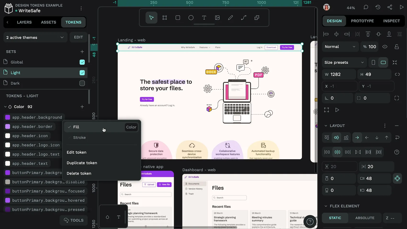
- The first design platform to natively support the W3C DTCG’s Design Tokens
- Grab your designs as HTML and CSS, or copy specific CSS properties
- Complete control over your design system without framework limitations
Join the growing community of developers and designers who are breaking free from framework constraints and building truly unique web experiences. Start at penpot.app today and discover how open-source design can transform your web development workflow.
Related Blogs
We have even more posts about CSS, design and development. Here’s a few examples of handy articles to help you learn more about CSS.
 Laura Kalbag
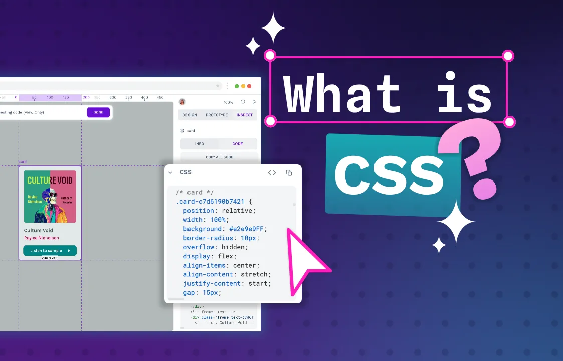 Laura Kalbag
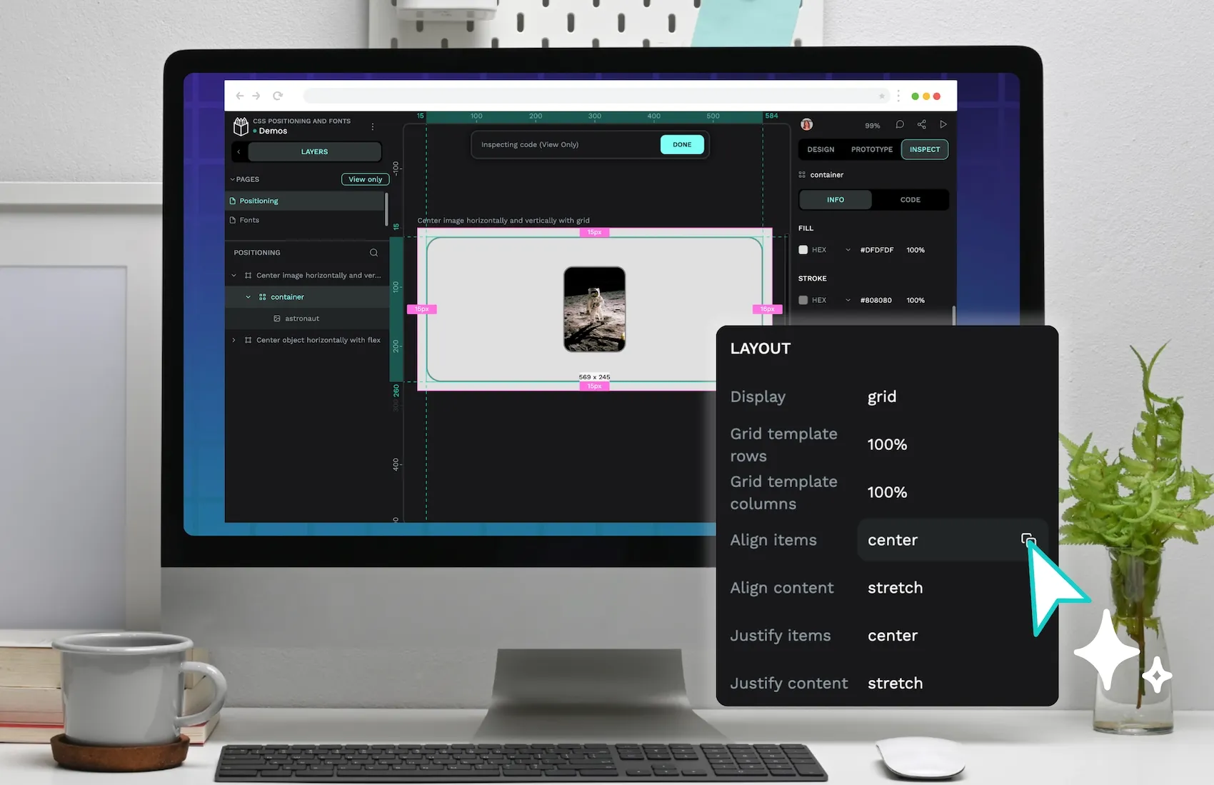 Paula Tienza
 Laura Kalbag
 Laura Kalbag