Web design color theory: How to build brands and improve UX with color
Colors bring a webpage to life, and some of our most engaging digital experiences wouldn’t work without a good use of color theory. What different colors go together? Are the basics of color theory enough?

Colors bring a webpage to life, and some of our most engaging digital experiences wouldn’t work without a good use of color theory. However, choosing colors can be a daunting task for even the most experienced designers.
So, where do you start? What different colors go together? Are the basics of color theory enough?
In this article, we answer these questions, explore the importance of web design color theory, and share how it can enhance your product’s user experience (UX). Get a head start on your next design with these trusted color theory tips.
Understanding the basics of web design color theory
Color theory is the art of applying color principles, or rules, to make aesthetically pleasing designs. While professional artists and graphic designers can spend years learning the ins and outs of color theory, many of the principles are simple enough for beginners to understand.
There are common challenges to color theory, including difficulty perceiving the differences between similar colors or applying outdated color trends that don't even use color theory. It can also be hard for new designers to take what they know from reading and learning and apply it in real-world design scenarios; color schemes may look appealing in theory, but can be vibrant and unpleasant when applied directly to designs.
Fortunately, with time, practice, and assistive tools like a color wheel, it’s possible to grasp color theory concepts — and excel at them.
How color theory is commonly applied in web design
Web design gives the user a functional and — hopefully — beautiful experience when they engage with a webpage or app. Color can support both of these goals, so designers shouldn’t rush the process of addressing, planning, and executing the right colors for their projects.
Instead, you should ask yourself: Do I have brand guidelines to follow? Is there a clear briefing that constrains me? What is the purpose of this design?
Here are some of the ways that color theory influences the web design process.
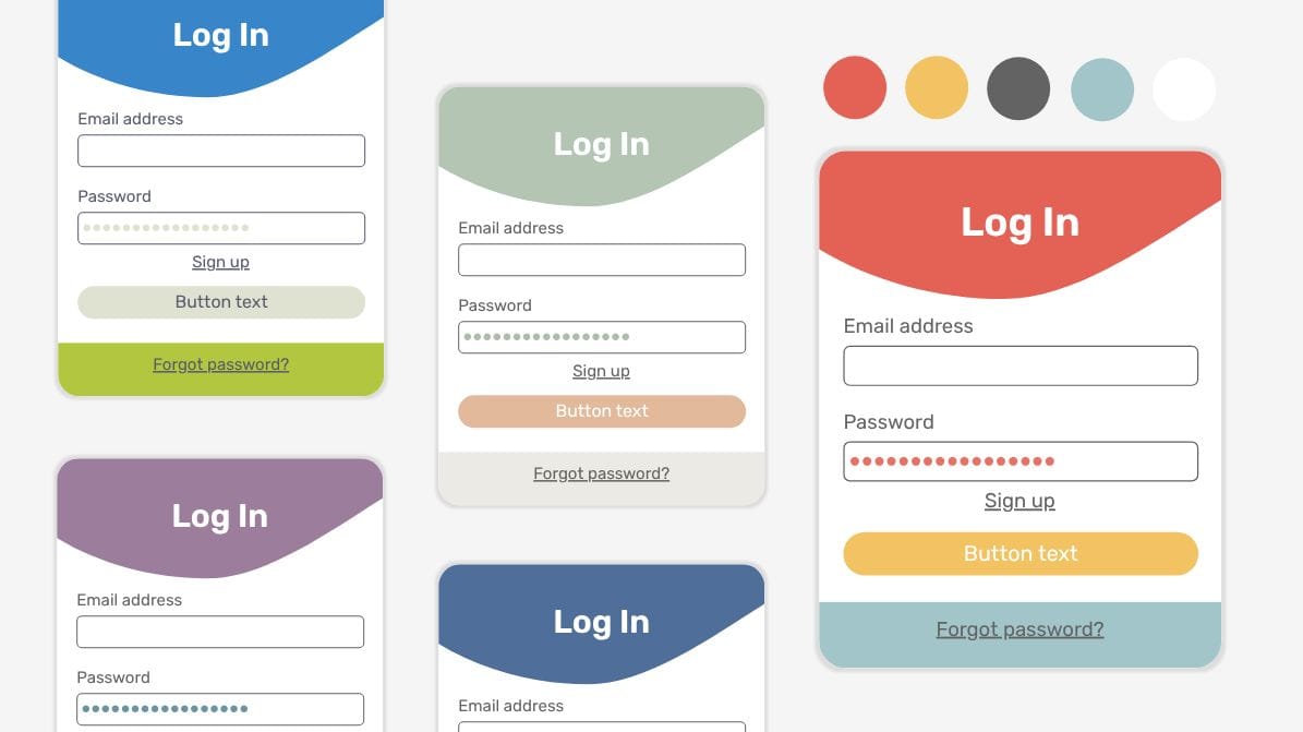
- Colors should integrate with and complement a company’s existing design rules, including logo colors and product details that create brand recognition.
- Colors evoke certain emotions or feelings (also known as color psychology), making it important to pick colors that align with the desired user emotional response, such as red for a sense of urgency or yellow for optimism. Although even if colors have meanings and help generate emotions, they don't work alone. They are mixed together with composition, tone of voice, and typography to create a completed product.
- Colors can support or inhibit how a user navigates and interacts with a site, with contrasting colors making navigation simpler than colors that are too similar to one another.
- Colors make the call-to-action (CTA) more prominent than the rest of the content, giving designers an opportunity to truly hit home the next steps they want users to take.
- Colors should encourage interaction from those with hearing or visual impairments working with modern assistive technology.
The 3-color rule
The 3-color rule is a design method that limits your color scheme to just three main colors. The goal is to simplify the color planning process and bring harmony to a design. While there are variations of this principle in interior design or fashion, it’s applied to web design in this way:
- A dominant color is used throughout the design for the main elements and backgrounds.
- A secondary color is used for subheadings and less noticeable design features. (This isn’t to be confused with the label for “secondary” colors of green, violet, and orange in the color wheel. Secondary colors in this context can be any color.)
- An accent color, which may be bold or neutral, is used sparingly to help certain elements, like a call-to-action (CTA), pop.
There’s no set standard for how much of each color to use as long as the dominant color is used more than the secondary, and so on. Designers might try the 60-30-10 rule, which limits the dominant to 60%, secondary to 30%, and accent color to just around 10%. If you want to know more about this rule, take a look at this video on how not to use color.
Advanced color theory: Exploring the 7 types of color schemes
Even if you commit to the 3-color rule, you still need to decide what color combinations to use. Thankfully, color theory offers at least seven commonly accepted color schemes for inspiration.
1. Monochromatic
This scheme uses variations of a single color, such as navy blue, to create a cohesive look and feel. Here’s an example:
- Base color: navy blue
- Tints: lighter variations, such as baby or powder blue
- Shades: darker variations, such as midnight blue or indigo
- Tones: desaturated variations, such as periwinkle
By adjusting the original color of navy blue, you can get a wide color palette that creates depth. Depth matters because it helps engage the user by emphasizing important elements.
2. Analogous
The analogous color scheme focuses on three colors that appear next to one another on the color wheel. They are very similar and can remind the user of natural elements, such as the sea or sky. For example, blue, blue-green, and green can be used to create an analogous theme.
Analogous color palettes give designers a chance to use all warm colors or all cool colors to create an emotional connection or mood.
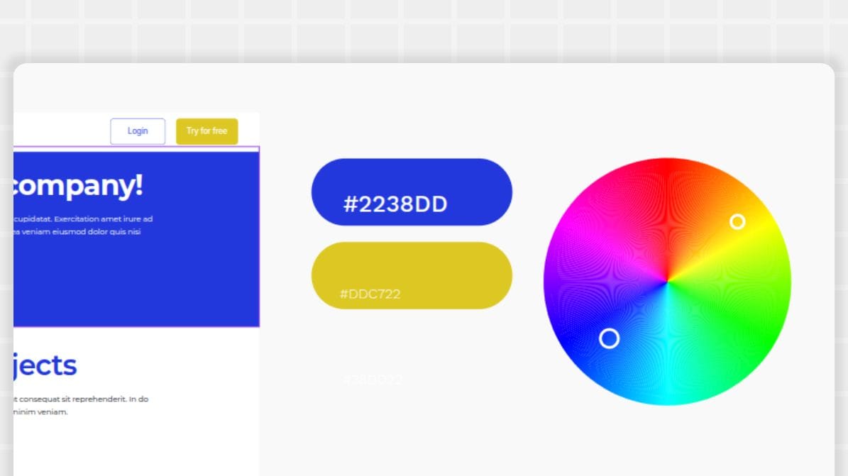
3. Complementary
When two colors appear across from each other on the color wheel, they are considered opposites. If paired together, they create a complementary color scheme. Examples include red and green or blue and orange. They create color contrast and balance while bringing attention to the design.
4. Split-complementary
Similar to complementary, the split-complementary scheme uses opposite colors on the color wheel. However, it uses three colors instead of two, with a base color and two colors adjacent to its complementary color.
For example, a blue base color would have the split-complementary colors of yellow-orange and red-orange. It uses the two colors next to orange instead of orange to bring a more balanced look to the scheme.
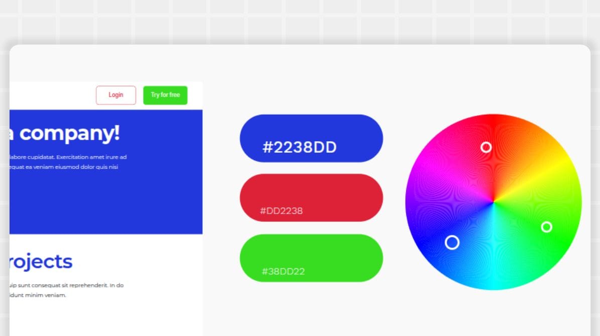
5. Triadic
In a triadic color scheme, three evenly spaced colors on the color wheel are used together for a high-contrast and energetic look.
Examples include:
- Primary colors of red, yellow, and blue
- Secondary colors of green, orange, and purple
- Tertiary colors of yellow-green, blue-violet, and red-orange
6. Tetradic
A tetradic color scheme is also known as a double complementary or rectangle scheme. It uses four colors broken into two complementary pairs on the color wheel in either a rectangle or square pattern.
Examples include the rectangle tetradic of red, green, blue, and orange. It can also be a square tetradic, such as yellow-green, orange, red-violet, and blue.
The tetradic scheme results in a vibrant look with lots of color choices for the designer to work from.
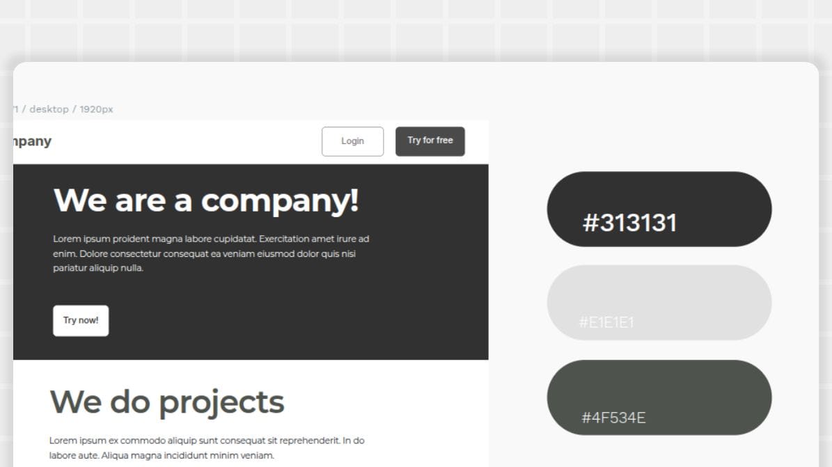
7. Achromatic
An achromatic scheme is the least vibrant — it only uses neutral colors. You can still get a great contrast with lots of impact, but it does so with a cleaner and more minimalist look.
An example of an achromatic scheme includes black, white, and shades of grey.
How to craft the perfect color scheme for your website
Once you have a good grasp of web design, color theory, and the different types of color schemes, you can begin your journey in these steps:
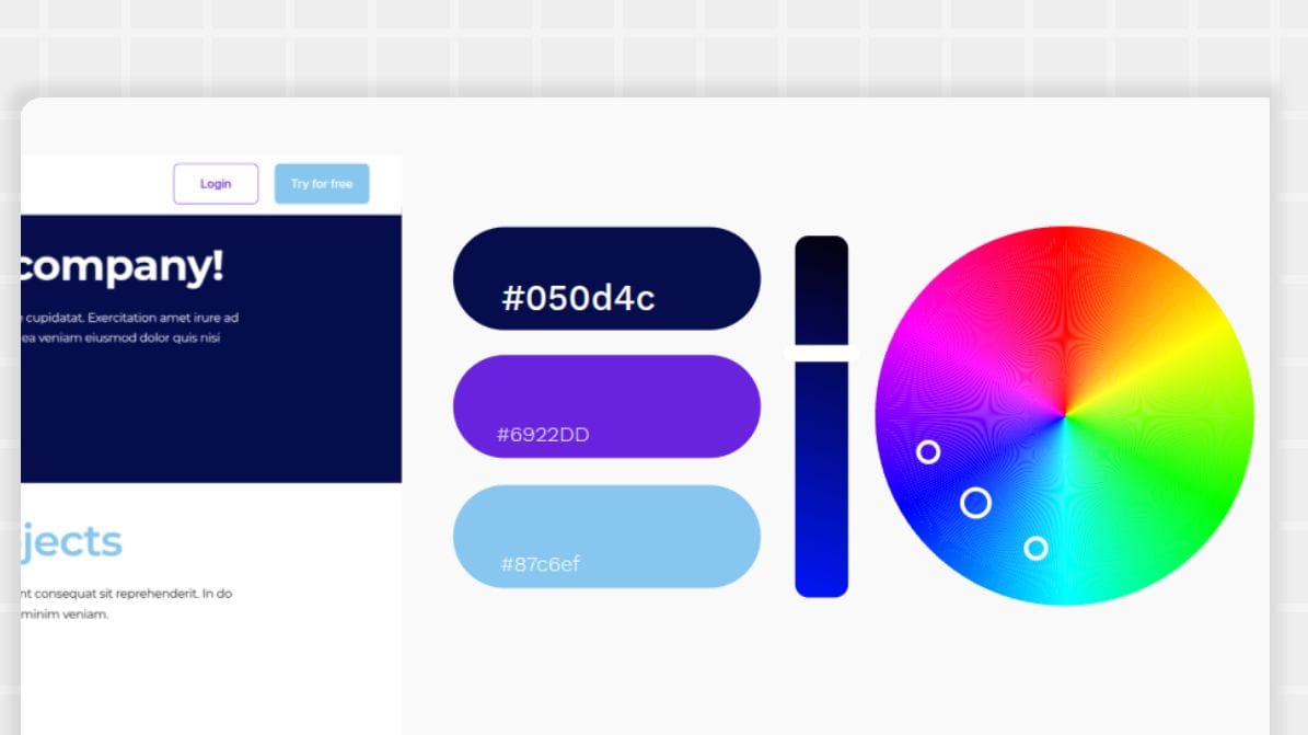
- Determine your brand identity: Is your business bold? Classic? Stately? Chaotic? Define your business personality and then choose colors that complement that identity.
- Pick a base color: Most color schemes require a base color. For some brands, this is your brand’s major logo color. You can also go outside this color for a special campaign or brand event.
- Select a color scheme: Which of the seven schemes we shared works best for your brand? It could take some experimentation to find a mix you like. Feel free to try things out and swap out color choices to see how they feel in your test designs.
- Remember the 60-30-10 rule: Consider going with the lightest or most neutral color for the dominant color (60%), leaving the boldest color for the accent tone. The secondary color will be used throughout to highlight and create contrast.
- Create contrast and readability: You’ll want your colors to show up well on a number of different devices and technologies, as well as follow best practices for accessibility. The WebAIM Contrast Checker will let you know if your text and background color pairings show up well and allow users with disabilities to enjoy your design.
- Test and refine: Very rarely will you land on a winning color combo the first time around. Use your chosen colors in a variety of prototypes to see how they work in real life. Pay close attention to things like headers and navigation, body content, and CTAs to see if a simple color swap could enhance your UI.There are a couple of websites that are very useful if you are stuck and cannot come up with a final decision. Palette Maker can show you how palettes look on different visual deliverables (UI designs, posters, etc.), while Color Hunt gives you many random color combinations you can start working with when you have no clue what direction you want to take.
Build your brand design with Penpot
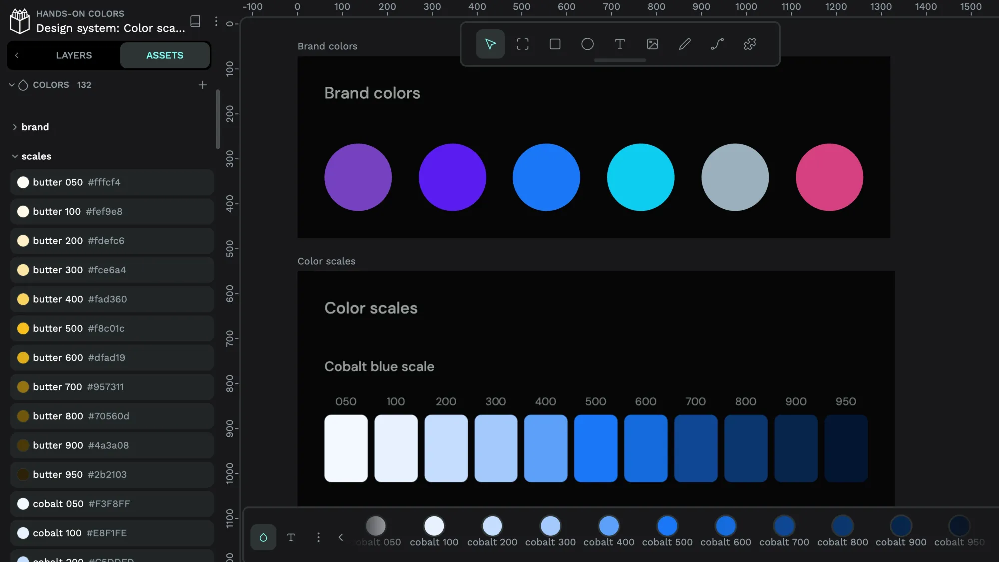
Penpot’s free design tool is easy enough for beginners to master, and you can store your color palettes in a library for quick access later.
Whether you create one design or one hundred, you can return to your prototypes and designs at any time. Our cloud-based platform enables anyone on your team to see and use your color choices for your next big website design project.
Sign up for your Penpot account in minutes, and build your best color scheme today.
Related Blogs
We have more posts about color in design. Here’s a few examples of helpful articles to help:
 Elena Scilinguo
 Laura Kalbag