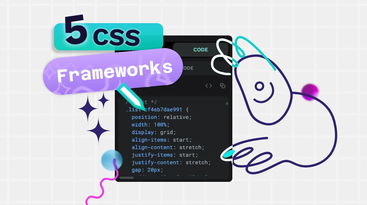
The top 5 questions people have about CSS answered by Penpot
Having a basic knowledge of CSS can really benefit your skills in web and UI design. Let’s start with these answers for the top CSS questions asked by beginners today.

CSS is the foundation for many of the websites and apps used today. In fact, 96% of all websites use it!
Having a basic knowledge of CSS can really benefit your skills in web and UI design. So, where should you start? Let’s start with these answers for the top CSS questions asked by beginners today. This can help give us an understanding of CSS’s role in modern web design.
What are CSS styles?
Cascading Style Sheets (CSS) are sets of guidelines or rules for how items display on a web page. These items are known as elements, and include headings, text, links, lists, headers, footers and much more. CSS dictates the style of elements, which can include:
- Color, including text, background, borders, and icons
- Font, including font family, size, boldness, italics, or underline
- Space, such as paddings, margins, and gaps between elements
- Layout and the width and height of containers
- Alignment, such as whether text is right/left aligned or centered
- Opacity, or how transparent an item appears when overlaid on top of another element on the page
- Overflow, or what happens to things that are too big for their containers (to scroll or not to scroll!)
blockquote {
  background-color: indigo;
  color: hotpink;
  font-style: italic;
  font-size: 17px;
}
This CSS sets the background color, text color, font style and size of any quote on the page.
These rules are known as CSS styles. To set CSS styles, you can include them in the page or view itself, or create a CSS style sheet that can be referenced by the entire project.
What is a CSS selector?
Designers generally don’t want CSS rules to apply to everything on a web page. For example, you wouldn’t want all of your text — from paragraph text to all your headings — to be 12px black san serif font. CSS selectors specify which elements are affected by each rule, such as just H2s or all paragraph text.
Selectors help find the elements in a long line of HTML code and ensure the rule is applied correctly. Here are some examples of CSS selectors and what they do:
Simple selectors
Simple selectors are just that: simple. They filter out elements on a page based on element name, ID, and class and apply the rule based on each.
Element includes the element name like paragraph (or <p>). To make every paragraph have centered blue text, you could use CSS like this:
p {
  color: blue;
  text-align: center;
}
ID is for identifying a unique element as each ID can only be used once on a page. The # in the CSS is for selecting an ID. To make just one element (second-heading) on the page pink and bold, you could use this code:
#second-heading {
  font-weight: bold;
  color: hotpink;
}
Class attributes can be shared by multiple elements, and are targeted with the class selectors. The . in the CSS is for selecting an class name. If we wanted to make any element with a class name of accent into magenta italic text, regardless of the element, you could use this code:
.accent {
  color: magenta;
  font-style: italic;
}
Selectors can also be a combination of the simple selectors. For example, you could use element name and class like h2.accent which would target all h2 headings with the class of accent, ignoring all other h2s or non-h2 elements with the classname accent.
There are also more complex selectors and ways to combine selectors, relating to which elements are inside a specific element, which element follows another element, or an attribute value. As you learn more CSS, these become easier to understand. Those starting out in CSS will tend to use the simple selectors, such as changing all text to a gray color or all H2s to a bold font.
What is CSS padding?
The term “padding” refers to the space or cushion around a web page element, but inside the border. (Or where the border would be if there was a border!)
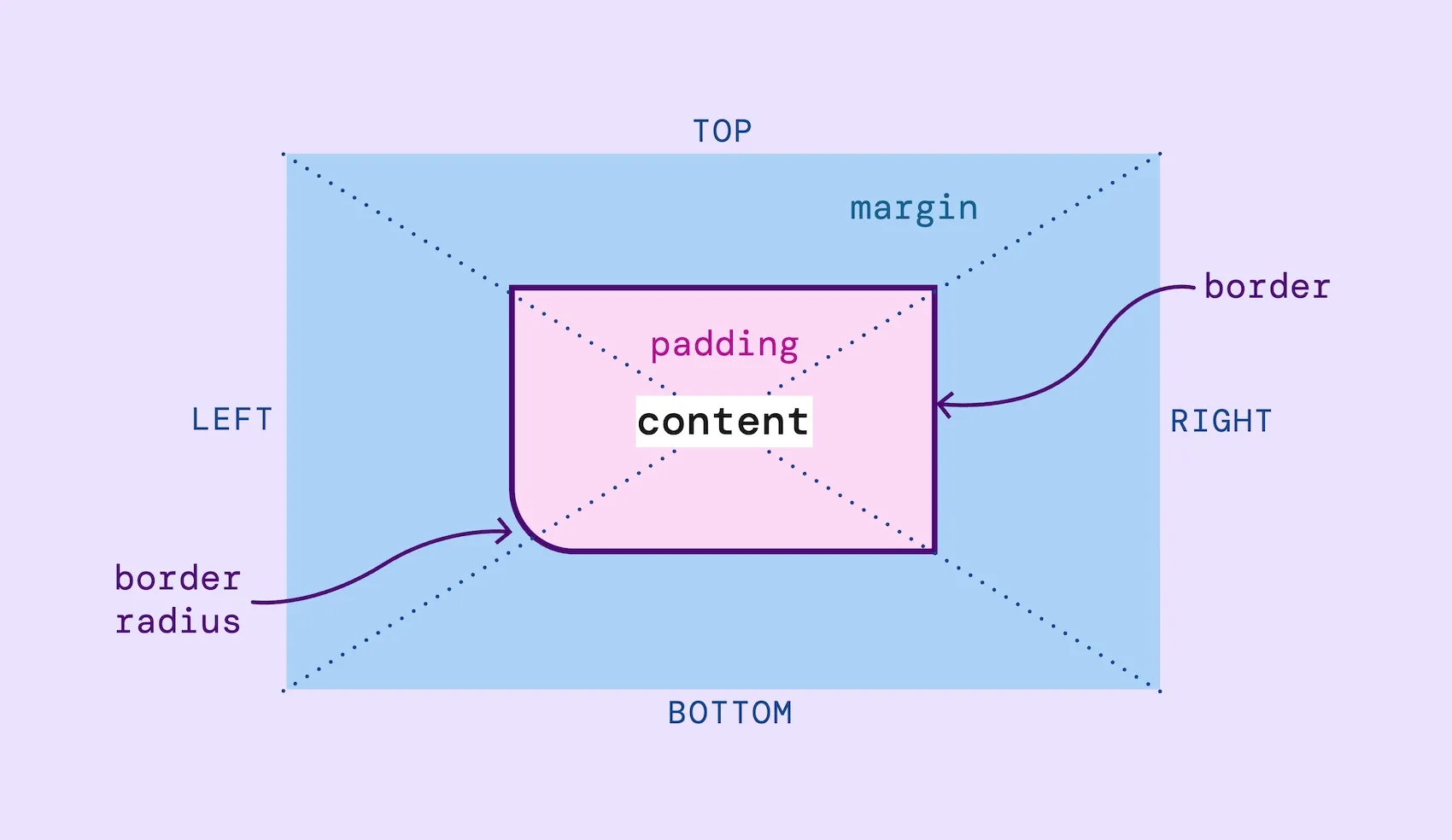
You can use padding to make an element bigger, for example adding an even amount of space around text in a button. Or to ensure there’s always space around an element so the layout doesn’t feel too crowded, like in a menu.
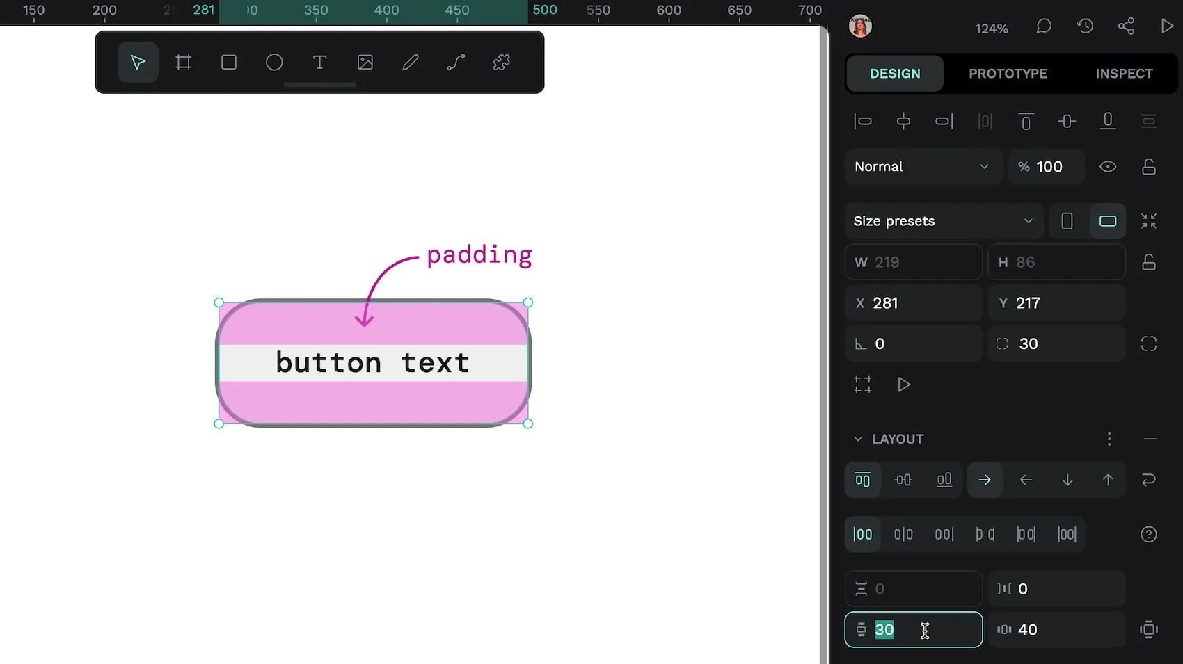
Designers can take different approaches to setting up padding. Common CSS padding rules include:
- Setting up equal padding for all sides:
padding: 20px; - Setting up padding for each side individually, including the top, right, left, and bottom, on its own line:
button {
  padding-top: 30px;
  padding-right: 40px;
  padding-bottom: 30px;
  padding-left: 40px;
}- Using a type of shortcut, called a universal shortcut, that addresses all the paddings at once on the same line
button {
  padding: 30px 40px 30px 40px; /* top, right, bottom, left */
}- In CSS, you can also define padding as a percentage of the whole width, for example
padding-left: 20%. As well as many other absolute (not relative to anything) and relative units (proportional to the size of the element or a defined “base” size.)
What is display in CSS?
The display property controls how an element interacts with the elements around it in a layout.
Most elements use either display: block or display: inline by default.
block: Makes the element behave as a block-level box that spans the entire width of its container, taking up all the available width space. By default, these boxes stack vertically on top of each other and include elements like headings and paragraphs.inline: Makes the element behave as an inline box, that sits in the flow of the surrounding elements, like a link inside a paragraph of text.
The display property can also tell a container element how to layout any elements inside it. This is how we can create responsive layouts:
flexTurns the element into a block-level flex container using the Flexbox layout. Read more about the advantages of Flex layouts to see how they can help make your design more flexible to fit any device or browser size.grid: Turns the element into a block-level grid container using the Grid layout. CSS Grid is powerful for creating designs with defined rows and columns.
There are also less commonly-used display commands like none. Using none makes the element seemingly disappear and not appear on the page at all. This is useful for when you want to create an element and don’t immediately want it in the flow of the webpage but might want to include it later on. It reduces the need to create, delete, and recreate elements as your needs change. Like showing and hiding layers in a design file.
You can use Penpot to design these layouts and get working CSS: Flex and Grid Layouts.
What is CSS overflow?
Sometimes when you create an element, the content will be too large for its container. You may have seen this on a website where there's missing text within a box, the image you want to see just cuts off, or an element inside a web page has its own scroll bar.
One example is an element with a width of 300px and a height of 50px, but the text the designer wants to display inside the element measures more like 150px high.
What should be done with everything contained in that extra 100px? It depends on how you want it to appear to the users. The CSS overflow property addresses this issue in one of a few ways using specialized values:
hiddenvalue: This clips off the excess. Anything that doesn’t fit won’t be shown, and the reader won’t have an option to enlarge or scroll to see more.
visiblevalue: The excess is shown on the page but will run over the borders of the element and may show up outside the intended area (or even overlap with another element).
scrollvalue: This cuts off the overflow but provides a scrollbar that users can press to see all of the data. It’s a good way to show everything without messing up the design of the page.
There are a few other values used to address overflow, but the main idea is that it works only for elements with a defined height and width. For responsive designs, we rarely use the overflow property as we don’t set defined heights and widths for our elements, instead telling them to fit the content or the height/width of the available space.
More answers to your CSS questions
These are just five of the most common things people want to know when exploring CSS, and they represent just the beginning of what you can learn. CSS knowledge is something you can build upon over time. Using the right tools (like Penpot) can help you understand how a design works in CSS, enhancing your CSS skills and giving your web projects a polished, professional look.
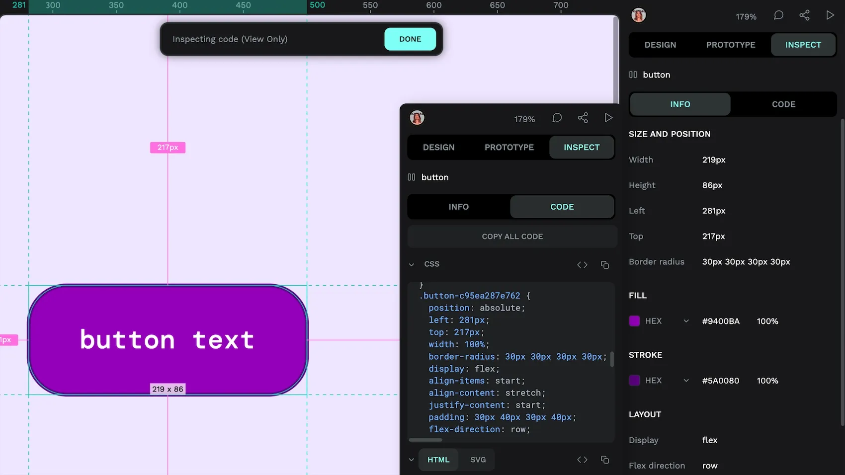
Get started today with Penpot’s free app. Make a new design in minutes, and then click Inspect to see the CSS code for that design. Get even more CSS know-how in our ultimate guide, which is full of tips, tricks, and next steps for anyone wanting to level up their design game.
Related Blogs
We have more blogs about CSS and many other design and code-related topics. Here’s a few examples of handy articles to help you learn more about CSS.
 Laura Kalbag
 Laura Kalbag
 Laura Kalbag
 Laura Kalbag