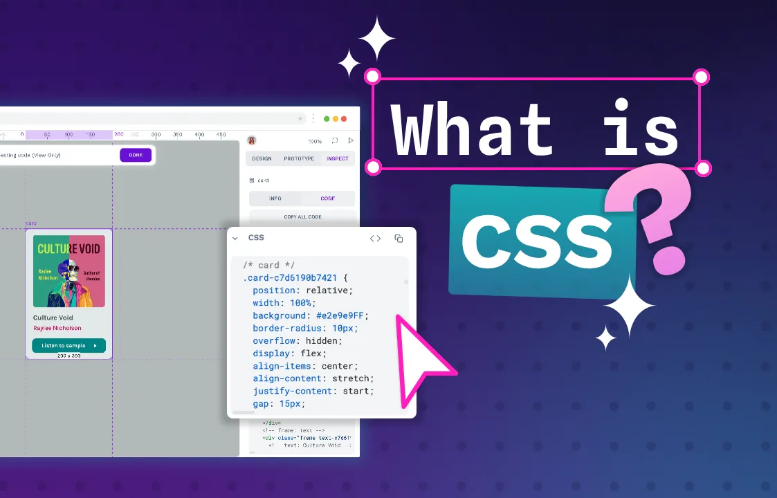
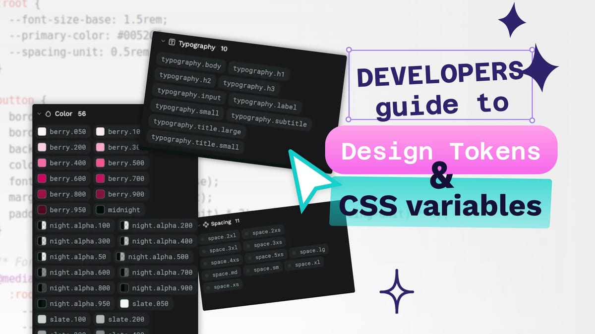
The developer’s guide to design tokens and CSS variables
Design tokens are a platform-agnostic representation of your design decisions, while CSS variables provide a way to implement these decisions in the browser.

Design systems provide a shared language and reusable components that help designers and developers work together toward a common goal: creating cohesive, scalable, and maintainable user interfaces across multiple platforms.
Systematic design approaches have become increasingly essential as platforms have become more varied, products have grown more complex, and teams have become more distributed. Two useful concepts that can help us create effective design systems are design tokens and CSS variables.
Let’s explore the concepts of design tokens and CSS variables, compelling reasons for using them, clarify their key differences, and set some best practices for using both in your design system.
The difference between design tokens and CSS variables
Some developers may confuse design tokens and CSS variables because they share a core concept: representing reusable values. However, they operate at different levels of abstraction and serve different roles within the design and development workflow.
Design tokens: The abstract language of design
Design tokens are the smallest indivisible elements of a design system, representing individual design decisions as data. They function as named entities that store specific visual design attributes such as colors, typography (including font families, sizes, weights), spacing units, border radii, stroke widths, and more. Think of them as a glossary for a design system’s visual style.
Their main job is to create a single source of truth for these design decisions, acting as a centralized repository that bridges the gap between design intent and code implementation. Instead of designers specifying concrete values (for example, hex code #6c0c00) and developers hard-coding them, both disciplines reference a meaningful token name (for example, color-text-error). This token then resolves to the appropriate value for the target platform.
Design tokens also support aliasing—the ability for one token to reference another. This can create hierarchies of design decisions. Here’s how it works:
At the top level, we might define design decisions like:
background.surface {colors.white}
card.background {theme.bg.surface}
These simple declarations show two token references:
- The background.surface token references a primitive color token called
colors.white - The
card.backgroundtoken references a theme token calledtheme.bg.surface
In design tokens’ JSON format, these references are described through a structured token definition:
{
  "colors": {
    "white": {
      "value": "#FFFFFF",
      "type": "color"
    }
  },
  "theme": {
    "bg": {
      "surface": {
        "value": "{colors.white}",
        "type": "color"
      }
    }
  },
  "card": {
    "background": {
      "value": "{theme.bg.surface}",
      "type": "color"
    }
  }
}
In this token structure, we see three layers of abstraction:
- A primitive token (
colors.white) with a raw value (#FFFFFF) - A theme token (
theme.bg.surface) that references the primitive with{colors.white} - A component token (
card.background) that references the theme token with{theme.bg.surface}
This aliasing structure can enable theming capabilities while maintaining the tokens’ semantic meaning. Changing just the theme token’s value would cascade through the entire system, affecting all elements that reference it directly or indirectly. For instance, to create a dark theme, you’d only need to change theme.bg.surface to a reference dark value like "colors.black,” and all surfaces and cards would automatically update.
Design tokens are platform-agnostic. They are typically defined and stored in neutral, machine-readable formats like JSON and have a specific W3C standard for adoption. This abstraction allows a single set of design decisions to be transformed and applied consistently across diverse platforms, including web (CSS, Sass, JS), native mobile (iOS, Android), and potentially others.
CSS variables: Dynamic styling for the web
CSS custom properties, commonly referred to as CSS variables, bring dynamic styling capabilities to the browser. Unlike design tokens, which exist as abstract data, CSS variables live inside the stylesheet itself. They’re declared using a custom property syntax prefixed with two dashes (--) and accessed using the var() function:
:root {
  --font-size-base: 1.5rem;
  --primary-color: #0052CC;
  --spacing-unit: 0.5rem;
}

button {
  border: none;
  border-radius: 1rem;
  background-color: var(--primary-color);
  color: white;
  font-size: var(--font-size-base);
  margin-top: var(--spacing-unit);
  padding: calc(var(--spacing-unit) * 2) calc(var(--spacing-unit) * 4);
}

/* For smaller screens, we can adjust our base units */
@media (max-width: 600px) {
  :root {
    --spacing-unit: 0.25rem;
    --font-size-base: 1rem;
  }
  /* All elements using these variables will automatically adjust */
}
Try changing the viewport/browser width to see the button font size and padding adapt.
This example demonstrates three characteristics that make CSS variables unique:
Live and reactive: Unlike preprocessor variables (Sass, Less), which are replaced during compilation, CSS variables remain changeable in the browser. In the example above, changing --spacing-unit in the media query automatically updates all calculations that reference it. This reactivity enables real-time theme switching and responsive adjustments without requiring complex overrides or page reloads.
Cascading and inheritance: CSS variables follow the cascade, which means their values can be overridden by more specific selectors. They also inherit down the DOM tree from parent to child. You can define your variables on :root to apply them globally but then override them for specific components:
.dark-theme {
  --primary-color: #2684FF;
}
button.danger {
  --primary-color: #DE350B;
}
Scoped context: In this way, variables can be scoped to specific components, creating encapsulation that prevents styles from conflicting. While global variables set on :root provide system-wide consistency, component-specific variables enable local customization without affecting other elements.
CSS variables are the perfect way to implement design tokens on the web. While tokens define what your design values mean across platforms, CSS variables make these values work dynamically in the browser, keeping your design decisions connected to your actual code.
The relationship: Tokens as the source, variables as the web implementation
The process of connecting design tokens to CSS variables typically starts with design decisions being shared as structured token data:
{
  "color": {
    "brand": {
      "primary": {
        "value": "#0052CC",
        "description": "Primary brand color used for buttons, links, and key UI elements"
      }
    }
  }
}
During the build process, a transformation tool (like Style Dictionary, Theo, or a custom script) converts these abstract tokens into platform-specific formats. For the web, this means generating CSS variables:
:root {
  --color-brand-primary: #0052CC;
}
These variables are then used throughout the project’s CSS:
.button {
  background-color: var(--color-brand-primary);
}
a {
  color: var(--color-brand-primary);
}
The benefit of this approach becomes clear when you need to make changes. If the brand color needs to be updated from blue (#0052CC) to purple (#5243AA), you only need to modify the token value in one place. The build process regenerates all platform-specific implementations, including CSS variables, and the changes are synced throughout the entire project.
Meanwhile, you can also simultaneously transform the same token into formats for other platforms:
// iOS Swift code
let colorBrandPrimary = UIColor(red: 0, green: 82/255, blue: 204/255, alpha: 1)
This keeps things organized:
- Design tokens define what the design values are and their semantic meaning.
- CSS variables determine how these values are implemented in the browser.
- The transformation process connects them, maintaining consistency across platforms.
With this architecture, design systems achieve both the cross-platform benefits of tokens and the dynamic flexibility of CSS variables, helping create properly scalable, maintainable user interfaces.
Why adopt tokens and variables?
Design tokens and CSS variables offer major benefits that can help address common development challenges:
Achieving consistency across platforms
Design tokens establish a single source of truth for design decisions, enabling consistent implementation across web, native apps, and any other platforms. Combining their platform-agnostic nature with automated transformation processes, helps ensure that styling remains uniform. This in turn reduces design drift and visual bugs.
As your system grows, tokens can help you keep everything consistent, protecting your brand across all platforms. For example, a color-brand-primary token can transform into CSS variables for web, UIColor definitions for iOS, and XML color resources for Android, maintaining exact color matching across all platforms from a single definition.
Improving efficiency and development workflows
The token-based approach significantly speeds up development by enabling designers and developers to reference predefined values rather than repeatedly looking up specific codes.
Tokens have the most impact when making updates—changing a token value automatically propagates across entire products or platforms in minutes rather than days of manual updates. This architecture can fundamentally transform how design evolution is managed, replacing cumbersome handoff processes with more streamlined workflows.
For large-scale applications, tokens help reduce redundancy in code, improving maintainability and allowing developers to focus on implementing core functionality rather than pixel-perfect styling. This efficiency is particularly valuable during design system evolution, where global updates can be managed through token changes rather than manually hunting for occurrences across the codebase.
Creating a shared language
Tokens provide a common, unambiguous vocabulary that bridges design and development. When you use semantic naming conventions, token names ideally clearly convey the purpose of a style (for example, spacing-inset-medium, color-background-pressed.) This should minimize misinterpretation during both design and development.
Codifying design tokens in this way helps transform subjective style choices into objective, shareable data points. Which should then contribute towards teams communicating based on a precise, agreed-upon framework. Modern design tools like Penpot support design tokens directly so designers can create and work with the same token definitions that developers use. During design reviews, teams can reference token names rather than try to make sense of hex codes or pixel values.
Enabling theming capabilities
The combination of token aliasing and CSS variables can create a strong foundation for theming. By structuring tokens so that semantic tokens reference primitive tokens, theme switching only requires redefining primitive values within the theme selector. Since CSS variables are live, the browser automatically recalculates styles based on currently scoped values, making theme changes instantaneous without requiring component recompilation.
A well-structured token system typically uses layers of abstraction including global primitives ( --color-blue-600: #0052CC), semantic mappings (--color-interactive: var(--color-blue-600)), and component-specific tokens (--button-background: var(--color-interactive)) — enabling powerful theming capabilities with minimal code. This approach not only facilitates dark/light modes but also enables accessibility features like high-contrast themes, color blindness accommodations, and user preference settings that can respond dynamically to system preferences through CSS media queries like prefers-color-scheme.
Try switching your device between light and dark mode to see the colors adapt.
Reducing technical debt
A token-based design system can significantly reduce technical debt by creating a more maintainable architecture for style management. Without tokens, styling information tends to become randomly scattered throughout codebases, leading to inconsistent implementation, duplicate values, and unused code that’s difficult to identify and remove.
By centralizing design decisions in tokens, teams can create a clear structure that makes dependencies more visible and refactoring safer. You can also enhance the transformation process that converts tokens to platform-specific variables with validation and linting, catching errors before they reach production. Using a structured approach like this can prevent the accumulation of styling anomalies that would require loads of work to reconcile later.
Implementing tokens as CSS variables
Using design tokens for web development requires a clear process for translating the abstract token definitions into concrete CSS variables that browsers can understand and utilize. This involves choosing a transformation workflow, establishing naming conventions, structuring tokens, managing CSS scope, and organizing your resulting CSS files.
Manual setup vs. build tools
Implementing design tokens in CSS can be approached in two ways: manual setup or automated build tools.
For small projects, a manual approach involves hand-coding token values directly into CSS variables within a stylesheet. You simply define your tokens in the :root selector as custom properties and reference them throughout your CSS. This approach is straightforward for the first few tokens but quickly becomes unwieldy as your design system grows.
For larger projects, build tools like Style Dictionary offer significant advantages. Style Dictionary takes centralized token definitions (usually in JSON format) and automatically generates platform-specific outputs, including CSS variables for web. The tool ensures consistency by transforming tokens from a single source of truth into multiple platform formats.
/* Example output from Style Dictionary */
:root {
  /* Primitive tokens */
  --color-blue-500: #2980b9;
  /* Semantic tokens */
  --color-primary: var(--color-blue-500);
}
Check out Stu Robson’s guide for using Style Dictionary with Penpot’s design tokens.
While manual setups require no tooling and offer full control, they quickly become error-prone for larger token collections. Build tools may introduce initial setup costs but they dramatically improve scalability and consistency. They can also support advanced features like token aliases, grouping, and theming.
Hierarchical naming patterns
Try to adopt a consistent, multi-level naming convention that clearly conveys a token’s purpose and organization. Most design systems use a structure that progresses from broad to specific:
[category]-[property]-[element]-[modifier]-[state]For example, --color-background-button-primary-active immediately communicates this token is:
- A color token
- For backgrounds
- For buttons
- For the primary variant
- In the active state
Structuring names like this prevents naming collisions, improves organization, and makes the token’s purpose clear. When translating token names to CSS variables, use kebab-case with hyphens as a consistent separator.
Avoid overly generic names like --primary or --large, and instead use descriptive, context-based naming like --color-primary or --spacing-large that clarifies both category and purpose.
Separating primitive and semantic tokens
Distinguish between primitive tokens (raw values) and semantic tokens (contextual usage):
:root {
  /* Primitive tokens: raw design values */
  --color-blue-400: #3498db;
  --color-blue-500: #2980b9;
  --spacing-4: 1rem;

  /* Semantic tokens: contextual usage */
  --color-primary: var(--color-blue-500);
  --color-primary-hover: var(--color-blue-400);
  --layout-page-padding: var(--spacing-4);
}
Primitive tokens define your fundamental design palette without context (colors, spacing units, and so on), while semantic tokens map these primitives to specific UI roles. This separation creates a valuable layer of abstraction that helps you:
- Update primitive values while preserving semantic references
- Create themes by remapping semantics to different primitives
- Make design language changes without modifying component code
Try to always ensure semantic tokens reference primitives rather than hardcoding values. This maintains the one-directional relationship where primitives define options and semantics define usage.
Defining tokens at the right scope
You can make use of CSS’s natural scoping to apply tokens at the appropriate level:
/* Global tokens */
:root {
  --color-primary: #3498db;
  --font-size-base: 1rem;
}
/* Themed tokens */
[data-theme="dark"] {
  --color-background: #1a1a1a;
  --color-text: #f5f5f5;
}
/* Component-specific tokens */
.button {
  --button-border-radius: 0.3rem;
}
Global tokens that apply throughout the application (brand colors, type scales) should be defined on the :root selector. Component-specific tokens can be scoped to their respective selectors to prevent namespace pollution.
For theming, define base tokens globally, then override specific tokens within theme selectors. The cascading nature of CSS variables allows the same token name to have different values in different contexts.
One approach I’d generally recommend is to use variables for reusable values that appear in multiple places or may change, but use literal values for one-off styles to avoid unnecessary abstraction. For example:
/* Good practice */
:root {
  --border-radius-button: 0.3rem;  /* Used across multiple button variants */
}
.button {
  border-radius: var(--border-radius-button);
  padding: 0.4rem 0.8rem;  /* One-off padding specific to this component */
}
.button-large {
  border-radius: var(--border-radius-button);
  padding: 0.6rem 1.2rem;  /* Different one-off padding */
}
In this example, border-radius is tokenized because it’s used consistently across button variants, while the padding values remain as literals since they’re specific to each variant.
Organizing tokens semantically
It can help to structure your token definitions in your CSS files to mirror your design system’s organization:
:root {
  /* Color Tokens */
  --color-primary: #3498db;
  --color-secondary: #2ecc71;

  /* Typography Tokens */
  --font-family-base: 'Inter', sans-serif;
  --font-size-base: 1rem;

  /* Spacing Tokens */
  --spacing-1: 0.25rem;
  --spacing-2: 0.5rem;
}
Here are some ways to organize your tokens:
- Design categories: Group color tokens together, typography tokens together and so on, either in separate files (like tokens-colors.css) or clearly marked sections.
- Token types: Separate primitive and semantic token definitions to clarify the relationship between values and their usage.
- Theming/modes: Organize token overrides for each theme (light/dark) in dedicated files or sections.
- Component scope: Keep component-specific tokens alongside their component CSS when they won’t be reused elsewhere.
Use comments liberally to label token sections and document their purpose. This semantic organization ensures the CSS reflects the design system’s conceptual structure, making the codebase more maintainable as it evolves.
Creating and managing design tokens in Penpot
Design tokens are foundational building blocks for design systems. As the first design tool to natively support the W3C DTCG standard, Penpot offers an environment for creating and managing design tokens, connecting design and development.
Token creation and organization
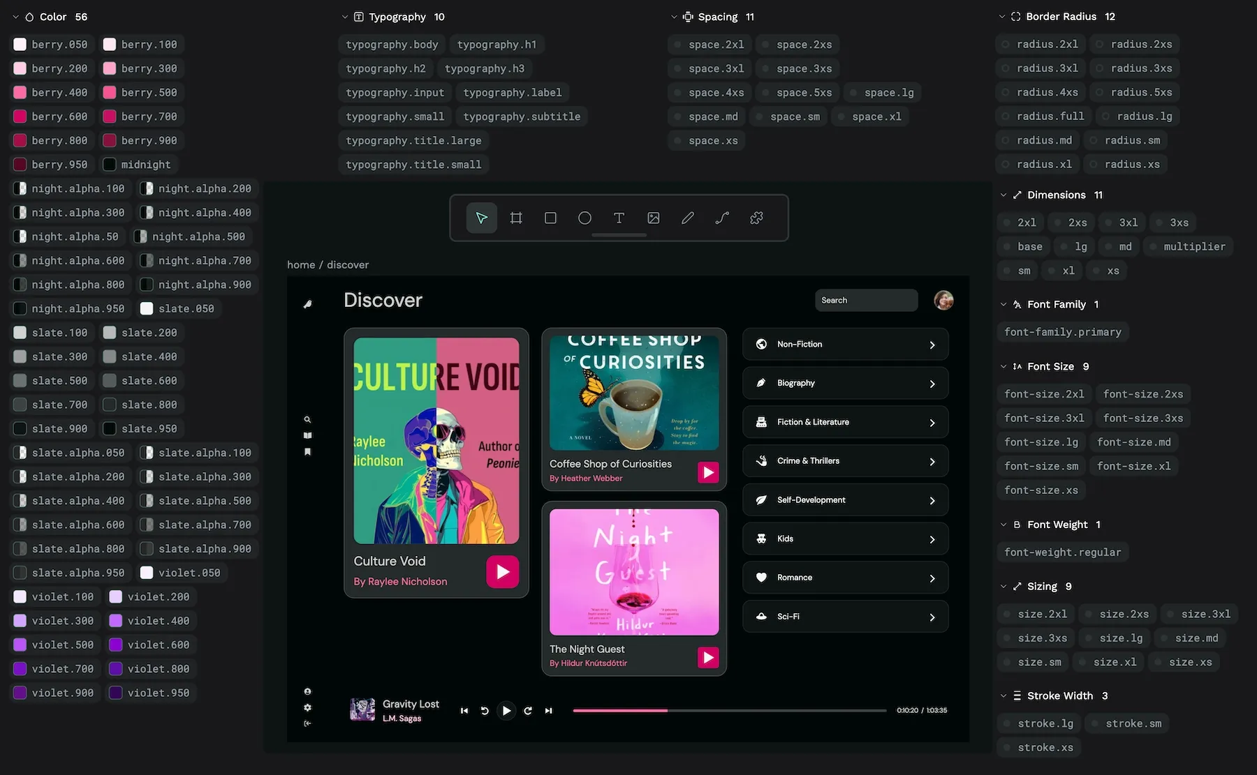
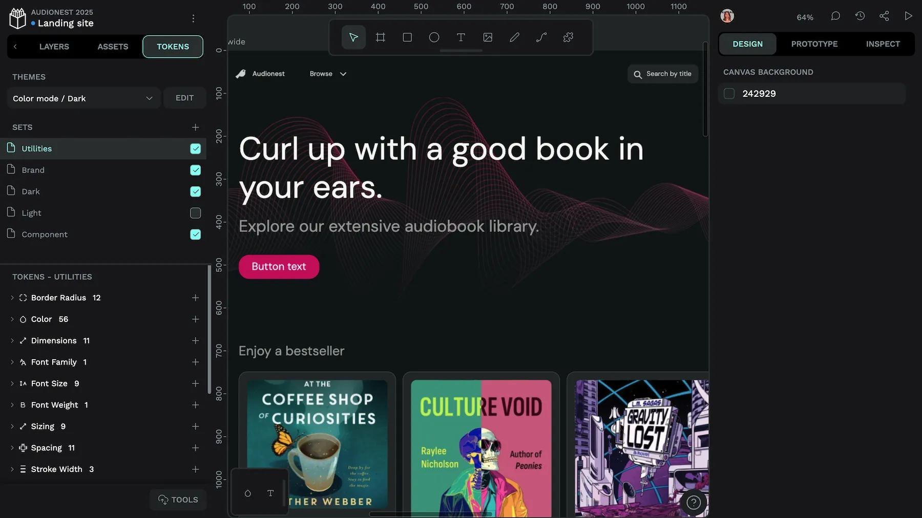
Penpot implements design tokens following the W3C DTCG Format Module, ensuring standardized cross-platform compatibility. You can create tokens from the Tokens panel with three key attributes:
- Name: Must be unique within a token type (for example, dimension.small)
- Value: Can be numerical values or color spaces (Hex, RGB, RGBA, ARGB, HSL, HSLA)
- Description: Optional documentation for the token’s purpose
Penpot uses token sets so you can separate tokens into collections that work for your system and team:
Sets/
├── Global/
│   ├── Color/
│   └── Dimension/
├── Brand/
└── Mode/
    ├── Light/
    └── Dark/
Sets follow a cascading priority model — tokens with identical names in different sets will be resolved based on the order of the sets, with later sets overriding earlier ones, similar to the CSS cascade.
Using token references and equations
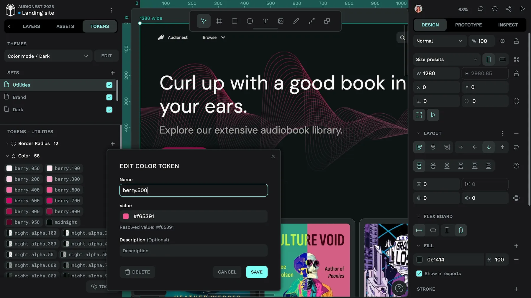
Penpot supports token referencing (aliases) by using curly braces to reference existing tokens:
spacing.small: {dimension.small}This creates handy token dependencies where changing a primitive token automatically updates all derivatives. And these updates are also reflected in any objects using tokens on the canvas. References are case-sensitive and must be enclosed in {}.
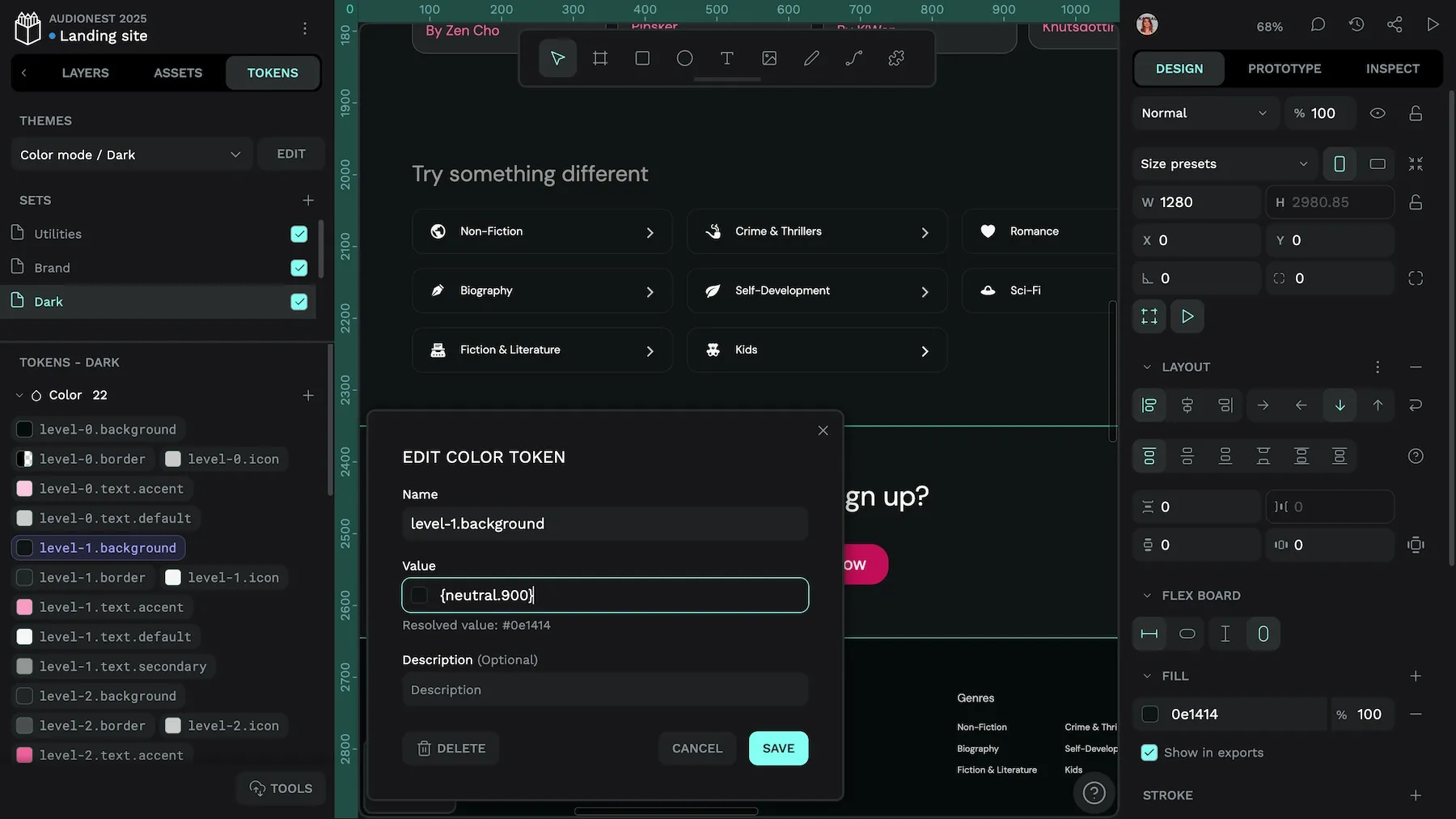
level-1.background token references the neutral.900 token.For numerical tokens, Penpot also supports mathematical equations:
spacing.medium: {spacing.small} * 2

spacing.large: {spacing.small} * {spacing.scale}
Equations support basic operators (+, -, *, /), which can help create proportional relationships between tokens.
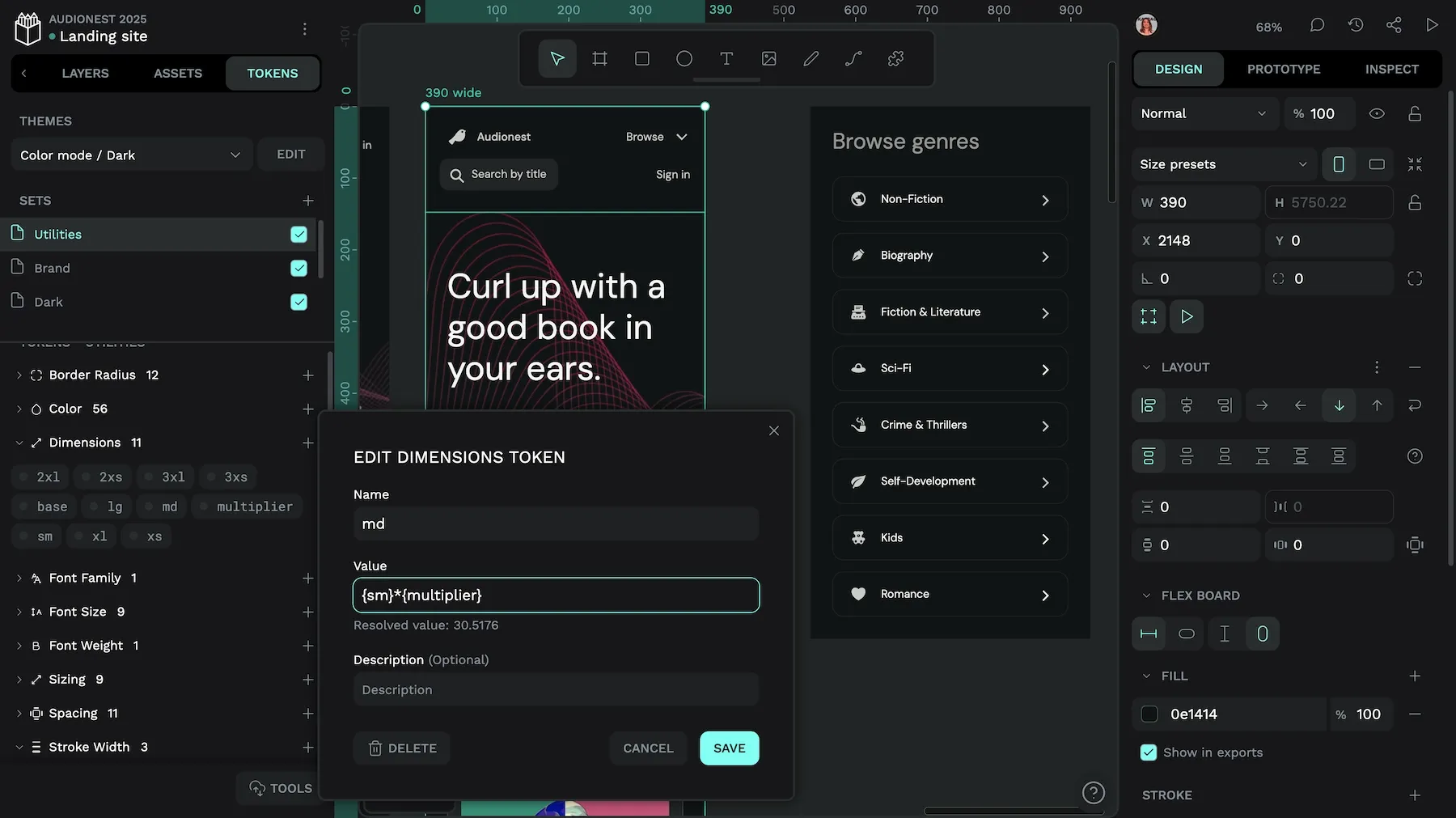
md dimension token is created by multiplying the sm token by the multiplier token.Theming with token sets
Penpot’s theming system allows you to combine token sets in themes, which can also be grouped:
Mode/
├── Light
└── Dark
Brand/
├── RedPlanet
└── YellowCab
This approach allows efficient management of theme variants without you having to create every possible combination. When a token exists in multiple active themes, the theme appearing last in the list takes precedence.
To create effective theme structures:
- Define global or primitive tokens in base sets
- Create semantic tokens that reference primitives
- Organize theme-specific overrides in dedicated sets
- Group related themes (for example Light/Dark under “Color mode”)
Switching between the light and dark themes toggles the corresponding token set.
Design tokens and CSS variables together create a powerful system for maintaining design consistency across platforms while enabling dynamic theming and responsive design on the web. By bridging the gap between abstract design decisions and concrete implementation, they can help establish a shared language that both designers and developers can understand and reference.
Ready to start? Try Penpot today to start creating and managing W3C-standard design tokens that integrate with your development workflow.
Related Blogs
We have loads more posts about design tokens, CSS, and web development topics. Here’s a few examples of helpful articles to help you get started.
 Laura Kalbag
 Laura Kalbag
 Laura Kalbag
 Laura Kalbag
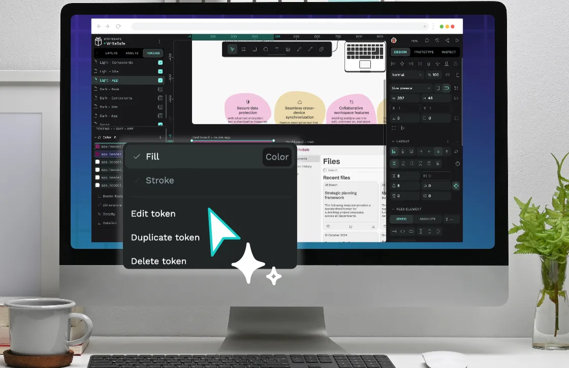
 Laura Kalbag