
Tools
6 best Adobe XD alternatives
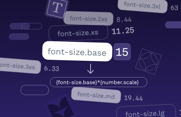
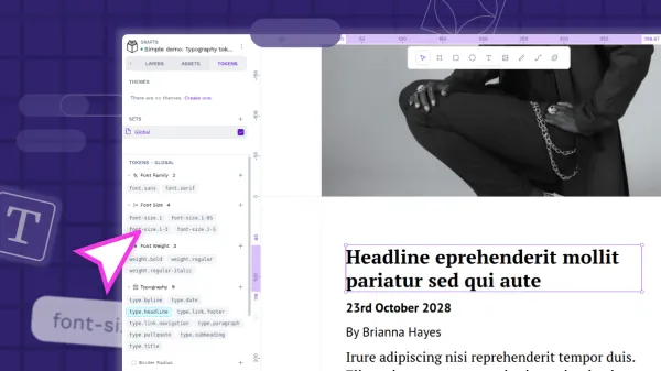
In this guide, we’ll explore six of the best Adobe XD alternatives, following its sunset in June 2023, highlighting their features, pros and cons, and which tools may serve as the best long-term replacement for your team.