How to create an intuitive design token system
In this guide, we’ll walk through creating a token system that works intuitively for both designers and developers.

Keeping design decisions consistent across platforms is a constant source of friction for designers and developers. That perfect shade of blue somehow becomes three different colors across your website, iOS app, and Android platform. Your carefully crafted spacing system dissolves into arbitrary pixel values. Your icons... well, let’s not even go there.
Design tokens tackle this problem head-on. They're the building blocks that transform your design decisions from scattered values into a structured system that travels between design tools and code. Think of tokens as the DNA of your design system—small, fundamental units that encode how everything should look and behave.
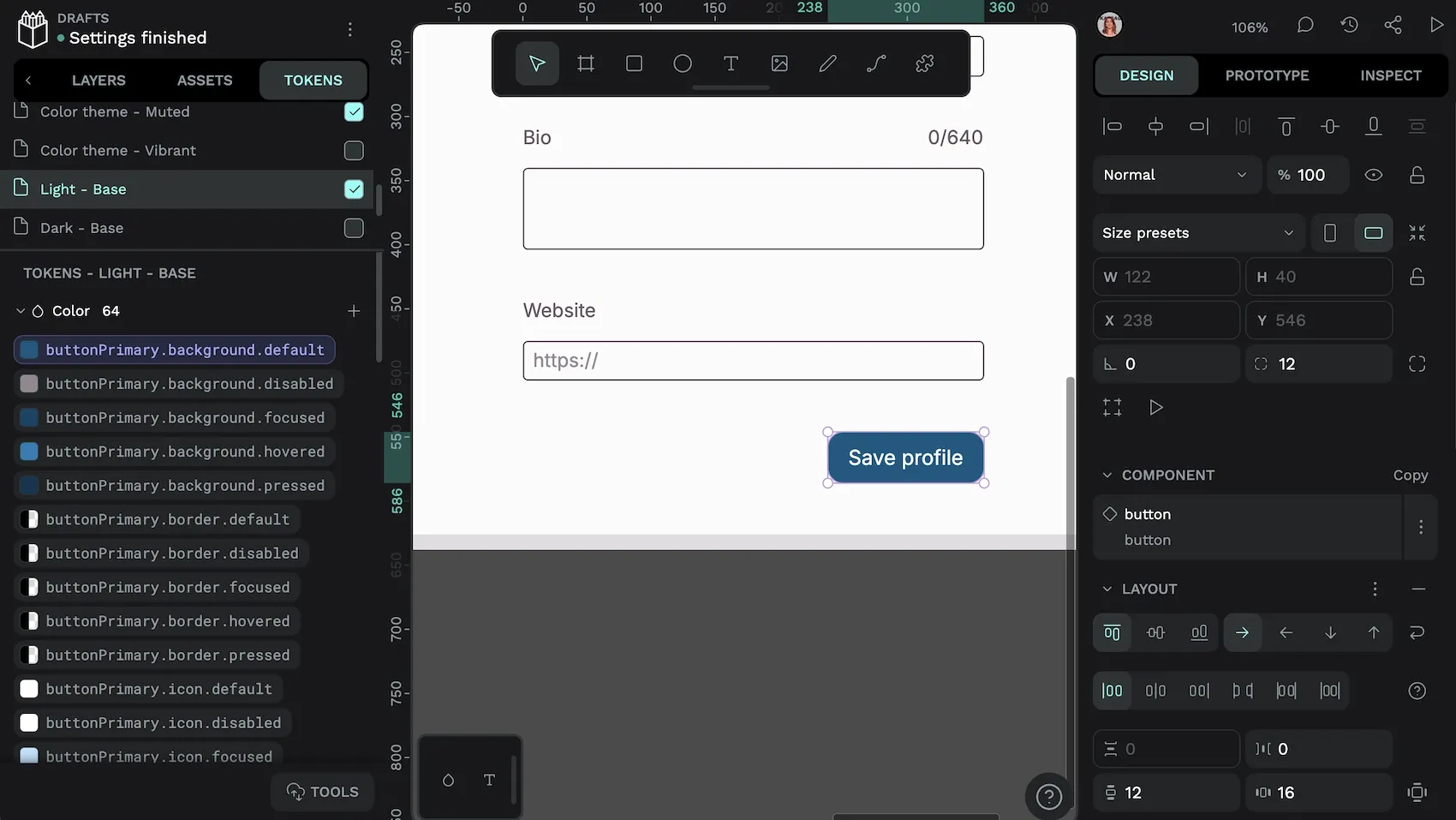
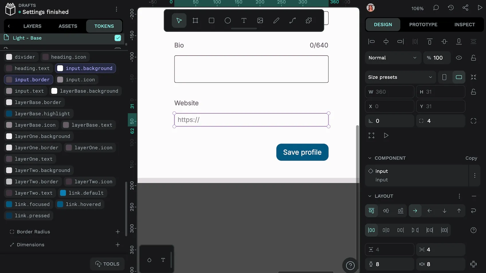
buttonPrimary.background.default token.In this guide, we’ll walk through creating a token system that works intuitively for both designers and developers. Whether starting from scratch or wrangling an existing design system into shape, you’ll learn practical steps to create tokens that scale with your product’s growing needs and keep your interfaces consistent across every environment.
Let’s dig in.
What are design tokens?
Design tokens are the fundamental units of design information that encode your visual decisions into platform-agnostic variables. Rather than hardcoded values scattered throughout your design, tokens create a structured foundation of design attributes that can be used across all platforms and technologies.
For example, instead of using #00b2ff directly in your code, you might define a brand-primary token containing this value. As the W3C Design Tokens Format Module shows, tokens follow a structured format:
"brand-primary": {
  "$value": "#00b2ff",
  "$type": "color",
}
In modern design systems, tokens are becoming the definitive storage mechanism for design decisions, from colors and typography to spacing and animation timing. They can range from primitive tokens (direct values like hex colors) to semantic tokens (purpose-based references to primitives) to component tokens (specific styling for UI elements).
Consider how a button’s appearance might be defined with tokens that reference other tokens:
"button-background": {
  "$value": "{accent}",
  "$type": "color",
  "$description": "Button background color"
}
As the “single source of truth,” design tokens ensure that when a design decision changes, that change propagates across all implementations. A well-structured token system creates layers of abstraction that separate absolute values from their usage, allowing for powerful features like theming and brand variations without changing component code.
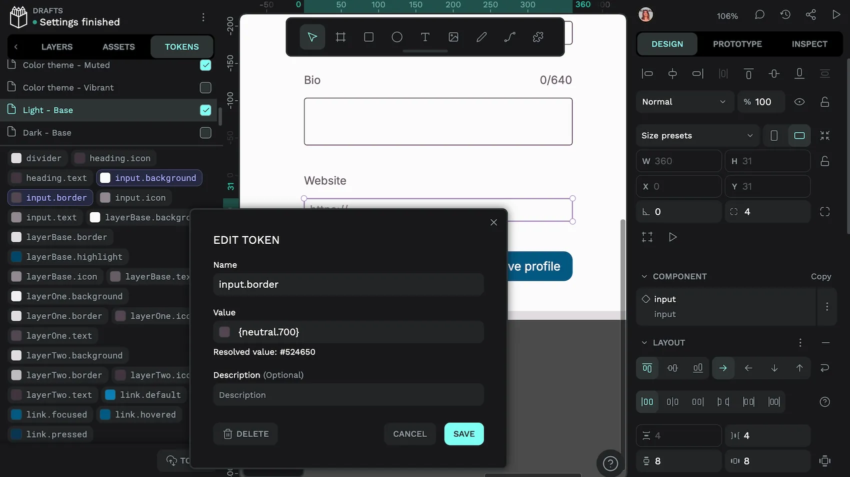
input.border token references the neutral.700 color token in this design.The W3C standard specifies how these tokens should be formatted. This enables them to move between design tools, development environments, and platforms while preserving their relationships and meaning.
The basic components of a design token system
A comprehensive design token system organizes your visual language into distinct categories that form the building blocks of your entire design experience:
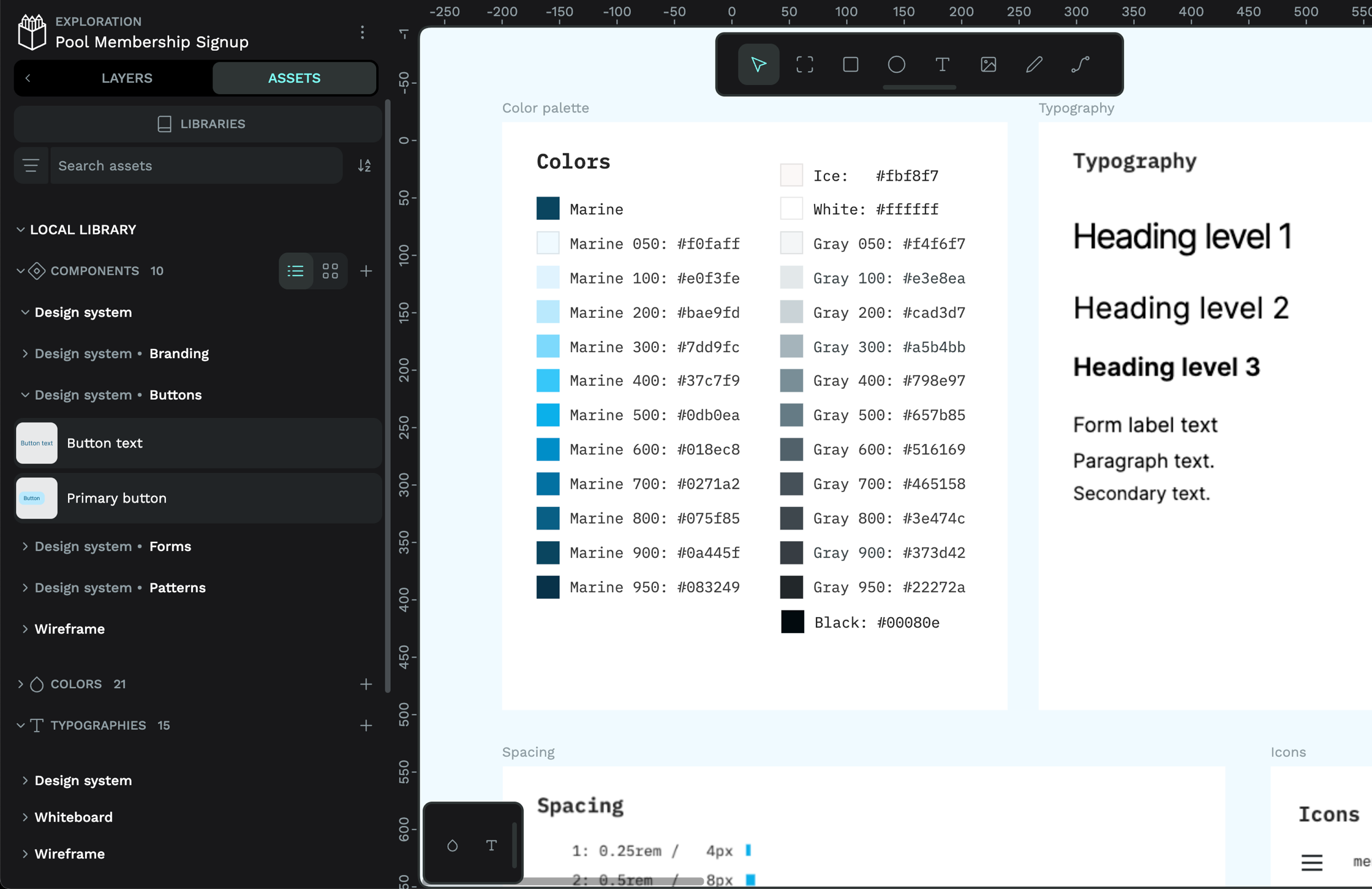
Colors
Your color tokens establish the palette (or palettes) that defines your brand identity and user interface usability. These include primary brand, secondary accent, and functional colors for elements like alerts and status indicators.
"brand": {
  "primary": {
  "$value": "#00b2ff",
  "$type": "color",
  "$description": "Primary brand color"
  }
}
Color tokens can also extend to gradients, opacity values, and specialized color treatments that maintain consistency across all contexts.
Typography
Typography tokens capture the voice of your interface through text elements. They encompass font families, font sizes (from headings to body text), weights (light, regular, bold), line heights, and letter spacing. These tokens ensure text remains consistent and readable across all platforms and screen sizes.
"typography": {
  "heading-level-1": {
    "$type": "typography",
      "$value": {
        "fontFamily": "Work Sans",
        "fontSize": { "value": 46, "unit": "px" },
        "fontWeight": 700,
        "lineHeight": 1.1
      }
    }
  }
Typography tokens are “composite” tokens made up of multiple design token values. These tokens allow you to describe all the properties used to style text.
Spacing
Spacing tokens create the foundational rhythm and breathing room in your layouts. They define standardized units for padding within components, margins between elements, and gaps in layouts that organize content.
"small": {
  "$value": { "value": 10, "unit": "px" },
  "$type": "dimension"
}
A well-crafted spacing system prevents arbitrary values and creates visual harmony throughout the interface.
Icons and imagery
These tokens establish guidelines for visual elements like icons, logos, and images. They may include size specifications, padding requirements, and stylistic parameters that ensure all visual assets feel cohesive with your overall design language.
"icon": {
  "size": {
    "default": {
      "$value": { "value": 24, "unit": "px" },
      "$type": "dimension"
    }
  }
}
Motion
Motion tokens bring your interface to life through carefully defined animation properties. They specify duration values, easing curves for natural movement, and transition behaviors.
"transition": {
  "emphasis": {
    "$type": "transition",
    "$value": {
      "duration": { "value": 200, "unit": "ms" },
      "delay": { "value": 0, "unit": "ms" },
      "timingFunction": [0.5, 0, 1, 1]
    }
  }
}
By tokenizing motion, you ensure that all animations throughout your product share a consistent feeling and timing, reinforcing your brand's personality.
How to create an intuitive design token system
Building an effective design token system requires strategic planning and thoughtful organization. Here’s how to establish a foundation that will support your design needs both now and as you grow:
Step 1: Audit your current design system for recurring patterns and elements
Begin by examining your existing design assets to identify inconsistencies and patterns. Document all color values, text styles, spacing measurements, and other design properties currently in use. This inventory reveals which elements need standardization and where opportunities exist to simplify through tokenization.
Step 2: Identify key design attributes that should be tokenized
Not everything needs to be a token. Focus on design attributes that appear repeatedly across your interfaces—colors, typography, spacing, shadows, borders, and animations. The W3C standard supports various token types, including color, dimension, duration, font-family, and composite tokens like shadows and typography.
Step 3: Define token names that are meaningful and scalable
Create a naming convention that's intuitive, descriptive, and built for growth. Consider structuring names with increasing specificity:
{category}.{concept}.{property}
For example: color.background.primary or spacing.inset.large.
This hierarchy enables semantic references and easy organization. Avoid names tied to specific values (like blue), which can become confusing when values change.
Step 4: Store tokens in a centralized tool for easy access and updates
Establish a single source of truth for your tokens using a format compatible with the W3C Design Tokens specification. This could be a dedicated design token management tool or a version-controlled repository of token files. The standardized JSON format allows tokens to be easily shared:
"color": {
  "brand-primary": {
    "$value": "#00b2ff",
    "$type": "color",
  },
  "text": {
    "heading": {
      "$value": "{color.brand-primary}",
      "$type": "color"
      }
    }
  }
}
Step 5: Collaborate with developers to ensure tokens integrate smoothly with code
Work with development teams to create transformation processes that convert your design tokens into platform-specific variables (CSS custom properties, Swift/Android values, etc.). Translation and build tools can generate the appropriate code for each platform while maintaining the relationships between tokens.
Step 6: Test and iterate to maintain alignment with evolving brand needs
As your design system evolves, regularly review your token structure. Test tokens across different platforms and contexts to ensure they meet design and development needs. Create processes for adding, modifying, and deprecating tokens that maintain system integrity while allowing growth.
Best practices for managing design tokens
Maintaining a healthy design token system requires ongoing attention and transparent governance. These best practices will help you build a robust foundation for your design decisions:
Keep token naming conventions consistent and descriptive
Your naming system should be intuitive and self-explanatory. Follow a predictable pattern like category/concept/property or use semantic prefixes. As the W3C format shows, token names can be structured in groups to enhance clarity:
"color": {
  "text": {
    "primary": { "$value": "#111111", "$type": "color" },
    "secondary": { "$value": "#787878", "$type": "color" }
  }
}
Avoid cryptic abbreviations, arbitrary numbering systems, or implementation-specific terminology. Document your naming conventions to ensure everyone understands the pattern.
Regularly audit your token system for unused or redundant tokens
Schedule periodic reviews to identify tokens that are no longer in use or that have drifted from their original purpose. The W3C standard includes a $deprecated property specifically for marking tokens that should be phased out:
"color-old-blue": {
  "$value": "#0066cc",
  "$type": "color",
  "$deprecated": "Please use color.brand.primary instead"
 }
During audits, look for near-duplicate values that could be consolidated, and ensure each token still serves a meaningful purpose in your system.
Ensure accessibility is baked into token values
Design tokens should encode not just visual preferences but also accessibility requirements. Store information about contrast relationships for color tokens and create token pairs guaranteed to meet WCAG standards. Consider creating specific tokens for accessible combinations:
"color": {
  "text": {
     "text-on-primary": {
      "$value": "#111111",
      "$type": "color"
    }
   }
 }
For typography, maintain tokens that preserve readable line heights and ensure spacing tokens create adequate touch targets for interactive elements.
Leverage tools for version control and collaboration
Store your tokens in a version-controlled repository that tracks changes and maintains a history of updates. This creates accountability and makes it easier to roll back problematic changes. Use collaborative tools that implement the W3C standard to help bridge the gap between design and development teams, ensuring everyone works from the same token definitions as they evolve.
Start building your design token system with Penpot
Now that you understand how to create a design token system, it’s time to put this knowledge into practice. Penpot offers an intuitive platform for creating and managing your design token system with native W3C Design Tokens standard support.
Penpot’s open-source approach aligns perfectly with the open standard nature of design tokens, allowing you to build a truly interoperable design system. With Penpot, you can:
- Create and organize tokens directly within your design environment
- Import design tokens from your existing design system
- Share tokens seamlessly between design and development teams
- Maintain a single source of truth that synchronizes across all platforms
- Export tokens in the standard format for use in various implementation tools
- Integrate your tokens with components for a cohesive design system
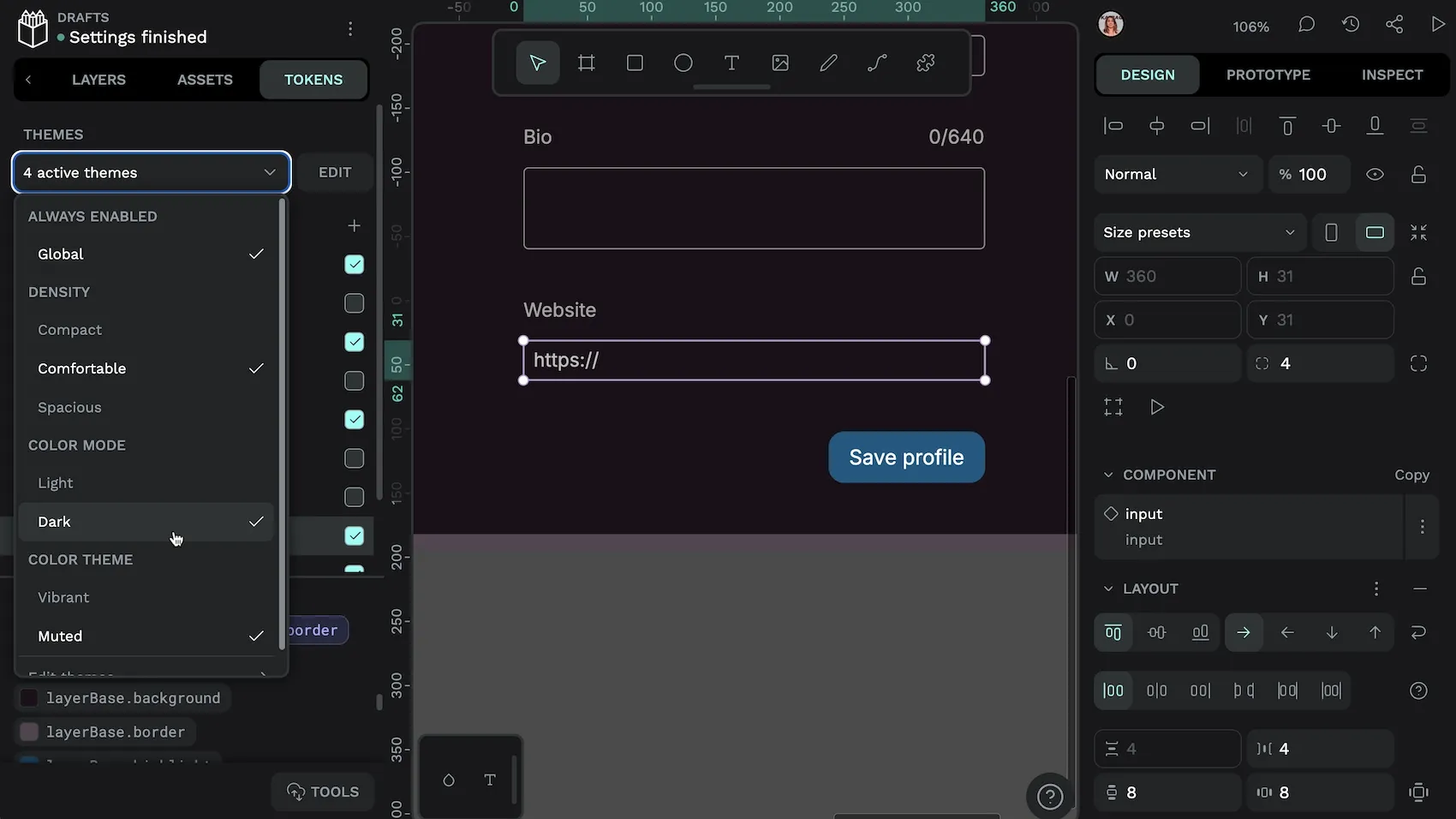
- Create and quickly switch between themes for your design tokens sets
Whether you’re building a design system from scratch or evolving an existing one, Penpot provides the foundation for making your design tokens work effectively for your team.
Ready to build a more consistent, maintainable design system? Get started with Penpot today and transform your design decisions into powerful, reusable tokens that scale with your organization’s needs.
Related Blogs
We have more blogs about design tokens and many other design and code-related topics. Here’s a few examples of helpful articles to help you get the most out of Penpot and design tokens:
 Laura Kalbag
 Laura Kalbag
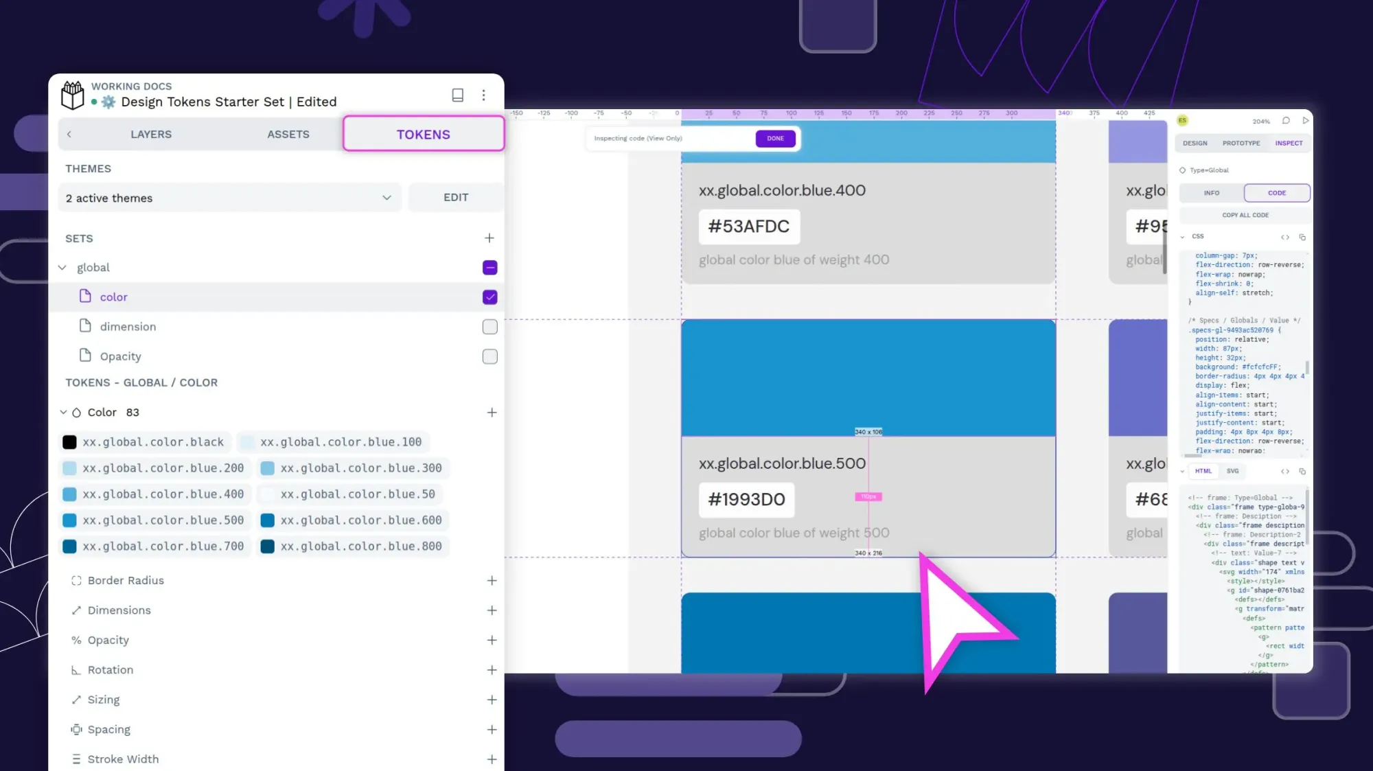 Laura Kalbag