How to choose a color palette and use it to build your brand
Colors play a crucial role in shaping brand identity. Since the 15th century, color theory has guided designers worldwide in selecting the ideal combinations to enhance and elevate their designs.

Color and how our eyes perceive it plays a vital role in marketing and design. You may think you have created a beautiful brand kit, but is it as aesthetically appealing as you had hoped?
One way to check your work is by using a color palette grounded in proper color theory. Embracing these timeless principles ensures your design resonates with viewers and sets your brand apart from others.
What is color theory?
Color theory is the school of thought around colors, how they relate to one another, and their effect on the larger world. It aims to provide a set of rules or best practices around which colors work together and which ones don’t. It addresses color mixing, harmony, schemes, symbolism, and contrast, among other actions. The color wheel is an example of a tool that simplifies color theory and the interplay of each shade.
While color theory touches many disciplines, we most commonly think of it in terms of the fine arts and marketing. Professionals who understand color theory may be better equipped to create amazing UI and UX designs that wow customers.
The history of color theory
Color theory in brand and design is a newer application of the discipline. Color theory was first pursued in the 1660s when Isaac Newton broke white light up into six colors using a prism. Aristotle was said to have created the first color theory.
Other great thinkers (including Leonardo DaVinci and Johann Wolfgang von Goethe) continued to refine how color works until we got to where we are today.
A couple books that can help you understand better the color theory and make it work are “The Element of color” by Johannes Itten and “Colour and meaning” by John Gage
Why is choosing the right color palette important?
Picking appropriate colors for your brand design or project matters quite a bit. Just think about the biggest brands you know and how color helps them stand out in the crowd. Coca-Cola and Pepsi, for example, share two of three colors, but the third (blue) helps consumers know which is which without even looking at the words on a can, bottle, or ad.
This addresses differentiation, but it’s just the start. Consider what else a good color palette offers your next project.
A great first impression
If a customer knows nothing else about your product, what will your colors tell them about you? Are you bold? Classy? Modern? Brash? Avoid confusion by using colors that infer the right things.
Emotional or psychological connection
We lack many concrete studies around the role color plays in a person’s inner psyche, but there’s at least some anecdotal data suggesting color affects the mood and mind. Chromotherapy, using colors to improve mental state, has some validity; brands may want to err on the side of caution by using calming, energizing, or other positive mood-related colors in their design.
Cultural and experiential touchpoints
What colors do you think of when you hear the term "patriotic"? Most likely, it's red, white, and blue. What about "nighttime"? Did you pick black and dark blues? From the colors of a nation's flag to the primary red/yellow/blue for nursery school themes, humans naturally associate colors based on their experiences and cultures. Brands hoping to attract a demographic can use color to attract these audiences.
Consistency
Of all the elements a brand uses across channels, color may be the easiest to implement. While getting the right sized font and text spacing between mobile and desktop versions can be difficult, it's not that hard to choose the same colors for all submission buttons and menu links across both versions. Once established, a color palette can be deployed everywhere the brand goes so customers know it's an official asset.
How to choose the color palette for your project
There’s no universal way to begin making your palette, and you may already have some great colors you want to explore right away.
However, you’ll want to use color theory principles as a basis for initial color choices. You may want to explore primary, secondary, and tertiary colors in your palette and consider how colors complement each other naturally.
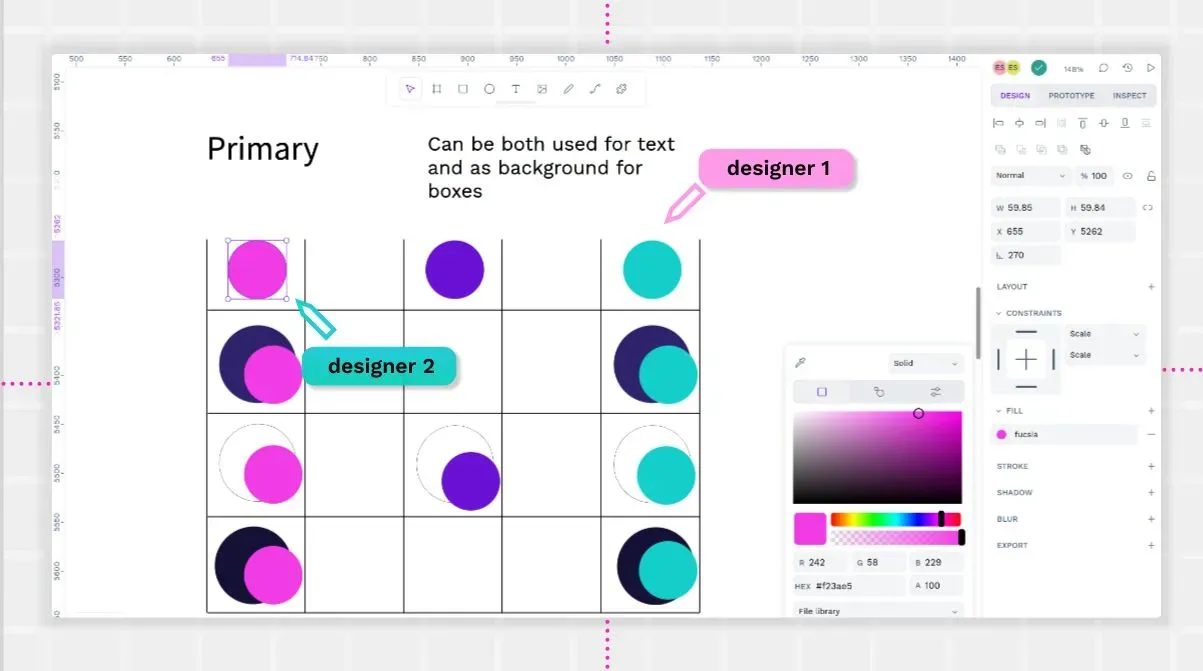
Ask yourself the following questions as you explore color options:
- Do we already have a color or two that we love or that customers associate with our brand?
- Are there colors we want to avoid? Will any colors be confused with other brands on the market or with our competitors?
- What feelings or emotions do we want to invoke in our customers?
- Will any colors be impractical to implement in the UX environments we deploy?
- What trends do we see in color? How will following that trend define our brand? What happens when that trend is over?
With these questions answered, you can start selecting contenders for your initial color scheme.
Additional color palette considerations
Don’t forget to include a range of hues and tones, including lighter and darker shades. Pick some whites, blacks, and grays to round out your palette and give you options for every use case.
You’ll also want to have semantic colors included in your color palette, even if they are only used for specific applications. Examples of this include a shade of red for error codes or a bright blue for GDPR data collection opt-in popup buttons. Use a color scale tool to get each shade just right for your chosen brand preferences.
After you’ve picked your colors, test them in the wild. Create some mockups to see how the menu navigation colors contrast with the background or if the notification messages stand out enough. Some colors may need just a shade or contrast adjustment to make them work for each use case. Be sure to try each color on a variety of screen outputs (mobile vs. desktop) before final approval.
Ensuring that colors work well together and are legible for text is crucial, and there are many tools online that can help you with that. Contrast Grid, for example, allows you to create a table where itś very easy to see the levels of accessibility of different colors.
4 tips for using your color palette to build your brand
Setting up your color palette is a big undertaking, but once finished, you can use it in amazing ways.
1. Add it to your design system
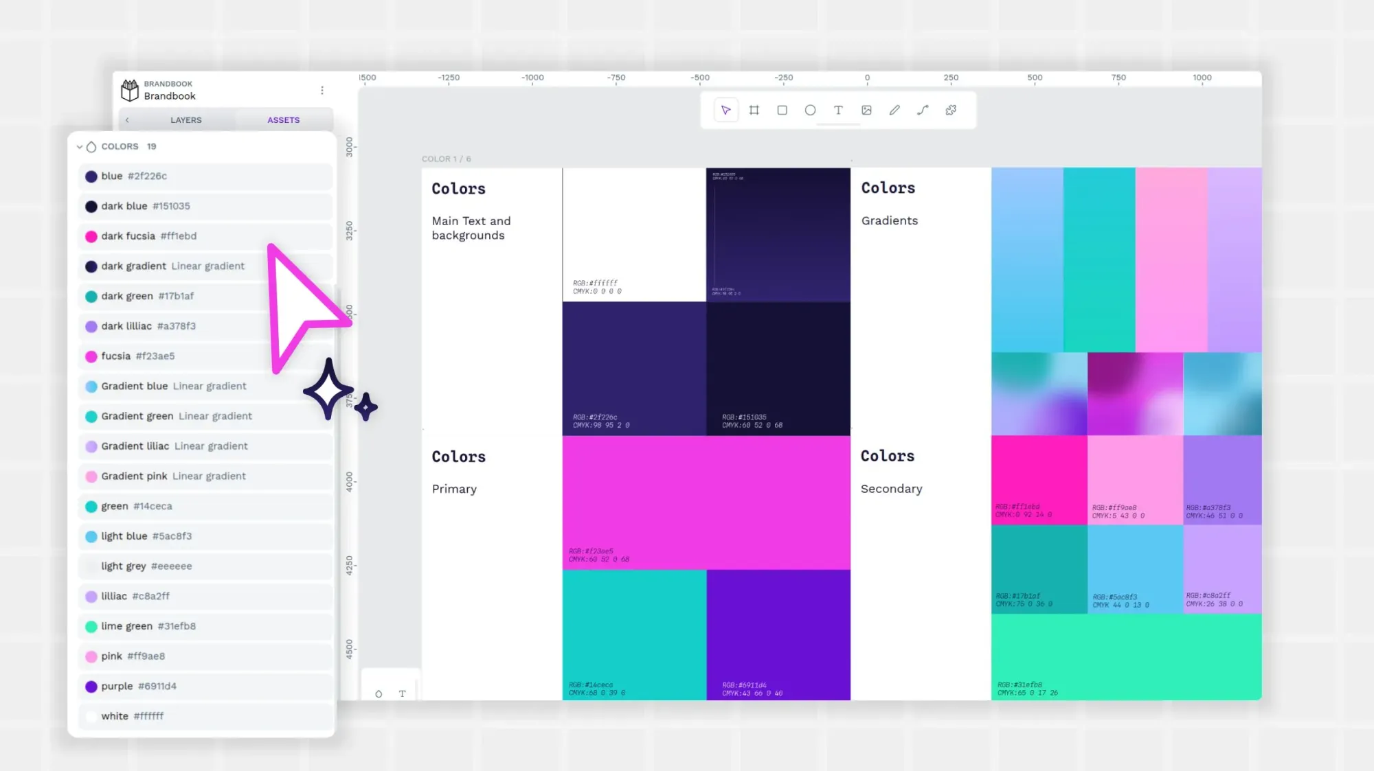
Once you have selected and approved your color palette, be sure to include it with your other design assets and add it to your brand kit. If you have a design system, create a designated place for it in the files or on the public-facing website.
You'll also want to include instructions or guidance on how to use the color palette in accordance with your brand kit principles. Leave no one guessing which red to use, for example, for each use case.
2. Use it uniformly across all channels
It’s okay to have a different messaging approach between your Instagram feed and your website. Your color palette, however, shouldn’t be inconsistent between use cases.
If a color is used for CTAs on one platform, then also use it that way on another. Make it easy for consumers to see a color and know what they should do next.
3. Consider user feedback
Don't get too attached to your color palette! While you likely spent many hours creating it, the consumer should guide your continued use of a shade.
For example, A/B tests on social media ads may suggest that the blue works better to get attention than the green or that two shades of red aren't needed at all. If the app or website’s use confirms these trends, you may want to change up your palette to only use the colors that move people in a meaningful way.
4. Watch for brand confusion
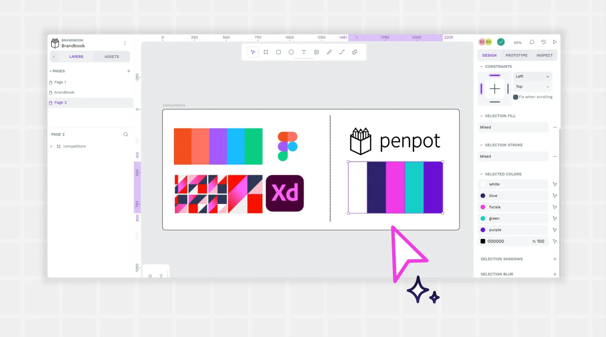
You’ll also want to watch other brands for their use of color. Just because you created your color palette first doesn’t mean you’re entitled to it. In fact, unless you have trademarked a color (such as T-Mobile’s magenta), others can use colors from your palette, too.
While you shouldn’t have to give up a color you love and use often, it may be confusing for consumers to see two competing brands with similar design features. If it becomes hard to differentiate yourself, a color revision may be necessary.
Get started on a color palette
Making a color palette takes time, but the sooner you start, the sooner you’ll finish! Get on your way to making vibrant, memorable brand designs with the Penpot UI design software guide. You’ll get best practices for impressing your audience with brilliant designs.
The upcoming release of Penpot 2.5 will introduce a new multi-gradient feature, giving you even more creative control over colors and shades.
Related Blog posts
We have even more posts about design. Here’s a few examples of handy articles to help you get the most out of Penpot.


