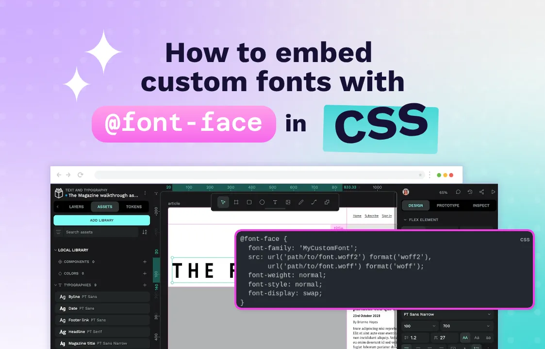
How to embed custom fonts with @font-face in CSS
Learn how to use @font-face to embed custom fonts in your website. Includes practical examples, performance tips, browser compatibility, and common mistakes to avoid.

There is something Old School Cool about a website that defaults to using system fonts like Times New Roman or Arial. If a blog is written entirely in these fonts, you know the content is going to be deep.
But there’s a reason designers moved on to custom fonts. They allow designers to create unique visual identities, improve readability, and evoke specific emotions that generic system fonts simply can’t achieve.
@font-face was designed for exactly this reason: To give designers the opportunity to use any font they want in their web designs. Here, I’ll take you through @font-face, how to embed custom fonts using the rule, and best practices for ensuring your typography loads quickly and displays beautifully across all browsers and devices.
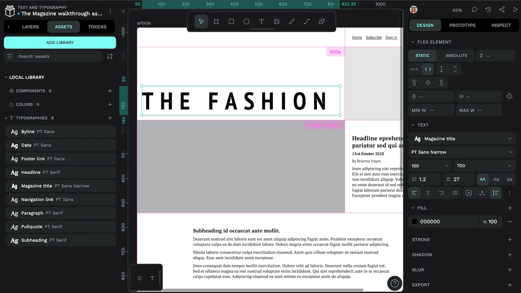
What is @font-face in CSS?
@font-face is a CSS at-rule that allows you to define custom fonts to be downloaded and used on your site and in your product. Instead of being limited to the handful of “web-safe” fonts installed on users’ computers, @font-face lets you specify font files hosted on your server or a CDN (Content Delivery Network), giving you complete typographic control.
The @font-face rule isn’t new — it was actually part of the CSS2 specification in 1998. However, it was removed from CSS2.1 due to a lack of browser support and concerns about font licensing. The rule made its triumphant return in CSS3, and by 2015, all major browsers supported it, ushering in the web typography revolution we enjoy today.
Here’s the basic syntax:
@font-face {
  font-family: 'MyCustomFont';
  src: url('path/to/font.woff2') format('woff2'),
       url('path/to/font.woff') format('woff');
  font-weight: normal;
  font-style: normal;
  font-display: swap;
}
Key properties of @font-face
font-family: The name you’ll use to reference this font in your CSS. This can be anything you want; it doesn’t need to match the actual font name.src: The location of your font files. You can specify multiple formats for browser compatibility. The browser will use the first format it supports.font-weight: Defines the weight of this particular font file (100–900,normal,bold).font-style: Specifies whether this is normal, italic, or oblique.font-display: Controls how the font renders while loading. Options include:auto: Browser decides.block: Invisible text until font loads (FOIT — Flash of Invisible Text).swap: Fallback font shown immediately, swapped when custom font loads (FOUT — Flash of Unstyled Text).fallback: Similar to swap but with a shorter swap period.optional: Browser can choose not to download the font.
Modern @font-face supports variable fonts, which contain multiple weights and styles in a single file:
@font-face {
  font-family: 'MyVariableFont';
  src: url('variable-font.woff2') format('woff2');
  font-weight: 100 900;
  font-stretch: 75% 125%;
}
This allows infinite variations between the defined ranges, dramatically reducing the number of font files needed while increasing design flexibility.
Why use @font-face instead of web-safe fonts?
Web-safe fonts, such as Arial, Times New Roman, Georgia, Verdana, and their sort, are called “safe” because they’re pre-installed on virtually every device. But safety comes at the cost of personality.
Here’s why @font-face has become essential for modern web design:
Brand consistency
Your brand likely has specific typefaces that define its visual identity. Using @font-face ensures your website matches your business cards, brochures, and marketing materials. A tech startup using Times New Roman sends a very different message than one using a sleek geometric sans-serif.
Improved readability
Not all fonts are created equal when it comes to screen reading. Custom fonts designed specifically for digital displays, like IBM Plex, Inter, or Source Sans, offer superior legibility compared to system fonts that were often originally designed for print.
Emotional design
Typography is one of the most powerful tools for setting mood. A vintage slab serif can transport visitors to the 1800s, while a clean humanist font feels approachable and modern. Web-safe fonts offer limited emotional range — they’re the typographic equivalent of beige walls.
Competitive differentiation
When every Bootstrap or Tailwind site uses the same system font stack, custom typography becomes a powerful differentiator. It’s often the first thing visitors notice, consciously or not, that makes your site feel premium and intentional rather than templated.
The trade-off for using custom fonts is additional HTTP requests and download time — but with proper optimization techniques (which we’ll cover in a moment), the performance impact is minimal compared to the massive design benefits.
How to embed fonts with @font-face in CSS
Now, let’s dive into the practical implementation. Embedding fonts with @font-face involves several steps, from obtaining font files to writing CSS that works across all browsers.
First, you’ll need the actual font files. You have several options:
- Purchase from a type foundry: Professional fonts from foundries like Hoefler&Co., Commercial Type, or MyFonts come with web licenses. Always check the licensing terms (for example, desktop fonts often require separate web licenses).
- Use open-source fonts: Google Fonts, Font Squirrel, and GitHub host thousands of free, open-source typefaces. Popular choices include Inter, Roboto, Open Sans, and Playfair Display.
- Convert existing fonts: If you have desktop fonts with appropriate licenses, use tools like Font Squirrel’s Webfont Generator or CloudConvert to create web-optimized versions.
For maximum compatibility with minimal file size, use this format hierarchy:
@font-face {
  font-family: 'MyCustomFont';
  src: url('fonts/mycustomfont.woff2') format('woff2'),
       url('fonts/mycustomfont.woff') format('woff');
}
The most popular font formats for the web are WOFF, WOFF2, OTF, and TTF. WOFF2 offers the best compression (typically 30% smaller than WOFF), while WOFF provides a fallback for older browsers. Unless you need to support Internet Explorer 8 or earlier, you can skip TTF/OTF in your @font-face declarations.
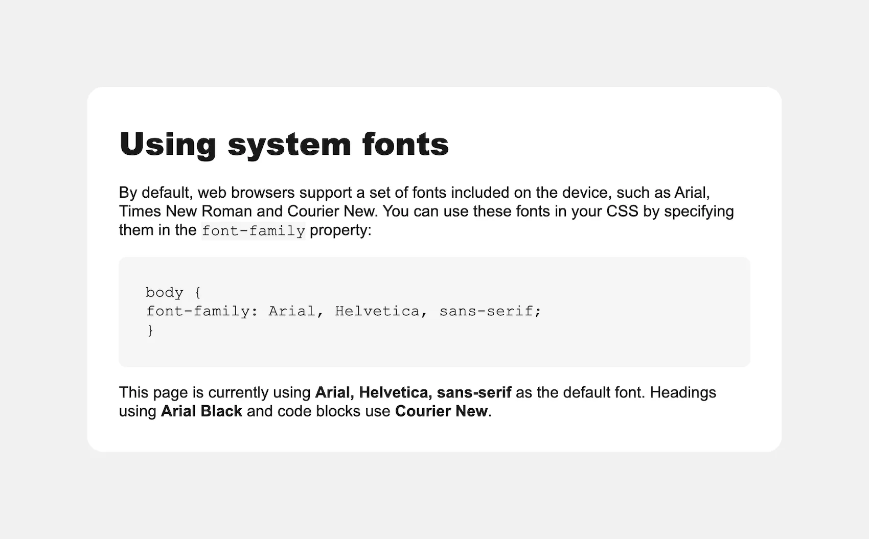
Let’s now work through an example. If we are starting with system fonts, we might find our CSS file looking like this:
body {
  background: #f1f1f1;
  color: #171717;
  font-family: Arial, Helvetica, sans-serif;
  line-height: 1.2;
  margin: 0;
  padding: 0;
}

h1, h2, h3, h4, h5, h6 {
  font-family: "Arial Black", Arial, Helvetica, sans-serif;
}

code, pre {
  font-family: "Courier New", Courier, monospace;
  background: #f4f4f4;
}

pre {
  padding: 0.5rem;
  border-radius: 0.5rem;
}
This type of font use would render like this:
Now, let’s say we want to spice this up a little using:
- Atkinson Hyperlegible for main text: Excellent for accessibility and readability
- Inter for headings: Modern, clean, and highly readable
- JetBrains Mono for code blocks: Designed specifically for developers
In this case, we’ll download the fonts from Google Fonts and then place them in a /fonts directory in our project.
We start by using the @font-face rule to define each font family. Here’s how we'll set up our custom fonts:
/* import custom fonts using @font-face with local files */
@font-face {
  font-family: "Atkinson Hyperlegible";
  src: url("/fonts/atkinson-hyperlegible-regular.woff2")
    format("woff2");
  font-weight: 400;
  font-style: normal;
  font-display: swap;
}

@font-face {
  font-family: "Atkinson Hyperlegible";
  src: url("/fonts/atkinson-hyperlegible-bold.woff2")
    format("woff2");
  font-weight: 700;
  font-style: normal;
  font-display: swap;
}

@font-face {
  font-family: "Atkinson Hyperlegible";
  src: url("/fonts/atkinson-hyperlegible-italic.woff2")
    format("woff2");
  font-weight: 400;
  font-style: italic;
  font-display: swap;
}

@font-face {
  font-family: "Atkinson Hyperlegible";
  src: url("/fonts/atkinson-hyperlegible-bolditalic.woff2")
    format("woff2");
  font-weight: 700;
  font-style: italic;
  font-display: swap;
}

@font-face {
  font-family: "Inter";
  src: url("/fonts/inter.woff2")
    format("woff2");
  font-weight: 100 900;
  font-style: normal;
  font-display: swap;
}

@font-face {
  font-family: "Inter";
  src: url("/fonts/inter-italic.woff2")
    format("woff2");
  font-weight: 100 900;
  font-style: italic;
  font-display: swap;
}

@font-face {
  font-family: "Jetbrains Mono";
  src: url("/fonts/jetbrains-mono.woff2")
    format("woff2");
  font-weight: 100 800;
  font-style: normal;
  font-display: swap;
}

@font-face {
  font-family: "Jetbrains Mono";
  src: url("/fonts/jetbrains-mono-italic.woff2")
    format("woff2");
  font-weight: 100 800;
  font-style: italic;
  font-display: swap;
}
By setting rules for different font-weights and font-styles, we ensure the browser uses the correct font file for each text variation instead of synthetically generating bold or italic styles, which often look fuzzy, distorted and unprofessional.
Then, just as before, we can use these new, named fonts in our styling:
body {
  background: #f1f1f1;
  color: #171717;
  font-family: "Atkinson Hyperlegible", Arial, Helvetica, sans-serif;
  line-height: 1.2;
  margin: 0;
  padding: 0;
}

h1, h2, h3, h4, h5, h6 {
  font-family: "Inter", "Arial Black", Arial, Helvetica, sans-serif;
  font-weight: 600;
  line-height: 1.1;
}

code,
pre {
  background: #f4f4f4;
  border-radius: 1rem;
  font-family: "JetBrains Mono", "Courier New", Courier, monospace;
  font-size: 0.9rem;
  padding: 1rem;
}
Here’s how it looks on the page:
With that, we have any font design we want within our webpage.
9 tips for @font-face cross-browser compatibility and performance
While @font-face enjoys excellent browser support today, ensuring your fonts load quickly and display correctly across all devices requires attention to detail. Here are some strategies for robust web typography.
1. Format stacking for maximum compatibility
Although we mentioned WOFF2 and WOFF earlier, here’s a complete format hierarchy for edge cases:
@font-face {
  font-family: 'Universal Font';
  src: url('font.woff2') format('woff2'), /* Modern browsers */
       url('font.woff') format('woff'), /* Older browsers */
}
In practice, WOFF2 + WOFF covers 96% of users. Only include other formats if analytics show significant legacy browser traffic. If you have fallback fonts in your font stack, there’s no need to add font file fallbacks.
2. Self-host vs. CDN: The performance trade-off
While Google Fonts is convenient, self-hosting gives you more control over caching, preloading, and privacy. And if Google Fonts goes down, your self-hosted fonts will still work! Plus, you can optimize file sizes with subsetting. CDNs like jsDelivr or Cloudflare offer a middle ground of global distribution without sacrificing control.
3. Font-loading strategies that work
The font-display property is your best friend, but choosing the right value matters. Flash of Unstyled Text (FOUT) with font-display: swap is usually preferable to Flash of Invisible Text (FOIT).
Users would rather see imperfect text than no text. However, for short, prominent text like logos, a brief FOIT with font-display: block might be acceptable.
swap: Perfect for body text. Users see content immediately with a brief flash when the final fonts load.block: Use sparingly for brand-critical elements where the flash between fallback fonts and final fonts would be jarring.optional: Great for decorative fonts. On slow connections, users get a fast experience over perfect typography.
4. Preloading critical fonts
Add this to your <head> for fonts used at the top of the page to load them before the page loads:
<link rel="preload" href="/fonts/main-font.woff2" as="font" type="font/woff2" crossorigin>The crossorigin attribute is mandatory as browsers treat fonts as CORS (Cross-Origin Resource Sharing) requests.
5. Variable font optimization
Variable fonts are fantastic for reducing HTTP requests, but they can be large. Use tools like Slice to subset variable fonts to only the weight/width ranges you actually use:
/* Instead of loading all weights 100-900 */
@font-face {
  font-family: 'Inter Optimized';
  src: url('inter-subset-400-700.woff2') format('woff2');
  font-weight: 400 700; /* Only the weights you need */
  font-display: swap;
}
6. Local font detection
Reduce bandwidth by checking for locally installed fonts first:
@font-face {
  font-family: 'System Inter';
  src: local('Inter'),
       local('Inter-Regular'),
       url('/fonts/inter.woff2') format('woff2');
}
Be careful: Local font names can vary across operating systems. To address this, specify multiple local names that different systems might use (e.g., Helvetica Neue, HelveticaNeue, Helvetica Neue Regular).
7. Performance budget reality check
Each font file adds 20–100kb to your page weight. Budget wisely:
- Body text: 1–2 weights maximum
- Headings: Consider using the same font as the body text
- Code blocks: Often just needs regular weight
8. Test across devices
Font rendering varies dramatically between operating systems. What looks crisp on your Mac might appear fuzzy on Windows. Test using:
- BrowserStack or LambdaTest for real device testing
- Chrome DevTools’ rendering emulation
- Actual devices — nothing beats real hardware
9. The nuclear option: System font stacks
When performance is absolutely critical (such as payment or emergency sites), modern system font stacks have gotten remarkably good:
/* sans-serif system font stack */
font-family: -apple-system, BlinkMacSystemFont, avenir next, avenir, segoe ui, helvetica neue, Adwaita Sans, Cantarell, Ubuntu, roboto, noto, helvetica, arial, sans-serif;

/* serif system font stack */
font-family: Iowan Old Style, Apple Garamond, Baskerville, Times New Roman, Droid Serif, Times, Source Serif Pro, serif, Apple Color Emoji, Segoe UI Emoji, Segoe UI Symbol;

/* mono system font stack */
font-family: Menlo, Consolas, Monaco, Adwaita Mono, Liberation Mono, Lucida Console, monospace;
These load instantly and look professional. Save custom fonts for where they matter most.
Web typography is about finding the sweet spot between design aspirations and user experience. A beautiful font that takes five seconds to load is worse than a good-enough font that appears instantly. Start with performance, then layer on the personality.
Common mistakes to avoid with @font-face
Even experienced developers stumble over these gotchas. Learn from their pain and save yourself debugging headaches.
Forgetting the cross-origin attribute
This silent killer will have you staring at the Network tab, wondering why your preloaded fonts aren’t working:
<!-- Wrong -->
<link rel="preload" href="/fonts/myfont.woff2" as="font" type="font/woff2">

<!-- Right -->
<link rel="preload" href="/fonts/myfont.woff2" as="font" type="font/woff2" crossorigin>
Fonts are always CORS requests, even when self-hosted. No crossorigin = no preload.
Mismatching font weights and styles
Nothing screams “amateur hour” like faux bold, when the browser artificially thickens a font because you didn’t load the proper weight:
/* Problem: Only loading regular weight */
@font-face {
  font-family: 'MyFont';
  src: url('myfont-regular.woff2') format('woff2');
  font-weight: 400;
}

/* Using it wrong */
h1 {
  font-family: 'MyFont';
  font-weight: 700; /* Browser fakes it - looks terrible */
}
Always load the exact weights you use or embrace variable fonts.
Relative path confusion
@font-face paths are relative to the CSS file, not the HTML document. This trips up everyone at least once:
/* If your CSS is at /css/styles.css */
/* And fonts are at /fonts/myfont.woff2 */

/* Wrong */
src: url('fonts/myfont.woff2'); /* Looks for /css/fonts/myfont.woff2 */

/* Right */
src: url('../fonts/myfont.woff2'); /* Goes up one level first */
Loading entire font families
Don’t load every weight from 100 to 900 “just in case.” Each weight is a separate download:
/* Wasteful */
@import url('https://fonts.googleapis.com/css2?family=Inter:wght@100;200;300;400;500;600;700;800;900&display=swap');

/* Smart */
@import url('https://fonts.googleapis.com/css2?family=Inter:wght@400;600&display=swap');
Audit your styles and load only what you actually use.
The WOFF2-only gamble
Yes, WOFF2 has 96% support, but that missing 4% might be your boss’s old browser:
/* Risky */
src: url('font.woff2') format('woff2');

/* Safe */
src: url('font.woff2') format('woff2'),
     url('font.woff') format('woff');
WOFF files are small enough that the extra safety is worth it.
Forgetting about print
Your beautiful web fonts might not embed in PDFs or print properly:
@media print {
  body {
    font-family: Georgia, serif; /* Reliable print fallback */
  }
}
Test printing and PDF generation if those matter for your use case.
Create your next project with Penpot
Now that you’re equipped with the knowledge to implement beautiful, performant typography on the web, it’s time to put it into practice. Whether you’re designing a new website, refreshing your brand, or prototyping your next big idea, you need design tools that understand the importance of typography.
Penpot is the open-source design platform that speaks the language of design. With full support for custom fonts, Google web fonts, and developer-friendly exports, Penpot bridges the gap between design and code. Create your designs with the exact fonts you’ll use in production, and hand off specifications that developers will thank you for.
So, start designing with Penpot for free and bring your typographic vision to life with the fonts that make your brand unforgettable.
Related Blogs
We have even more posts about CSS, design and development. Here’s a few examples of useful articles to help you learn more about CSS.
 Laura Kalbag
 Laura Kalbag
 Laura Kalbag
 Laura Kalbag