6 CSS tips for mastering positioning and fonts
Creating a great design with CSS comes with a learning curve. However, a lot of what you’ll make focuses on knowing two design areas: positioning and fonts.

Creating a great design with CSS comes with a learning curve. However, a lot of what you’ll make focuses on knowing two design areas: positioning and fonts. By understanding both, it’s much easier to make a balanced and user-friendly digital product. We cover the basics here to get you started.
How to center in CSS
You can center objects inside a container horizontally, vertically, or both ways. Centering different elements, such as text or images, requires different CSS rules.
1. How to center a div in CSS
A div, short for “division,” is a container in an HTML document that contains other elements. It appears in HTML as <div>. It’s a block-level element and can hold paragraphs, headings, and images together in a layout.
Some other block-level elements that you can use and center in your layouts are <article>, <form>, <header>, <footer>, <nav>, <aside>, and even the <body> element. Many of these elements provide more structural information than generic <div>s, making your web pages easier to understand for search engines and assistive technologies for accessibility.
While the exact CSS you need depends on the layout you choose, these examples will give you a start.
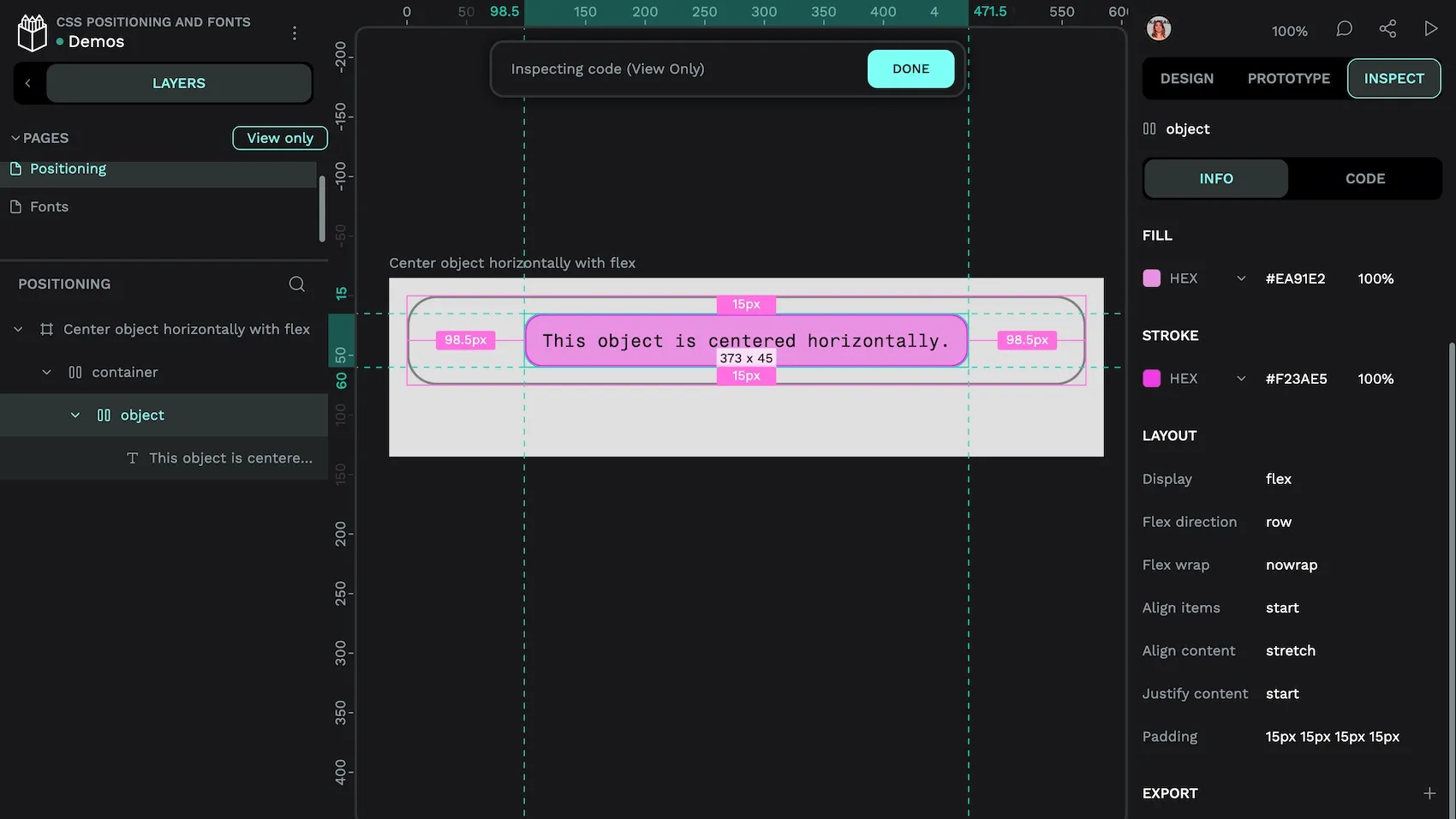
Flex properties make it easier to center horizontally:
.container {
  display: flex;
  justify-content: center;
}
Center horizontally with flex.
Or vertically:
.container {
  display: flex;
  align-items: center;
  height: 250px; /* the height of your container */
}
If you want the <div> to be centered both horizontally and vertically, you’ll need to create CSS that combines the previous two examples. When finished, you’ll see your element appear in the center of the page. Something like this would work:
.container {
  display: flex;
  align-items: center;
  justify-content: center;
  height: 250px; /* or the height of your container */
}
If you need to center the <div> without changing the properties of its container, you can use an old favorite method of CSS developers:
.center {
  margin: 0 auto;
  width: 50%; /* or any fixed width */
}
2. How to center text in CSS
Centering text works similarly on inline elements. Centering it horizontally is actually easy. Use the text-align property to center the text:
.text {
  text-align: center;
}
What about centering text vertically? While a bit more complicated, it’s still possible with a few more lines of CSS:
.container {
  display: flex;
  align-items: center; 	/* Center vertically */
  height: 250px; /* Height of the container */
}
In this example, the 250px is the height of the container, but you can adjust it to any size you need to fit your design.
3. How to center an image in CSS
Horizontally centering an image may be easiest using Flex, and is the same as centering a <div>. The CSS would look something like this:
.container {
  display: flex;
  justify-content: center; /* Center horizontally */
}
And the vertical centering like this:
.container {
  display: flex;
  align-items: center; 	/* Center vertically */
  height: 300px; /* Height of the container */
}
Of course, many designs require images to be centered both vertically and horizontally. Both Flex and Grid layouts accommodate this through CSS code.
For Flex, try something like this:
.container {
  display: flex;
  align-items: center; /* Center vertically */
  justify-content: center; /* Center horizontally */
  height: 300px;
}
For Grid, consider using this as inspiration:
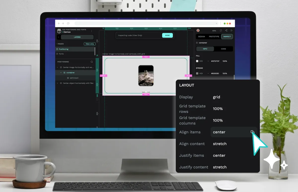
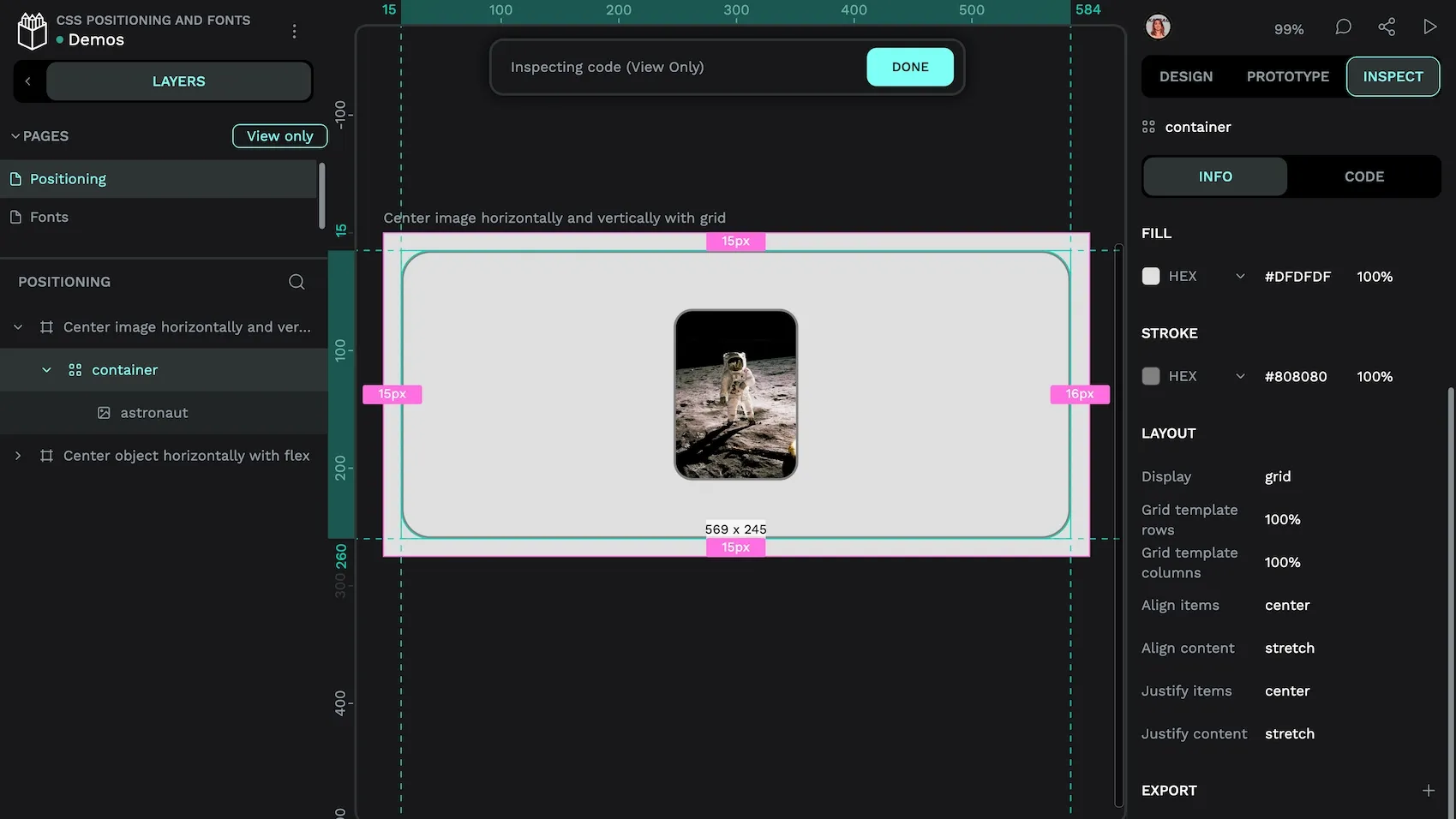
.container {
  display: grid;
  height: 300px;
  place-items: center; /* Center both horizontally and vertically */
}
Again, these are just rough layout recommendations. The exact CSS you use will depend on your project’s layout and design. Expect to make tweaks to get the desired results, and don’t hesitate to use a tool like Penpot to design visually first, then get the CSS directly from the Inspect tab.
How to change the font in CSS
When creating a design for the web, you’ll make a lot of changes to the color, font type, or boldness of text. It’s a simple style adjustment that can have a maximum impact on the usability of your page layout.
Changing the font itself happens through the font-family property. If you want to change the font to Inter, for example, you would list out several fonts with a similar neo-grotesque style, with your first choice listed in front. You do this because not all displays or operating systems recognize all fonts. Listing out several creates a backup plan for displaying fonts that closely match your first choice.
So, the CSS might read as:
body {
  font-family: Inter, Roboto, "Helvetica Neue", "Arial Nova", "Nimbus Sans", Arial, sans-serif;
}
If Inter isn’t available, the font will default to Roboto, then Helvetica Neue, and so on, with the final backup option being default sans serif font on the user’s operating system.
1. How to change font color with CSS
Color changes are what makes your design more exciting than the defaults. If you decide to swap out all of your blue link text for something more accessible against a new background, you would use the color property to do this.
The color can then be specified in a few ways: naming the color, using a hexadecimal value, or typing out an RGB value. Some designers use HSL values, and CSS supports this, too.
For a color value, here’s how the code might look:
p {
  color: gray; /* Using a named color */
}
Using hexadecimal color codes is similar to using color names, but you use the hexadecimal color code instead of the color name.
p {
  color: #808080;
}
You can find several free color charts online at sites that share HTML colors. They give you the color name, hexadecimal value, or RGB text to put into this code formula to get just the right hue for your project. You can also use Penpot’s color picker tool to see the CSS from the Inspect tab. Then, you’ll have that value when you want to change it in other places.
2. How to make text bold in CSS
If not overused, bolding text can draw attention to more important messages. It’s expressed through the font-weight property like this:
p {
  font-weight: bold;
}
When you use this rule, it makes all the text in the same paragraph bold.
Despite this simple command creating bold as a binary option (either bold or not bold), boldness can happen on a scale, as well. If you want to adjust the level of boldness or font weight, use a numerical value to express it.
In the following CSS, 700 makes the font weight bold:
.bold {
  font-weight: 700;
}
If you replaced the 700 with a smaller number, it would bring the weight down to a lighter weight accordingly. Some fonts support very heavy weights up to 900. A normal/regular weight (or unbolded text) is usually 400.
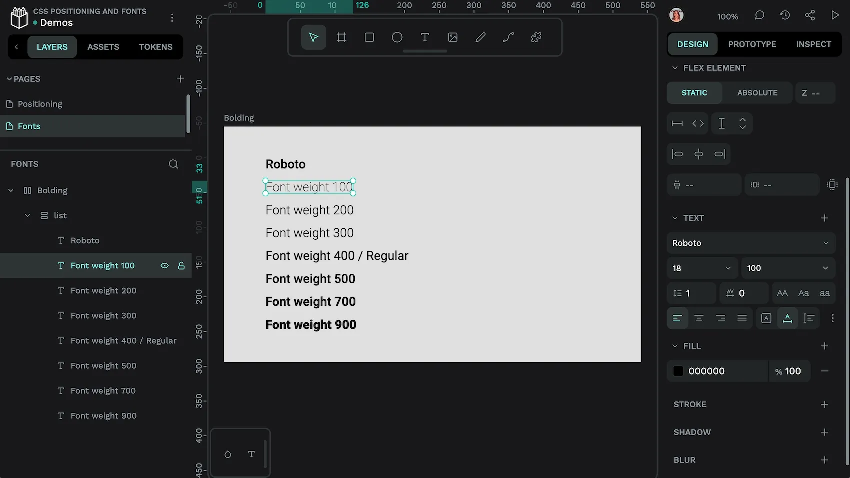
When using bold text, you want to make sure that the font you’re using supports bold weight and any numeric font weight values you want to use. When a font doesn’t support bold text, the browser will force the text into a “faux bold” appearance. Faux bold can give text a fuzzy or blurry appearance which makes text harder to read and makes font designers cry.
3. How to underline in CSS
Designers frequently underline text on a webpage, but it’s most commonly used for hyperlinks. To make link text underlined, use the text-decoration property:
a {
  text-decoration: underline;
}
You can remove an existing underline on a paragraph using the following:
p {
  text-decoration: none;
}
Many modern web designs don’t underline hyperlinks but change the font color to stand out from the surrounding text instead. While making this change can appear to reduce the clutter in a text block, it is bad practice for accessibility. Many users can’t distinguish the difference between link text and surrounding text based on color alone, so underlines are a useful and recognisable indicator.
Further resources for fonts and positioning
CSS is full of possibilities, and it can get very complex in terms of the number and type of rules you can use for a design that’s “just right.” However, once you start using CSS, you’ll recognize fonts and positioning everywhere and start remembering which properties you find most useful.
A fun way to explore how other sites use CSS is to use the “Inspect” developer tool on a browser to see the markup for pages you visit. It will be under a “Styles” tab. Look for language that indicates font and positioning choices and compare them to how you would write that CSS code.
You can also review Penpot’s beginner guide to CSS, which is full of guidance for getting started. It's the perfect companion to the free design tool, which helps you turn web designs into CSS you can actually use.
Related Blogs
We have even more posts about CSS and layouts. Here’s a few examples of handy articles to help you learn CSS get the most out of Penpot.
 Laura Kalbag
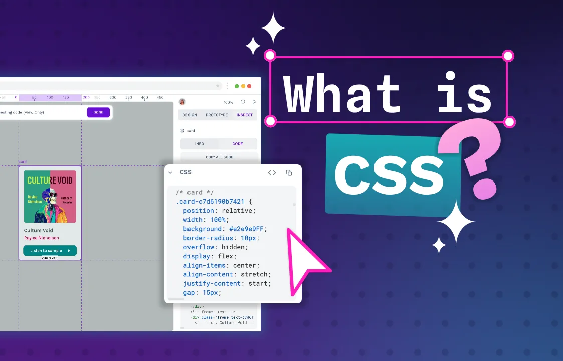 Laura Kalbag
 Paula Tienza