Code
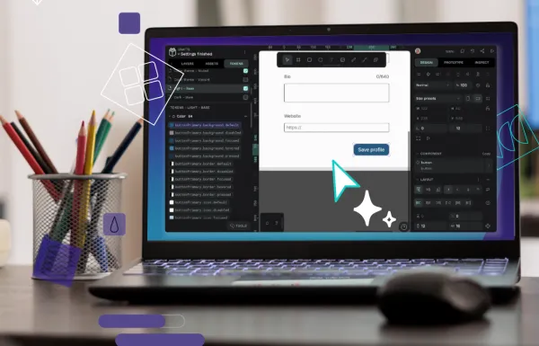
How to create an intuitive design token system
In this guide, we’ll walk through creating a token system that works intuitively for both designers and developers.
Designer, developer, and huskamute sidekick.

Code
In this guide, we’ll walk through creating a token system that works intuitively for both designers and developers.
Design
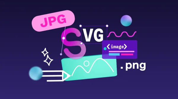
Each image file type was created for a good reason, but it may not be the right reason for you. Because images can have different purposes, you’ll need to know your ultimate purpose in using an image before selecting the right type.
Code
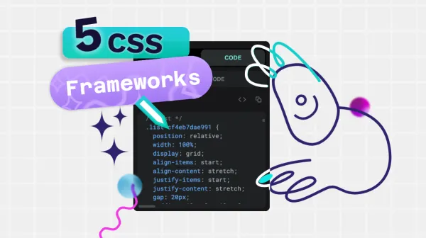
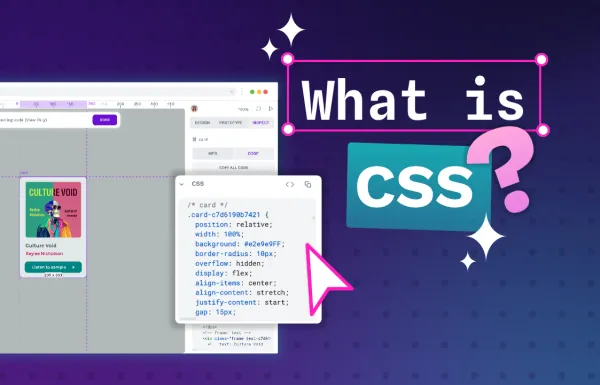
What are the benefits of common CSS frameworks? We give you some reasons why you might want to consider designing in pure CSS.
Code
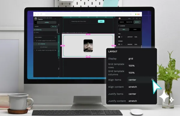
Creating a great design with CSS comes with a learning curve. However, a lot of what you’ll make focuses on knowing two design areas: positioning and fonts.
Design
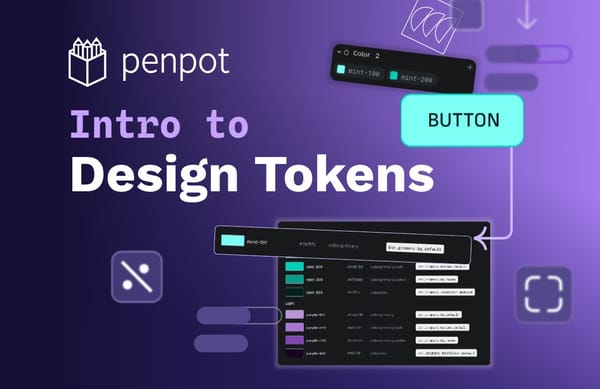
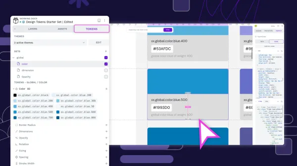
Design tokens are tiny reusable building blocks. You can use them to keep colors, spacing and other styles consistent across your design, and combine them to create design systems.
Tutorial
Design tokens are the smallest repeatable elements of your design that can be reused consistently across your Penpot projects and teams.
Code
While learning CSS takes time, understanding how it works should be easy. In this guide, we’ll explain the basics of CSS to help you start your journey.
Code
Design tokens create a single source of truth for design decisions, making your design system more maintainable, scalable, and consistent.
Design
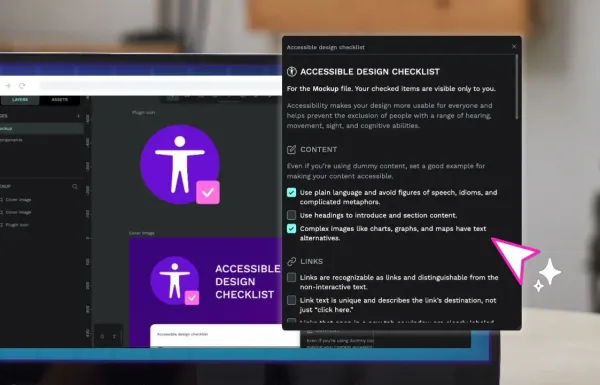
Improve your design’s accessibility with this quick reference checklist and Penpot plugin.
Tutorial
If you want to create a design system using Penpot, I’ve got some tips, tricks, and best practices for you.
Code
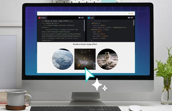
Learn how to create effective hover effects in different ways and how they help designers provide a better user experience
Code
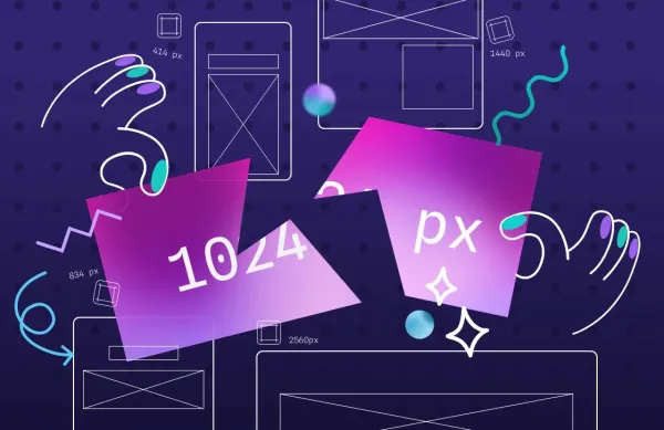
Responsive layouts “respond” to the size and resolution of the device they are presented on, and underpinning these layouts are CSS media query breakpoints.
Tutorial
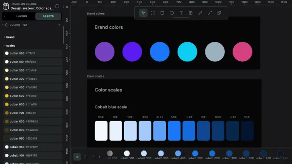
Learn how to use color and save reusable colors for your design system with Penpot’s color palette and shared libraries.
Tutorial
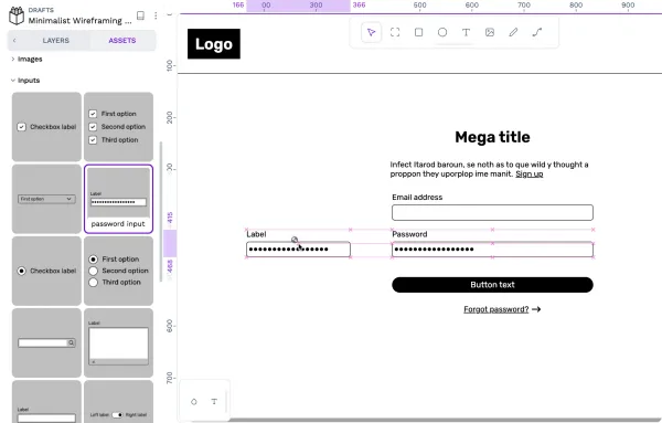
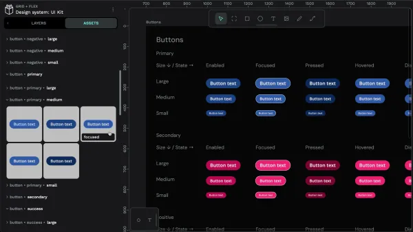
Learn about components and how to use your team’s shared components for your design system in Penpot.
Tutorial
Learn about creating components and libraries of shared components in Penpot for your team’s design system.
Tutorial
I recently shared a css.gg icons library template in the Penpot Libraries & Templates collection. Here’s how you can use icons from this (and other) shared libraries in Penpot.