AI
Penpot AI workflows explained
What AI workflows are, how Penpot MCP connects your files to agents, and when they’re worth using on real product work.
Creating educational materials for Penpot. Designer, developer, author of Accessibility for Everyone, and co-founder of Small Technology Foundation.

AI
What AI workflows are, how Penpot MCP connects your files to agents, and when they’re worth using on real product work.
Tools
Discover 8 advanced Penpot features that help product teams reduce design-to-development friction, create more efficient workflows, and maintain consistency at scale.
AI
The fastest and simplest way to get started with Penpot and AI workflows from scratch. Learn how to get started with Penpot and Cursor, a code editor with an integrated AI client.

AI
One of the fastest ways to set up Penpot for AI workflows in just 6 steps, no coding required, and only using free, open, and/or low-cost tools.
Code
Penpot design tokens support both basic calculations and complex math functions. Let’s explore how you can use both to level up your design systems.
Code
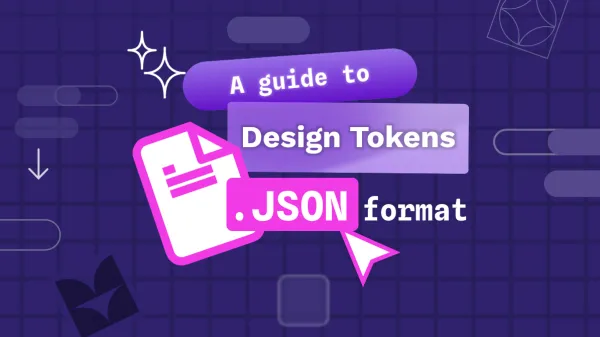
Learn about the design tokens JSON file format and how Penpot works with it.

Penpot
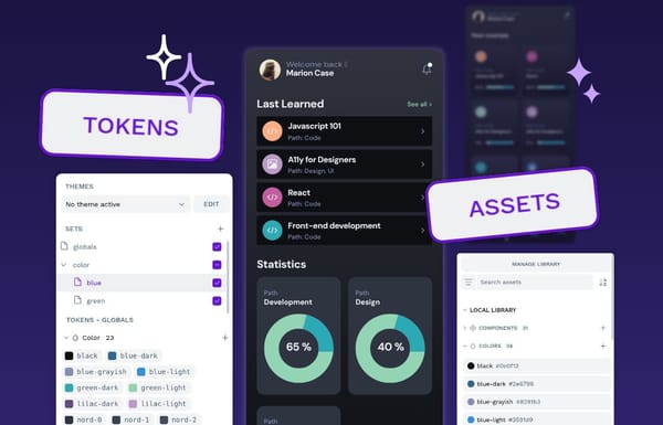
Design tokens eliminate inconsistency and speed up designer-developer collaboration. Explore 6 benefits that make them essential for enterprise design systems.

Tools
Penpot bridges the design-development gap by eliminating the translation layer that creates friction in traditional workflows.
Tutorial
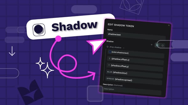
Using shadows carefully and consistently in your UI design can make it feel polished. Shadow design tokens help you implement the consistency and quickly update your shadows across your design system.
Tutorial
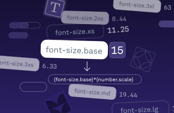
A proportional typographic scale is a hierarchy for font sizes that uses a consistent mathematical ratio. Design tokens are ideal for creating these scales.
Tutorial
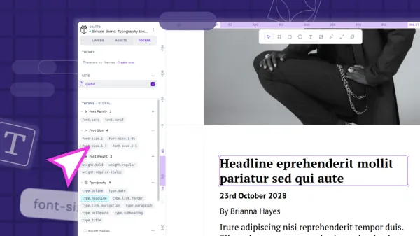
Typography design tokens are a way to save your text styles for reuse across your projects. The typography composite token combines multiple typography-related properties in one mega token.
Tutorial
Color design tokens and asset colors are both ways you can store colors in Penpot for reuse. There are some key differences that might affect which you choose to use in your project.