How to create a brand identity: Tools and tips to make it happen
In this guide, we’ll walk you through the essential steps and tools to create a brand identity that’s memorable, meaningful, and built to scale.

What comes to mind when you hear "Nike"? What colors do you associate with Pepsi? What emotions do Dove ads evoke? While responses vary, strong brands create consistent associations. These brands built their identity strategically — and you can, too.
In this guide, we’ll walk you through the essential steps and tools to create a brand identity that’s memorable, meaningful, and built to scale. Whether you're struggling with inconsistent visuals, unclear messaging, or scattered brand assets, we’ll show you how to define your identity and execute it across every touchpoint.
The difference between defining and executing a brand identity
Defining your brand identity involves conceptual work — it establishes your brand’s position, visual elements, and core messaging. Execution, on the other hand, is how you consistently apply these elements across customer touchpoints. Both are essential: a well-defined brand means little without proper execution.
Defining your brand identity usually includes:
- Creating a clear positioning of your value in the market and to the target audience
- Developing a visual identity through logos, color palettes, typography, and brand voice
- Establishing your mission, purpose, and what you stand for in the market (and the world)
The process involves activities like market research and conversations with stakeholders as you try to balance your own identity with the ways you’ll meet the larger community’s needs. We’ve even created a guide on how to build a memorable brand identity that explains all the steps and what to think about as you create.
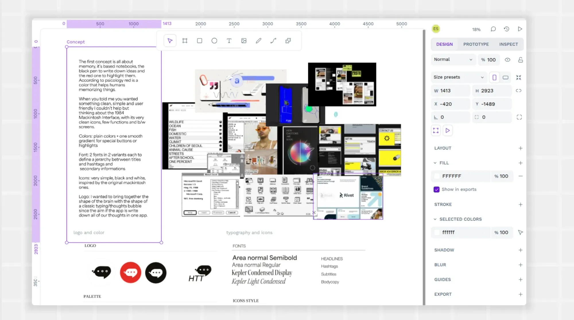
On the other hand, executing your brand identity is the phase where your brand identity is brought to life in all the places your customers will encounter your business. Just as important as the first phase, a well-executed brand identity brings about the following rewards:
- Offers consistent brand communication across all channels, such as advertising, customer service, product quality, and employee interactions
- Delivers value to customers, which helps them realize what you mean to them, so they continue supporting you
- Bolsters your credibility as a company that does what it says, ultimately fostering more customer trust and loyalty
Execution doesn’t happen overnight. Even after a successful rollout of your new brand identity, continue to make tweaks to improve your communication and consistency. You’ll nurture your brand identity plan with each new ad, product launch, or customer interaction you make. It’s the best way to tell people who you are and that you should be taken seriously.
How to create a brand identity using the right tools
You may know the steps to take to make your brand identity shine. But are you clear on which tools you’ll use to make it happen? Since part of proper execution is picking the right technology, we’ve broken down the tools you can use to speed the process along.
1. Design a unique and scalable logo
A company logo may be the first point of contact for a potential or existing customer — it can say a lot about you without any background.
To create a stand-out logo, make sure it’s unique to your brand and can’t be confused with any other company (even in a completely different market). To ensure your logo is unique and hasn't been used already, you can utilize tools like the one available on the World Intellectual Property Organization's (WIPO) brand website.
Your logo should also contain memorable elements that easily come to mind, such as custom fonts or color shades. Avoid any stock elements or generic patterns; customers should be able to recognize it apart from anything else you communicate.
A great way to test your logo's effectiveness is by checking its legibility in black and white. If the logo isn't clear or well-defined in monochrome, it could present challenges in various applications.
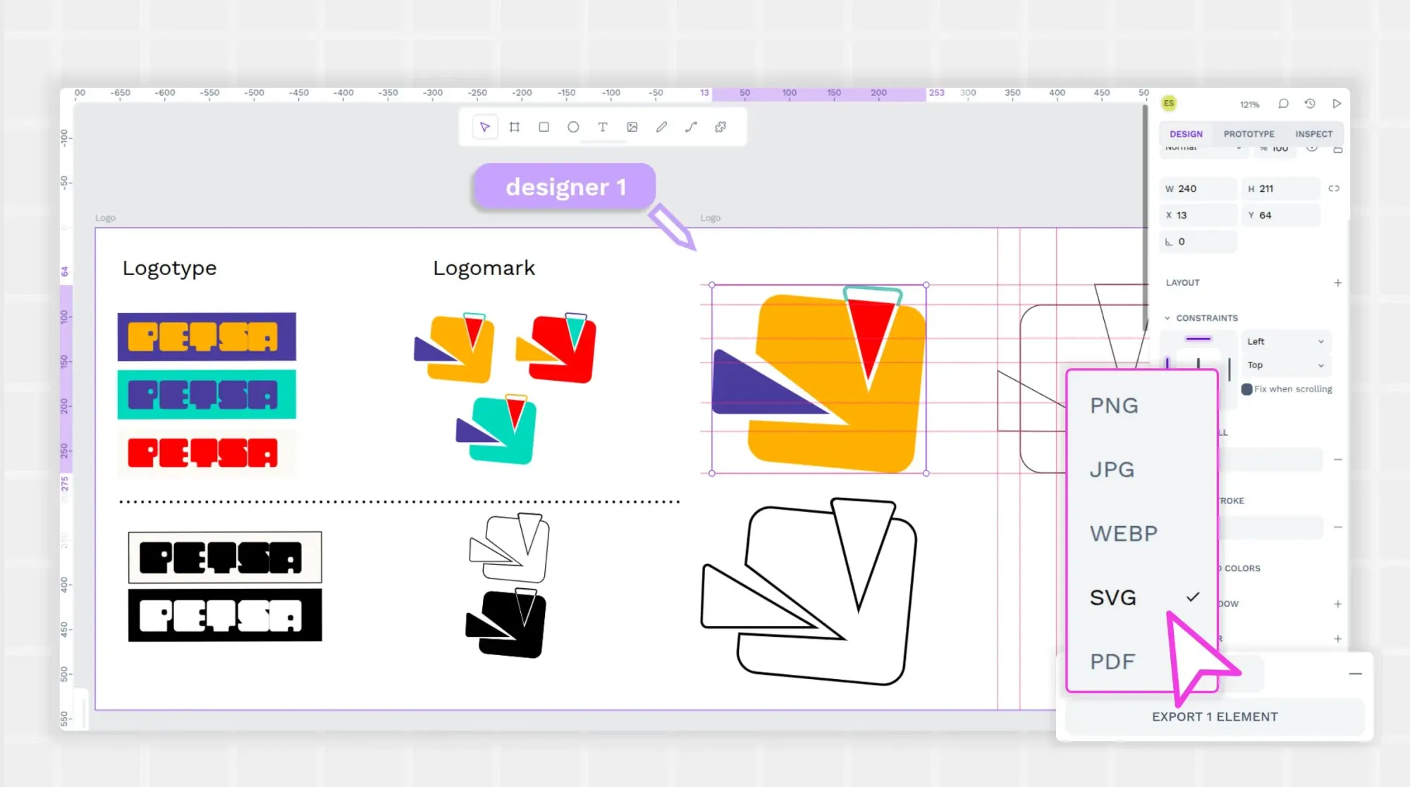
You also want it to be scalable so it can be for both digital mediums (like websites) and physical mediums (like sky-high billboards.) Scalability lets you adjust the height and width without losing clarity or impact.
Here are three tips for creating a recognizable and scalable logo:
- Use Penpot’s intuitive vector design capabilities to create your logo. You can make it scalable to any size for web pages, apps, and print marketing.
- Reflect on your mission and brand values to inspire a meaningful design. Think about what separates you from your competitors and how you want to be remembered by your audience.
- Focus on a clean and clutter-free design that reduces cognitive load and can be easily recalled without extra effort.
- Save your logo file as a Scalable Vector Graphics (SVG) file for use in various formats.
Pro tip: A mood board can help you decide the vibe for your logo and accompanying brand assets. See our guide to creating a mood board to help kick off some great ideas.
2. Select a brand typography system
Typography, or the design of your printed words and lettering, plays a powerful role in how customers see you. Typography showcases your brand’s personality and sets the tone for all of your communications.
When picking a typography, use these best practices:
- Create consistency across all branding, including font size, style, and color. Slight changes between platforms (such as mobile vs. desktop) can confuse customers and dilute your brand efforts.
- Pair fonts thoughtfully. Tools like Google Fonts and TypeTool make this easier — no design experience required. These tools help you consider how different font weights from the same font family might work together for authentic brand engagement. Limit your brand to no more than three fonts to avoid a chaotic look. Pairing fonts can be tricky, but there are some basic guidelines to follow. Websites like Fontpair or Monotype can help you visualize the perfect font combinations for your brand. You can also consider following trends, but this largely depends on your brand’s longevity. For a timeless brand (like Coca-Cola), consistency is key, whereas for something short-term (like a festival), embracing current trends might work better.
- Keep it legible. You can find fancy fonts with embellishments and flourishes, but these don’t translate well to most design uses. Body text should be clean, simple, and accessible for most people to read without enlarging the screen size or pausing to decipher. If you do use decorative fonts, use them as accents only.
Pro tip: With so many fonts, weights, and sizes available, knowing your typography style can take research. Narrow down your font choices with our guide on how to choose a typeface.
3. Define a brand color palette
Colors help tie together all of your branding pieces and familiarize customers with your tone and style. When people see your colors, does your business instantly come to mind? If not, consider these palette best practices.
- Avoid the overwhelm. Start with just one major color to start. Then, use basic color theory principles to explore complementary hues.
- Connect emotionally. Pick colors that show your personality and values, using color theory basics to guide your decisions. Red may be considered serious and energetic, while blue can calm and promote trust. Shades of the same color can evoke completely different responses depending on their warmth and coolness.
- Rely on go-to tools. Finalizing your first color palette can be daunting, as it requires you to think about all the possible color use cases and what you want to communicate. Coolors and ColorSpace are two tools that help generate harmonious color pairings quickly. Use them to safely experiment with different options until you get a visually appealing look consistent with your brand goals.
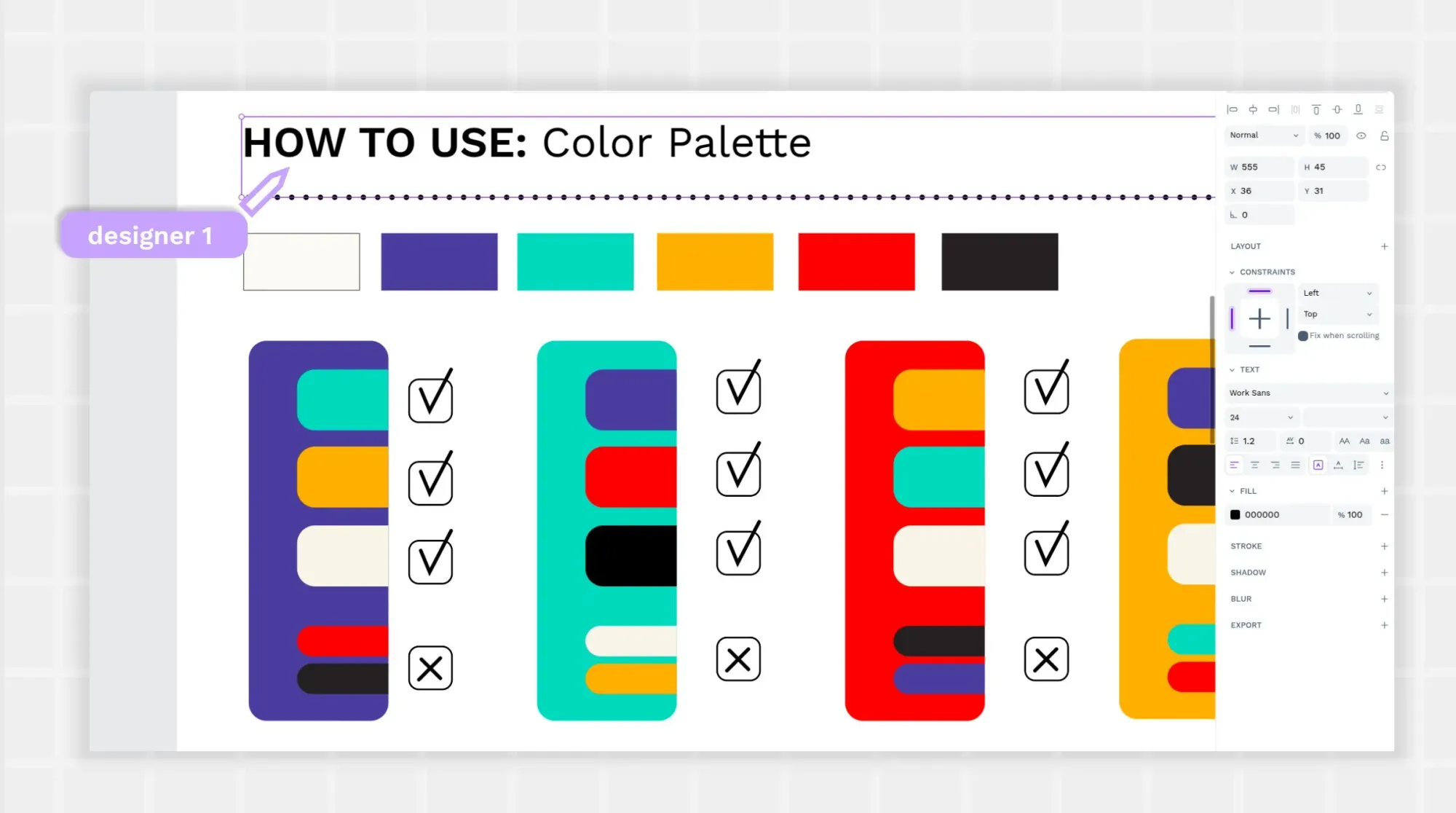
Pro tip: Looking for more color guidance? See our guide on how to choose a color palette. It can help you brainstorm color ideas and implement solid color theory best practices.
4. Create and document brand guidelines
Companies of all sizes should have rules for using their colors, assets, logos, etc. This ensures everyone knows the brand guidelines before they make an ad or put out a Facebook post. Every message — no matter the format — should look and feel consistent.
Create brand guidelines with a tool that can also store them. Penpot’s cloud-based platform does this and gives access to anyone sharing on behalf of your brand. Anytime someone needs to use a logo or font, they can check your documentation to be sure they’re using the latest approved version.
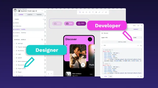
If you expect your guidelines to be very complex or to grow over time, consider making them part of a design system. This approach treats each part of the guidelines as its own unit, stored in the library as a single source of truth. There’s no confusion over which file to use, and it also supports easy communication between designers and developers when it comes time to build more involved projects (like apps).
Pro tip: Learn what a design system is and how to create one in Penpot. It can help you organize your official design elements and make sure they are executed correctly across all platforms and use cases.
5. Apply branding consistently across platforms
Even with well-established branding rules, things get tricky when you start sharing your brand with the world. The person posting to Instagram needs to use the same logo as the person building your website.
In addition to the brand guidelines in step four, you need a cross-platform strategy for how these guidelines will be followed. Each platform will have slight adjustments, but the core identity should remain intact.
After you build your brand identity guidelines, train teams on how to use them and where to find updated files. You can also assign a point-person for all things branding to keep requests for new files or asset types going through a single channel. This may be the Creative Director or Brand Manager in the marketing department.
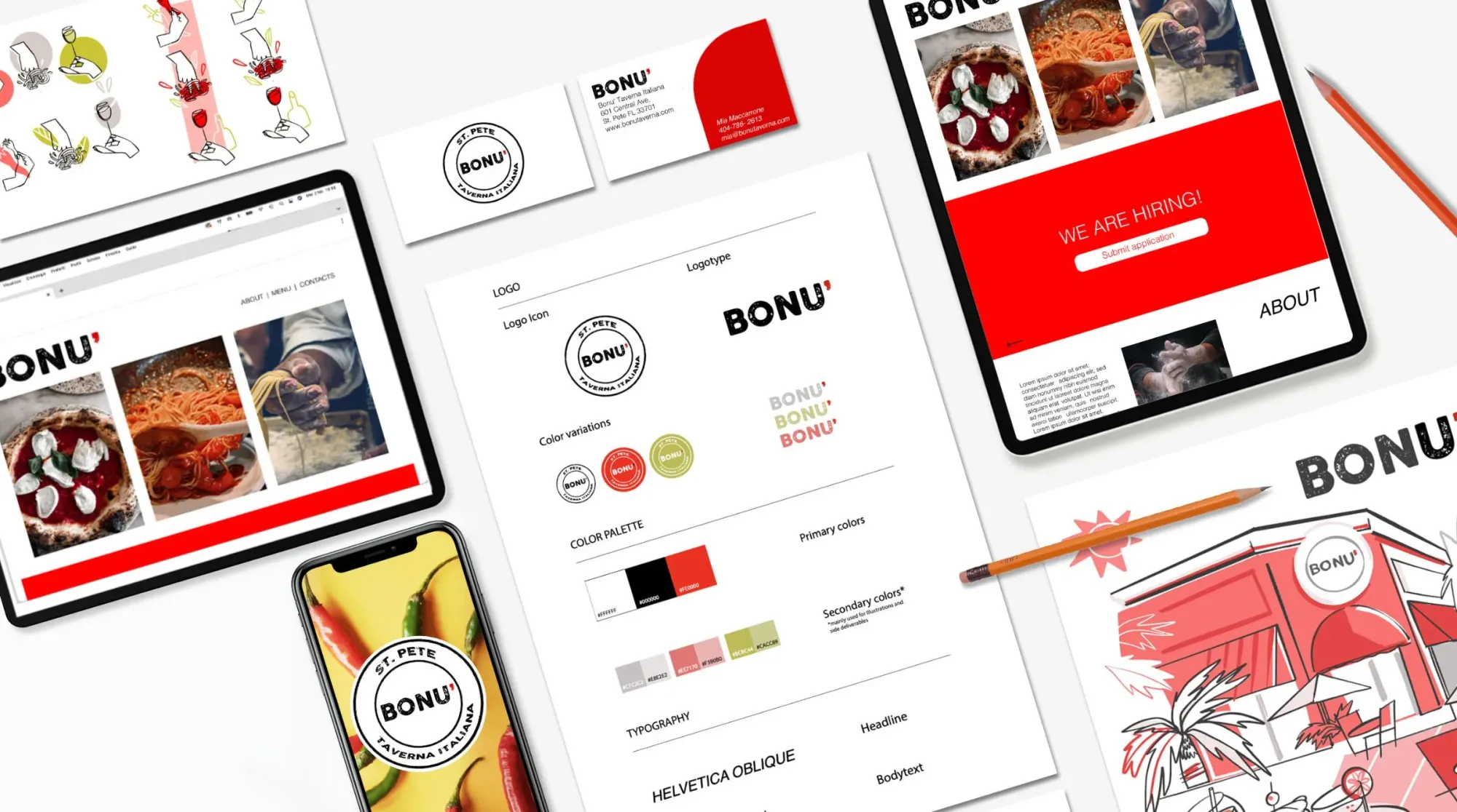
Finally, conduct regular audits of your brand asset files and uses of your brand identity to make sure they’re used consistently. You’ll likely find some misuses, but with regular checkups, you can correct them while they’re minor and before they infiltrate other aspects of your brand.
Pro tip: Learn the design system best practices pros use to keep their brand on target with every communication.
Maintain brand consistency with the right tools
One of the biggest challenges brands have in sharing their identity comes when it’s time to update brand assets. The solution? A well-thought-out design system.
Penpot allows teams to create and manage design systems, which are collections of reusable components, patterns, and guidelines. These design systems benefit teams by standardizing commonly used design elements, from logos to typography, and are consistent and easily accessible for all team members. Because designers don’t have to think about small details like proper sizing, font, or color, they can focus on more important, bigger-picture design work. The Penpot platform, specifically, supports real-time collaboration, so designers can work with others using design system elements simultaneously. This reduces errors and keeps projects on target.
Before finalizing your designs, create wireframes and prototypes to see what they might look like in real life. Penpot’s robust prototyping features and pre-made templates are easy enough for even first-time designers to use right away.
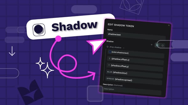
Penpot’s design platform also supports the use of design tokens, which can be especially useful for maintaining brand consistency. These reusable collections of style values (such as colors, spacing, and typography) work across all designs. So, when it comes time to swap out the old blue on your web page with a fresher blue, you just need to change the color within your design token. The changes propagate instantly any place the token was used; you don’t need to update the color in every instance manually.
Design, document, and apply your brand identity with Penpot
While design ideas can sometimes happen over a lunch brainstorming session or coffee break, the execution only happens with the right tools. Penpot helps teams collaborate, prototype, and maintain brand identity to evoke emotion in your customers and build brand reputation over time.
It’s also incredibly easy to get started using, even if you’re new to cloud-based design tools. Since it’s open-source, you’ll own all of your work forever and never have to pay a subscription fee to access your designs.
Ready to get started? Try Penpot for free and start building a strong brand identity today.
Related Blog posts
We have even more posts about enhancing your brand design skills. Here’s a few examples of handy articles to help you get the most out of Penpot.
